

A typeface is a big realm for design. Finding a suitable typeface can be challenging since there are many styles of typefaces. Fortunately, there is a way to classify typefaces into several categories. Here, we’ll help you understand the classification of typeface styles so you can find a suitable typeface.
13 Classification of Typeface

Generally speaking, typefaces are classified into four categories: serif, sans serif, script, and decorative. However, there are smaller classifications from those major four. Read thoroughly the following explanation to understand them better!
1. Serif
Serif is one of the most classic and traditional typeface styles. It has characteristics for its small strokes that are called serifs at the end of each letterform. Since the serif typeface is legible, the typeface is suitable for headlines or body text. As for design, the serif typeface is fit for formal and professional content tones.
This font style has four smaller typeface classifications.
a. Old Style
Old-style serif has the characteristic of its axis being angled to the left. The serif form is a bit curvy and bracketed. Additionally, the contrast between thick and thin strokes is relatively minimal. Examples of this style are Garamond, Goudy Old Style, and Adobe Jenson typefaces.
b. Transitional
Compared to the old style, the traditional serif presents a visible contrast between its thin and thick strokes. The typeface also has a vertical axis rather than diagonal form. Times New Roman, Merriweather, and Baskerville are known to be in this serif-style classification.
Also Read: Transitional Typeface: Definition, History, and Its Characteristics
c. Neoclassical
Neoclassical or Didone typeface was developed in the late 18th and 19th century. The typeface has a more modern, delicate, and refined style compared to the two mentioned above. The thin and thick strokes’ weight and width are more dramatic and distinguishable. Additionally, it also has a vertical axis and no bracketed serifs.
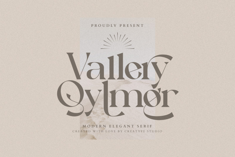
You can find what this typeface looks like through Didot and Bodoni fonts. In the picture above, you have Vallery Qlymer from Creatype Studio that also classified in this typeface style.
d. Slab Serif
Slab serifs normally have heavy stroke weight and no bracketing serifs. There is also no contrast in its font character strokes. This font style is often stylized in geometric or square shapes. Some of the most popular fonts examples from this style are Rockwell, Courier New, and Egyptian Slate.
Also Read: 10 Most Popular Slab Serif Font Chosen by Designer
2. Sans Serif
Sans serif is another classification of typeface styles you are already familiar with. Sans serif means “without serif” which describes that sans-serif font characters don’t have any extra strokes at the end of their letterform. This typeface is well-liked for its simplicity, minimalist, and modern look.
Like Serif styles, sans serifs also have four classifications, as explained down below.
a. Grotesque
This typeface style has a square look for some letters. It is also distinguishable for its spurred look for uppercase “G” and a double-story (double bowl) for lowercase “g”. Curious about how those characteristics appear? Just take a look at the Franklin Gothic, News Gothic, and Venus-Grotesk fonts!
b. Neo-Grotesque
Neo-Grotesque is a simpler version of the grotesque version. It doesn’t have a spurred uppercase “G” and the lowercase “g”, yet often has a single bowl. You’ll see how it goes on Roboto, Helvetica, and Arial typefaces.
c. Geometric
Geometric sans serif is a simple typeface since its design is strictly based on geometric shapes, like circles, triangles, and squares. It has a perfect round of the letter “O” and a single bowl for the lowercase letter “a” and “g”.
Commonly, the typeface in this classification, like Futura and Kabel, doesn’t have any contrast strokes.
d. Humanistic
This typeface classification style adapts to the Roman form which also has clear strokes contrast. Hence, it improves the text readability. You can use Verdana and Optima fonts that represent this typeface classification.
3. Script
The script is a classification of typeface style that imitates handwriting style which comes in many forms. No wonder that the characters’ form in this style are also more fluid than the traditional typeface. People often use this typeface for display and headline copy rather than for body text. Learn more about the script classifications.
Also Read: What Are Script Fonts and How To Apply to Your Design
a. Formal
Elegant and graceful letterforms are characters of formal script style. It’s distinguishable with its curvy and flowing loops which often have ligatures that connect each letter. Snell Roundhand and Bickham Script fonts are some examples.
b. Casual
As for the casual script, the style appears to imitate letterforms produced by pen or brush. The strokes tend to be solid and have noticeable contrast. Additionally, the letterforms are usually connected by ligature.
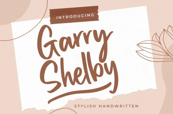
rush Script, Mistral, and Bianca are fonts that are classified in this script style. You can also find it in Creatype Studio, such as Garry Shelby, Hurtley, and Peachy.
c. Calligraphic
This typeface emulates the style of hand-lettering calligraphy with high and dramatic contrast between thick and thin strokes, as you can see in Ballerino and Vivaldi fonts. Ligatures also appear in calligraphic style, just like at any other script style classification.
d. Blackletter
Blackletter is also known as Gothic and Textura style, which are based style of Old Englis and Fette Fraktur typefaces. It is heavily influenced by the medieval era.
The unique features of this typeface are a solid black color and very decorated uppercase letters. It also emphasizes the angular form with dramatic thin and thick strokes.
4. Decorative
This classification of typeface is the most unique and eccentric one since it tends to be highly stylized. Usually, designers utilize this style to attract attention. Thus they put it in huge headlines, titles, or short messages.
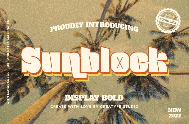
There are various examples of this typeface, such as Broadway, Banco, and Curlz. Creatype Studio also crafted many options of decorative font styles you can choose from, like Sunblock, Brighton, Massyabhan, and Vantage.
Also Read: What is Monospace Font? Here are Some Well-Known Monospaced Typefaces
Which Classification of Typeface Do You Like?
Each classification of typeface styles has its function and uniqueness. If you like your design to be modern, you can use sans serif typefaces. On the other hand, in order to impress your audience with striking design, using script and decorative typeface are good choices. Find your design objective first, then pick the best font accordingly.
Don’t waste your time looking for a needle in a haystack then! Drop by Creatype Studio to try out all their font collections for only $1 and find the right font for your project!


