
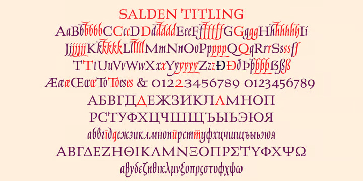
What is the secret to gaining readers’ attention in seconds? One of the best answers is—depending on the context—implementing a suitable transitional typeface. However, the knowledge of the field is massive and might require proficiency earned by experience. But worry not, here is what you must know about the typeface really quickly.
What is Transitional Typeface?
Do you use Times New Roman to write papers, books, or messages in an advertisement? The font is one of the types categorized as transitional typefaces—commonly known as Neoclassical type, including Baskerville and New Caledonia. Its name originated from a period back in the 18th century.
It was a period where mathematics and science principled many designers to generate new forms of letters: by mixing two styles altogether. For example, rounded serifs appear less formal compared to the modern type; however, the font still holds a formality, especially the older style.
History of Transitional Typeface
Near the end of the 17th century, Louis XIV—a member of France’s government printing works—brought up an idea to invent a new typeface for the French Academy of Science. The process was quite taxing and long-term; the entire 86 fonts created had yet to be perfected until 1945 despite being commissioned in around 1692.
Two names were offering a tremendous contribution in the making: Pierre Simon Fournier and John Baskerville. Let us discuss more Baskerville, a dedicated entrepreneur involved in several businesses and eventually engaged in the printing field. He soon designed his type of font by improving on one of Caslon’s works.
However, Baskerville’s creation did not receive good reactions from the world of printing. The poor man must endure the constant lashes of criticism regardless of having endless support from people; such as Benjamin Franklin. Fortunately, the entrepreneur was tireless: reviving the types from metal to even digital ones.
In contrast to Baskerville, Fournier was quite respected during his time; His creation of italics received constant compliments. The man, who developed an interest in musical notation’s typography, was more recognized for his invention of the point system to measure type sizes. Additionally, Fournier praised Baskerville
These days, transitional typefaces are continuing. Their components, including the details, are getting more prominent and advanced. However, the weight difference between the thinnest and the thickest points might be larger than in the past; it is filled more with exaggerations. Also, the serifs are more flattened out and less bracketed.
Also Read: Learn 5 Easy Ways How to Add Fonts to Illustrator
Characteristics of Transitional
The serif—transitional one—has approximately six characteristics that differentiate it from the others. The first one is the contrast; serif font serves as a more highlighted contrast between the thickness and thinness of the strokes. Secondly, the strokes are wider; they contain brackets endorsed by flat bases, which appear more graceful.
Thirdly, the stress is visible vertically on each stroke. Also, the x-height is larger than the y. Next, the capitals’ height is matching to the ascenders. Lastly, the numbers’ heights are all consistent in size.
Is Sans-Serif Included in Transitional?
The answer is no. Both are quite preferred in many mediums yet easily mistaken as similar to each other. However, there are apparent differences between the two, as follows:
1. Decorative
Serif’s stroke is way more decorative and stretches to the end of a letter from: such as Times New Roman, Georgia, and Garamond. On the other hand, sans-serif does not contain such a style of stroke: as Helvetica and Arial.
2. Mood
Transitional typefaces exude a classic mood or formal style, and therefore newspapers or books tend to use the type. Meanwhile, sans-serif fonts appear more to the casual side, and thus magazines favor the type.
3. Legibility
The popular belief is that serif is the best choice for reading smaller-sized text in books or newspapers ever. On the other hand, sans-serif fonts adjust better for digital readings, creating a better experience for readers at a personal and comfortable level.
Also Read: A Comprehensive Guide on Serif Vs Sans Serif and How to Choose Them
Examples of Transitional Typefaces
Below are some examples, along with their distinctive characteristics.
1. Seriffic
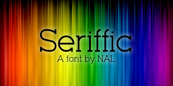
Seriffic has thin and defined strokes; the lines are also elegantly and formally bracketed. However, the style can still appear casual, especially on the numerical, representing the transitional typeface very well.
2. Georgia

The second recommended font is Georgia. Its font style might define the great combination between modern and classic. In addition, its lower-case letters are quite tall with thin strokes and no brackets, showing that the font can be more suitable for casual or creative works.
3. Enyo Slab
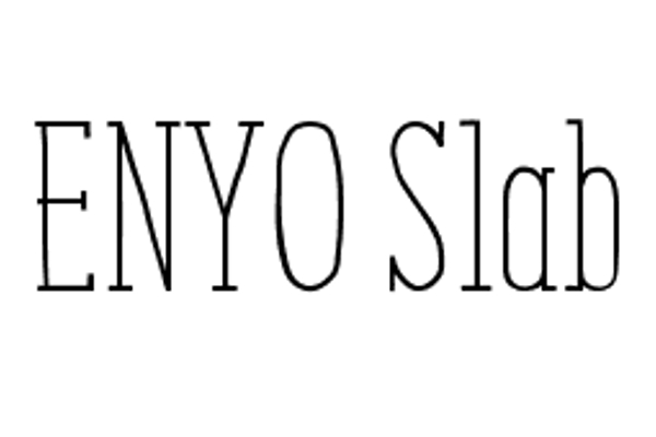
Classic and simple are the perfect words to describe Enyo Slab. The font style has very thin and bracketed strokes; the characteristics make it appear fancier and suitable for creative or formal works.
Ready to Catch Your Readers’ Attention?
Transitional typefaces had to go through a long process of development and perfection for years. The printing industry has even claimed its capability to establish readability for the readers; in other words, your messages can be delivered well. Moreover, the types are getting more refined and have numerous improved styles in the modern days.
Suppose you are looking for the best transitional typefaces; look no further than the ones from Creatype Studio. This place has various selections, allowing you to choose the one. Not to mention it offers $1 deals at the moment. So, let’s visit the website now!


