
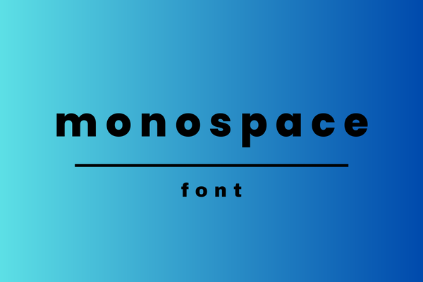
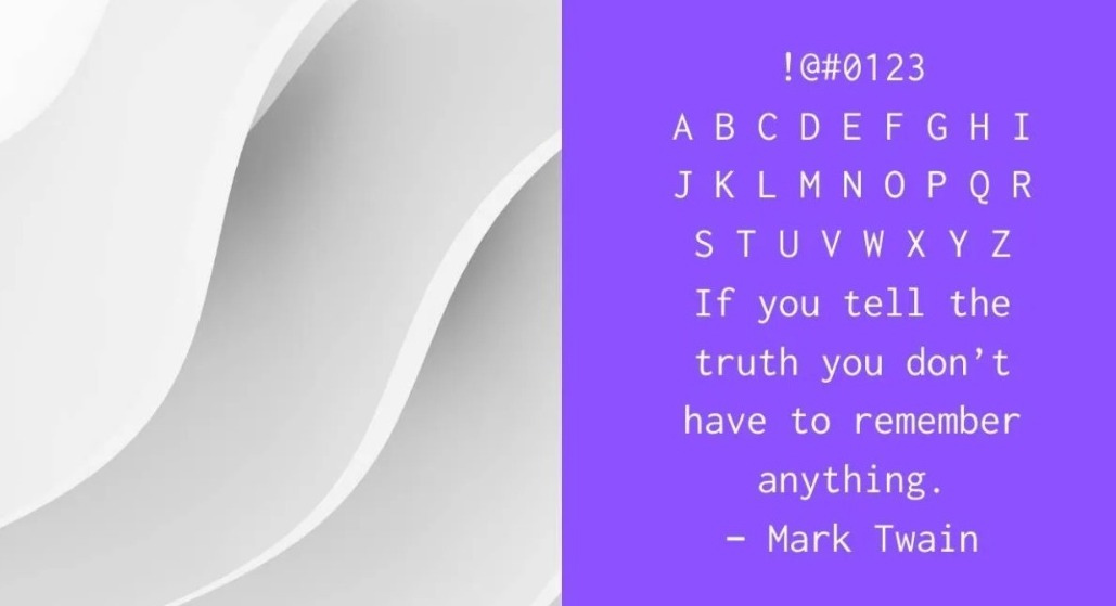
Talking about typography cannot be separated from fonts. There are many types of fonts used to beautify typography. Monospace is a well-known typeface and has many uses. Then, what is monospace? The distinctive feature of this font is that each letter has the same horizontal space.
To learn more about typography, please follow this article.
What is a Monospaced Font?
The meaning of Monospaced font is a type of writing that looks like a typewriter. This type of writing has the same space for each character, so it’s a little difficult to read. Monospaced fonts will have the same amount of horizontal space and width characters.
Initially, this typeface was more often used on old-school computers, because at that time the graphics capabilities on computers were not as sophisticated as they are today. In addition, the Monospaced design was also created specifically for standard typewriters.
Commonly Used Famous Monospace Fonts
To improve your deeper knowledge of typography fonts, we recommend you check some of the Monospace font types that are often used as follows:
1. League Mono
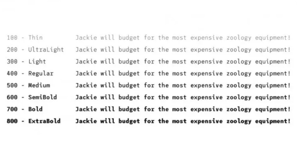
A typeface that is part of the monospace font family is League Mono. Even though the design character looks like writing on a typewriter, it has a clear level of legibility.
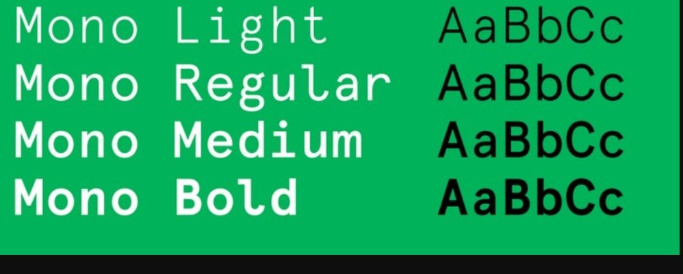
The League Mono font provides 8 options, starting from thin, ultralight, light, regular, medium, semi-bold, bold, and extra bold. These options present the same letter design, but only the thickness is different.
The easy-on-eyes design and good legibility allow you to use the font for long texts. Besides, the space for each letter looks neat and not too tight.
2. Courier
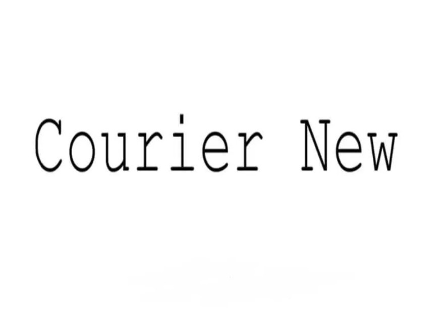
What type of monospace font is suitable for short text? It is a Courier font. Then, why is that? It is because the display of the Courier font character is similar to the typewriter character. If you use this font for long text, then it will reduce the readability of the text.
So, to have good legibility for your design, it’s best to use Courier font for short text only. Using the Courier font properly will bring out a strong vintage feel. It will certainly give artistic and aesthetic characteristics to your work.
Also Read: What Is Tracking In Typography? With Tips and Examples
3. ElroNet Monospace
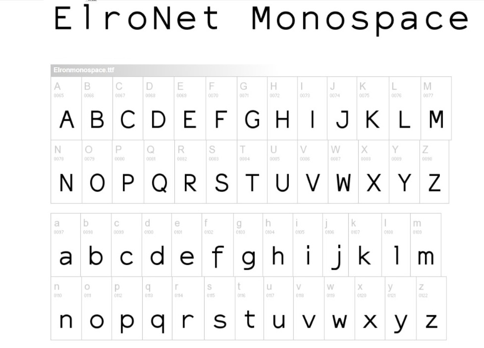
What is the monospace ElroNet typeface? Have you heard that before? For those of you who are still not familiar with this type of font, it is a typeface with characters like a typewriter but comes with a more modern display.
Choosing this font will make your design look fresher and give it an interesting artistic touch. Each letter’s medium-thickness design also gives a sweet and friendly vibe. Although each end of the letter does not use rounded corners, it does not look stiff.
The Elronet font has uppercase, lowercase, numbers, symbols, and punctuation. These options certainly provide convenience to its users. In addition, the ElroNet font doesn’t look clumpy either, because each letter has a wide enough space. As a result, you won’t have any problems with readability.
4. Inconsolata
The next font that belongs to the Monospace font family is Inconsolata. The use of this font is for code listings and the like. Thus, this font is used on the screen for programming fonts. For high-resolution rendering needs, the Inconsolata font is not perfect yet.
Considering that this font is more widely used in programming, the display of writing is also not designed humanely. Even so, the Inconsolata font still has fairly clear legibility.
5. Apercu Mono
The last well-known font type from Monospace is the Apercu Mono font, which comes with a fresher vibe. You can use Apercu Mono for digital media text. Its display is slightly different from the other Monospace families, making this font have an eccentric side.
Each Apercu Mono letter design has corners that are not rounded but still give a friendly and unique vibe. In addition, the long text in the Apercu Mono font is also pleasing to the eye and has well-read legibility.
Also Read: Bad Kerning in Typography: Here Are Also The Examples and Tips
Have You Understood What is Monospace?
Which fonts are monospaced according to your needs? Some examples of the famous Monospace font types above have different uses. The design of each letter will affect the display you want to present. To produce artful and readable designs, choose wisely.
If you want to get references for various types of cool, unique, and interesting fonts, please visit the official Creatype Studio website. You can find both free and paid fonts starting at an affordable price. So, let’s visit the website and grab the deal now!


