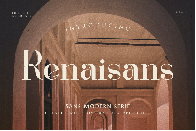
Speaking of logo design, usually sparks a question like “How to choose a font for your logo?”. Well, there are certain aspects you need to consider before choosing the perfect font for your logo. Interested? Let’s delve deep into it!
Understand the Logo Types
The first aspect to consider is the general look of your logo. There are two types of logos, namely logotype, and logomark. Learn more about them before jumping to choose a font for your logo!
1. Logotype
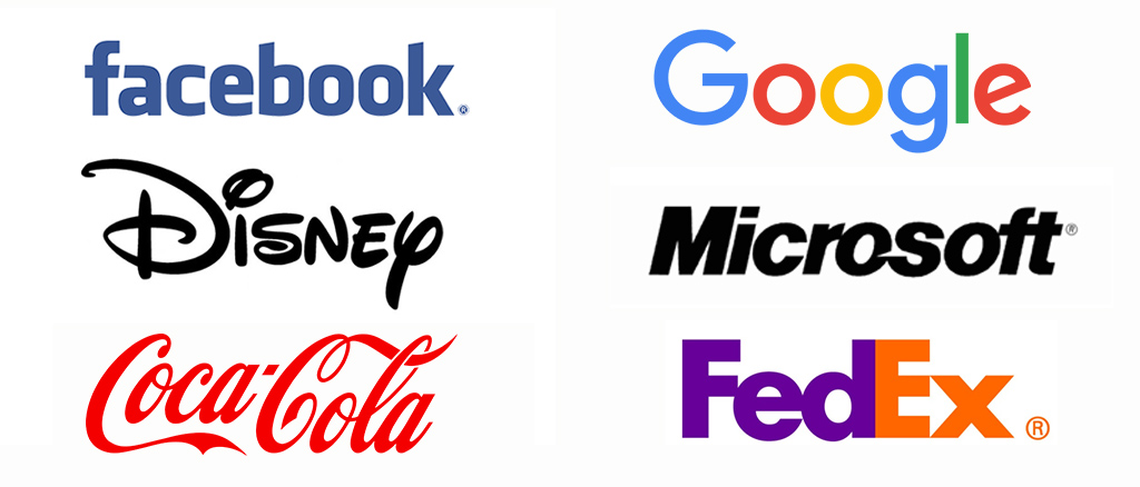
This style of logo features text that usually says the brand’s name, such as brands like Jeep, Disney, Google, or Sony. These brands simply just type out their name and make it their logo. The distinct difference is a logotype brand doesn’t have an associated icon or picture.
If you want to make your brand a logotype, naturally, you need to choose a font for your logo. A font that speaks clearly of your brand’s value while maintaining legibility. You have to consider the size and style too, because you’ll inevitably put your logo in every product.
The most important advantage of using a logotype design is it’s simple to work with, and more identifiable. This text-based logo provides a clear message about your company or brand which all in all makes it more distinct and exclusive.
The only disadvantage is fonts are evolving, so at some point, that particular font can be outdated.
Also Read: Logo Design Trends: 5+ Trends to Elevate Your Design
2. Logomark

A logomark design features text and an icon or artwork. You can take a look at the logos of Instagram, Adidas, Mercedes, or MacDonald’s. Instead of just text, they have an associated icon to put on their products. This makes their brand unique and highly customizable.
They can place the icons in small places and integrate them as part of their design. As a digital product, Instagram has to make an icon because apart from needing it as their app, in a blogging environment, their icon can be a button too. Thus, it also looks fancier and cool.
However, there are also disadvantages to this design, for instance, people might have difficulties finding your brand name if you only put icons in your products.
Having an icon means that you’ve gone through hardships making it and finding a professional designer or artist is difficult enough, let alone if it’s time to make a new one.
Also Read: How To Win Logo Design Contest: 5 Ways to Boost Your Odds
Mind about The Font Style
Choosing a font for a logo is very influential when conveying your brand’s value. So, knowing every font style is key. Check out the font styles in the brief explanation below!
1. Serif
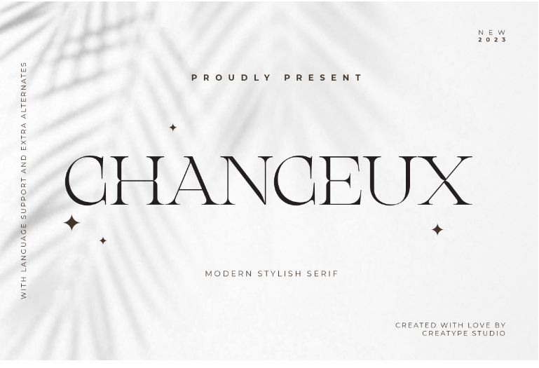
Serif font always has a little line at the end of a stroke. This font has a classy, elegant, or trustworthy feel.
2. Sans-serif
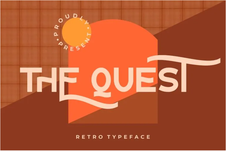
The word “sans” is taken from the French and means “without”. So, without the serif, this font style has a clean, simple, and minimalist look.
3. Slab Serif
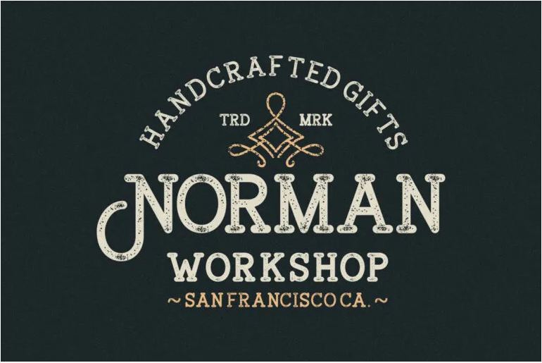
A thick font with serif refers to the Slab Serif typeface. This can create a masculine and authoritative vibe.
4. Display
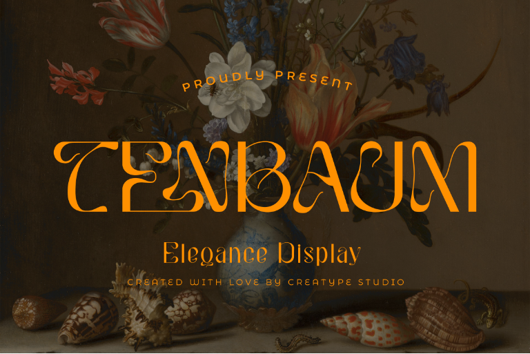
This display style is an attention seeker. It usually looks bold, unique, and quirky.
5. Script
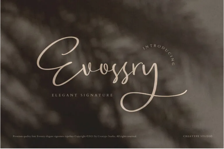
There is a calligraphic influence in the script font style, making it elegant, ornate, and opulent.
Also Read: 15+ Capital Letter Fonts to Achieve the Best Designs
6. Handwriting
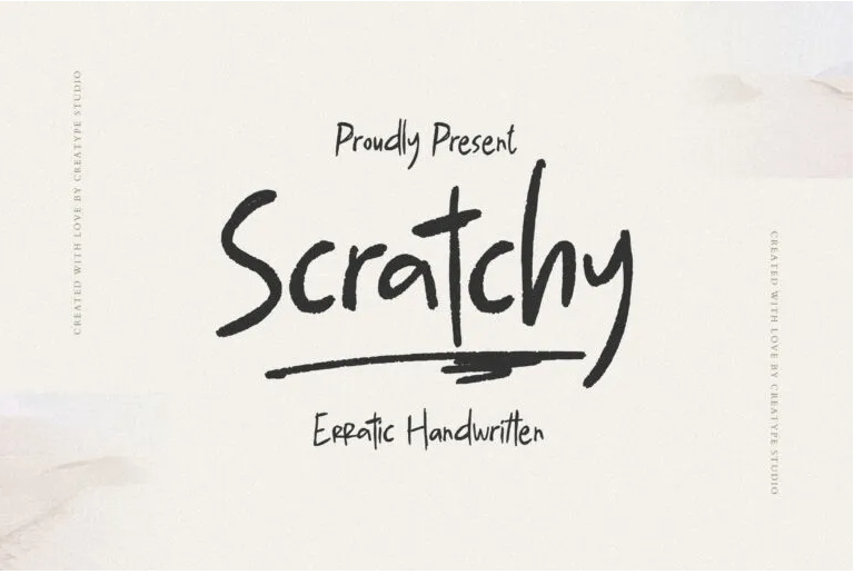
A font that imitates organic handwriting. Using this style you can present a natural and approachable feel in your logo.
To choose a font for your logo, you need to know what mood certain styles bring. You can also try mixing and matching two styles, one for the brand’s name and another for your tagline. While different sizes are enough to make a difference, using a different font style is much more exciting.
Meeting Industry Standards
It’s best to use not more than 3 fonts when choosing a font for your copyrighted logo. That standard also meets the current industry expectations. Selecting proper fonts for your logo not only has to radiate your brand image but you also have to consider the impression it leaves behind.
Your brand’s name should be in one font that represents your value, field, and identity. Another supporting text, like a tagline or established year, should be in another font smaller and lighter than the name.
Also Read: Golden Ratio, A Guide to Master Logo Design Structure
Ready To Choose A Font For Your Logo?
Ready to choose a font for your logo? Here are our top collection of 15 fonts for logos. The Creatype Studio is full of carefully crafted fonts, and your design deserves a great typeface just like these.
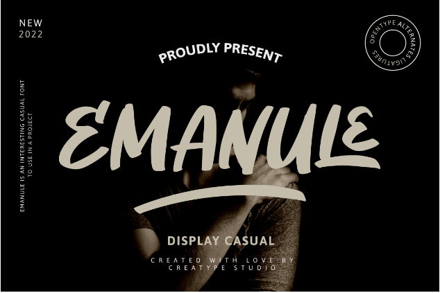
1. Emanule
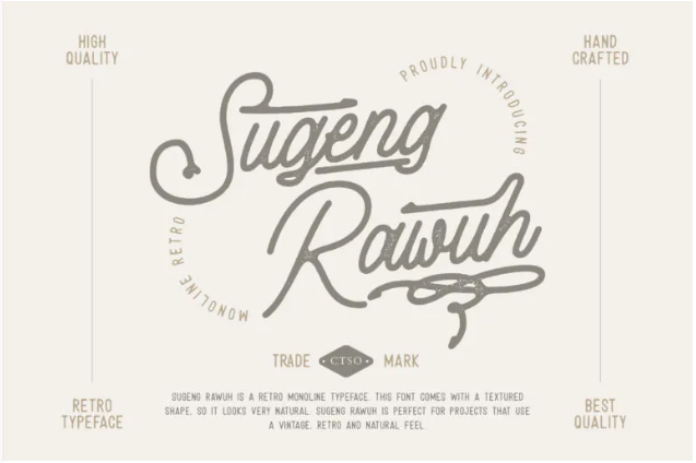
2. Sugeng Rawuh
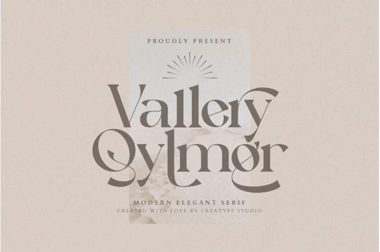
3. Vallery Qylmor
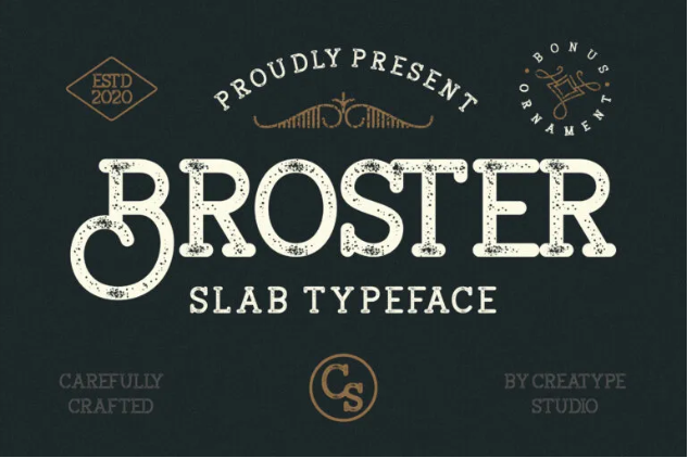
4. Broster
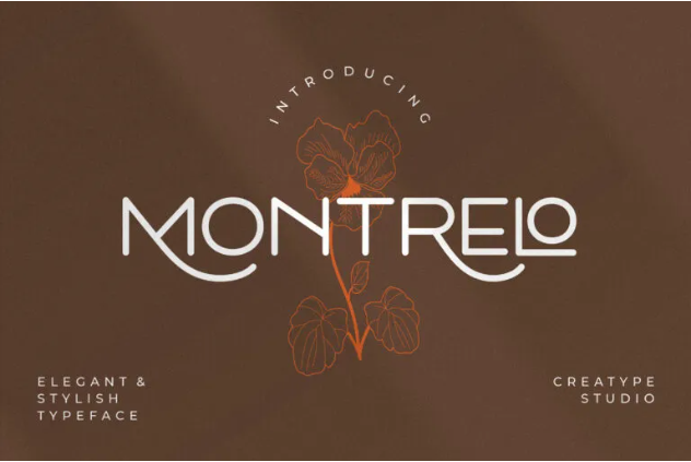
5. Montrelo
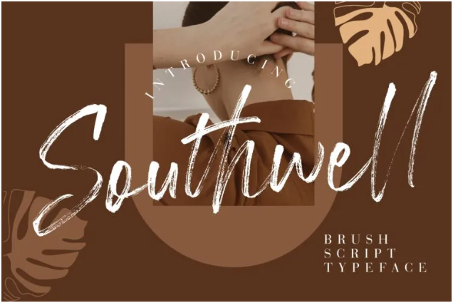
6. Southwell
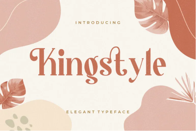
7. Kingstyle
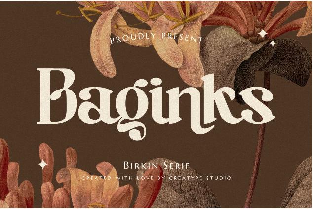
8. Baginks
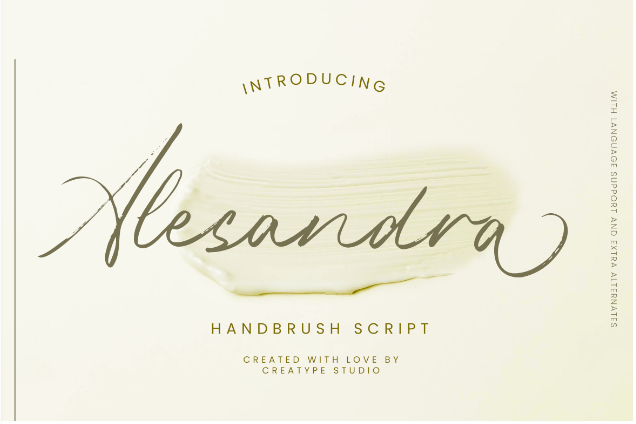
9. Alesandra
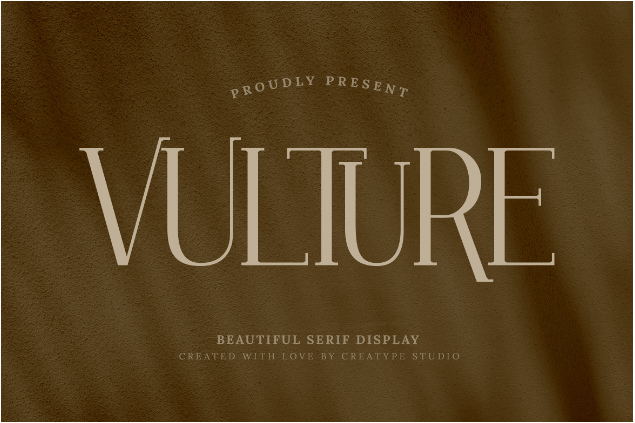
10. Vulture
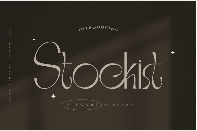
11. Stockist
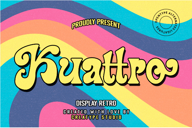
12. Kuattro
13. Mattador
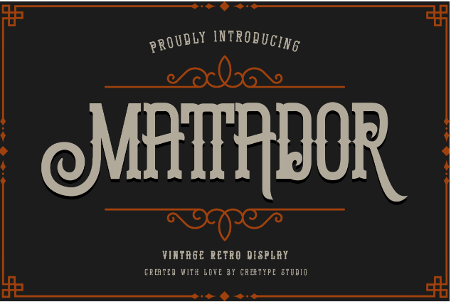
14. Molland
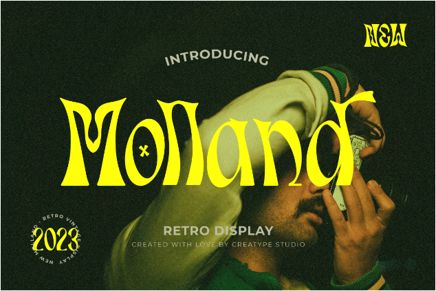
15. Renaisans
