
Designers often find themself working on projects with a lot of information involved. In some cases, even so much of just text-based content. Well, to show better text-based content, understanding the typographic hierarchy can expedite the information transfer process. Let’s take a look at this topic.
What is Typographic Hierarchy?
Simply put, typographic hierarchy is the arrangement to make texts more readable. As a designer, you already know what piece of information is more important, but the readers don’t know yet. You can reflect your knowledge in the text using hierarchy typographic designs — and even incorporate current font trends to make your layouts more engaging.
All of this involved levels of typography, typographic elements, and creativity. But don’t forget the main goal, which is arranging more readable texts. So, here’s the gist of it.
Sections of Typographic Hierarchy
There are three basic sections of visual hierarchy in text-based design. The sections are headline or heading, subheading, and body. This arrangement allows readers to scan for relevant information first and also attracts them to read more. What are the definitions? Here is the explanation.
1. Headline or Heading
The headline or heading should contain the most important information. This section should be the easiest to read. Ideally, visually stimulating with large bold fonts. The headline is the first thing people will read, so it’s best to make it compelling.
2. Subheading
The subheading is a great addition after the headline. You can expand the heading without being too explicit.
The subheading also acts as a divider between the heading and the body. You can use a completely different typeface than the other sections. Further, this section should be smaller than the heading, and slightly bigger than the body.
3. The Body
The last section in the typographic hierarchy is the body. This is where your main idea is located. The body has the smallest size font, but most used spaces. However, it should be big enough so people can read it. Ideally, you may use clean and easy-to-read typefaces with consistent spacing between letters.
Also Read: What is a Typographic Scale? And How to Use It?
Elements of Typographic Hierarchy
Understanding each element can also make your design more compelling and rich. Try to be creative with each of the following elements.
1. Typefaces
Choose fonts that fit the mood of your design and pick another that’s easy to read in dense sections. Play with more font types to further decorate your design.
2. Size
Font size contributes to steering the reader’s eyes. The bigger the size the easier it is to read, so eyes will likely read that section first.
3. Case
You can even use all uppercase letters in your heading or subheading. But avoid using uppercase letters in the body text as it can be exhausting to read.
4. Alignment
Putting your most important section such as the heading in the middle of your design gives more typographic hierarchy to the section. A More centered text gives the text prominence and importance. Finally, it will attract more eyes to it.
5. Weight
A bolder text emits heavier weight and it will appear more critical. A light font appears less important, but perfect for texts that contain additional information.
6. Color
Of course, your text color has to be complemented with each element. It also creates contrast with the background and provides readers with the direction of which text you want them to read.
7. Position
Positioning your texts is also important as people typically read from up to down and left to right. So, understanding people’s behavior can give you more options to optimize the design. Don’t forget to place all related contents together in a relatively close space.
8. Spacing
This includes the space between sections, space between letters, space between lines of text, and space for artwork.
It’s okay to give small-sized letters a big space in contrast with the heading that already has a big font. This gives both sections their importance in the design.
9. Contrast
The last element of our typographic hierarchy is contrast. Four things that make contrast are color, style, size, and weight.
For example, contrary elements like bold and light font styles for headings and subheadings. With roughly the same size, people already know which one is more important. Contrast like that makes one element stand out than the other, and ultimately makes it easier for people to read.
Also Read: What Is Leading In Typography? With Rules and Examples
Examples of Typographic Hierarchy
Here are some examples to better understand the concept
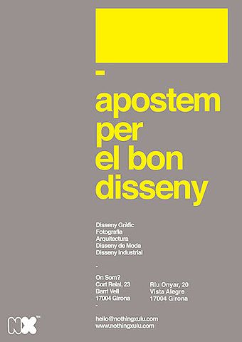
1. Up Down Application of Sections
This first one of the typographic hierarchy examples applies up and down application. You can see the contrast between letters yet they are indeed readables.
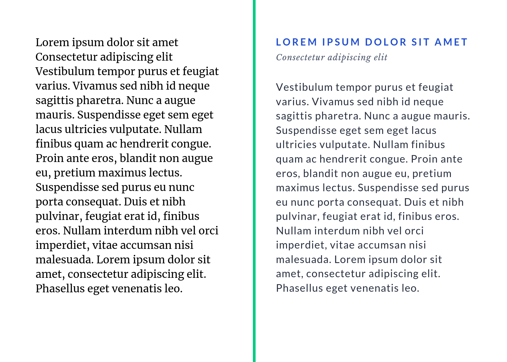
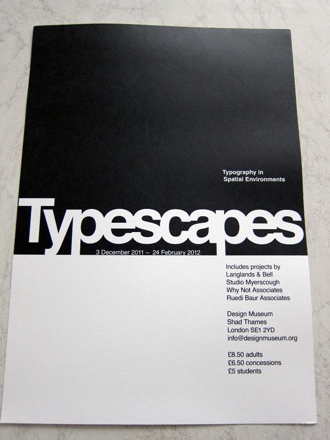
2. Heading and Body Text Only
If you fond of large fonts, applying this heading and body text with huge letters may be the best option. Not only does it look simple, but alo people will immediately love the readability rate.
Also Read: 10 Best Font for Brochure Text and Headings to Win Your Market!
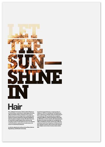
3. Subheading and Heading between the Body Text
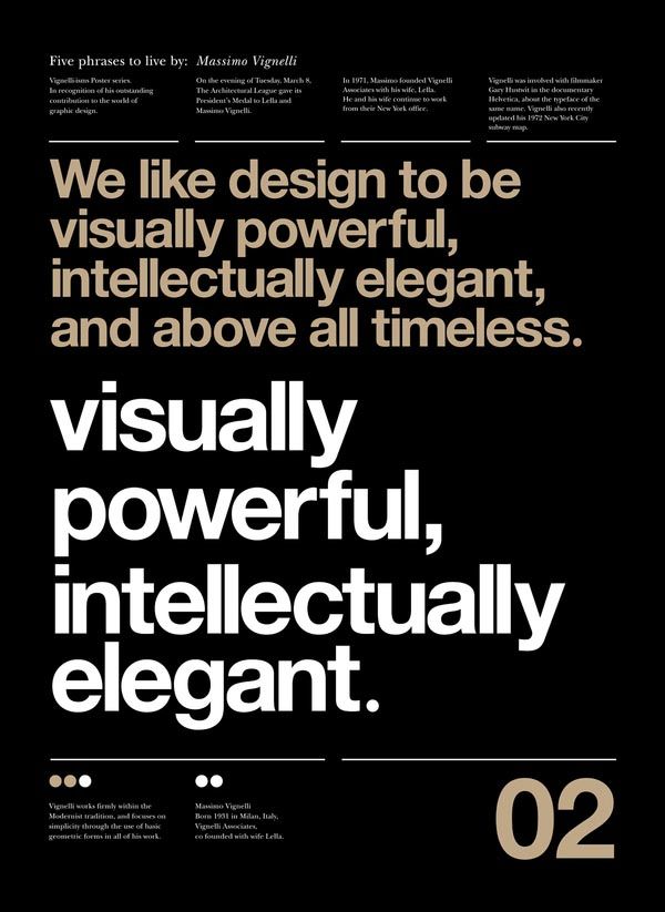
As the picture portrays, you can see that the body is placed before and after heading and subheadings. You may think that the letters crashed, yet the concept is unique and persistent, which is much more readable.
4. Subheading above the Headline Produced by Color Contrast not Size
You may also play with the color. Try to make the contrast shade as mentioned above to give new point of view. Therefore, your audiences will find it impressive and new.
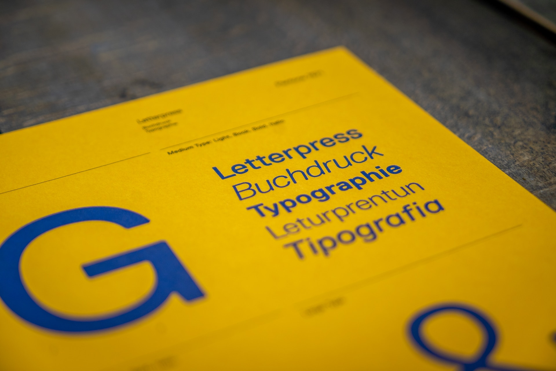
5. Comparison of Color, Style, Size, and Weight in Every Section
Last but not least, using the comparison in color of every letter can be your next option. This design feels new yet readable. Thus, your audiences won’t find it difficult to read it and get the information you portray.
Also Read: What is An Ascender In Typography: Explanation and Examples
Use Typographic Hierarchy on Your Next Design!
Keep experimenting with all the elements, and you’ll be a great designer in no time. It’s a form of art anyway, so the only limitation is your own creativity. You can visit the Creatype Studio website for more font selections. Grab the $1 deal for each font and find the perfect one for you. So, what are you waiting for?


