
Aside from serif and sans serif, you see a lot of classic, victorian, and modern style typefaces. Since now is considered a modern era, why don’t we dig deeper into modern typography? Guide your way through the insights compiled here.
The Basic Concept of Modern Design Typography
As you may consider the modern concept incorporates something that in trends, modern typeface represented a specific meaning and movement at the time. It refers to the type with a breakthrough style compared to the previous trends sparked around the 18th century. Below are 3 basic concepts you must know:
1. When This Typography Style Created
As explained above, the typeface design mentioned represents a reaction opposing the previous type concept. Firmin Didot, a French man, had created the first modern type ever which was then known as Didot. Didone from Bodoni followed those character sets attributed to Didot.
Over time, the influence got larger and bigger, thus its utilization became a hit in the 19th century. In addition, Didones is the other name for the modern typeface.
2. The Distinguished Attributes
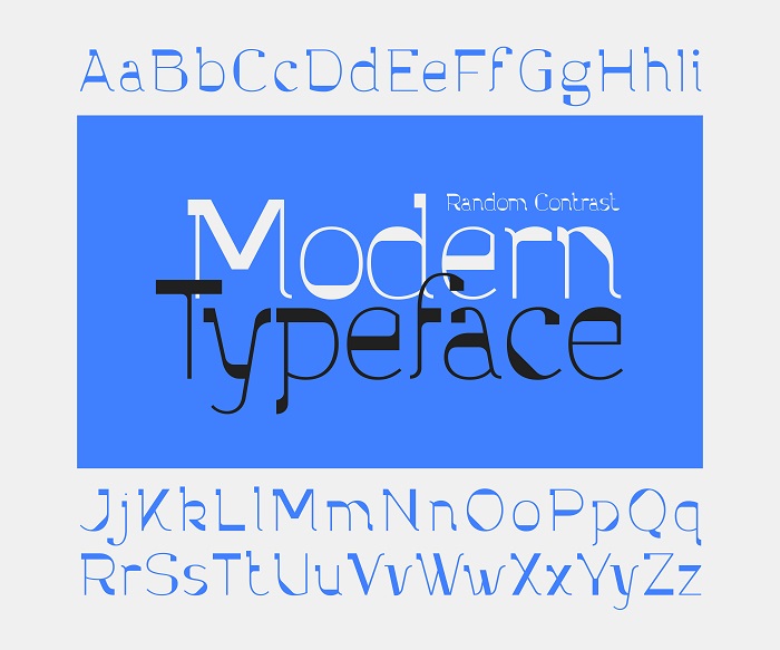
The modern typography style has taken the contrast that came with the Baskerville style even further. In the case of Old style or Baskerville, the contrast between the stroke’s thin and thick. As for Didones or Modern, sans serif is the appropriate representative.
It offers horizontal and long serifs (tailing/feet) specifically for the lowercase. The strokes are rather thin in width and weight, with transition cuts that are clearer and higher between those thick and thin. In general, Didones or Modern typeface’s legibility attribute appears visibly clean and sharp.
3. Best Usage of Modern Typography Fonts
Because this typeface style is sharp, it’s a striking alternative in large sizes, like titles and headings. For print version projects, this type is also good as reversed.
However, avoiding Didones in extensive or long text. The reason is that the contrast of its strokes can not lead your eyes to go horizontally, shortly ineligible for long readability.
Creative Illustrations of Modern Typography Fonts
Without further ado, here are some recommended fonts for your project. Let’s dive in!
1. Graphire
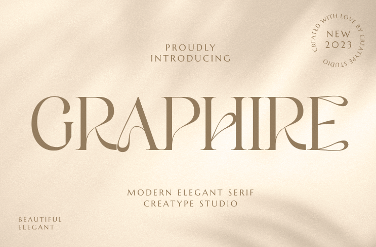
Graphire typeface looks quirky with the touch of curvy contrast not in the character’s stroke, but rather between their lines. This typeface looks good for elegant or luxury product ads, branding, or magazine headings.
2. Mangroove
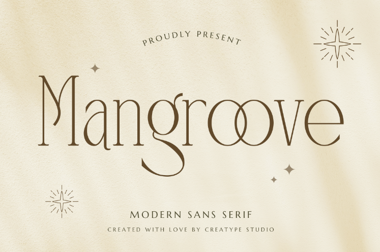
Although the modern typeface’s attributes refer greatly to a serif font, this one is from the sans serif family. Mangroove font’s stroke does not have high contrast, yet the lines are thin and the height is quite long. The glyphs in alternate and ligature styles are playful in a humble style.
3. Renaisans
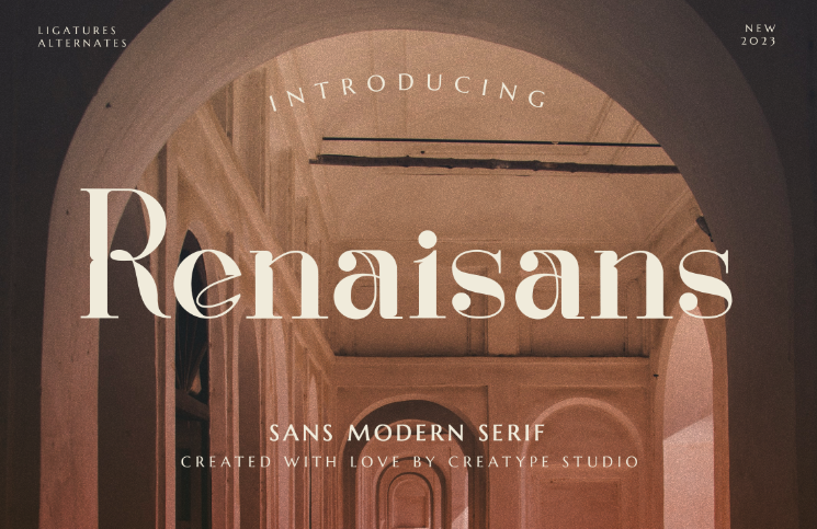
Though Renaisans font is categorized as sans serif modern, you can see some traces of serif here and there. With bold, and thick weight, this font provides a higher contrast and boldness in the character set. Renaisans matches with product packaging, label, and also photography.
4. Kallisoka
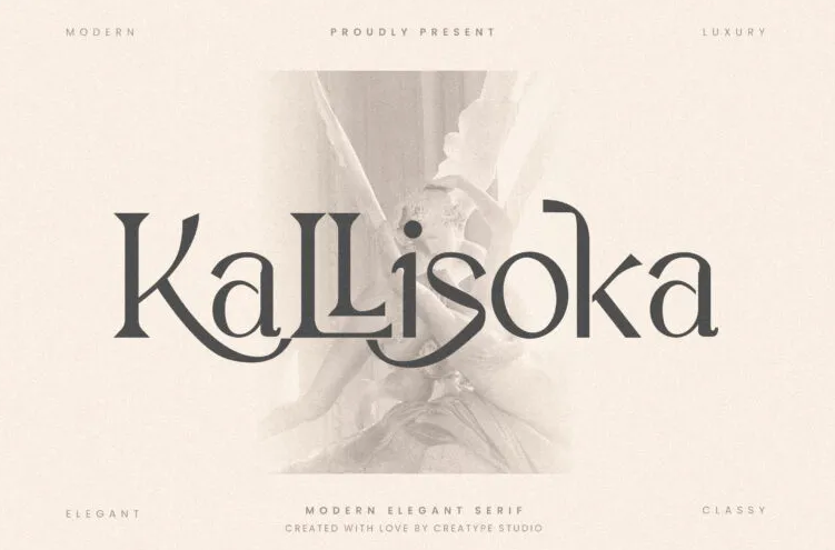
Let’s create your design project for logos, signage, and ads more glamorous using Kallisoka Modern serif typeface! You will have no regret. Instead, your project will have mesmerizing aspects.
5. Churlees
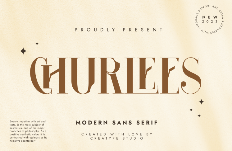
Churlees modern sans serif brings an exquisitely contemporary vibe with the disruptive looks in the characters’ strokes. Besides, their contrast just makes it more attractive to look at. Lead the trend for large print or digital versions of various designs for branding projects with this modern design typography.
6. Vallery Qylmor
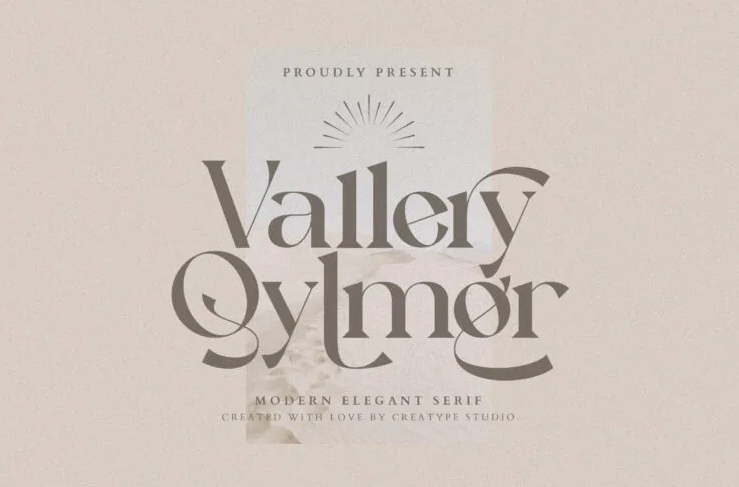
Vallery Qylmor may have long swash and stylistic alternates, but the lines, contrast, and a little bit of serif are quite clean. They’re indeed simply elegant modern typefaces that fit to grab attention in large-sized copies.
7. Marline
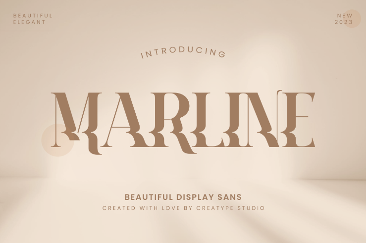
Impress your audience by applying Marline to your design! The contrast and transition between the thin and thick strokes and lines are quite extreme. Moreover, the twisted texture in the thin characters’ lines makes this font feel exclusively modern. At a glance, it adds a watery texture to one whole copy of a text.
With the Winning Attributes, What Product Paired Best with Modern Typography?
The features of Didone’s style make the typeface an adorable pair with high-end and luxury brand products. How so? It’s the romantic mood that comes from contrast and decorative ornament that turns to look good.
Accordingly, you may put this typeface style for branding in social media, product packaging and designs, photography, ads, signages, or logos. Then, with a $1 deal, try every font collection from Creatype Studio you are interested in for any kind of design project for your first trial. Let’s visit the official website now!


