
Are you interested in learning graphic design? If so, do you know what is leading in typography? Leading typography is very common because we encounter it almost every day. A graphic designer must be able to master typography techniques to make the writing looks attractive and has good readability too.
To broaden your knowledge in graphic design, especially in leading topography, please check the following articles.
Definition of Leading in Typography
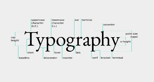
Leading is the vertical distance between two lines of text which has an important role. This is because leading can make content more successful and easy to read. Therefore, you can rely on this tool to improve the readability of the designs you create.
Deciding the leading that is starting from the baseline first. As an example of the letters abcdefgh, some of these letters are included in the bottom line (ascender), and some are included in the top line (descender). The letter abcfeh is an example of an ascender letter, and g is a descender.
To get the right leading, you need to make good calculations for ascenders and descenders. By paying attention to this rule, your design writing will not only have good readability but will also look professional.
Leading Rules Typography
Basically, typography has a lot of rules. However, here is a summary of the rules you need to know and master.
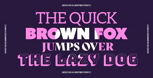
1. Tracing capital letters
![]()
Source: Wildpicks.design
You can improve the readability of the text by tracing all capital letters. Thus, you can see the sentence structure and the rhythm of the words, as this will be less noticeable if the letters are the same height.
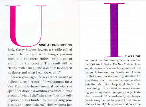
2. Avoid Using Uppercase Letters
Source: Creativepro
Using capital letters with a larger size at the beginning of a phrase is something you need to avoid. It will make the appearance of the text unattractive. Besides that, using capital letters with a larger size is also redundant.
If you want to make the sentence stand out more, you can use all capital letters. However, using all capital letters in sentences is not recommended for social media as well as work email.
Also Read: What Is The Difference Between Kerning Tracking And Leading In Typography?
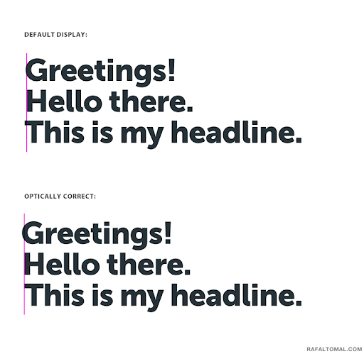
3. Avoid Using Center Alignment
Source: Rafaltomal
If you are creating text designs for social media, books, or magazines, it would be better to use left alignment. Left-aligned text is acceptable because it looks simple and neat. In addition, this rule is a standard in creating text designs. You can use center-aligned type when creating invitation designs.
4. Find the Ideal Size
Source: Medium
You may already understand the explanation of what is leading in typography? Well, one of the leading rules is to find the ideal font size. Avoid making the font too wide, as it will look unprofessional.
5. Avoid Combining More Than 3 Types of Fonts
Source: xd.adobe
Font selection is an important consideration because it affects the readability and visual beauty of the design. You may combine several fonts to refresh the design. The thing you should pay attention to is not to combine more than 3 different font types.
The more different types of fonts you use, the less beautiful the design and the readability of the text will be.
6. Use the Contrast
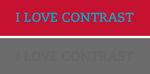
Source: Crazyegg
Using contrast in typography will make your text design stand out and be more attractive. Elements that you can explore to bring contrast such as font size, kerning, prefix, margins, and also font-weight. To come up with a composition, make sure you learn how to create a harmonious balance.
Also Read: What is An Ascender In Typography: Explanation and Examples
7. Use Grids
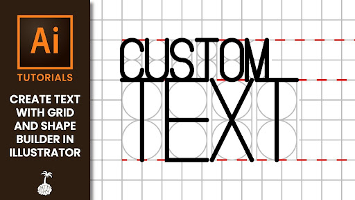
Source: Mind Island Design
Understand how to use grids perfectly because it will benefit you in creating cool and professional designs. Once you understand it well, of course, it’s easier to apply it.
Leading Typography Examples & Measurement
In order for you to determine the default leading, please pay attention to the terms below:
- Positive leading
Creating positive leading is using Helvetica 10/14 (remarkable font in design) with the largest size of the typography point.
- Negative leading
Making negative leading also uses the Helvetica font but with a smaller size of 10/8 than the positive leading.
- Normal leading
The font size used in normal leading is the same as the typeface’s size, namely Helvetica 10/10.
Do you understand what leading is in typography?
To summarize the topic, what is leading in typography is a basic technique that a graphic designer must master. The goal of mastering leading typography techniques is to create designs with perfect legibility and present visual beauty.


