
Fonts selection is vital for designers due to its effect to design industries. Additionally, there are many choices you can select for your designs. Thick fonts look heavy and chunky, also they are appropriate for several functions such as advertisements. If you are looking for recommendations, keep reading to the next chapter!
Because you are looking for recommendations, I will list the best eight chubby fonts in this article. Feel free to choose the one suits your need so that it can beautify your designs. Without further ado, let’s begin!

Nestor is one of the thick fonts recommendations you can use for many designs, including advertisements, headlines, posters, and posts on social media. It features groovy curves with a bold personality.
Not only is the font heavy and chunky, but also it has unique shapes. It seems quirky yet has exact letters that are easy to read. As a result, people will find the font great to entitle your message.
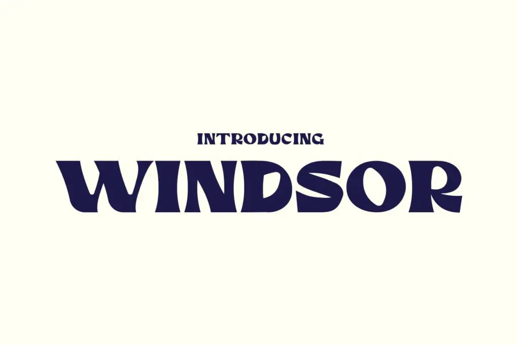
Are you a magazine designer who is used to designing a cover? Then, Windsor is the best option! It is steady with a bold shape but still very easy to understand. Every line of the letter arranges neatly to perform a word or sentence.
Furthermore, this font is ideal for your magazines or posters. You may even use it for huge stickers that require a clear message. Thus, designers can utilize Windsor effectively to create eye-catching designs.

As the name implies, Promesh is one of the thick fonts you can function for athletic requirements. It is bold and chubby, yet seems manly. Although it is only available in capitals, designers may effectively use it for any sporty projects.
For example, athletic products, tv entertainment correlates with sports and fitness, or even banners to promote your gym center. With this look, you can attract anyone who has great interests in the sports industry.
Also Read: Find 10 Best Free Dripping Fonts (Graffiti, Blood, Ink) in 2023

Next, you may think that Summit Font looks out of date. But, do not need to think so because this traditional-like bold font will highlight your headlines well. The height and weight are perfect to attract readers.
You may even add some controversial words with this bold appearance. Even though some people think it looks so old, others find this font nostalgic. Hence, designers have an excellent choice for their next project.

Do you need recommendations for simple thick fonts? Then, I would say Franchis Font would be your best choice. It is clean with easy-to-read shapes, allowing the readers to easily understand the message.
Moreover, the details are subtle, which can grab attention efficiently. This font is perfect for headlines due to the bold choice, giving supremacy and power. Even better, you will love the magnificent space between the letters that is compact and well-fitted for your designs.
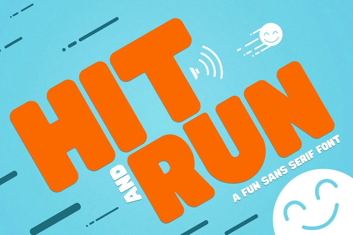
Is your design related to children and childhood memories? If so, Hit and Run in this sixth list can accompany you to reach great attention. It is cute and playful, but bold yet very easy to understand, even for children.
In addition, you can add kids-friendly illustrations such as the smile in the picture above to give a more friendly look. So, are you ready to show fun things to your target audience?
Also Read: 8 Best Fun Summer Fonts to Add Cuteness to Your Design
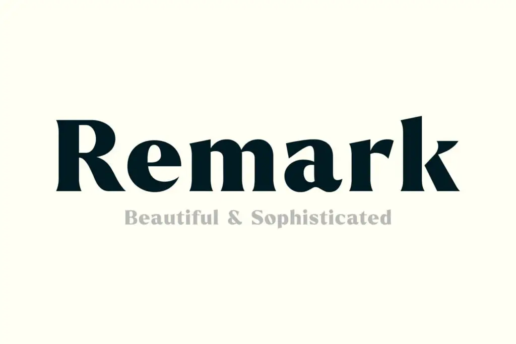
Sometimes people could not understand thick fonts due to their unique shapes. But not for this list because Remark Font can bring distinctive effects. It is a font inspired by Roman Empire, looking gorgeous with a perfect line from capital to lowercase.
Thanks to its flawless, designers can use it for quotes, posters, headings, websites, invitation labels, and even packaging design. So, whoever read the font will fall in love because of its beautiful appearance.

Speakeasy is created after inspiration by the 20th century. It is futuristic, and the line is different from others. You can see the E letter has a unique and distinctive shape.
But, do not worry because some people are fond of this kind of font. They will immediately think if the font is attractive and easy to read. So, what design will you use for one of these thick fonts?

Lastly, Gorock Brush is a result of a hand brush that enhance your design into a better image. If you are into handwriting, I’d recommend using this font for your next project.
In addition, this font will give a new look to photography. You may even use it for watermarking a photo or designing a product label. Therefore, this thick font will bring your design attractiveness to engage more audience.
Also Read: 9 Best Free Groovy Hippie Fonts to Spice Up Your Design in 2023
Thick fonts are different from others because of the heavy look. But, they have functions to grab people’s attention due to the bold shapes. Furthermore, they are unique and function for many industries.
Ultimately, designers must choose the best ones for their designs to give more highlights. Creatype Studio provides a wide variety of fonts from Sans Serif, Brush, Display, and Script. Not to mention that this company offers $1 deals! So, visit the website and get your wallet ready to buy unique and high-quality fonts now!