

When designing a web, there are many things you need to prepare beforehand, including the typographic scale. A type scale could help you maintain the consistency of the hierarchy of your type system. However, you may need to know more about this scale.
Thus, it is an important aspect of your web design. Let’s learn more about the type scale to bring proportional design outcomes!
What’s a Typographic Scale?
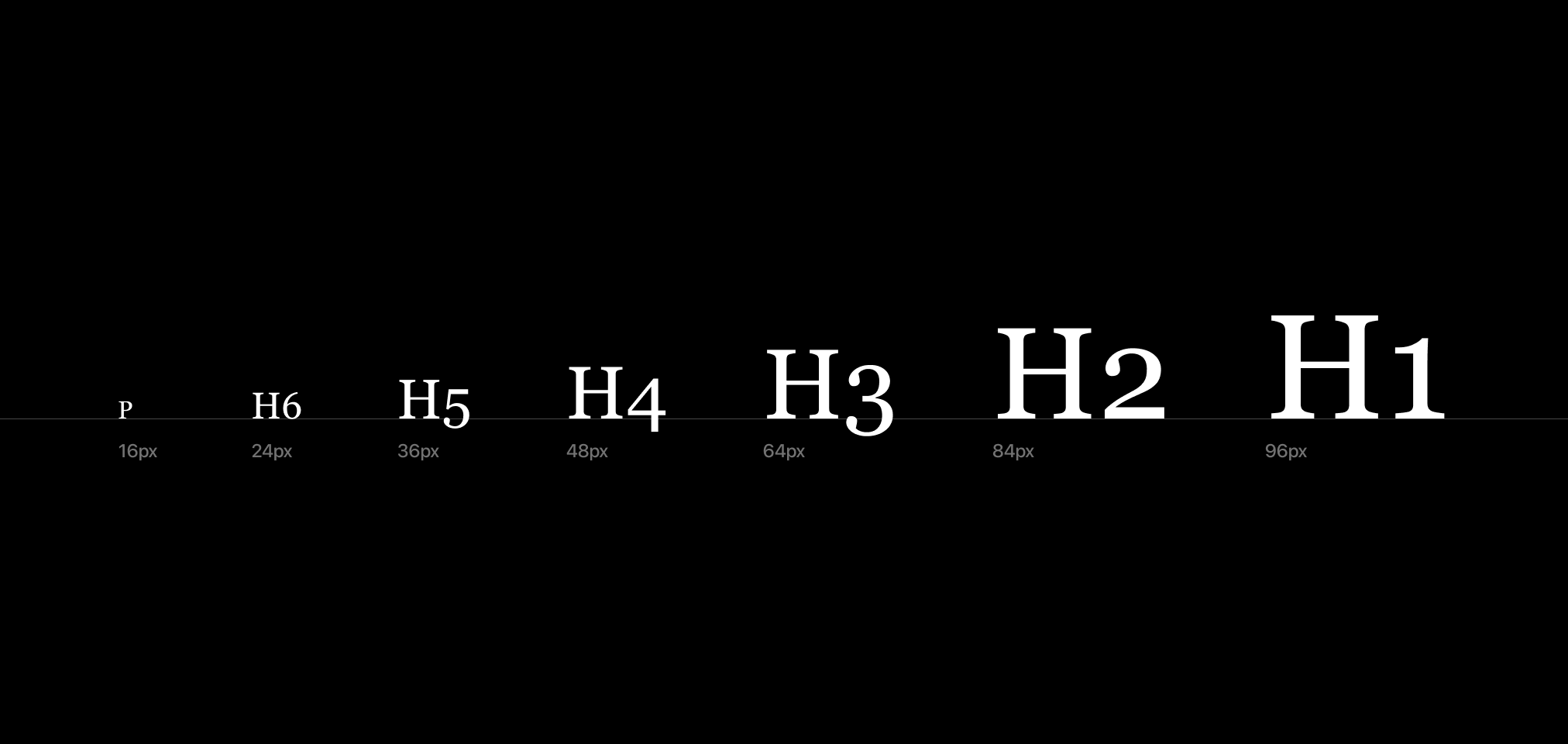
A type scale is a range of font sizes based on a ratio. This set of font sizes is helpful for establishing balance and harmony in the digital product. Using this type of scale could help you choose the ideal font size, kerning, and line heights for your design.
That’s why the type scale can be handy if you prepare it before working on your project.
Why Do You Need a Typographic Scale?
A type scale has a historical value such as the Fibonacci sequence, the golden ratio, and the musical scale. Since this ratio has structures, it plays a reference role in establishing the hierarchy of type systems on your design project.
For instance, to create a type scale, you will start off with base size. Then, you set a ratio to define the larger or smaller size of the typeface. You might use the values to determine the size of the heading, subheading, and body text.
That’s the reason why this type of scale will help you in making a scalable and readable font design.
Furthermore, the type scale is helpful to influence the reader in perceiving and processing the information. As a result, readers can break down the information based on its importance. Additionally, they could relate to your design in levels of emotion, contrast, and significance.
Also Read: What Is Leading In Typography? With Rules and Examples
The Based and Types of Contrast of the Type Scale
Commonly, the ratio of the type scale is based on the musical scale. Both the musical and typographic scale have similarities since they both tend to maintain the rhythm, flow, and harmony of their specific subjects. Take a look at the simple chart below.
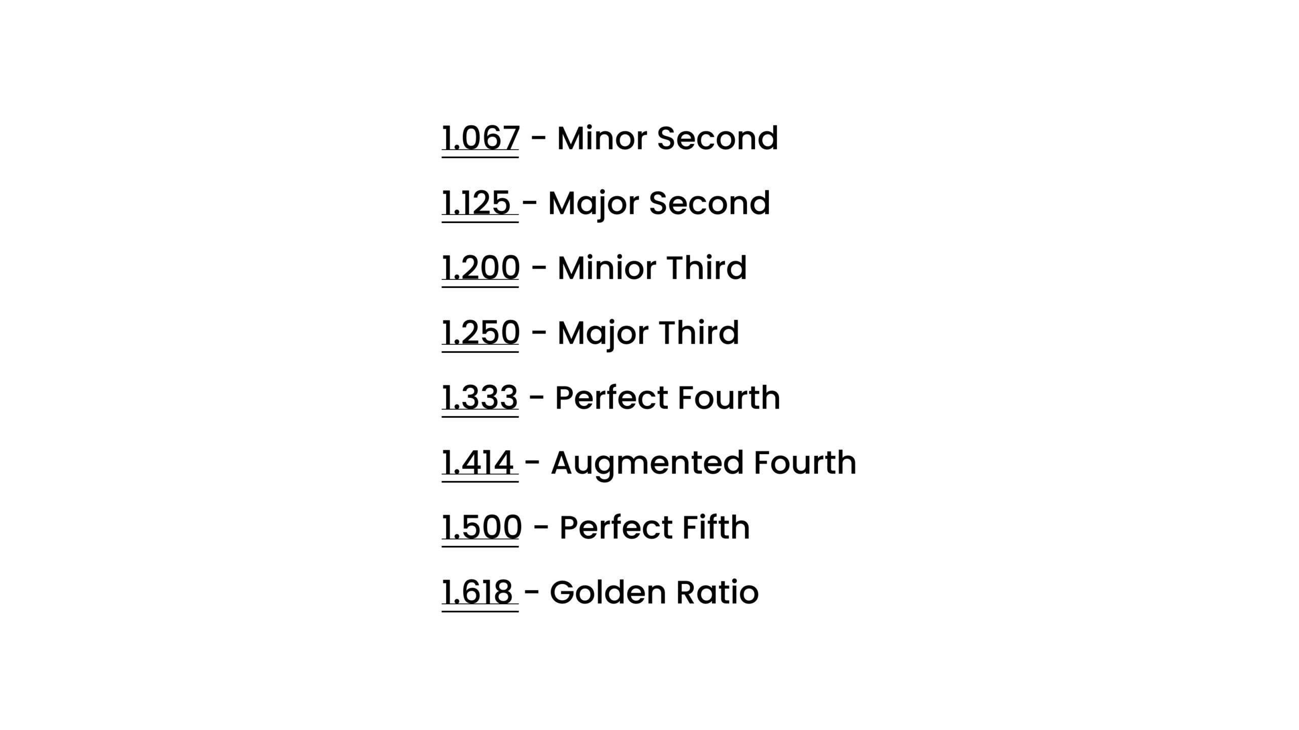
For example, the Major Third would give a ratio of 1.25x for each letter size. This scale looks stable and fit for a neat layout design. Another example is the golden ratio, which will give you a scale of 1.6x for each letter size. The last one is an adequate scale for designing a high-contrast layout.
Also Read: What is An Ascender In Typography: Explanation and Examples
3 Types of Type Scale Contrast You Can Opt-for
Depending on design project objectives and media, you can choose one of the following types of contrast to meet your needs.
1. High Contrast Scale
High contrast scale fits for designing large screen devices. Moreover, it would be a good option for creative design, like an art portfolio. The high contrast type scales are the Golden Ratio, Perfect Fifth, and Augmented Fourth.
2. Medium Contrast Scale
A medium contrast scale is the safest scale for delivering content and information. The scale is not too contrasting but still distinguishable. Layout design for tablets, desktops, or even mobile can fit this scale. It includes the Major Third, Major Second, and Perfect Fourth.
3. Low Contrast Scale
A low contrast scale is for identifiers for minor elements. It is also handy for dashboard apps, mobile phones, or e-commerce listing. The scale for low contrast is Minor Second and Major Second.
Also Read: What Is The Difference Between Kerning Tracking And Leading In Typography?
How to Use a Typographic Scale
Picking a typography scale might be tricky. The first thing you need to do is to find your purpose. If you want to design a newspaper layout, you may need a scale that creates an authoritative and clear design. Meanwhile, if you create a blog, you need intuitive scales that make an expressive layout.
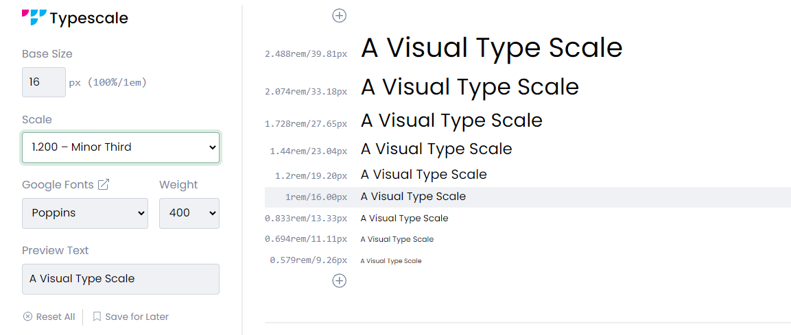
Although the type scaling is about mathematics, you don’t have to worry. There is a typographic calculator to help you with the calculation. Simply input the font, ratio, and baseline size, then you will get the result. You can use it as a reference to determine the typographic system of your design.
For example, on the type scale generator, you set 16px as the base font size with a ratio of 1.250 (Major Third). The scale generator will calculate the type scale you have input.
From that result, you can create a typographic system. You may round it off for easy input. The hierarchy of the type system would be like this:
- H1: 48px,
- H2: 39px,
- H3: 31px,
- H4: 25px,
- H5: 20px,
- Body text: 16px,
- Subtitles/Caption text: 12px.
Once you decide on your type scale, put it to your design. You may check if the scale is accessible on other devices, like tablets or mobile phones. You don’t have to follow as they are, you always have the freedom to adjust the scale or customize your type scale.
Moreover, you can play around with several fonts, weight, color, or style. You may use tools like Figma or Adobe XD to create a prototype to evaluate your custom scale.
Also Read: Bad Kerning in Typography: Here Are Also The Examples and Tips
Prepare Your Typographic Scale Before Designing
Maintaining the consistency and harmony of the typographic scale would have a huge impact on your design. Therefore, you need to prepare the type scale before you work.
Do you have projects and need fonts? Visit Creatype Studio to find worthy and magnificent designs. Our font collections are legible and compatible across any device. Furthermore, you’ll get a good deal to try all the fonts for only $1 as much. That sounds like a good deal, right? Go try it now!


