If you are a beginner graphic designer, one of the techniques that you first need to master is typography. In typography on its own, there are some basics that you have to learn as well, namely leading vs kerning vs tracking.
By learning the three basic typography, it will lead you to have a better type design that is easier to read. Now the question is, what is the difference between kerning tracking and leading?
In order to help you figure out the answer to this question, we’ve rounded up some comprehensive breakdowns of leading vs kerning vs tracking in typography. Without further ado, let’s get started!
Get to Know Kerning
What is meant by kerning is the space between two letters or characters. If you are not good at this technique, then the typography you have in your design will be harder to read.
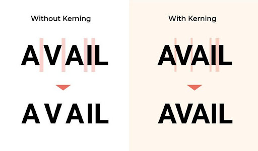
Why? Because this technique greatly affects the readability of a design. For example, if two letters are too close, it can generally cause a word to be difficult to understand. Meanwhile, if they are too distant, the word will be awkward to read. The example of kerning is depicted as the following;
Source: Vectornator
Based on the example above, a word without kerning techniques has a space between two letters that is considerably distant. Besides making it look awkward to read, it also makes it wastes much space in your design.
Unlike the word that uses a kerning technique, the space between two characters has a proportional distance that makes it easy to read.
In its usage, this kerning technique is best for use in creating logos, headlines, and website names.
Also Read: Get to Know the Difference Between OTF vs TTF, Which Is Better?
Get to Know Tracking
Tracking might have almost the same function as kerning, which is to adjust the distance between letters. Nevertheless, they are two different kinds of techniques. If kerning serves to give the distance between two letters, then tracking serves to give the distance of all letters in a word.
You can apply this technique to adjust the spacing of all the letters to make them equal. If you are still confused, you can get a better understanding by looking at the example below.
![]()
Source: Design.Tutsplus
Tracking is generally used to adjust larger or smaller spaces in a word to make it look more evenly proportional.
As a reminder, when you apply this technique, you should be mindful as too much tracking can cause your words to be difficult to read. Therefore, use this technique with some care so that your design has proper balance and readability.
Get to Know Leading
If kerning and tracking are typography basics to adjust the distance between letters horizontally, then leading is a technique with a function to adjust letters or words vertically.
Just like kerning, leading techniques can also affect the readability of a word in design or text. If the distance between lines is too close, it will definitely make it difficult for readers to understand your sentence. The same applies if the distance between the lines is too far, which makes reading become more complicated.
Source: Postprepress
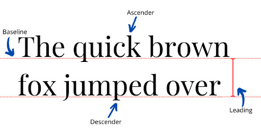
Leading is commonly measured from what is called the baseline or simply the position where a word is located. When you apply leading techniques, it is important to take descenders and ascenders into account.
As in the example above, descenders are letters that have the characteristic of being further below the baseline, such as the letter y. In contrast, ascenders are letters that have the characteristic of being higher than the baseline, like the letter k.
Why Is It Important to Learn Kerning vs Tracking vs Leading?
If you are a graphic designer, learning leading vs kerning vs tracking techniques in typography is important.
Let’s say you are in a situation where you want to change the font or are designing a logo. Then, having an understanding of the difference between kerning tracking and leading will definitely help you to create better lettering and design.
In addition, understanding these three typography techniques can give you a great impression of professionalism to your clients.
Now, Learn Kerning vs Tracking vs Leading for a Better Design
Understanding the difference between kerning tracking and leading means you are improving your techniques in design, especially typography. On the other hand, you are also practicing to become a professional designer who has a good grasp of the basics behind designing.
