
Everyone loves a responsive, high-speed website, which explains why responsive web design is good for SEO. Beyond improving user satisfaction, a responsive layout also boosts the site’s ranking and visibility on search engines. Let’s learn the key reasons it makes such a big difference.
Key Takeaways:
- Responsive web design improves SEO by supporting mobile-first indexing, reducing bounce rates, and creating a smoother user experience across all devices.
- Faster loading times, clearer navigation, and consistent layouts keep visitors engaged longer and send strong positive signals to search engines.
- A single, responsive version of a site avoids duplicate content issues and helps search engines crawl and index pages more efficiently.
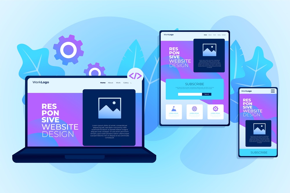
Preview on Responsive Web Design
So, what is responsive web design and why is it important for everyone? In simple terms, responsive web design allows a website to automatically adjust to any device, whether it’s a phone, tablet, or computer. This matters now more than ever because most users browse on mobile.
When a site doesn’t adapt, it looks broken, frustrates visitors, and can ultimately hurt your search rankings and cost you potential customers. Not to mention, Google prioritizes responsive sites, making it crucial for online success and reaching your audience wherever they are.
Also Read: How to Optimize Webflow Websites for SEO: Tips and Best Practices
10 Reasons Responsive Web Design Boosts Your SEO
Let’s explore the main reasons why responsive web design is good for SEO.
1. Mobile-First Indexing Priority
Google now crawls and ranks sites based on their mobile versions, reflecting how most people search today. If a site isn’t responsive, Google ends up indexing a weaker mobile version or separate URLs. With responsive design, your content stays consistent across all devices, giving Google a clear and complete version to index.
2. Improved Mobile User Experience
Visitors form opinions about a website in just 0.05 seconds. When a site forces people to zoom, scroll endlessly, or move sideways on mobile, it quickly leads to frustration and harms your brand.
With a responsive layout that adjusts typography, spacing, and interactive elements for smaller screens, users can browse comfortably and are far more likely to have a positive experience.
3. Reduced Bounce Rates
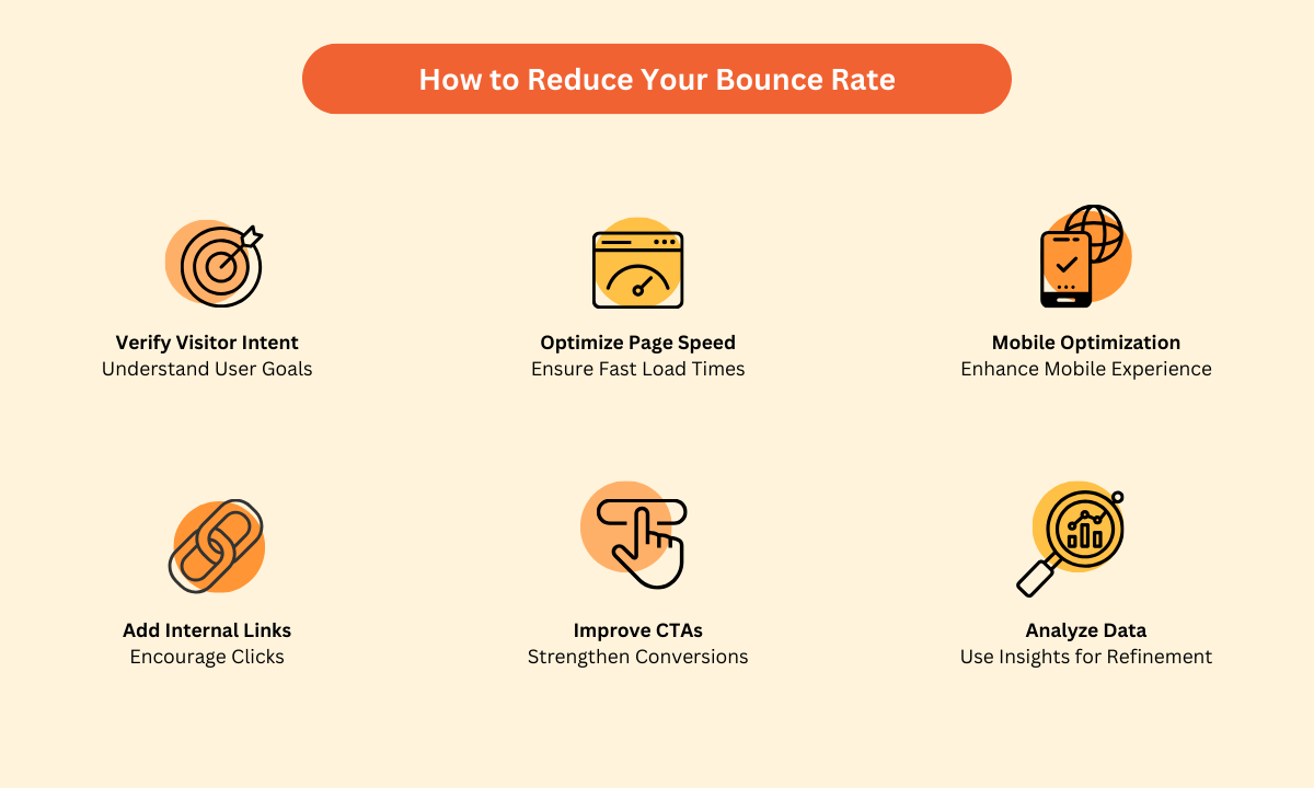 How to reduce bounce rates (Source: Neil Patel)
High bounce rates tell search engines that users are having a bad experience, which can hurt your rankings. Contrarily, responsive sites typically see about half the bounce rate of non-responsive ones.
When a site isn’t mobile-friendly due to tiny buttons, hard-to-read text, or forms that are impossible to fill out, people leave fast, and bounce rates can increase significantly. A responsive design can solve these frustrations and keep users engaged no matter what device they’re using.
Also Read: Inexpensive and Staple Tips for How to Design a Landing Page
4. Increased Time on Site
Building on the previous point, a responsive website with a low bounce rate often leads to longer visit durations. This extra time on site helps search engines assess your content’s quality and relevance. When visitors stay longer, it signals that the content is valuable, which can contribute to higher rankings.
5. Faster Page Loading Speed
By using optimized images, cleaner code, and smarter asset handling, responsive design not only creates a flexible layout but also ensures faster loading speeds. This leads to better user satisfaction, stronger engagement, and higher conversions.
On top of that, loading speed is a key factor in Google’s rankings. Modern users expect a site to load in about three seconds, making speed essential for both user experience and SEO performance.
6. Better Crawlability and Indexing
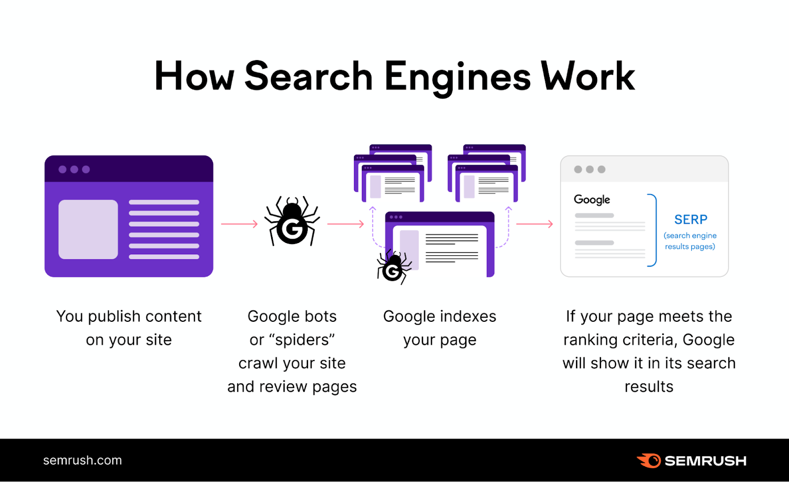 How Google’s bots work (Source: Semrush)
It’s not just Google that values mobile-first design. All search engines rely on clear, consistent site structures to crawl pages effectively. With responsive design, every device uses the same URL instead of separate versions for each platform.
This setup reduces confusion, prevents duplicate content issues, and helps search engines crawl and index your site more efficiently, further proving why responsive web design is good for SEO.
Also Read: Lucrative Good UX and UI Design Tips for Your App or Web Project
7. Eliminated Duplicate Content Issues
Having separate desktop and mobile sites can create duplicate content issues and confuse search engines about which version to rank. Even worse, splitting content across different URLs also divides link equity and weakens both versions.
A responsive, single-URL design avoids these problems by serving the same content in a layout that adapts to any device resolution.
8. Higher Search Rankings
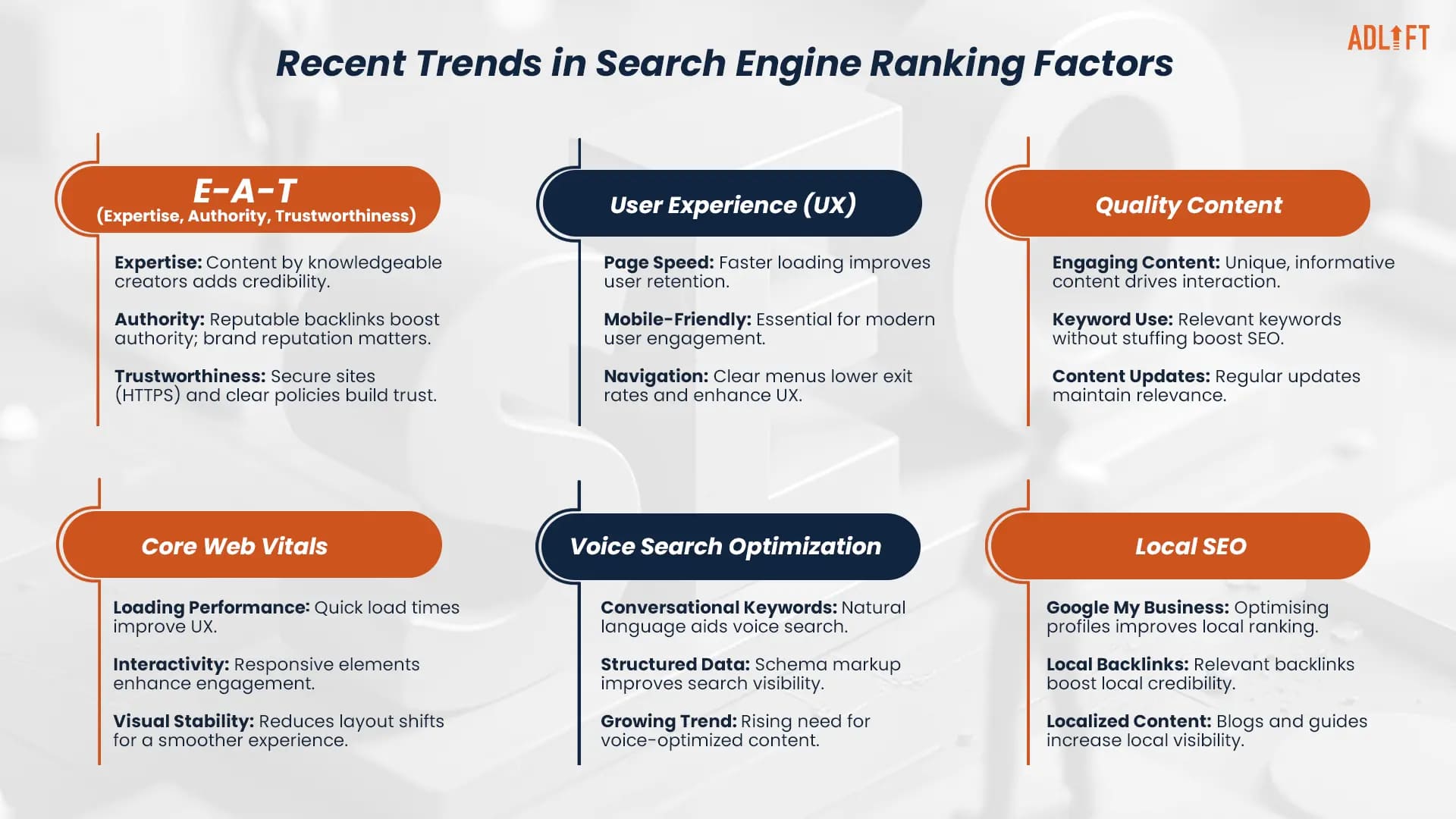 Trends that can help boost search rankings (Source: AdLift)
Responsive design boosts search rankings by hitting several key factors at once. Google directly recognizes mobile-friendliness as a ranking signal, and responsive sites naturally offer better user experience, lower bounce rates, faster loading, and cleaner indexing.
Altogether, these advantages help responsive websites consistently outperform non-responsive ones targeting the same keywords.
9. Enhanced Conversion Rates
A smooth browsing experience, such as touch-friendly buttons, clean forms, and an easy checkout process, has a direct impact on conversions. When visitors enjoy using your site, they’re more likely to engage, make a purchase, and even recommend your site to others, which helps bring in more quality traffic.
10. Better Core Web Vitals Performance
Lastly, Google’s Core Web Vitals measure loading speed, interactivity, and visual stability, all of which are influenced by how well your responsive design is built. Sites with strong responsive design typically load faster, feel smoother to interact with, and maintain stable layouts across devices.
A strong responsive design also keeps your site future-proof. As search algorithms evolve, sites built for speed, usability, and consistency are more likely to maintain solid performance and adapt easily to ranking updates.
Also Read: Top 10 Mistakes in Web Design That Can Break Your Website
Implement a Responsive Web Design for Desirable SEO Performance!
Understanding why responsive web design is good for SEO comes down to how well it supports user experience, performance, and consistency across devices. When your website adapts seamlessly, search engines recognize the quality and reward it with stronger visibility.
If you want to reinforce your site’s visual identity as part of your SEO efforts, custom fonts from Creatype Studio can help! With versatile, web-friendly typefaces, you can easily maintain a consistent look across your pages and ensure stronger SEO performance.


