If you think that a design with a strong theme and character only comes from choosing a color palette and style, then you are wrong. Our masculine font are here to give each template a strong impression with a bold, formal, and professional feel. Not only that, but font design also has a big influence on brand identity.
Masculine Font for Manly and Strong Design
We can’t deny that this strong masculine font is synonymous with men. Usually, designs that use similar fonts will tend to introduce men’s apparel products or brands whose target market is mostly men.
1. Highlight
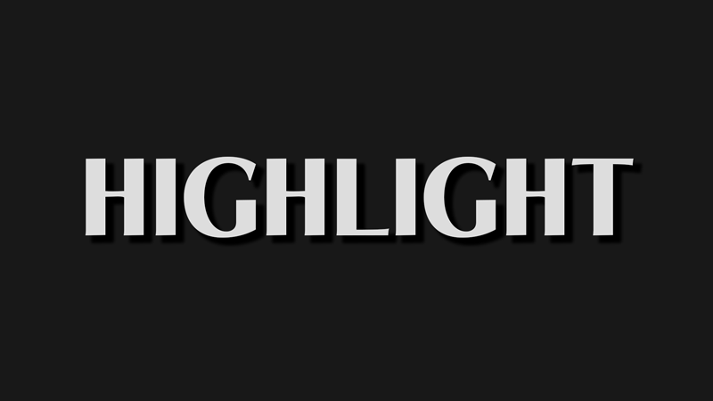
A design with a simple but elegant look while still emphasizing a mysterious feel, will match this font from Highlight. The letters look semi-bold but don’t seem too big and exaggerated.
This font from Highlight is suitable for display for apparel, logos, and headlines. The highlight of this font also doesn’t take away from the professional impression, so it’s suitable for designs with formal themes.
2. Couture
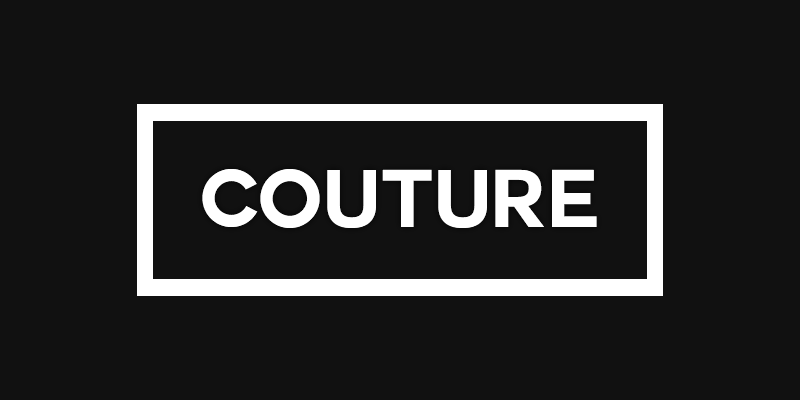
At first glance, it almost looks simple and the same as the previous font, but this font from Couture is a Sans Serif font type. It has a simple and standard impression, but if you pay attention to the details of selecting letters with precise curves, it gives a neat impression.
3. Backcountry
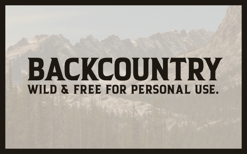
Backcountry is one of the characteristics of masculine fonts is usually found in products related to hobbies. For example, sports products such as sports equipment, jersey, and mountain climbing equipment. These fonts from Backcountry might be the best reference for those of you who like manly and sporty nuances.
Also Read: 9 Best Romantic Fonts for Your Gorgeous Design
4. Blacklisted
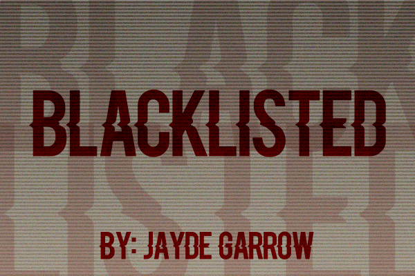
If you are interested in bold fonts but still have a characterful style, then these masculine fonts from Blacklisted. In general, bold fonts like this give a firm and manly impression. So this font is also suitable to complement masculine designs.
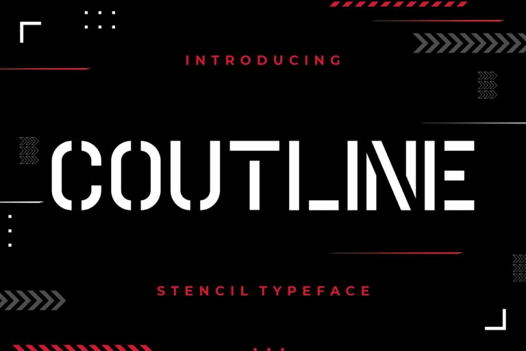
5. Coutline
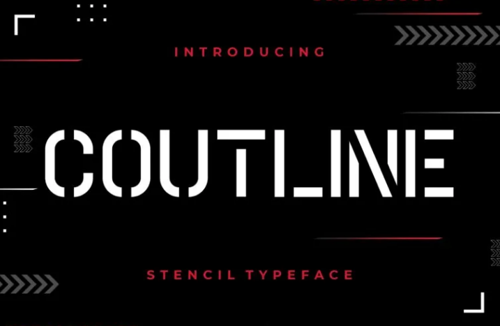
If you are bored with the same type of fonts all the time? This collection of fonts from Coutline might be on your purchase list.
The neat appearance of the letters with consistent dotted lines gives the impression of being manly and eccentric at the same time. Besides that, this font from Coutline will suit you as a complement to casual and formal templates. You can buy it directly at Creattypestudio.com.
6. Old School United
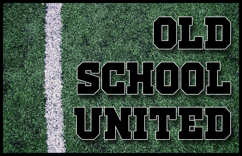
Some people like designs with strong themes that also give off a youthful impression. Fonts like Old School United are often found in school or college designs. Fonts like these have been around for a long time, and now using them makes your designs look vintage and quirky.
Also Read: 25 Gorgeous Wedding Invitation Fonts for Perfect Cards
7. Night of The Hunter
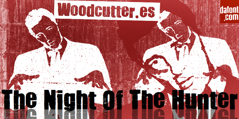
Who says that masculine design must always be neat and standard? Of course, you often find manly designs that come from templates with a slightly rebellious look.
For example, in video games, you may find that many masculine fonts like this Night of the Hunter appear in their templates. Interested in finding a similar template? You can find it at Dafont.com.
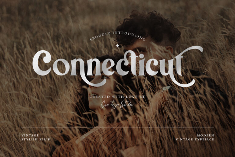
8. Connecticut
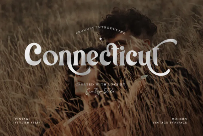
You could say a font type like Connecticut is the most suitable as a display font. This font is also masculine because its unique appearance can convey a retro impression. Some manly designs also deserve a font like this. especially if you like designs that are vintage and not rigid. There are many other retro look fonts that you can get at Creatypestudio.
9. Dream Orphans
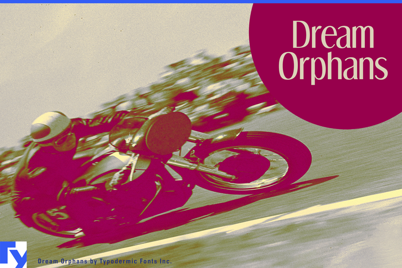
Everything related to sports is perhaps more synonymous with men than women. But of course, sport does not rule out certain genders. Therefore, the Dream Orphans Font comes with a neat, masculine but also aesthetic appearance at the same time. Therefore, this font is suitable for you to put in a sporty and natural design.
Also Read: 25 Canva Fonts to Better Build Your Design Elements
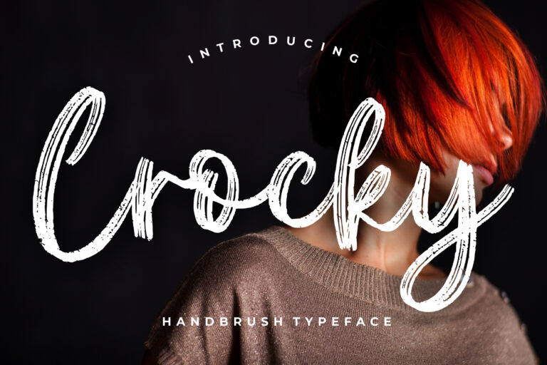
10. Crocky
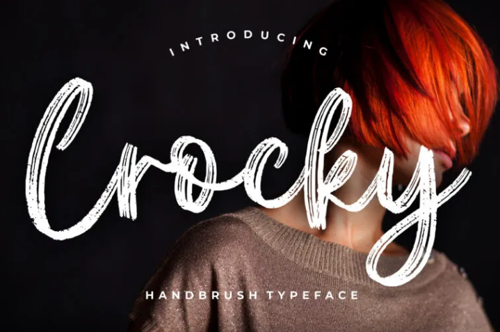
The best masculine font is about the art of beauty behind the basic letters of the alphabet. Seeing this font from Crocky makes us realize that a typical brush font like this can give a manly impression too. The semi-bold curve of the brush makes for a strong and beautiful look.
Let’s Get Your Style With Masculine Fonts!
Have you found a font that can represent your brand and design? Some of the font examples are suitable to complement your strong design. On the other hand, choosing a font is indeed a crucial moment, because these letters will also become the characteristics of a brand. The font you choose can also define your brand and style.
Fonts featured in this article
Every typeface named above, ready to license and download.