
There’s a tendency for small or indie game publishers to look at major video game covers when designing their own. This is not necessarily bad, but it could be the wrong move.
Because let’s face it, you’re not going to have the number of marketing dollars to compete with the big guns. So, the better strategy could be creating a style that can stand out in the marketplace.
Thankfully, nowadays, video game cover art is not permanent. Since you are selling on digital stores, it’s much more flexible to create an alternate cover or even update your old cover to increase sales.
Yes, at the end of the day, the cover is a marketing tool. That does not mean it has to be bland or generic. It just means that the art should also consider the business. This is after all a business, right?
Common Video Game Cover Formula
First of all, you need to know the difference between formula and framework. When we mentioned the formula, it’s likely what we mean is work that is done according to a common template without much alteration. But on the other hand, what we called formulaically could be something following a framework, meaning something that is done according to best practices. A framework is necessary as a guide to create a work that achieves a certain standard.
Now, what is the working formula common in designing a video game cover? Simple enough, it is, as mentioned by Luke Plunkett in Kotaku, more than 10 years ago: “Hero + Logo = Box Art”
Why does that formula work? Well, in short, people want to see familiarity. The hero and logo formula communicates clearly what the gamer can expect from the game.
There is also an adage in the creative world, to create something uniquely familiar. This means for a design to be interesting, it has to have something familiar, something easily understood by the target, while also promising something unique.
Best Cover Art in Games
One of the most well-received cover art for games that also follows that formula is Borderlands. This now classic game features a character and logo on the cover, almost exclusively. But the cell-shading illustration really does represent the visual feel of the game. The way the character is pointing a finger gun at his time while the art then shows the splatter with images from the gameplay also entices gamer interest. This cover is the definition of uniquely familiar.
Sleeping Dogs is another game with an exciting cover that exemplifies the use of this formula. The cover shows the heroes (and other characters) from the game and its logo. The line art style and background illustration all convey a feeling of theme in sync with the game while still using a formula of Hero + Logo.
Other games using this formula with great result includes Dishonored, Red Dead Redemption, and The Saboteur. Note that the formula is almost always augmented by a unique style. We’re back to that old adage: uniquely familiar.
Now, how about those not following the formula? Can they work? Absolutely yes.
Just look at covers for games such as Ico or Heavy Rain. Ico actually used a painting as an inspiration for its cover art, and it works tremendously well. While Heavy Rain decided to go with a more subdued atmospheric style of origami in heavy rain.
A non-formulaic style was also used in games like Limbo. This cover does show the hero+logo, but the environment is much more dominant. This bodes well because the game actually has the same feeling of being in the dark most of the time.
How The Professional Does It
One thing you should understand is that the process of designing a video game cover is not always straightforward. Even if your game already has assets and arts that you can work with, it would still require some iterations.
Multiple Iterations
When creating the cover for the game Sunset Overdrive, design studio ilovedust worked closely with Insomniac Games through several iterations “followed by a mind-numbingly large number of smaller tweaks,” says Insomniac Creative Director Marcus Smith, in an interview with Polygon.
Adapt The Style and Feel
When designing the cover for Hotline Miami, painter Niklas Åkerblad draw inspiration from the feel of the game which he said was very 80s and kitschy. “You’re not painting the game — you’re interpreting the [game’s] style in your own style,” Åkerblad was quoted in Polygon.
Have a Good Silhouette
It’s also important that the game art be distinctive and preserve a good silhouette. This will make it legible and easily recognizable when buyers are browsing through the games in a store, physical or digital.
Use a Design System
It’s also a nice idea to have a design system in place. Final Fantasy uses the same style of cover throughout the series, Grand Theft Auto use of illustration sticks with the franchise for years and made it iconic. You also need to be flexible and create multiple aspect ratios for use in banners and multiple-sized thumbnails on the digital storefront.
Have a Good Typeface
One of the most iconic elements of good cover art is the logo, and more often than not it is developed from a typeface. “I think creating the logo for a game is more fun than creating the art because we have more creative license to create a unique logotype,” said Charles Bae from Rokkan, a company specializing in marketing and design work for video games, in an interview with Kotaku.
In conclusion, designing a cover for a video game is a combination of marketing and art. You should always try to strike a balance between selling the game and actually making something to impress the audience. Because if you can create an impressive cover that sticks, you could very well end up with a franchise that lasts for many sales cycles. And, in the end, we want to sell the games we made.
Some Typeface Inspiration
Here are some fun and quirky typefaces that could inspire your next game cover design. Some of these typefaces may even be part of your logotype.
Frighted Haunted Halloween
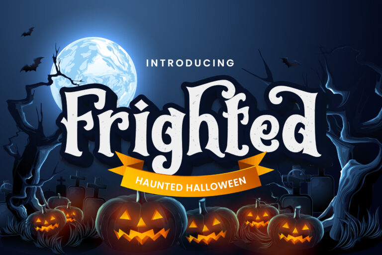
Frighted is a haunted Halloween typeface specially crafted with love to create amazing-looking fonts. This font is perfect for all your big products so it looks amazing. This typeface can inspire your fun Halloween projects, perhaps even some seasonal games for kids and teenagers.
Learn More
Punchline Poster Display
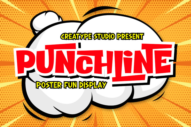
Punchline is a fun poster display typeface made with love, resulting in a font that looks unique and fun. This font is very suitable for products that prioritize a sense of fun and cute. This font makes all your big products look different and awesome. This could be good for your superhero-inspired projects, with a funny paper vibe.
Learn More
The Rocky Handbrush Typeface
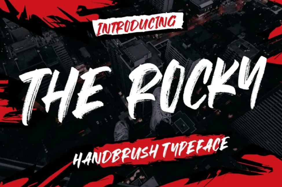
The Rocky is a hand brush font with scratch bold with natural textures. This type can be good for projects that require a rough style, urban adventure, or even beat-em-up style games.
Learn More
Graffity Stylish Graffiti Street Style
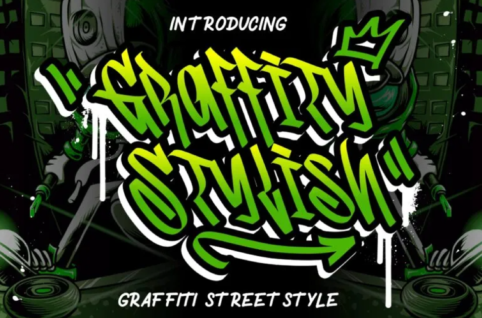
Graffity Stylish is a graffiti street style font that looks marvelous and is perfect for mural effect creation. Get into the street vibes with this type, you can use it to highlight an adventure on street level, deep urban exploration, or even a post-apocalyptic world where the streets are overrun by gangs.
Learn More
Doodleland Display Fun Children
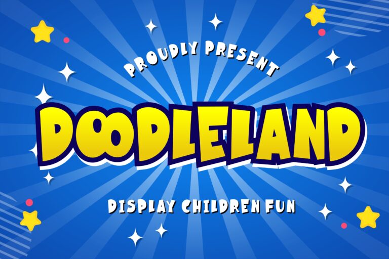
Doodleland displays a fun font which perfects for kindergarten occasions and children’s events. This is definitely fun for casual games projects or any project that requires a whimsical touch.
Learn More
The Quest Retro Typeface
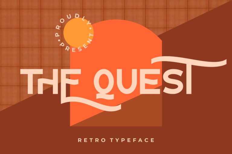
The Quest is retro sans-serif font with retro style and perfect for your latest project. This excellent font can be used on your puzzle games with classic or retro style graphics, or it could be good for a space adventure with a retro golden age civilization and mythology.
Learn More
Western Wildler Slab Vintage
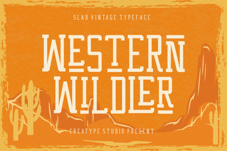
Western Wildler a slab vintage font inspired by wildlife west with retro style will make your work looks amazing. Of course, this type could be used in western shooters or adventure-type projects.
Learn More
Wildrock Handwritten Brush Font
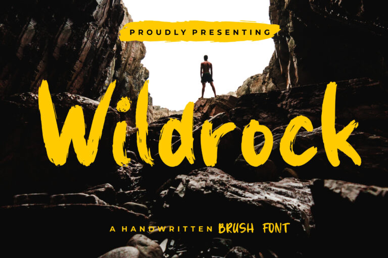
Wildrock is a handwritten brush with stylish script font with a hand-drawn sketch that perfect for your amazing project. Use this for projects set in the wild, outdoor adventure, or even extreme sport adventure projects.
Learn More
Kayooh Japanese Display Typeface
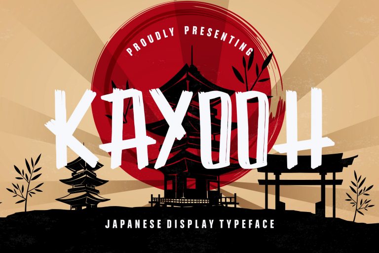
Kayooh is a bold and solid display font that has a Japanese traditional feeling and suits any Japanese event. A touch of Japanese style could be good for your martial arts or fighting games project, it could also give a kitschy look for an underground crime organization kind of games.
Learn More
Clattering Brush Typeface
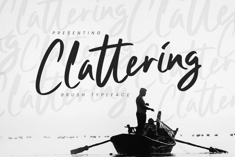
Nicely introducing Clattering Brush is a handmade brush font with free-flowing and confident bold between thick and thin curves. This could be used on puzzle games or hidden objects games, you could also use this one for mystery point-and-click adventures.
Learn More


