Using the right combination font can be one of the ways you can apply in designing, whether it’s graphic designs or web designs. With font combinations, the design you create will have a more attractive look and portray the message you want to convey.
In this article, we have summarized some tips and examples about the combination font that you can learn from. Hence, keep scrolling down!
What is a Combination Font?
A combination font, often known as a pairing font, blends two or three different fonts. These different fonts are used simultaneously with the purpose of complementing or balancing each other in a harmonical way. So, combining two different fonts with stunning compositions will take your design to a whole new level.
Some Tips You Should Know about Combination Fonts
Here are the tips on how to pair two fonts that go well together to create a great composition font.
1. Use No More Than Three Fonts on Your Design
When choosing a font for the header, you can use a font with a bold style that attracts the audience to see your design. As for the body text, you can choose a legible and readable font so that the audience can easily grasp the message of your design.
2. Your Combination Font Should Have Balance
Just like its name, combination font, balance is something you should consider when choosing two fonts. These two fonts should complement each other to present a reader-friendly design to the audience.
3. Don’t Be Afraid to Combine with Font Superfamilies
In choosing a combination font, there is no restriction to choosing two fonts from the same font family as long as they don’t have too similar styles. Moreover, you can later find several pairing options with different font styles, such as thin & bold, solid & extended, and serif & sans serif.
Also Read: 9 Best Free Groovy Hippie Fonts to Spice Up Your Design in 2023
Top 10 Combination Fonts to Choose From
The time has come. Now it’s time for you to discover 10 combination fonts that you can opt for to create your stunning designs.
1. Avenue and Roboto
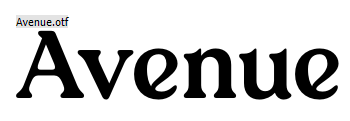
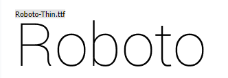
The first font combination is Avenue with Roboto, both are two fonts that are perfect when juxtaposed together in your design.
Avenue brings a luxury, elegant, and unique nature that is ready to be used in magazine design, branding, and web design. On the other hand, Roboto brings a neutral style that is suitable for the body text of your design.
2. Sunflower and Hypereality


Next up is a combination of Sunflower and Hypereality, two font pairings that are perfect for magazine designs, advertisements, and blog headers.
Sunflower features unique old-style elements, making it suitable as the header of your design. Meanwhile, Hypereality comes with a sans serif style perfect for aligning with Sunflower.
3. Sergio Trendy and Evermore


If you’re in the middle of a design project that requires a combination of bold fonts, then Sergio Trendy and Evermore might be a good fit.
Sergio Trendy has a modern and elegant style coupled with some beautiful curves in each letter, making it an audience attractor. Its counterpart, Evermore, brings an elegant bold-style lowercase, harmonizing it with Sergio Trendy.
Also Read: 30 Creative Kids Font to Liven Up Children-Themed Design
4. Freshman and Ronaldson Gothic


You might like the font combination between Freshman and Ronaldson Gothic. These two font combinations are perfect for those who are in a design project with a bold and laid-back style.
Freshman brings an assertive style with capitalized and bold letterforms. At the same time, Ronaldson Gothic gives a casual style to each font.
5. Vogue and Coco Gothic
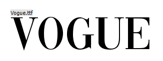

The fifth is a font combination between Vogue and Coco Gothic. If you are in a web design project with a fashion theme, this combination font may be perfect for you to apply.
Vogue appears with a simple, classy, and elegant style with some lines at the ends of the letters, making it suitable for you to use as a header. Then there is Coco Gothic which comes with a geometric style that brings harmony between the two.
6. Cocogoose and TT Wellingtons


Anyone who likes bold, soft, and beautiful fonts for headers, then their choice will not be wrong if it falls on Cocogoose. Its partner is TT Wellingtons which comes with 18 thickness options that you can choose to enhance the combination with Cocogoose.
Also Read: Discover 10 Best Kinds of Racing Font to Portray Boldness
7. Badaboom and Caviar Dreams


Do you want to bring a fun and elegant ambiance to your designs? If so, a combination font between Badaboom and Caviar Dreams is the most sensible option to choose.
Badaboom features a bold, fun-loving font style. This font lets you draw your audience’s attention to your design. Meanwhile, its sidekick Caviar Dreams comes with a classically elegant style, enhancing the fun that Badaboom provides.
8. Classica and Mont

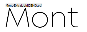
Next up is a combination of Classica and Mont fonts, a combination that is perfect for those of you who are working on simple and casual design projects. Indeed, Classica features a casual font style coupled with Mont, which has a light, readable font style.
9. Kids Magazine and Comfortaa


For those of you searching for a combination font for children’s magazine designs or fun-bringing projects, then Kids Magazine and Comfortaa are two fonts that are suitable to fulfill your project needs.
Kids Magazine brings a bold font style with a fun design to attract the audience’s attention. On the other hand, Comfortaa supports it with a relaxed font style. Thus, these two font combinations truly fit together.
Also Read: 9 Tips for Professional Designers to Work from Home
10. Designer and Eight One


Last but not least is the combination of Designer and Eight One fonts, a combination font that is suitable for futuristic-themed design projects.
The font designer comes with a clipped font style, signaling futuristic in each letter. This font style is perfect for a header, social media post, product design, or any design that requires a sense of handwriting. The font style of Designer is well supported by Eight One, which also has a futuristic font style.
Create Stunning Designs with Combination Fonts
Those tips and examples of a combination font you can implement when designing. Suppose you need another combination, don’t hesitate to find your preferred options through Creatype Studio. Not to mention the collection is massive, and it offers a $1 deal. So, what are you waiting for?
