In matters of flyer design, choosing the right font can make a huge difference to your project. This round-up of the best font for flyers can help you find a distinctive font for your next design project.
Are you doing flyer design for a business event, party, music festival, or club occasion? If so, then you need to find a professional font flyer that suits your flyer design, event message, and target audience.
Luckily, you don’t have to spend hours searching for that perfect font anymore. Below, we have collected the 20 best fonts for flyer design from DaFont and CreatypeStudio that you can choose based on your needs.
What Is a Professional Font Flyer?
Professional font flyers are any fonts that are well suited for use in posters, flyers, or other advertising materials. Generally, flyer fonts have a bold, blocky, and eye-catching style.
More than that, professional flyer fonts also commonly come in various shapes and sizes. You can choose font types from bold fonts and brush fonts to basic fonts that are suitable for use as body text in a paragraph.
20 Best Fonts for Flyer Design
1. Lemon Milk
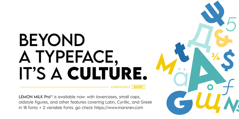
Lemon Milk is a typeface that comes with old-style figures and small caps. Complemented with a basic font style, making it perfect for use in a variety of your projects.
2. Coolvetica
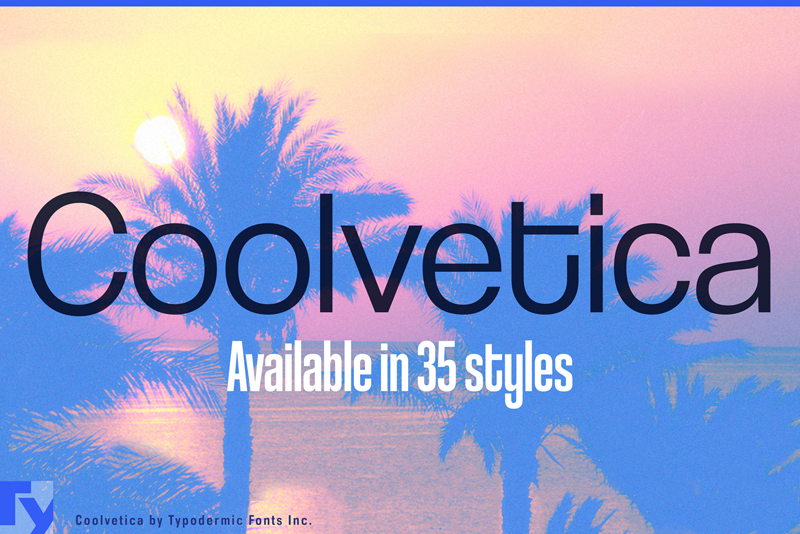
Coolvetica is a sans-serif typeface inspired by logo typefaces from the 1970s. Coolvetica revives the retro custom display letter style with extra-tight kerning and funky curls. It is a true display typeface intended for short sections, headings, and titles.
3. Keep on Truckin’

Nothing beats the thickness of Keep on Truckin’, which makes it a joy to look at on a flyer. This font is perfect for designing flyers for parties and fun music concerts.
4. Hello Valentica
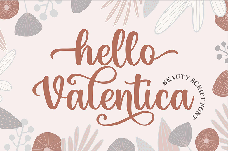
Beauty and stylish are the two words that describe Hello Valentica. Coming with a feminine design with beautifully curved corners, this font is perfect to complement your next project.
5. Autography
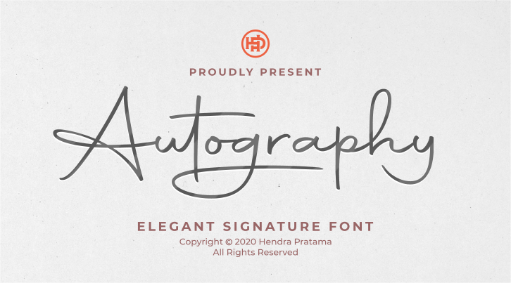
Bring your signature to your project with Autography. The thickness of this font is also beautiful and charming to appear in your flyer design.
6. Harrlem Display Vintage
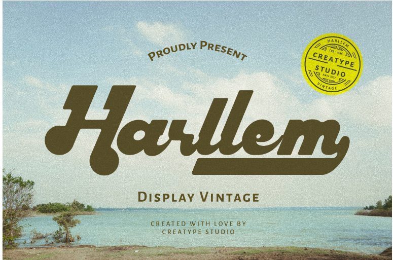
90s trends never fall out of style. Introducing Harllem, a font with a 90s vibe that gives your project a classic, vintage and fun impression. Get your audience’s attention through this typeface!
7. Komikaze Comic Fun
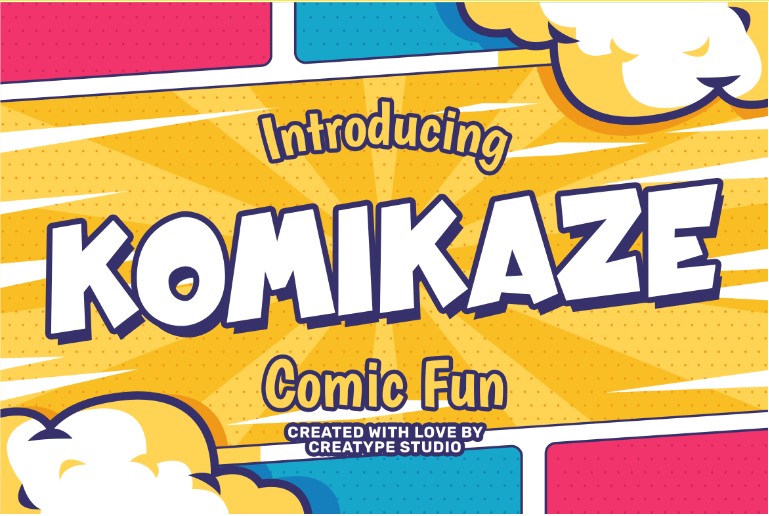
Komikaze is a creative typography that can accent the delightful side of your design projects. Go ahead and have fun messing around with Komikaze!
8. Moores Modern Serif
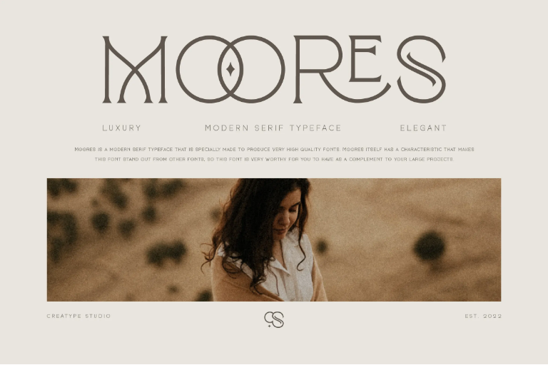
Moores is a modern serif renowned for its geometric sense of style. Without losing the geometric sense, the Moore font remains mesmerizing. It is feminine with a magical touch added to make it more appealing. Suitable for beauty, fashion, logos, and more.
9. Mangrove Sans Retro
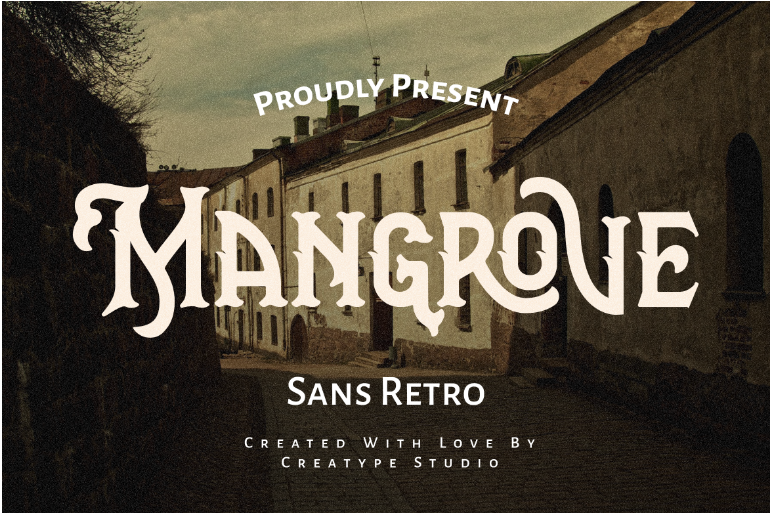
Vintage, masculine, and mysterious, that’s what Mangrove is. With all three characteristics, Mangrove will bring boldness and power to your projects.
10. Jacksonville Hand Brush
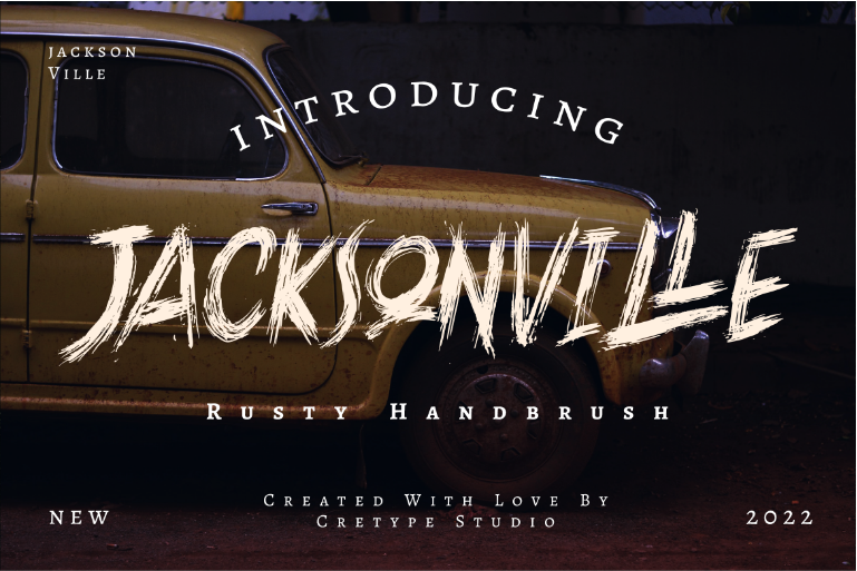
For Jacksonville, there are three words that describe it: rusty, strong, and ferocious. These characteristics of Jacksonville will render your design project more attractive and memorable to your audience!
Also Read: 9 Best Simple And Friendly Fonts In 2023, You Must Have!
11. Rockfull Capital Brush
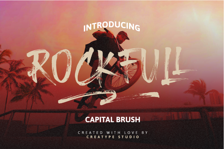
Rockfull is a typeface with a detailed, natural hand-drawn finish that will add a sense of fun to your project. Rockfull is suitable for any design project, such as logos, labels, posters, or other projects.
12. Brittany Signatura Script
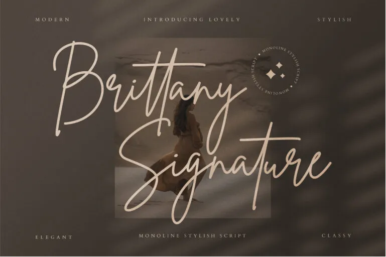
Brittany Signature Script is composed of a fashionable sophisticated signature style script with its own distinctive curves and graceful ink flow.
13. Quinlliyk Retro Style
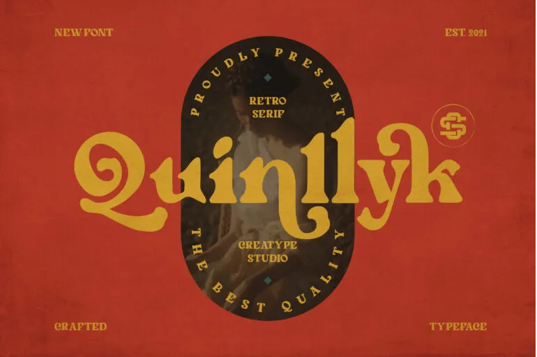
Quinlliyk is a retro serif font with a bold style. The thick curves are bold and unique, giving the impression of the 60s and 70s. It comes with more than 50 unique alternates and 10 unique ligatures.
14. Porcelain Sans Serif
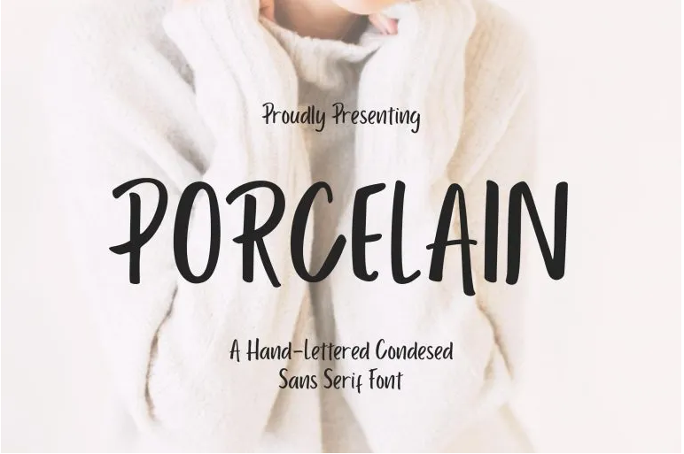
Porcelain is a handwritten compact sans serif font with a fine pen texture for a more personalized touch. This font is the perfect addition to the paragraph on your design project.
15. Whisholder Vintage Retro
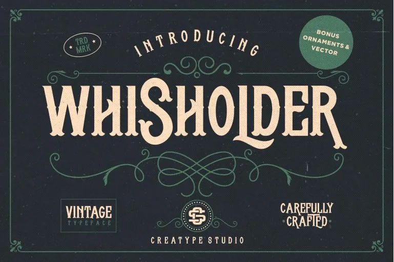
Whisholder is a vintage and retro font with gorgeous decorative ornaments inspired by vintage lettering and art marks. With Whisholder, you can get a Victorian touch that looks sturdy and bold.
16. Dellyssion Stylish Signature
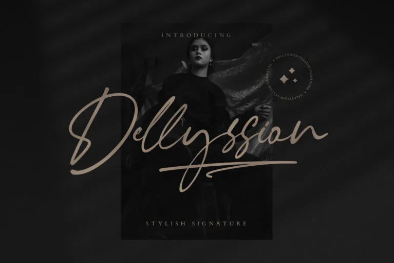
Dellyssion Stylish Signature is a handwritten script font that just looks so elegant and stylish. The Dellyssion typeface is perfect for projects with perfect handwritten nuance.
17. Vantage Retro Funk
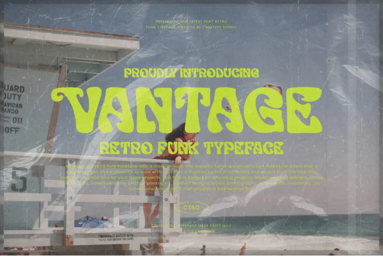
Vantage is a retro funk typeface with a modern twist. This expertly hand-drawn retro font delivers a font that is both flawless and enjoyable to use. Vantage Retro Funk is inspired by the psychedelic movement of the mid-60s, making it a wonderful font for your big projects.
18. The Brown Fox Stylish Marker
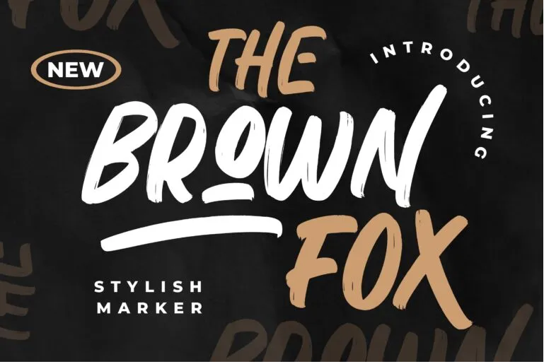
The Brown Fox is a stylized marker font with a brush style perfect for your most recent project.
19. Therhog Graffiti Brush

Therhog is a colored stylized graffiti brush inspired by the art of graffiti street projects.
20. Hardbeat Handbrush Caps
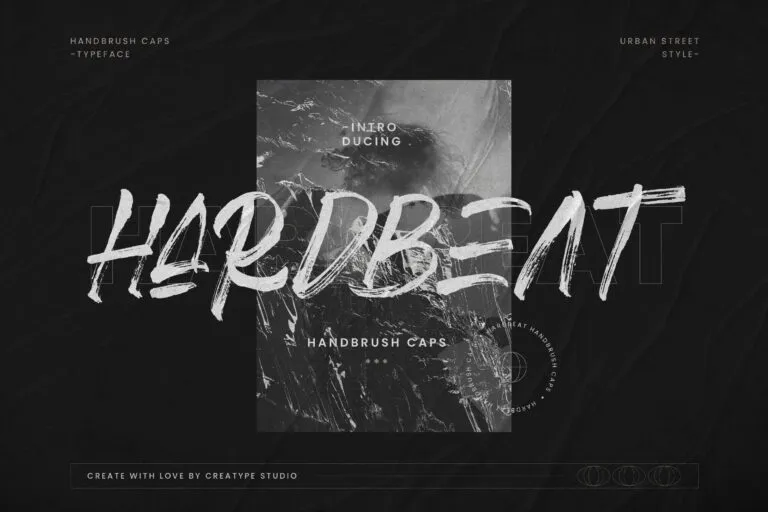
Hardbeat Handbrush Caps is a typeface that conveys an energetic message. Shown with highly distinctive hand strokes, the tonality of this font is detailed and bold.
Also Read: Bad Kerning in Typography: Here Also The Example and Tips
5 Tips in Choosing the Best Font for Flyer
Still hesitant to choose the most appropriate font for your flyer design? If so, the 5 tips below might help. Read them!
1. Pick Fonts that Best Suit the Content of the Flyer
As you know, fonts come in various styles and designs. For that reason, it is important for you to choose fonts that best suit the flyer you are currently designing.
For example, if you are designing a flyer to share information about a music concert, then you can choose a stylish bold brush font that can attract the attention of your audience.
In contrast, you can choose a basic bold font if you are designing a flyer for a business event or other formal occasion.
2. Take a Big Title Font
The title is the most important element of a flyer. Therefore, you need to use a big and bold font with the most creative style possible for the title of your flyer. With a big and bold font, it can attract the audience’s attention and make them get the content of the flyer you are designing.
3. Choose a Sans-Serif Font for Paragraphs
If you are allowed to choose fonts with the most creative style possible for the title, then it does not apply to the fonts in the body text in the paragraphs of your flyer.
Why? Because the purpose of each paragraph in a flyer is to be readable and understandable. Hence, choosing a sans-serif font for your paragraphs is the most ideal choice.
However, you can also choose fonts other than sans-serif as long as they are easy to read by the audience. Choose fonts with a basic style as they are generally suitable for the body text of a paragraph.
4. Apply Font Boldness Well
In addition to the font type, you also have to pay attention to the thickness of the font that you will use.
Nevertheless, all the designs of your flyer will definitely be printed on various types of paper, from glossy paper to matte paper. Thus, it would be important for you to choose your font thickness wisely.
5. Prioritize User Experience and Readability
Unquestionably, the purpose of making flyers is definitely for the audience. For that, you have to consider user experience when designing your flyer.
Be free to choose fonts, colors, and content layout. But one thing that you must prioritize is to keep making flyers that are easy to read so that the message of your flyer is conveyed properly.
Which Best Font for Flyer Do You Favor the Most?
When you’re looking for the best font for flyers, the options available in the market are numerous. For this reason, you have to consider various things before determining which one is most suitable for your flyer. So, from the 20 fonts above, which one is your favorite? Choose the most suitable one!
