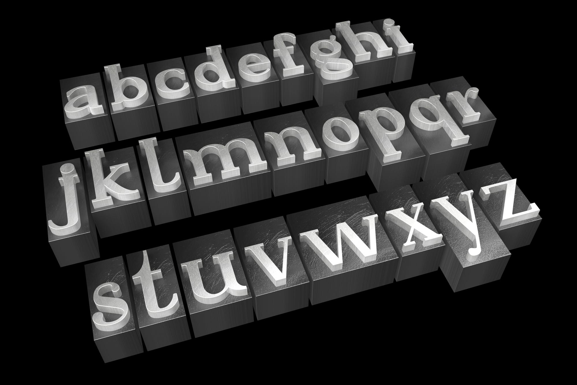
What is a slab serif? The font name might remind you of sans-serif, considering it to be in a different category than the classic serifs. However, the typeface can be included as a subcategory of the serif. The strength of the font is its uniqueness: a collection of eye-catching characteristics. Here is the further explanation you must know about it.
What is a Slab Serif?
The font style’s appearance of this type is unlike the usual serifs: which are simple, sophisticated, and formal. Instead, slab serifs have thick strokes and shapes like blocks.
Moreover, the font tends to be bold, which will catch anyone’s attention. It is not too surprising that the aesthetic typeface is used on billboards, webpage or even advertisements.
In addition, similar to the serif, the slab ones were developed in the past: specifically in the 19th century. Typographers and designers were quite fond of the fonts. They were using them on many designs everywhere and encouraged them to improve slab serifs to get more remarkable results than before.
Slab Serif Fonts History
As the question “what is a slab serif?” has been answered, it will be suitable to start discussing the origin of the font style. The story began at the beginning of the 19th century when the printing industry was desperate for extraordinary-looking fonts; it needed ones that were capable of capturing the readers’ attention in a split second.
Slab serifs soon came into the picture, introduced around 1815 to 1817 by Vincent Figgins. However, its popularity was threatened as sans-serifs were preferred. Its revival was quite an interesting story as it was included by Napoleon Bonaparte. The French military leader brought around 167 scientists and scholars to his Egyptian campaign.
The campaign lasted from 1798 to 1801, surprisingly increasing awareness of slab serifs despite their failure. Upon returning from Egypt, the scholars and scientists returned with the knowledge of Egypt and used it to develop the font style. It is the reason why slab serifs are often called “Egyptians”.
Also Read: A Comprehensive Guide on Serif Vs Sans Serif and How to Choose Them
Types of Slab Serif Fonts
Like sans-serifs, slab serifs have numerous styles as well. Some of the well-known ones are Karnak, Saxophone, Kinghorn, Sanchez, and Oklahoma. If you are looking for more modern and recent ones, here are some options to choose from.
1. Nightmare Bloody Thriller
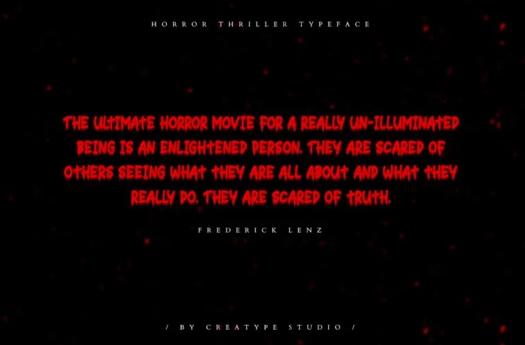
The concept of slab serif is a unique font, and it describes Nightmare Bloody Thriller well and Halloween! Unlike any other, experts created this distinct font style to have characteristics. They have defined lines with shapes like droplets of blood. So thrilling and scary!
If you need to catch the audience’s attention, the font is a perfect choice. Moreover, it also fits logos, wedding designs, social media posts, advertisements, branding projects, watermarks, invitations, product packaging, label, product designs, photography, and so on.
2. Oklahoma by Woodcutter
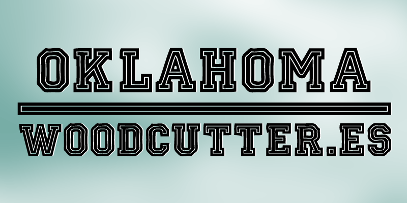
Another unique typography is a creative improvement of Oklahoma by Woodcutter. The bold lines are still preserved, yet there are two outer layers: one of them is white, and another is outlining the white one.
The font style looks very aesthetic, unique, and majestic at the same time. In addition, the font is only available in upper-case letters. Interesting, is it? So if you need an impactful font, Oklahoma by Woodcutter can be the best option: for shirts, branding, or even logo.
Also Read: 7 Best Font Recommendations for Subtitles with Good Readability
3. Moonview Display Children Fun
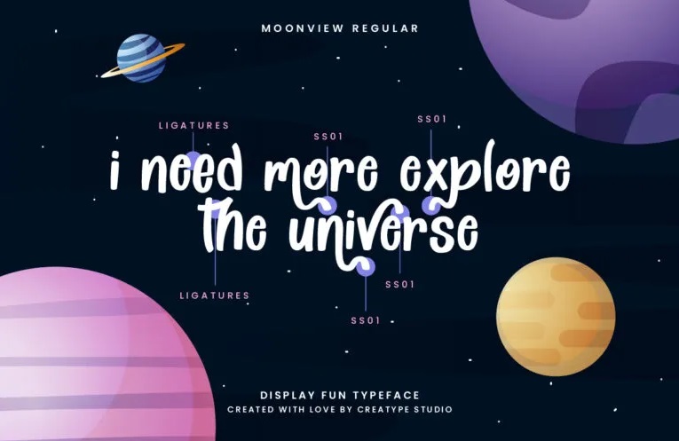
Moonview Display Children Fun might represent the font style well. The typography is intended for a specific purpose: to have an eye-catching and fun appearance, which you may find suitable for children’s products or projects that involve them.
This font is so extraordinary for any branding project, logo, social media post, invitation, watermark, stationery, product design, advertisement, etc.
4. Kayooh
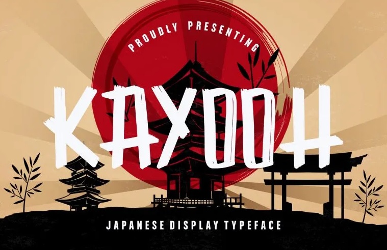
Kayooh shows Japanese appearance letters. Its strokes are long, bold, and solid. Additionally, the lines are not bracketed, so it seems as if the alphabet, either lowercase or upper cases, is drawn by a Japanese brush for calligraphy.
Therefore, it is very suitable for any Japanese or traditional events. Plus, you can use the font style for logos, branding projects, product designs, and others.
Anything You Like?
You have more insights concerning what is a slab serif. The font style is a bit similar to the bold characteristics of sans-serif, but the Egyptians represent more uniqueness. It has become more popular nowadays for designers and resulting in many new-looking styles.
So, anything catches your fancy? Try to visit Creatype Studio because this place has massive collections for your design. Then, are you ready to purchase the $1 fonts that this company offers?
