
Many terms are swirling around the typography designing world, but most commonly referred to and confused at the same time are a typeface and a font. If you’re still in the middle of understanding these two, we welcome you aboard. You’re not alone. Do you know that sometimes designers also question them? To discover more about a typeface and font, read our complete information below.

Talking about definitions sound much like college work, but you’ll be surprised to know that they’re easily identifiable—even when you’re used to using them interchangeably. Basically, a typeface is what we see, and a font is what we use. There you go!
Still, confused? No worries, scroll down again.

Okay, it now really looks like a semi-college-paper reading (but don’t worry, it isn’t).
So, over the decades, humanity has been experiencing technological advancement and digitalized era. Designing today isn’t the same as how it was in the past. We now use desktop publishing after the old-school process of analog printers, which were used to create a page layout. This is where the line between a font and typeface keeps getting thinner and thinner.
The origin of printing itself is something important to note. The machines back then utilized the whole collection of metal characters for the sake of forming a font. Why metal, you ask? Because it’s the French meaning of the word “font,” or “fonte” (to be cast in metal), to be exact.
Fonts with similar designs and characteristics would be assembled as a typeface, with each font possessing a distinguished case for capital (uppercase) and small (lowercase) letters. Since we haven’t had digital printing back then, these fonts would have to be manually put together letter per letter. Those metal chunks would be dipped into ink and then pressed on paper to form something as basic as a page layout. That alone sounds like lots of metal casts, labor efforts, and operational expenses.
Depending on what you would print, the metal chunks of those fonts come in their own size and weight. For instance, a font size of 12 points were definitely different from a similar font in size of 18 points. If your letter needs to be printed in bold, you would expect more weight and size. This makes fonts a part of this broader and larger group of typefaces. To elaborate: an uppercase, bold Times New Roman 12 point would be completely different than a lowercase, bold Times New Roman 10 point—even when they’re both from the same font family, each is unique thanks to their size and weight differences.
Depending on what typeface we’re talking about, it’s important to note that not all will comprise various fonts. A font, however, is always going to be a subset of a particular typeface and comes in different weights, styles, and sizes.

How did computers affect our understanding of a typeface and font today? And, is it actually more complicated than we initially thought? (Insert Roll Safe meme here.)
The rise of computers has opened up so many new experiences and convenience in dealing with everyday life, and digital typesetting. Remember typesetting history earlier. It was such a great jump to where we are today because our printing machines don’t require metal and manual labor anymore to print out one sentence. Typefaces can be used anywhere from Windows to macOS, from smartphones to PC desktops, and from a simple application like Paint to a complex one like Adobe.
However, all this convenience comes with the downside of producing confusion between fonts and typefaces. Take Microsoft Word on Windows, for example. Their menu Fonts don’t specify typefaces when you click on the dropdown choices. It happens from the primary navigation, as well as in tertiary and secondary navigation tabs. Microsoft Word on Apple has the menu Pages, where fonts basically mean typefaces and not otherwise.
I honestly think that our confusion stems from our unfamiliarity with the less-used word “typeface.” We’re so exposed and used to the word fonts on the applications we mostly use. Hence, when we finally learn that there’s another more correct term, we probably still can’t quite grasp it. It’s also why we’re still confused about the whole thing and probably choose to not care about these distinctions since it’s too practical.

Now that you know the difference between a font and typeface theoretically, it’s time to see some examples to set your mind in stone further. You probably have already heard some of these typefaces:
First order of business here: what distinguishes each font (not each typeface)?
The font’s weight here doesn’t refer to how many kilograms it weighs or how large the file size is. It’s more about the font’s outline thickness compared to its height. With various fonts featured inside a typeface, we’ll definitely see various weights as well. However, it’s more usual for a typeface to contain four to six weights for its font collection.
Here are the naming conventions for font weights:
Southwell Brush Script, for instance, is a perfect typeface for those craving handwriting taste in their creation. Its signature brush font is actually really made from natural hand brushes.


This typeface is perfect for wedding designs, labels, stationery, branding projects, logo, and so many more.
Another important thing besides the weight is the font’s size because readers will want to read their text properly, right? The availability of several font sizes will affect your choice and the text’s readability later on. Some fonts may work better at larger sizes and vice versa since they were designed as such.
Summarizing from Adobe, some of the most accepted naming systems for font sizes include:
If you’re looking for a thick, unique font for projects where readers can see your typography from far away, why not try Klassik Style Retro Bold Script?


Klassik Style boasts retro bold script font inspired by retro design posters, making it perfect for any project with a vintage ambience. Its sizes go from 24 px all the way to 72 px.
A font’s style or slope refers to how much it slants from left to right. Sometimes, we choose a specific style or slope for our fonts to give them a certain meaning, importance, or impact on the text.
Some of the common font styles or slopes:
Note the distinctive, italic slope in the Archive Garamond Italic Pro font.
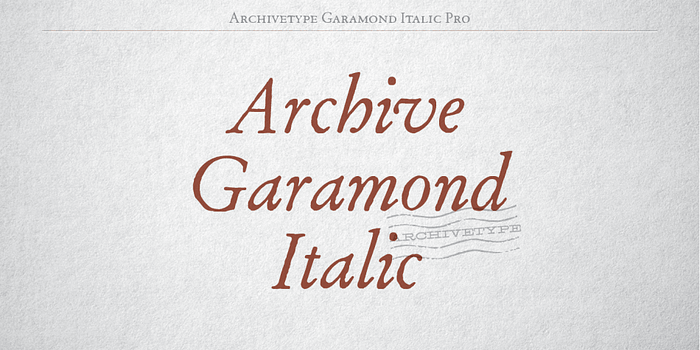
This font takes its design cues from the ideas of the famous French typeface designer of the 16th century, Claude Garamond.
A font should also be legible enough to modify, which is why sometimes it’s called stretch. If you’re not familiar with this one, we don’t blame you. This one is actually implemented less often than the other font characteristics.
When a font is fairly wide, it’s likely marked as:
When a font is fairly narrow, it’s likely marked as:
An ideal font sample that’s of the condensed-weight variety is Clab.
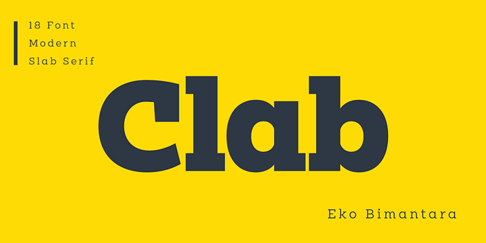
Each letter has small gaps in between, which present advantages when printed huge in billboard displays and posters. For a close-range reading, though, it’ll be harder to read.
The last characteristic is the serif, which refers to that little extension at the end of the letter’s bigger stroke within a particular font or whole typeface. If you always hear fonts bearing the name Serif with them, notice those extensions. Some variations include:
Say hi to Moores Modern Serif, one prime example of a Sans serif.
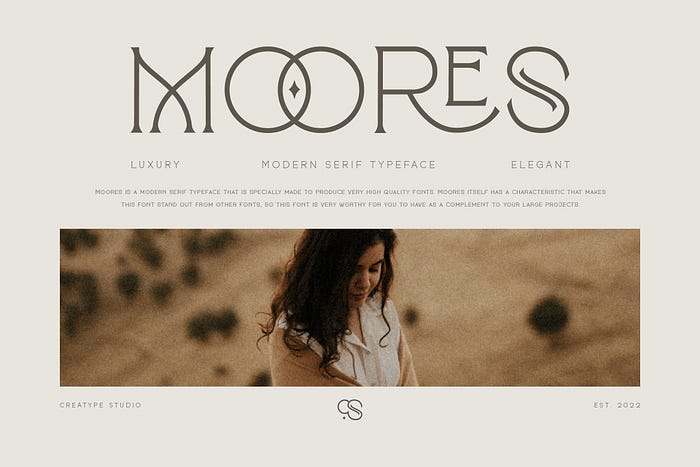
This typeface provides fonts with no swashes, flourishes, or extensions, making it super minimalist yet still elegant. Moores can be an ultimate option for designers favoring a sleek look for their texts since it’ll offer a high level of readability upon reading.
You already know the difference between a typeface and a font. You also have learned five font characteristics that can help you explore your creativity when designing. The last thing we’ll do here is to present you with several typography assets for the sake of sparking that inspiration inside your head:
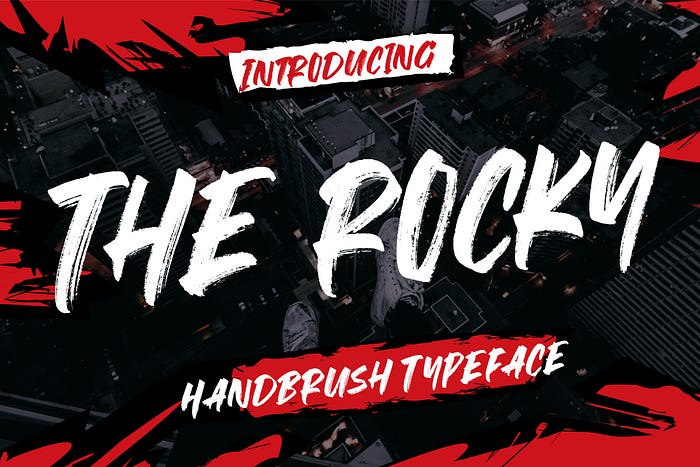
We are a sucker for hand brush-like fonts. Designed with a bold scratch in natural textures, the Rocky reminds me of concert posters or spray paint art on the road not taken.
Is it weird to say that this one reminds me of that wonderful coffee brew flavor from my local coffee shop? I love how Tropikana utilizes the power of vintage vibe combined with monoline font. Some letters come with multiple ligatures and alternates, hence adding more retro aspects to it.
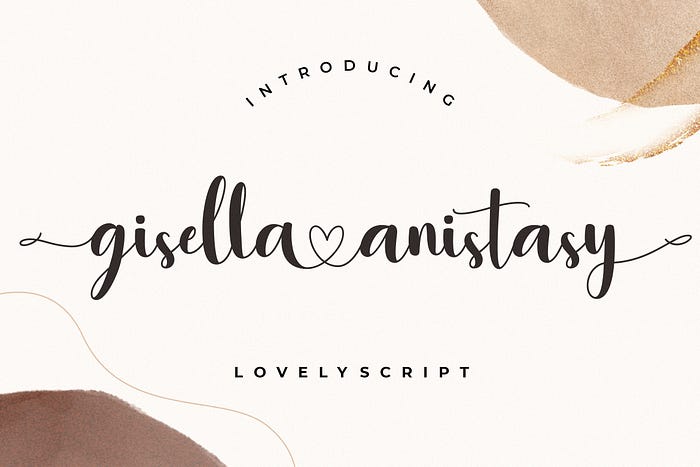
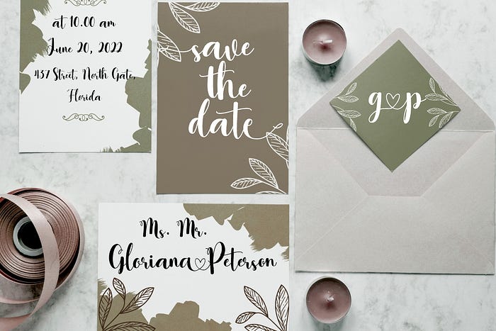
Lovey-dovey may be the best adjective to describe this font, and yes, I can’t stop looking at it like heart eyes emoji. Do you want to throw on something romantic over your text? I suggest you try this one, thanks to its modern calligraphy designed in a lovely and classy way.

While I’m still stalking the Internet to search about who Karllina this font refers to, I also highly encourage you to incorporate this one into one of your projects. Especially ones that miss natural signature script for elegance factor.
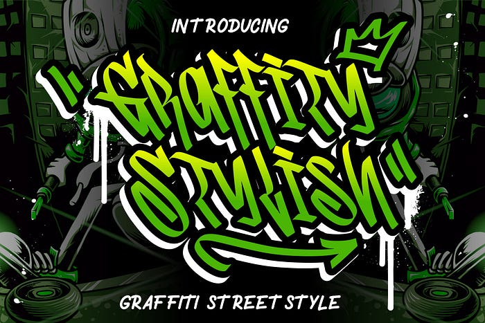

Let’s close this recommendation list with something quirky yet powerful: Graffity Stylish. This font lets me unleash my street art side into my typography design projects, which resulted in amazing mural-like creations in my texts.
Knowing the difference between a typeface and a font isn’t the only thing you’re going to bring back home today. While it’s true that people may still use them interchangeably without knowing what’s correct, you can have a small part in fixing that by doing something easy. Share this article with your acquaintances, colleagues, friends, and more! Yes, that’s it. Easy as that.
And, remember not to be fun police just because someone mistook these two terms. The goal of understanding a typeface and font is entirely about your decision to use each term correctly in the future. We thus wish you all the best in your typography design journey!