

Even well-intentioned websites can fail if they overlook the basics. While occasional mistakes are normal, repeating them in professional projects can lead to long-term consequences. The top 10 mistakes in web design are surprisingly common, and avoiding them can dramatically improve performance and user satisfaction.
Key Takeaways:
- Common web design mistakes like slow loading speeds, poor navigation, and weak mobile optimization can drive users away and hurt search rankings.
- Visual issues such as cluttered layouts, inconsistent styles, low contrast, and unoptimized images make sites harder to use and reduce credibility.
- Clear structure, strong readability, thoughtful white space, and well-placed CTAs are essential for creating a smooth, user-friendly experience.
10 Biggest Mistakes in Web Design Everyone Should Know and Avoid
Any beginner or even professional designer might wonder, “What are the common web design mistakes to avoid?” Here’s a list to guide you.
1. Slow Loading Speed
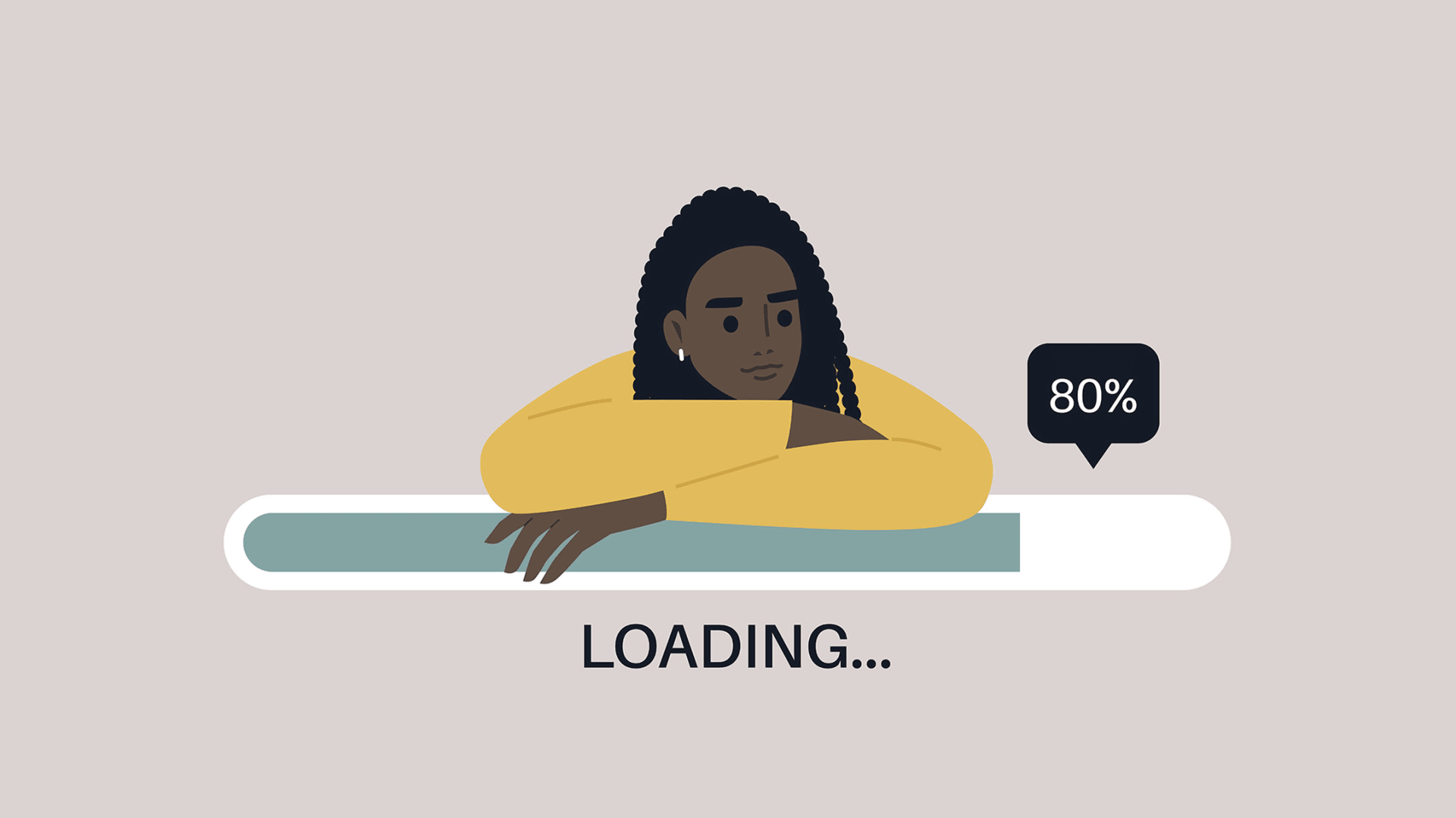 Slow website loading speed (Source: Inc. Magazine)
Slow page speeds quickly drive visitors away, especially on mobile, where most users expect a site to load in three seconds or less. If you miss that window even for a split second, nearly half of them will leave.
Search engines also push slow sites down in rankings, making the problem even worse. To speed things up, compress images, clean up excess code, remove render-blocking elements, and make sure you’re using reliable hosting.
Also Read: Bad Website Design Aspects with Examples
2. Poor Navigation
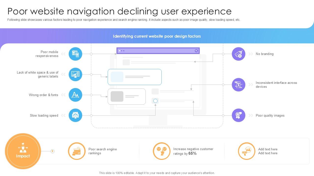 Bad website navigation criteria (Source: SlideTeam)
Navigation is the roadmap that helps visitors find what they need. When menus are cluttered, hierarchies don’t make sense, or the structure mirrors a company’s org chart instead of user needs, people only become frustrated.
To ensure your website is navigable, keep menus to 5–7 main items, add a clear search bar, use straightforward labels, and test with real users to smooth the experience.
3. Non-Responsive Website Design
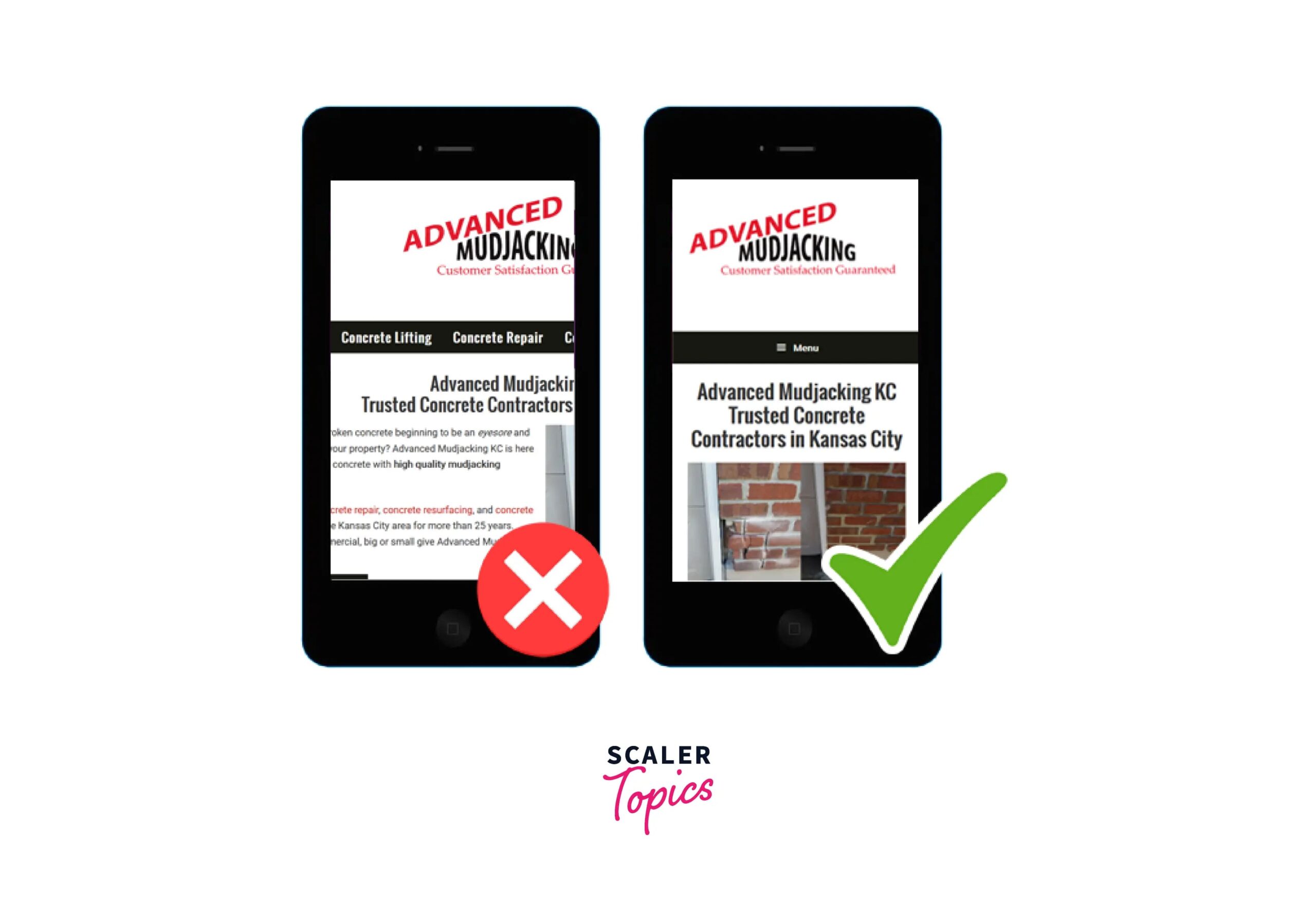 Unoptimized website design (Source: Scaler)
Mobile devices now drive more than half of global web traffic, but many sites remain desktop-first and poorly adapted to smaller screens. This leads to unreadable text, overlapping buttons, stretched images, and an overall poor experience.
Search engines also rank these sites lower, making them even harder to find. A mobile-first approach helps prevent these issues, especially when supported by thorough testing across different devices and orientations.
4. Cluttered Layouts
 A cluttered website (Source: Clay Global)
Among the top 10 mistakes in web design are overcrowded pages that overwhelm visitors by cramming in too many colors, fonts, images, and text. This visual clutter makes information harder to process and gives the impression of poor organization, which can hurt your brand’s credibility.
As a result, users often feel tired before they even reach key content or calls to action. To solve that problem, use a cleaner, more minimalist layout with intentional spacing and focused visuals.
Also Read: Interactive Web Design: 5 Tips to Invoke Your Creativity
5. Inconsistent Typography and Colors
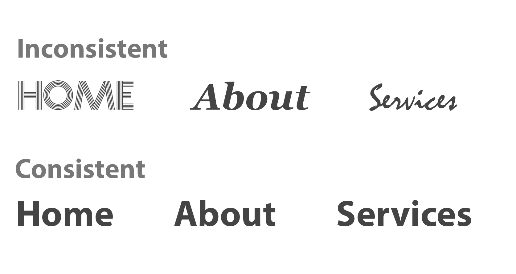 Inconsistent website typography (Source: Line25)
Inconsistent typography can undermine brand recognition and make a site look unpolished. Too many font families, shifting color schemes, or uneven spacing leave visitors unsure of what the brand stands for.
Strong design relies on a tight set of type choices and a cohesive color palette. As such, it’s important to have clear guidelines for typography and color to help keep every page aligned and instantly recognizable.
Also Read: Bad Kerning in Typography: Here Are Also The Examples and Tips
6. Poor Contrast and Readability
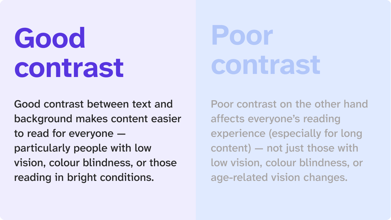 Example of good and bad contrast (Source: A11y Playground)
Low contrast between text and background makes content hard to read, especially for people with visual impairments or anyone using a phone outdoors. Small font sizes only make things worse by forcing readers to strain their eyes, while dense text with little spacing also leads to fatigue and reduces engagement.
To keep content accessible, use strong contrast, readable font sizes of at least 16px, and comfortable line spacing.
7. Too Many Elements and Intrusive Pop-ups
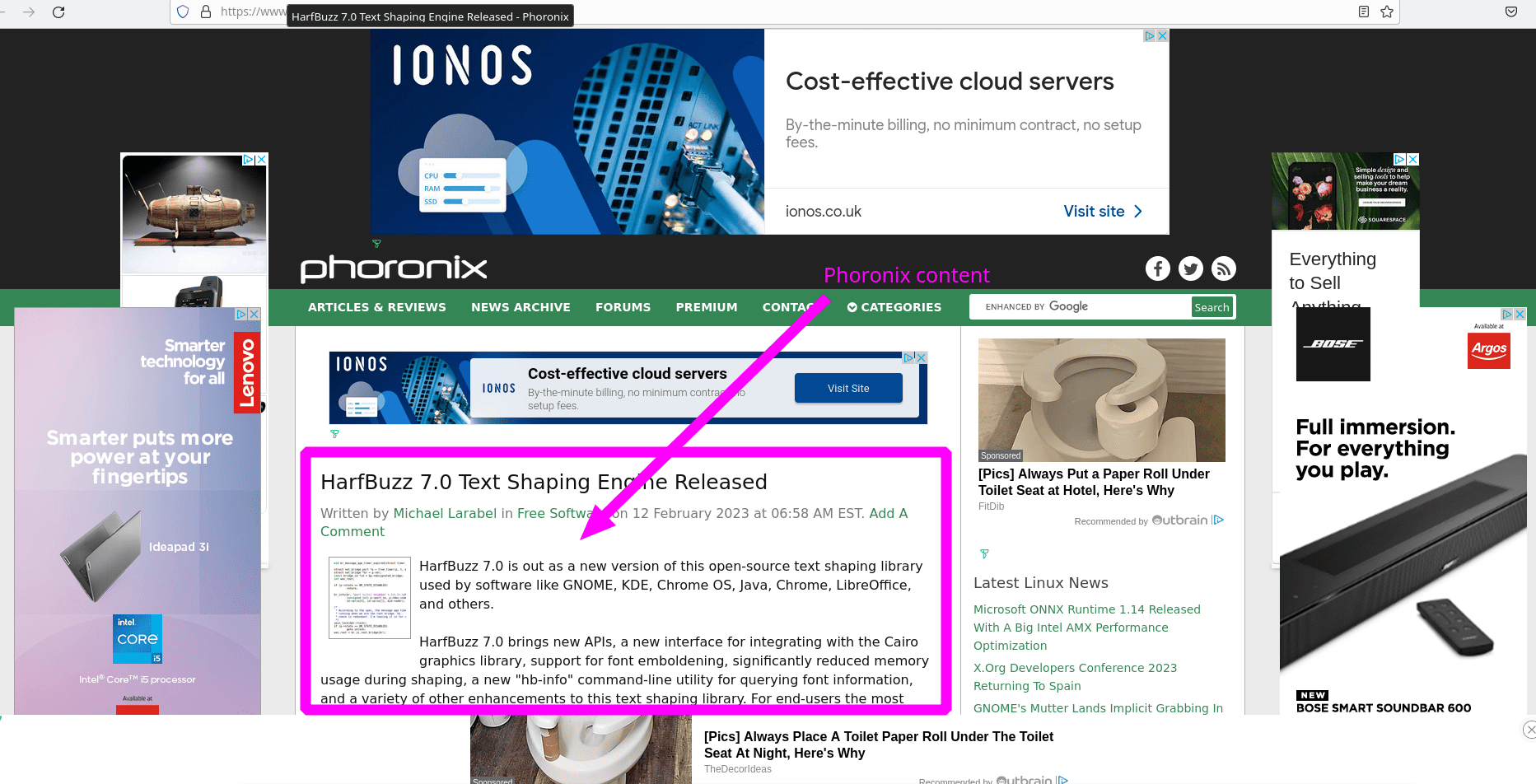 A website with too many ads (Source: Techrights)
Some of the common mistakes web designers make are pop-ups that appear the moment someone lands on a site, which create a bad first impression and push visitors away. Auto-playing videos, loud animations, and aggressive promos further distract users from the content they actually came for.
Because many pop-ups prioritize marketing over user needs, they often frustrate more than they help. Still, when they appear at the right time, offer genuine value, and remain easy to close, pop-ups can support, rather than interrupt, the experience.
8. Inadequate White Space
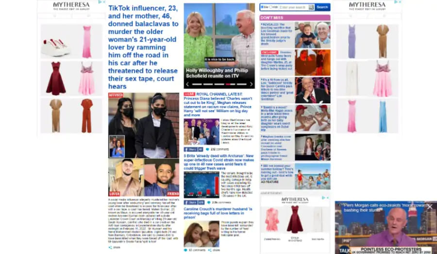 Daily Mail website with no white space (Source: Digital Silk)
White space gives designs room to breathe and keeps layouts from overwhelming viewers. However, when designers cram in too much content, patterns, or imagery, the result is visual fatigue and sections that blur together.
For that reason, your website must have well-used white space that creates clarity, strengthens hierarchy, and guides the viewer’s eye where it matters most.
9. Unoptimized Images
 Unoptimized and optimized images (Source: WP Beginner)
Large, uncompressed images are among the top 10 mistakes in web design because they slow pages down by using too much bandwidth and processing power. Blurry or pixelated visuals also make a site look unprofessional and hurt your brand.
To fix this, optimize images by compressing them, choosing the right formats, using lazy loading, and serving responsive sizes based on each device.
10. Weak Call-to-Action Placement
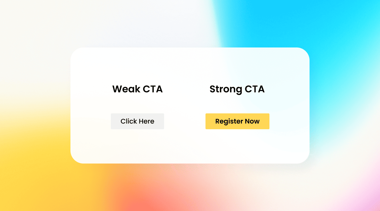 Examples of weak and strong CTAs (Source: Fliplet)
Unclear or poorly placed calls-to-action can hurt conversions, no matter how good the design looks. CTAs work best when they’re easy to spot, use strong action-focused wording, and appear above the fold.
Positioning them at natural breakpoints or right after meaningful content also helps guide users toward the next step. Ultimately, users should understand exactly what to do the moment they see a CTA.
Also Read: 5 Best AI Website Builders to Improve Your Online Presence
Achieve Visual Consistency to Prevent Web Design Mistakes
By avoiding the top 10 mistakes in web design, web designers can prevent significant business losses and fix existing issues. In that regard, achieving visual consistency is just as essential because it aligns typography, spacing, colors, and layout into a unified experience that feels reliable at every touchpoint.
If you want to enhance that consistency, high-quality custom fonts from Creatype Studio can support a more cohesive and professional look. With styles ranging from serif to script, their web-friendly font collections give designers the flexibility to build websites that feel polished and perform better.


