
User interface (UI) design is constantly evolving, with a focus on balancing aesthetics, functionality, and user experience. To bring a sense of feel and look to modern interfaces, three unique styles emerge. Let’s explore these trends and compare Skeuomorphism vs Neumorphism vs Glassmorphism together!
Skeuomorphism vs Neumorphism and Glassmorphism at a Glance
Before we pit the three of them against each other, let’s learn about their strength and weaknesses.
1. Skeuomorphism
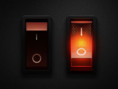
Skeuomorphism of On/Off Button | id.pinterest.com
Originating from the Greek words “skeuos” (meaning container or tool) and “morphe” (meaning “shape”), refers to a design approach that incorporates real-world elements into digital interfaces. The idea is to create a sense of familiarity with a new interface. Essentially, bringing the look and function of an existing thing into a digital interface.
In digital design, Skeuomorphism uses ample aspects of real-world senses, including using realistic textures, gradients, and visual cues. Maintaining some aspects while introducing a new world is the style of Skeuomorphism. For your convenience, check its characteristics below.
Characteristics of Skeuomorphism
- Realistic Elements: It mimics real-world details to a tee. For example, buttons will resemble actual physical buttons, with gradients, shadows, and function.
- Intuitive Interactions: The look and functions are the same IRL and digitally, reducing the learning curve for new users.
Weakness
If you want multiple accessibilities in your design, you need to make multiple real-world representatives too with its texture, color, shape, and shadowing, making it look cluttered. As minimalist designs are rising, designers shift to simpler and more modern approaches.
Also Read: How to Use ChatGPT for UI/UX Design with 25 Best Examples Prompt
2. Neumorphism
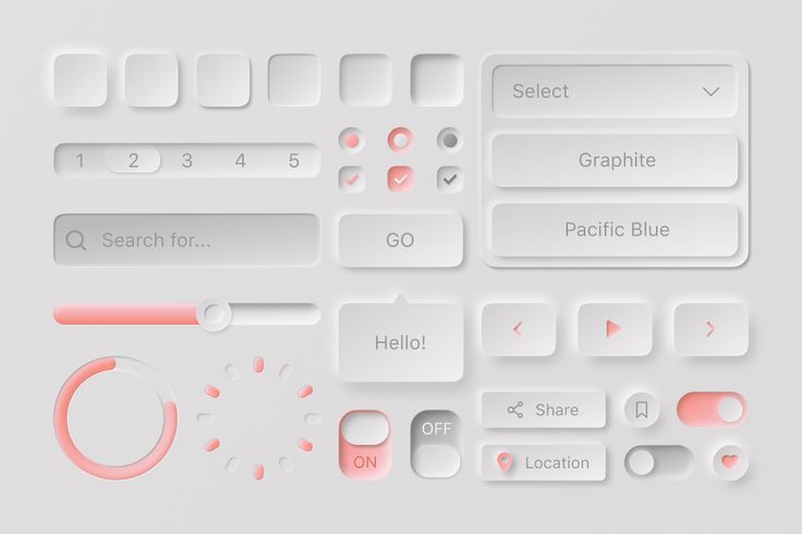
Neumorphism Elements | id.pinterest.com
The head-to-head of Skeuomorphism vs Neumorphism begins right after this. Now let’s learn about Neumorphism first.
The term was coined by Jason Kelly as the portmanteau, combining “neo” and “skeuomorphism” (just like “cosplay” is from costume + roleplay). So, it uses a little bit of skeuomorphism style with added “Neo”. The Neo is a flat design.
So, think of it like this: a button will look protruded from the base, and it can click, but without the texture and shadowing. It is characterized by a simpler, softer, and lighter look, it also appears to just protrude from or dent into the background. Focusing on subtlety and softness rather than excessive realism.
Characteristics of Neumorphism
- Soft Shadows and Highlights: Shadows are important in this style to create a sense of depth and tactile interactions. This approach gives elements a protruding and dented appearance.
- Minimalistic Aesthetics: The style avoids excessive textures and details, as a bridge of skeuomorphism and minimalism.
- Monochromatic Color Scheme: It often uses only pastel color schemes.
Weakness
The style has gained criticism because of its monochromatic color scheme. Particularly, concerns about accessibility, such as low contrast and poor visibility for users with visual impairments.
Also Read: 12 Best Tools for UX Designers, Still Fit for 2023 Era
3. Glassmorphism
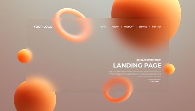
Glassmorphism UI Website Design | id.pinterest.com
A new contender following Skeuomorphism vs Neumorphism is Glassmorphism.
The term “Glassmorphism” was coined by Michael Malewicz, a YouTuber and UI Designer. The style gained popularity in 2020 after Apple updated macOS Big Sur.
As the name suggests, it is characterized by a frosted-glass effect where backgrounds (far things) are blurred, just like when you look at your friend sitting in a restaurant while you’re still outside. This blur effect creates a sense of depth whilst also acting as an opaque background for closer elements.
Also Read: Lucrative Good UX and UI Design Tips for Your App or Web Project
Characteristics of Glassmorphism
- Transparency and Background Blur.
- Color Contrast: Colors are important for this style. For example, a red circle has edges that can blur to support the effect.
- Light Border and Shadow: Instead of the regular black border, using white or a lighter shade of whatever color on the background for the border gives the illusion that there is a pane of glass.
- Sharper is Closer: This helps the user to determine the content hierarchy.
Weakness
Just like Skeuomorphism vs Neumorphism, Glassmorphism also has its challenges. On its up, it was praised for its modern aesthetics, depth, and focus on content. On the contrary, it faces challenges due to its semi-transparent look and readability issues.
In addition, performance can be impaired due to its constant resource-intensive effects, and achieving the same effect across platforms can be tricky.
Also Read: Bad Website Design Aspects with Examples
Skeuomorphism vs Neumorphism vs Glassmorphism
In the pit where the three of them challenge each other, they have similar traits that build each other and overcome their previous weaknesses. For example, Skeuomorphism manifests the actual detailed colors, Neumorphism limits this aspect to pastel color only, and Glassmorphism brings back the freedom of color.
So, take your pick, who’re you rooting for? Or maybe you find a newer contender in the game. No matter which style you choose, you can rely on PLEINHAUS to provide you with an effective and relevant design for your User Interface (UI) designs and bring a better website quality for your audience.


