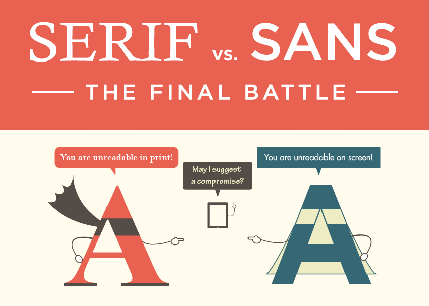
The most basic thing when it comes to the typography world is obviously about the font you choose. Think of it as a garment you’re wearing right now or most of the time. What does it tell people about you? What impression do people generate once they see how you dress yourself up? Despite it being a right or wrong impression, it still is an impression they see on the outside. This is also what happens when we talk about fonts before we delve into the discussion of serif vs sans serif.
Any selected font for your brand will determine people’s assumptions about what you represent, just like your outfit. It can range from your age, personality, style, or even the type of impression you want to make. What you select should also be appropriate, for instance, you wouldn’t wear a casual pair of jeans to a job interview. The same can be mentioned about the fonts you pick for your branding. Among many other marketing gimmicks you’ll put out there, your font is going to play a role when people discover your company. Hence, it’s important to be strategic and intentional in choosing the right font.
Why Is Selecting the Correct Font Super Important?
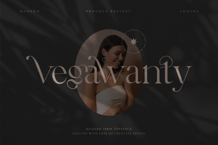
Think about your font as the outfit that suits your brand. Some are more youthful and casual, while others are probably more reserved and buttoned up. It depends on what vibe or feeling you want to generate.
Selecting the “wrong” font doesn’t necessarily mean that it’ll destroy your brand in an instant, though we still highly advise you to pay attention to this part just like other marketing elements on your brand. (Not) Surprisingly, a font can entirely amend your brand’s tone or personality. Choosing an unfitting one can lead people to the incorrect impression about your brand, which is definitely something you don’t want to have.
If you need more elaboration, think about some of the popular brands you know (e.g., Google, Nutella, Yves Saint Laurent, etc.) that incorporate a particular font for their branding. Put those images in your mind, and then try to replace the font in their iconic logos with another font with a completely different shape and size. Can you sense how different their brand’s tone and personality are now?
The bottom line is that you want to ensure your audience has an appropriate insight into your brand, which is why picking a font that conveys your brand perfectly is so crucial. Now the next issue is: where should we start?
Serif vs Sans Serif: What’s the Difference?
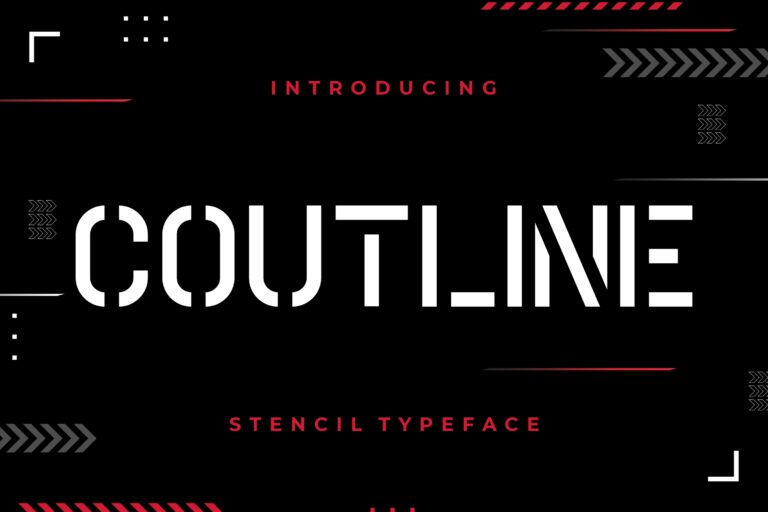
Before selecting your font (from millions of options out there, by the way), it’s always recommended to begin the process by understanding different categories of fonts. You probably have heard about gothic, display, script, etc., but the two primary font types are serif and sans serif.
Knowing these two’s differences is quite helpful in narrowing down which sub-categories of each one will be right for your needs. First, let’s look at the name.
- A serif refers to an ornamental stroke that snuffs out the end of a letter stem. You might sometimes hear people call it the letters “feet”).
- A sans serif, on the other hand, can easily be understood as the opposite of a serif font. The word “sans” is a French word, which means “without,” and here, it refers to the nonexistence of the so-called “feet.”
Depending on what you choose, both fonts exude styles with their own distinctive personality and deliver very diverse messages. Understanding the particular style from the font you select later will be important in ensuring that it aligns with the message you wish your brand to communicate. Otherwise, it’ll be just a clash of information, and you probably have to revise it all over again.
After learning the first serif vs sans serif difference, we can now take a look at the psychology and background of each font’s style.
Serif Fonts for A Conventional, Accepted, and Reliable Feeling
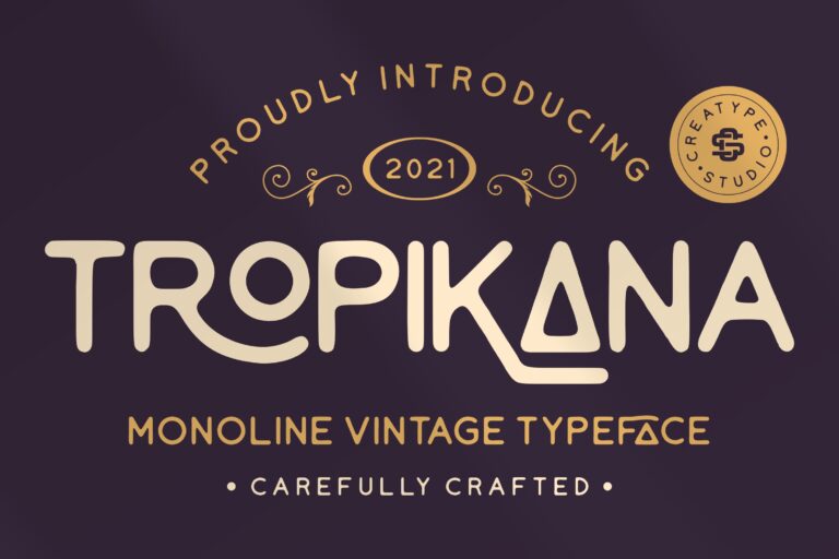
A little bit of history: serif fonts have been around since the 18th century when stonemasons would sculpt letters into rocks, hence creating the calligraphy we know today.
Nowadays we mostly come across many types of serif fonts in daily mediums like books, magazines, and newspapers. Because of this constant exposure, we’re used to seeing serif fonts as a more classic and refined option. Companies or brands who want to emit this feeling tend to pick such fonts to let us in on the vibe.
Remember those serif fonts are notorious for their decorative strokes and tails? They also generally utilize strokes that contrast in weight. What it means is that some surface parts of a particular letter may appear thicker or thinner when compared to the others in a similar typeface.
What Does a Serif Font Communicate About A Brand?
Using serif fonts tends to bring its readers to obtain a trustworthy, classic elegance, and confident feeling, thanks to its long history and constant exposure since then. Serif fonts can be a good fit for brands or companies who desire a more serious, established, and reputable image.
Some companies or businesses that might use such fonts range from insurance companies, editorials, and law practices. If you need any serif font recommendations, you can try using Baskerville, Times New Roman, Garamond, dan Georgia.
Examples of Serif Fonts in Design:
- The New York Times
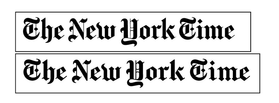
As a perennial publishing office that’s been around since the 1850s, The New York Times is notorious for its no-nonsense logo using the Georgia font. Their logo can be found in their articles, and the font successfully radiates the feeling of reputation and tradition. This is a common occurrence in print newspapers, which tend to use serifs for generating this sense of credibility and formality.
- Tiffany & Co
This American luxury jewelry and specialty retailer has been incorporating Old Baskerville TS Regular to exhibit to their audience a sense of knowledgeable and experienced nuance when it comes to assisting them with their fashion needs. The utilization of serif in their brand logo exudes a highly luxurious feeling, which also shows how their team is comprised of people with sophisticated taste in jewelry.
Sans Serif Fonts for A Clean, Approachable, and Modern Feeling
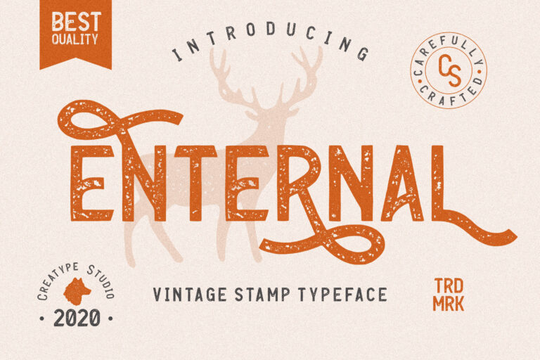
Meanwhile, sans serif fonts deliver an entirely different message, which usually tends to adhere to simplicity and the sensation of being modern. You can tell that these fonts’ primary attributes are their lack of serifs (as explained previously) and the application of unassuming, clean lines with the same width throughout.
Thanks to those characteristics, many web designers highly prefer sans serif fonts for on-screen use to create a much easier and more convenient reading experience. The font’s sharp edges and clean lines can render out more readable on a screen, which intensifies legibility for users.
What Does a Sans Serif Font Communicate About A Brand?
With a stark contrast to serif fonts, sans serif fonts exude a flavor of being highly approachable, friendly, informal, and casual to their readers. Hence, brands and companies who intend to broadcast their brands as more relatable and youthful usually select sans serif fonts for their logo.
You can probably name several local startups or tech companies near you who already choose sans serif fonts for their brand logos. It’s mostly to generate that sense of appearing cutting edge and more humanistic. If you’re interested in using the same technique, some of the most commonly used sans serif fonts are Arial, Open Sans, and Helvetica.
Examples of Sans Serif Fonts in Design:
- HubSpot

HubSpot is an American developer and marketer of software products for inbound marketing, sales, and customer service. Their brand logo uses Avenir Next, a cool sans serif font, which accentuates a clean and rounded appearance. When people read the font, there are certain feelings of approachability and friendliness.
- Wix

Wix.com Ltd. is an Israeli software company, providing cloud-based web development services. Wix intends to let people know that their service is user-friendly, they provide superb customer support, and makes producing a website fun. They do all that by selecting the font they have today successfully. Just like HubSpot, their clean and rounded font radiates a feeling of approachability and relaxation right from the minute someone interacts with their brand.
Serif Vs Sans Serif – Which One Should You Choose?

Sometimes, it’s still difficult to determine the answer to the question above, even if you already know the difference between their style and definition. One piece of advice from us is that there’s really no one size that fits all solutions. You also don’t need to jump on the bandwagon of what’s currently in trend.
Always think of what you want to convey from your brand, and it’s going to be different for every company. Therefore, make sure to brainstorm some of the characteristics and qualities of your brand before beginning your search for a font. Don’t forget to also consider the medium to which people are going to be corresponding with your company.
Besides creating a roadmap, this brainstorm list provides which one fits those qualities. Remember: a font can drastically change the way your brand is perceived by people. Overall, it’s always crucial to pay attention to your font (and all of your design choices for that matter) so that it reflects your brand.
Select the Font That Represents Your Brand
When utilized suitably and selected for the correct reasons, both serif and sans serif fonts can be highly beneficial. What’s most necessary is selecting one that’s suitable for your brand. It’s all about discovering a font that’ll deliver people the correct first impression, which later goes on to materialize your brand’s qualities.
If you’re still stuck, we can give you some general guidelines you can consider in this process:
Don’t Overload The Brand with Too Many Fonts
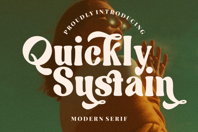
Sometimes, it can be tempting to choose several fonts just because they all look cool or represent some of the values of your brand at the same time. You probably have seen other companies doing this, and it further tempts you to do the same.
However, doing so can actually hurt your brand instead! If you really want to use several fonts, make sure to stick between one to three different fonts and incorporate no drastic styles between all of them. Doing otherwise will lead to your design looking cluttered, and each font will “compete with one another” on the eyes.
Pick Fonts with the Proper Amount of Contrast
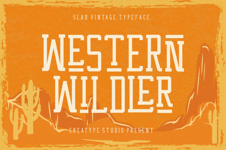
When our eyes are processing written words, we do it easier when they’re arranged in a certain hierarchy and layout for the sake of creating an effective way of reading. What we mean by “no drastic styles” before is also to avoid a big amount of contrast when you work with several fonts together.
We highly recommend discovering fonts with a shared quality, such as similar letter width or height, or a typeface designed by the same designer. To elaborate, you can look for Merriweather and Merriweather Sans, which are nice examples of what we just explained: two fonts from the same family with lovely contrast that still feels cohesive on the eyes. The fact that they’re designed by the same creator also makes them share a lot of similar qualities.
There are no Exact Hard Set Rules
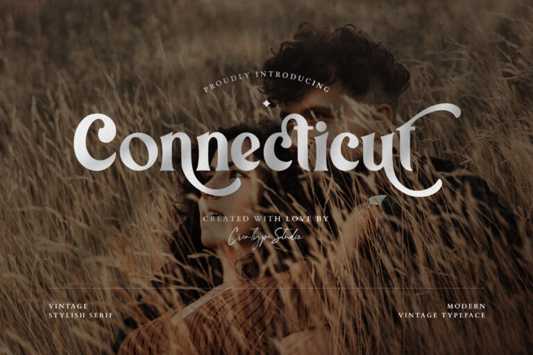
After reading this far, you probably think that the only way to create your logo is only from the comparisons of serif vs sans serif fonts and nothing else. You probably think that brands with a more traditional value should only stick to serif fonts, and vice-versa.
However, there are no exact hard-set rules when it comes to designs anyway. You have the flexibility to experiment as much as you want. It’s all about HOW you use the fonts to create the impression you need for your brand.
Conclusion
That’s a long discussion of serif vs sans serif, wasn’t it? We hope you enjoy the reading and that you can find the most suitable font for your brand. Make sure to enjoy the process, and have fun designing!
