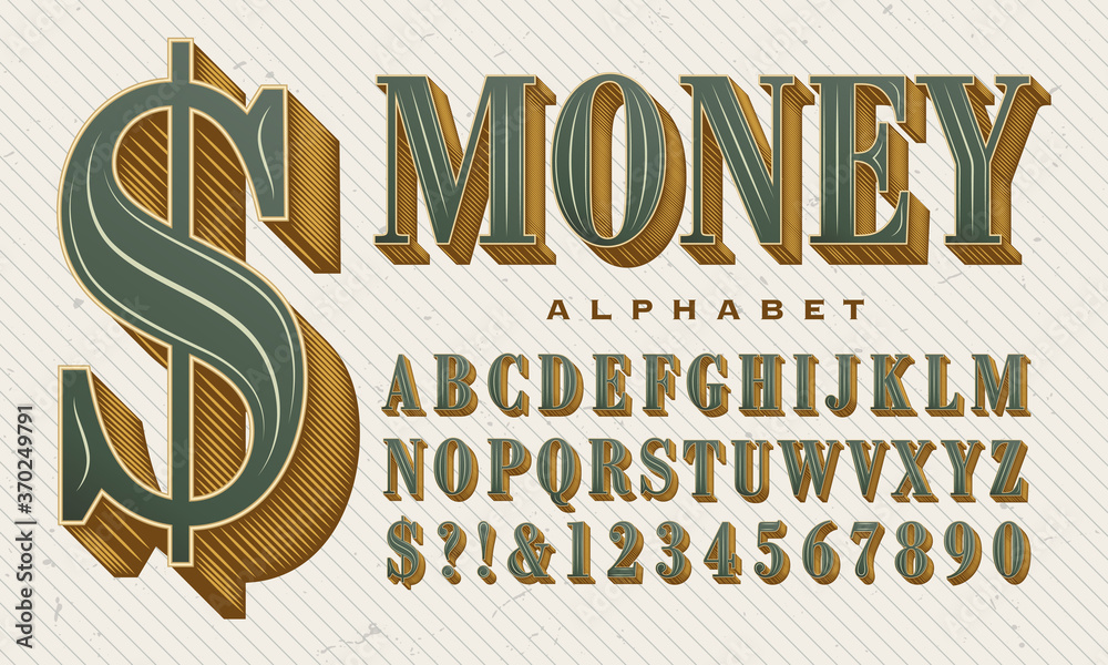
If you are interested in becoming a professional graphic designer, then you need to improve your knowledge. Typography is an important element in graphic design because it is useful for conveying information and adding aesthetic value. So if you need to make a design related to finance or business, use the appropriate money font.
Take your finance and business-related design to the next level by choosing a font that is detailed-oriented and has a unique look. Make sure to keep scrolling through this article for some great inspiration!
Best Choice of Free Money Font
There are many types of fonts you can use to enhance the impression that you want to highlight in your design. You can consider some of these free font choices below to upscale your design statement:
1. Dollar Bill 2
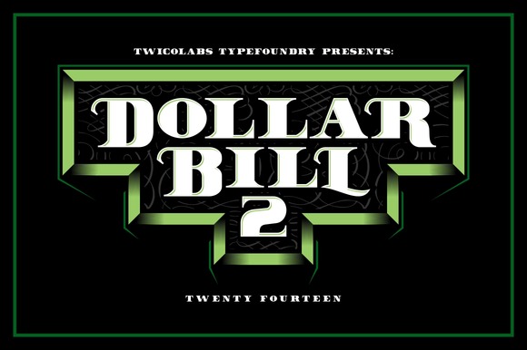
Dollar Bill 2 font is a fresh and modern type. This font only provides capital letters and numbers that can make your design stand out as a work of art. Dollar Bill 2 font letters and numbers are wide and bold. Therefore, typography that uses Dollar Bill 2 will be easier to notice because it has pretty good legibility.
If you want to bring a classic or vintage feel to your design, it would be perfect to choose Dollar Bill 2. You can also use this font for titles or logos that are closely related to business and finance.
2. Pocket Money
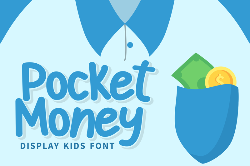
If you are creating a design with a target audience of children, make sure to choose an adorable font. Lovely and adorable fonts are suitable for children’s characters to make the design more interesting and fun.
You can consider Pocket Money font to enhance and brighten up your designs. This font can be used for special events, for example, inviting children to save money. This clean and tidy display font is also very comprehensive as it provides uppercase, lowercase, numbers, and punctuation.
3. Monocle
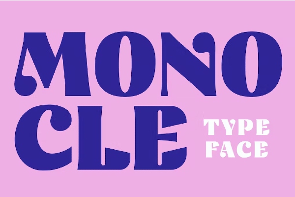
Want to create an eye-catching design? Try using the Monocle font because the letters are bold and wide. Given its wide size, this money font is more suitable for short text or logos.
The unique point of Monocle is that not all parts of the letters are thick and wide because one part of the letters use a slimmer line. If you want to present a strong piece of art with a vintage feel, Monocle is a great choice.
Also Read: Inspirational Fonts: 12 Best Fonts for Your Impactful Quotes!
4. Money Penny
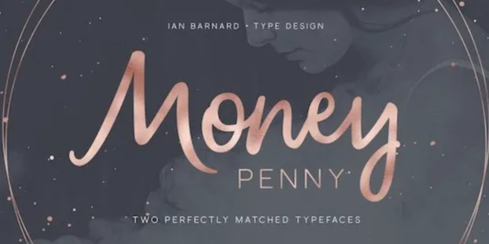
An important point you should pay attention to before creating a design is the target audience. If your design target is mature women, try to use fonts with an elegant and sweet display. Well, you can rely on Money Penny to bring that feeling.
The thing that makes the Money Penny font unique and fascinating is the combination of san serif and script. The signature san serif font without strokes collaborated with the script with a lovely touch of simple lines. As a result, it looks like semi-cursive letters.
5. Gram
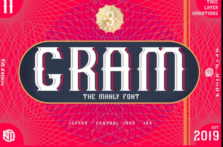
Are you working on logo projects, certificates, book covers, money designs, product packaging, or other financial-related designs? We recommend that you consider the Gram font as it has unique and eye-catching details. The Gram typeface features a collaboration of classic and modern typographic looks.
Your design will also look stylish if you use this font because there are layers that form thin shadow lines. The Gram font presents a non-cramped look due to the little space between letters. That means this type of font is very clear and easy to read.
6. Dollar Stencil
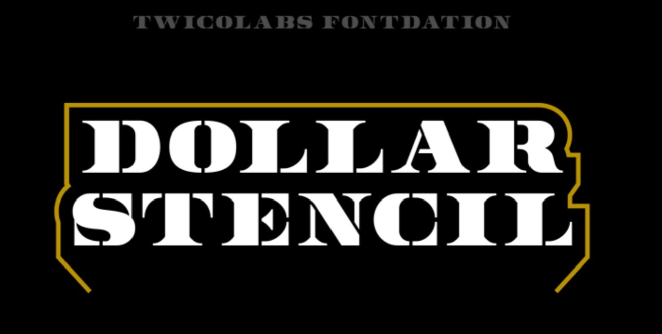
The last recommended font that can enhance your design is Dollar Stencil. You can also rely on this money font number when making designs related to numbers because it provides bold and wide number designs. Wide and bold display fonts make it easier to notice.
This font, inspired by the design of banknotes, also has high artistic value. Hence, Dollar Stencil will bring very strong classic elements.
Also Read: 9 Most Recommended Thick Fonts That Look Heavy and Chunky
Which Money Font Matches Your Design Theme?
The money font recommendations above are very varied because each has its own unique character. To produce a stunning design, make sure to choose a font that matches your design concept.
If you want to get more font recommendations, you can visit Creatype Studio. This place offers a unique and aesthetic font collection, allowing your designs to become more outstanding. Check it out right away, and get ready to become a professional graphic designer!