
In the world of branding, understanding the difference between logomark vs logotype is essential for building a strong visual identity. In 2025, clean, minimalist logos with bold typography and adaptable color schemes dominate the market, reflecting a shift toward simplicity and versatility.
As brands compete for recognition across digital platforms, the right type of logo can make or break their presence. Therefore, choosing between a symbol-based logomark and a text-based logotype requires strategic thinking.
Key Takeaways
- A logotype highlights your brand name with customized typography design.
- A logomark communicates brands visually through symbols without using text.
- Choose based on brand goals, visibility, and audience recognition.
Also Read: Logo Design Trends: 5+ Trends to Elevate Your Design
What is Logo?
Basically, a logo is a broad term that refers to the overall visual representation of a brand. It can be made up of text, images, or a mix of both. In essence, it’s the umbrella term that includes logotypes, logomarks, and combination logos. Whether it’s the golden arches or the iconic font, both are logos but each fits into a different category.
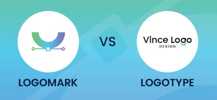
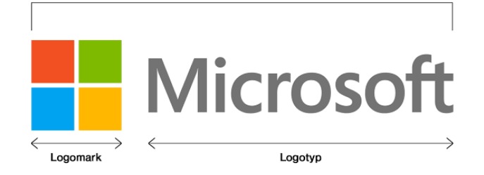
What Is Logomark?
Logomark Examples | Image Source: jessicadonesdesign.com
Meanwhile, a logomark is a logo design that uses a symbol, icon, or graphic element without including the brand’s name. It communicates the brand’s identity visually in a more abstract or symbolic way. Famous examples include Apple’s apple and Twitter’s bird. Logomarks are powerful for visual impact and global recognition.
What Is Logotype?
Logotype Examples | Image Source: visme.com
Lastly, a logotype is a logo design that uses the brand’s name in stylized typography without any separate symbol or icon. It relies on font, spacing, and color to create a distinct visual identity. Well-known examples include Coca-Cola, Google, and Canon. This type of logo is ideal for enhancing name recognition and brand recall.
Also Read: 6 Design Tips for Creating Unique Logo Typography
Difference Between Logotype and Logomark
Now that you understand both definitions, let’s compare logotype vs logomark and how they function differently in branding.
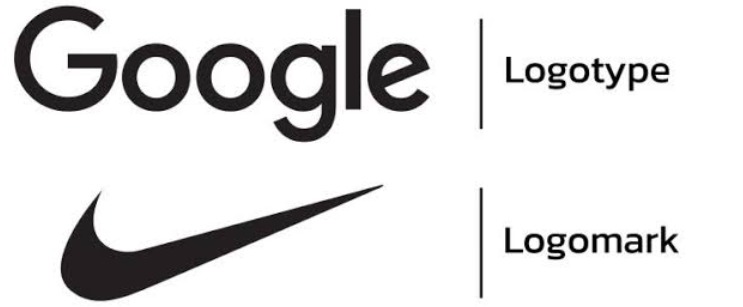
1. Appearance
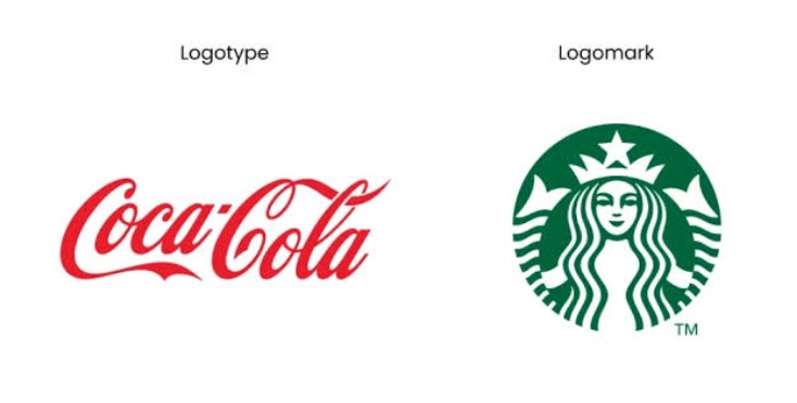
Coca-cola vs Starbucks Appearance | Image Source: inkbotdesign.com
A logotype is made up entirely of text, usually the brand’s name styled in a unique font, color, or spacing. There are no symbols or graphics, just the word itself as the visual identity. Famous logotypes like Coca-Cola show how powerful typography can be when it’s done right.
On the other hand, a logomark is purely visual with a symbol, icon, or abstract shape that represents the brand without using any text. Starbucks coffee is the perfect example. These icons become shorthand for the brand once they gain recognition.
2. Recognition
Logomark vs Logotype Recognition | Image Source: vincedesign.com
When it comes to recognition, logomark vs logotype plays a crucial role in shaping brand identity. Logotypes focus on building name awareness directly. Because the brand name is always visible, audiences quickly become familiar with how it looks, reads, and sounds for newer businesses.
In contrast, logomarks build visual recognition indirectly. Since they don’t include text, it takes time and repetition before people associate the symbol with the brand. That’s why many companies start with a combination of both to balance clarity and impact.
Also Read: 6 Logo Variations Every Brand Needs for a Consistent Identity
3. Best for
Logomark vs Logotype Usage | Image Source: (LinkedIn – Tom Klein)
Logotypes are often the best choice for companies with short, unique names. They’re also ideal for industries where professionalism, clarity, and direct communication are important, such as tech companies (Google), law firms, or financial services.
Logomarks, however, shine for established brands with strong visibility and recognition. These brands have already built trust, so they can rely on symbols alone to represent them as a major advantage for global companies (Nike) to overcome cultural barriers.
4. Scalability
Logomark vs Logotype Scalability | Image Source: vincedesign.com
When comparing logomark vs logotype, both can be scalable in different ways. Logotypes are easy to resize, especially when clean fonts and proper spacing are used. This ensures they stay readable across mediums, from website headers to business cards. However, in very small sizes, thin typography may lose its visual impact.
Meanwhile, logomarks, when thoughtfully designed, are highly scalable and often more adaptable. A bold, simple icon can retain its power whether displayed on a billboard or a tiny app icon. Still, overly complex logomarks may blur at smaller sizes, making simplicity essential in the logomark vs logotype debate.
Also Read: 10 Logo Design Mistakes You Should Never Make
Apply What You’ve Learned About Logomark vs Logotype
In the fast-moving design world, understanding logo vs logomark vs logotype is more than just theory. Each format serves a distinct role in how your audience perceives your brand. Therefore, choosing the right one helps your message come across clearly and memorably.
To bring your logo concept to life, you’ll need the right typography. Whether you’re going with a bold logotype or pairing a symbol with text, font choice matters. That’s why it’s worth exploring high-quality fonts for logos at Creatype Studio. Our collections, from clean serif to playful script, fit perfectly into any modern brand style.
Moreover, we also give you instant digital downloads and lifetime access with every purchase. You can buy a single font or invest in a bundle to unlock full creative freedom. So, if you’re ready to take what you know to the next level, start by choosing the right font. Your logo deserves nothing less!


