
For branding, logo variations play a role in maintaining its consistency across multiple platforms. Having flexible logo formats ensures your brand always looks professional and recognizable, whether in a business card, website header, or mobile app icon.
In fact, 45% of consumers expect a logo to communicate the brand’s story, making it essential to adapt your visuals without losing core identity. That’s why understanding and applying the right logo variation is key to building a strong and lasting impression.
Key Takeaways
- To maintain a consistent identity across various platforms, brands adapt their main logos into different forms.
- Six key logo variation ideas ensure consistent brand presence everywhere.
- Versatile typography powers strong logo systems.
What Is Logo Variation?
Simply put, variations of logos are adjusted versions of your main logo designed for different uses. Despite layout or color changes, they keep core elements like font and style intact. This ensures brand consistency across emails, labels, ads, and more.
Additionally, it isn’t just for layout. Instead, it serves strategic purposes too. For instance, you can adapt them for holidays, events, or cultural preferences. Thus, these variations help your brand stay relevant and relatable.
6 Logo Variations for Graphic Designers and Brand Managers
To ensure your brand maintains a consistent yet flexible visual presence across all platforms, explore our six recommended logo variations for brand that every designer and brand manager should be familiar with.
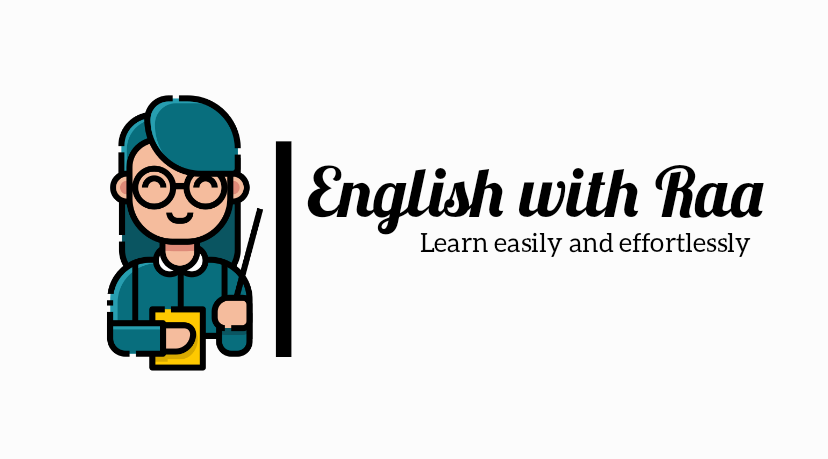
1. Primary Logo
![]()
Primary Logo Example | Image Source: canva.com
Start with the primary logo, the star of the show and the most complete version of your brand’s visual identity. It proudly showcases your full brand name, its distinctive symbol, and sometimes even a catchy tagline. Therefore, it’s the version that represents your brand’s entire essence.
Ultimately, this primary logo serves as the definitive visual for most major applications. You’ll see it gracing every website’s hero section, adding polish to business cards, and fronting key marketing campaigns. It truly sets the fundamental visual tone for every brand interaction.
Also Read: 6 Design Tips for Creating Unique Logo Typography
2. Stacked Logo
Stacked Logo Example | Image Source: canva.com
A truly effective logo is designed to adapt across all dimensions to maintain its impact even in the most unsample spaces. This is precisely where the stacked logo proves invaluable, serving as a clever re-arrangement of your primary mark. It reorganizes your brand’s elements into a tighter layout, making it more suitable for various limited areas.
Crucially, this becomes one of the incredibly valuable logo variations when the space is limited, like in mobile headers, square social media profile images, or compact ad banners. It ensures your logo remains perfectly legible and impactful, even without ample room.
3. Submark Logo
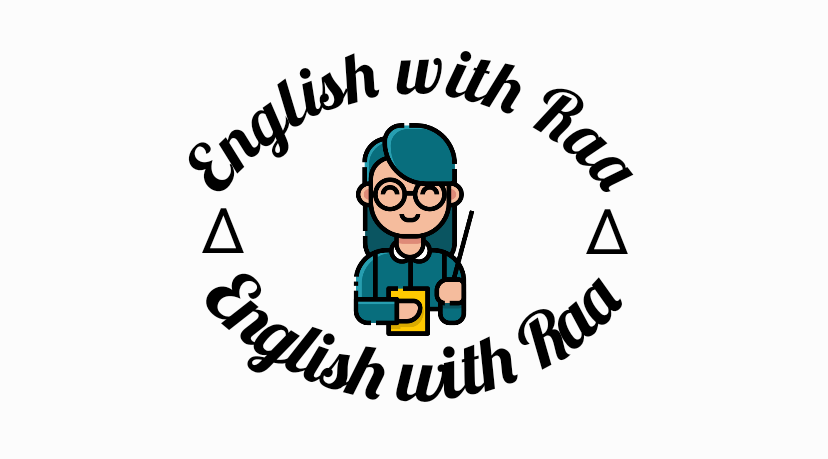
Submark Logo Example | Image Source: canva.com
When your full primary logo feels like a bit too much for a subtle touch, the submark logo steps in. This is a simplified, often circular or square, distillation of your brand’s core identity. Furthermore, it commonly features initials, a key symbol, or a condensed version of your brand mark, lending itself to more decorative and less formal uses.
Primarily, submarks are ideal for delicate branding touches: watermarks on images, email signatures, tiny social media profile icons, or even custom stickers. They offer a quick, recognizable wink back to your main brand, maintaining consistency in even the smallest details.
Also Read: 10 Logo Design Mistakes You Should Never Make
4. Favicon Logo

Favicon Logo Example | Image Source: canva.com
Don’t underestimate the power of the favicon logo, that minuscule icon nestling in your browser tabs. Typically measuring a mere 16×16 pixels, it’s often just a single letter or a super-simplified brand symbol.
Even though it’s small, a favicon plays a surprisingly big role in user experience. Specifically, it’s what helps users instantly spot your site amidst a sea of open tabs, enhancing navigation and lending an immediate sense of polish and professionalism to your online presence.
5. Wordmark Logo
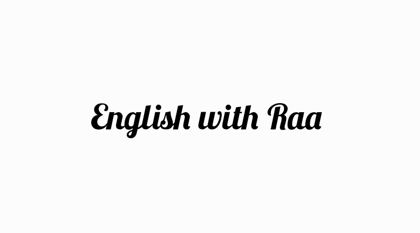
Wordmark Logo Example | Image Source: canva.com
Sometimes, words alone speak volumes. Therefore, a wordmark is one of the famous logo variations that relies entirely on distinctive typography to make its statement. There’s no separate icon or symbol; instead, your brand name itself is the entire design.
Most notably, wordmark logos are exceptionally effective when your brand name is unique and memorable. They champion a clean, legible aesthetic, making them perfect for minimalist branding, elegant stationery, or bold website headers where the name truly needs to stand out.
Also Read: Responsive Logo: Optimize Your Logo for a Dynamic Branding
6. One-Color Logo
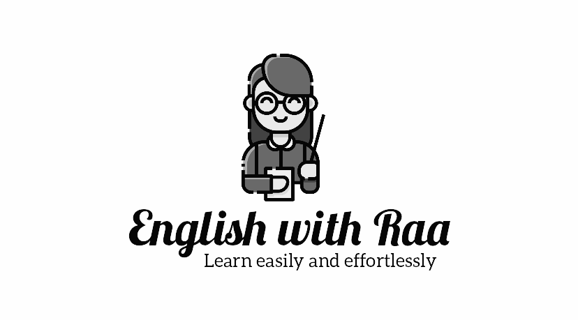
One-color Logo Example | Image Source: canva.com
Not every canvas is a vibrant rainbow; sometimes, simplicity reigns supreme. That’s why the one-color logo strips your brand mark down to its purest form, rendered in a single hue, typically black or white. Essentially, it ensures your logo remains perfectly identifiable and functional without relying on a complex palette.
This variation is a lifesaver for practical applications like printing on promotional merchandise, stamping on invoices, or branding product labels where full color isn’t feasible or desired. Critically, it demonstrates the fundamental strength of your logo’s design, proving its versatility across every medium.
Also Read: Golden Ratio, A Guide to Master Logo Design Structure
Beyond Recognition, Build Brand Resonance with Logo Variations
Ultimately, cultivating true brand resonance in today’s crowded market demands more than just a recognizable mark. By strategically deploying diverse logo variations, your brand can seamlessly adapt to every platform and context, ensuring clarity and impact.
Furthermore, a truly versatile logo system often hinges on the unique typography that underpins it. When crafting distinct fonts for branding designs, consider comprehensive licensing for broad application. For instance, Creatype Studio offers robust solutions like a corporate license.
With this license, your design logo variations can thrive everywhere. It provides unlimited usage across all platforms, sub-brands, and even large-scale broadcasting. Moreover, with perpetual access, investing in such a versatile font library is smart for lasting visual consistency.


