
Good design starts with mastering the basics, like color, shape, and space. But great design goes further. It combines these elements with design psychology to influence how people think, feel, and act. By aligning visual choices with psychological principles, you create beautiful designs that are strategically effective in driving better outcomes.
Key Takeaways:
- Understanding psychological principles helps you predict how people feel and respond to design.
- Applying design psychology to visual elements creates more strategic designs that influence user behavior.
- It also enhances user experience by increasing engagement, comfort, and trust.
7 Ways Visual Design Affects Human Behavior
Combining visual elements with design psychology might seem overwhelming at first, but it becomes much clearer when you understand the point. Let’s break it down to see how these visual components work together.
1. Colors
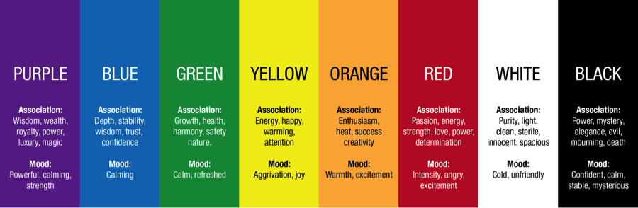
color psychology | source: blogs.meemz.info
Color psychology in design is essential in setting the emotional tone and atmosphere. Warm colors like red and yellow can evoke feelings of comfort, urgency, or even aggression. In contrast, cool tones such as blue and green tend to promote calmness, trust, and relaxation.
According to Linguistics and Culture Review, the strategic use of color in product design was shown to boost brand personality and generate more positive responses from consumers.
2. Shapes
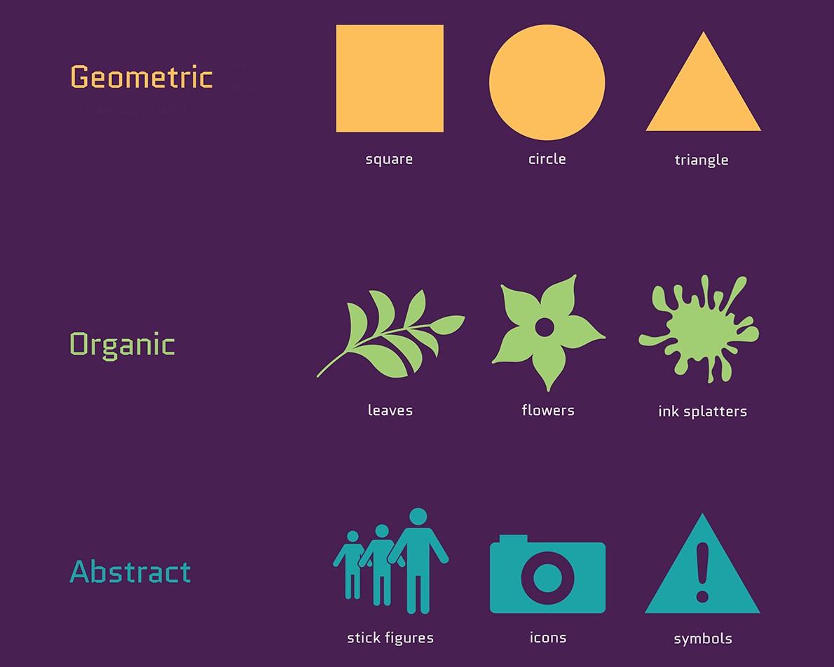
common shape in design | source: visme.co
Shapes are a powerful yet often subtle part of design psychology. They subconsciously trigger perceptions based on their structure. It’s why logo design considers shapes to add value to their brand. Here’s how different categories of shapes affect viewer response.
a. Geometric Shapes
- Circle: Symbolizes unity, softness, and continuous movement.
- Square/Rectangle: Conveys structure, stability, and strength.
- Triangle: Represents energy, sharpness, or tension.
b. Organic Shapes
These free-form, natural shapes are often found in nature and evoke feelings of comfort, spontaneity, and freedom.
c. Abstract Shapes
Abstract forms rely on symbolism and are often interpreted based on context. For example, the three-dot icon in user interfaces is widely recognized as a symbol for additional options or hidden menus.
Also Read: 6 Logo Variations Every Brand Needs for a Consistent Identity
3. Typography
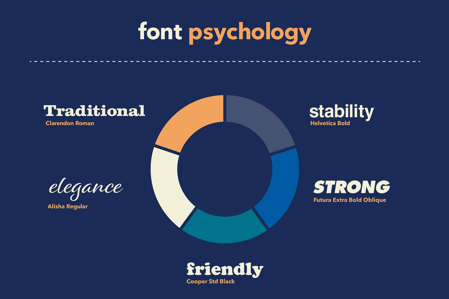
typography psychology | source: llpeach.com
The psychology of design can also include typography. Different typefaces can completely alter the emotional tone of a message. That’s why brands carefully choose fonts that align with their identity.
Here are four major type categories and their psychological connotations.
- Serif: Traditional, authoritative, and trustworthy.
- Sans-serif: Clean, modern, and accessible.
- Script: Elegant, emotional, and feminine.
- Display: Bold, playful, and unique.
Also Read: 6 Design Tips for Creating Unique Logo Typography
4. Layout
A strong layout shapes how users navigate information. And it starts with the anchoring bias, where people rely heavily on the first piece of information they see. This makes visual hierarchy and layout critical in creating a positive first impression that can lead to higher conversions.
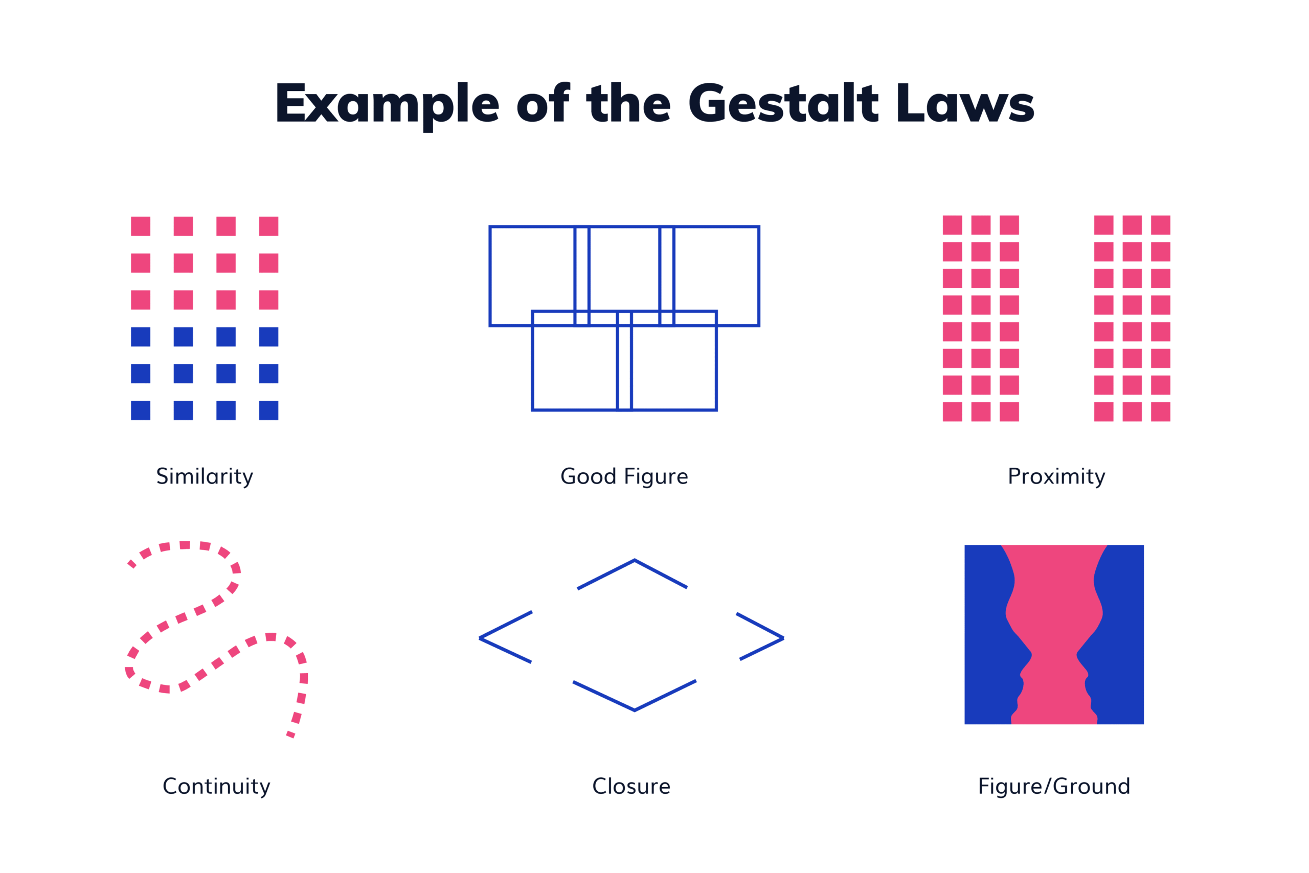
gestalt principles examples | source: manypixels.com
To apply design psychology effectively, use Gestalt principles to guide layout decisions.
- Similarity: Group elements with similar style or color to imply a connection.
- Proximity: Place related items close together to show they’re functionally linked.
- Continuity: Align elements in a way that leads the eye naturally.
- Closure: Design elements arranged to let the viewer mentally complete an incomplete shape or image.
- Figure/Ground: Use contrast to distinguish foreground (main content) from background.
- Simplicity (Prägnanz): Present elements in the simplest, recognizable form for quicker understanding.
5. Spaces
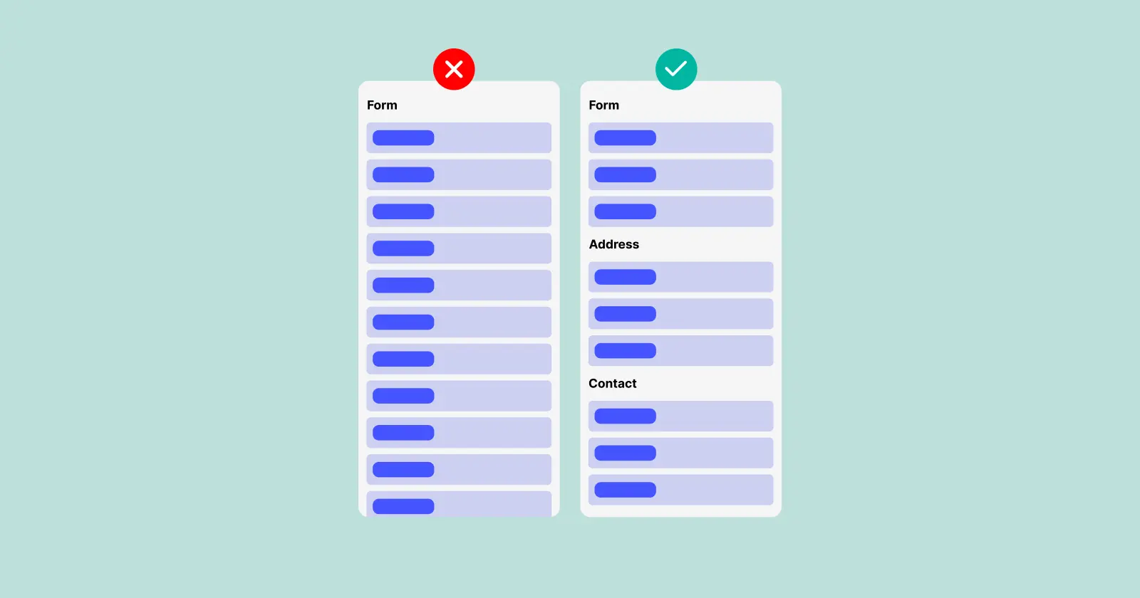
miller’s law | source: bluehans.com
In graphic design psychology, Miller’s Law states that the average person can only hold 7 items in their short-term memory at once. This means that overcrowded designs or excessive choices can overwhelm viewers and lead to decision fatigue. Effective use of spacing helps limit cognitive load and make the content easier to digest.
6. Value or Contrast
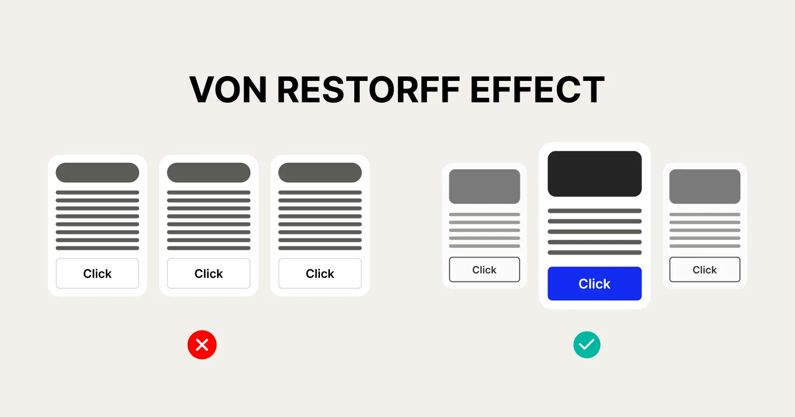
von restoff effect | source: bluehans.com
Value and contrast are crucial in design psychology by distinguishing what matters most. This concept aligns with the Von Restorff Effect, which states that items that visually stand out are more likely to be noticed. By applying clear contrast, especially in headlines or call-to-action buttons, you draw focus and guide attention.
Also Read: What is a Typographic Contrast? A Complete Explanation
7. Imagery
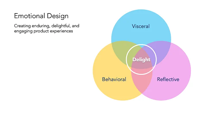
don norman’s emotional design stages | source: medium.muz.li – Justin Baker
Imagery improves storytelling and creates a deeper emotional connection with the audience. According to Don Norman’s Emotional Design theory, users experience design on three levels.
- Visceral: Immediate emotional reaction or first impression.
- Behavioral: How well the design helps users achieve goals or solve problems.
- Reflective: The personal value or memories associated with the design.
By using purposeful imagery, you can improve how users perceive and engage with your design, leading to a more memorable experience.
Also Read: UX Audit Explained: What It Is and How to Do It
Design Smarter with the Power of Psychology
By integrating visual elements with psychological principles, design becomes more than just decoration. It can become a powerful tool for influence. Understanding design psychology empowers you to create visuals that drive action, build trust, and enhance the audience’s experience.
If you’re ready to elevate your design with more purpose and impact, Creatype Studio is here to support you. We offer a lot of fonts crafted to match various tones, moods, and brand personalities. So, you can express your message more effectively through typography.
Explore our Font Theme Bundles for flexible, affordable collections that bring cohesion and style to your next project.


