
Designing letters that contain a name of a brand may be complicated. You need to give more attention since every font has a different shape. As a result, a cap height is essential to consider for designers who want to highlight the client’s brand. This article will discuss the definition and its examples. Hence, let’s jump into it now!
What is Cap Height in Typography?
First things first, a designer must understand the definition. This term is actually an abbreviation of capital height in the typeface. Cap height typography is also known as cap line, which refers to the height of the flat capital letters measured from the baseline to the top of the flat characters.
If you want to measure the point size of capital letters, you only need to ensure to count the right amount of numbers from the base to the top. For instance, many flat letters tend to overshoot the top line. In contrast, the cap line will stick to the top without overshooting so that readers can distinguish the real letters without misread on the sentence.
Also Read: 9 Best Simple And Friendly Fonts In 2023, You Must Have!
Examples of Cap Height
After understanding the definition, you may find it confusing without looking at some examples. Hence, I will provide seven different pictures of cap height so that you can see the differences between cap height and other flat letter heights. Without further ado, let’s begin!
1. Better Together
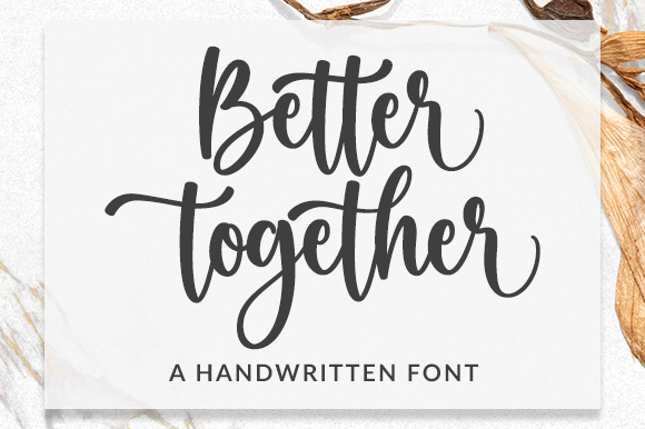
Take a look closer at this first example. You can see that Better Together has a standard-size of cap line. Whereas another flat “t” and “h” overshoot the line. The capitals would not go higher because it can cause misunderstanding in the reading.
So not only the writing is clear, but it also leads readers to understand the message efficiently. Furthermore. the shape of this capital letter is perfect to distinguish it from the lower letters.
2. Spinnenkop
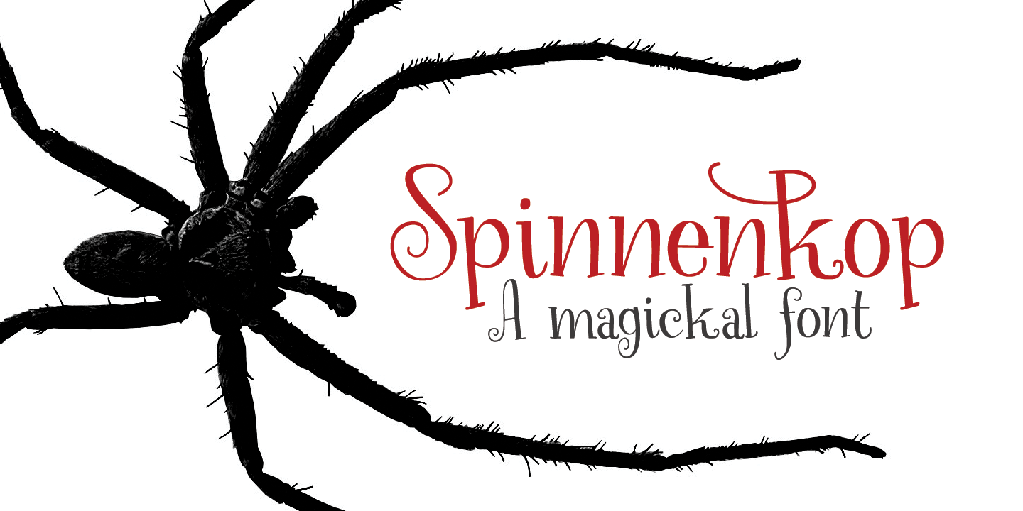
The second example of cap height is Spinnenkop, or a magical font. This font has an easy-to-read style with capital that sticks to the top line. In accordance with the capital letter, the lowercase ones also fit the line.
Both of them do not overshoot but are easy to distinguish. Furthermore, designers would not find it hard to deliver the message, and the readers will understand it clearly.
3. Castal Street
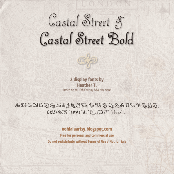
Third, this Castal Street is a unique font with a curly shape yet steady lines. You can see clearly that its capital letters do not overshoot. Although C and S have round shapes, they are easy to understand.
You may also distinguish that the L flat letter overshoots to the top line. It does not too long, but thanks to the design, the readers would not confuse about differentiating between L and I letters.
4. Shayfinton
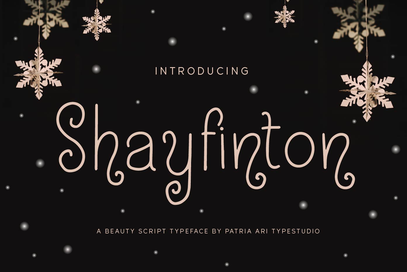
Next, the cap height from Shayfinton’s font is perfect for cute products, especially for children. The shape is round with a curly effect but still fine to the top line.
Even though the lowercase letter may be overboard to the baseline, this condition will help you to distinguish the capitals. Hence, you can read it effectively no matter what the sentence is.
5. Nicko Robin
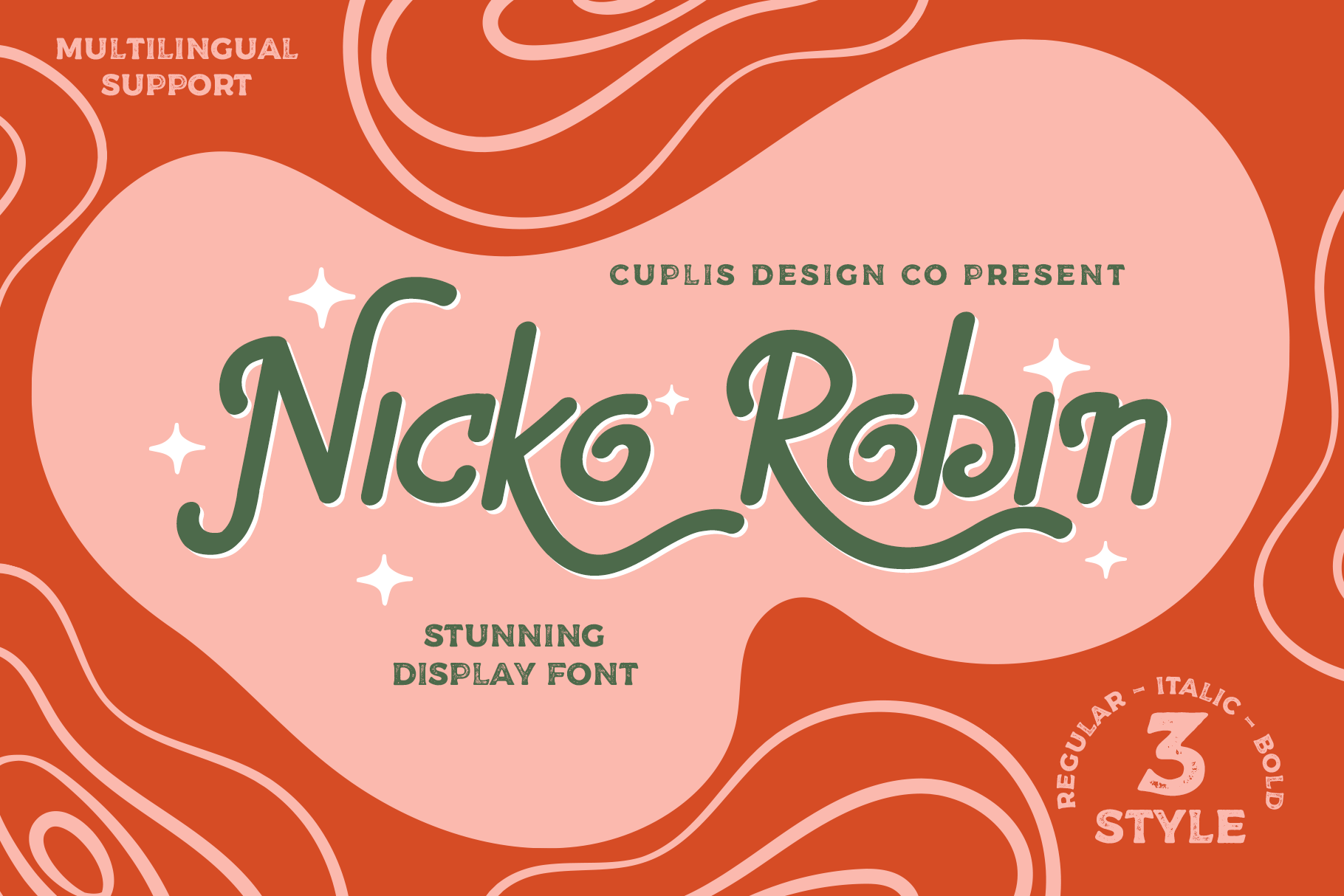
N letter is the favorite on the cap line since it is flat and does not have any other similar letter. Nicko Robin has a slight overshoot N capital letter with overboard R capital.
However, both of them are fine since the shape is totally different from the lowercase. Therefore, people can read the sentence easily and get the message clearly.
6. Bubble Bobble
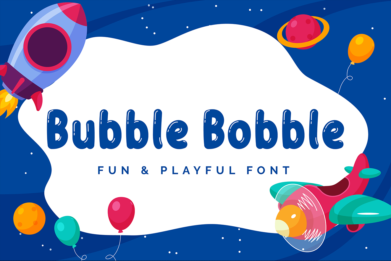
Bubble Bobble is the following cap height example which has rounded yet flat shapes. It is easy to distinguish because the capital letters stick from the baseline to the top line.
They are also different from the lowercase, which is great. Hence, you can read it easily and does not face any challenge in understanding the message.
7. Fresh Fruit
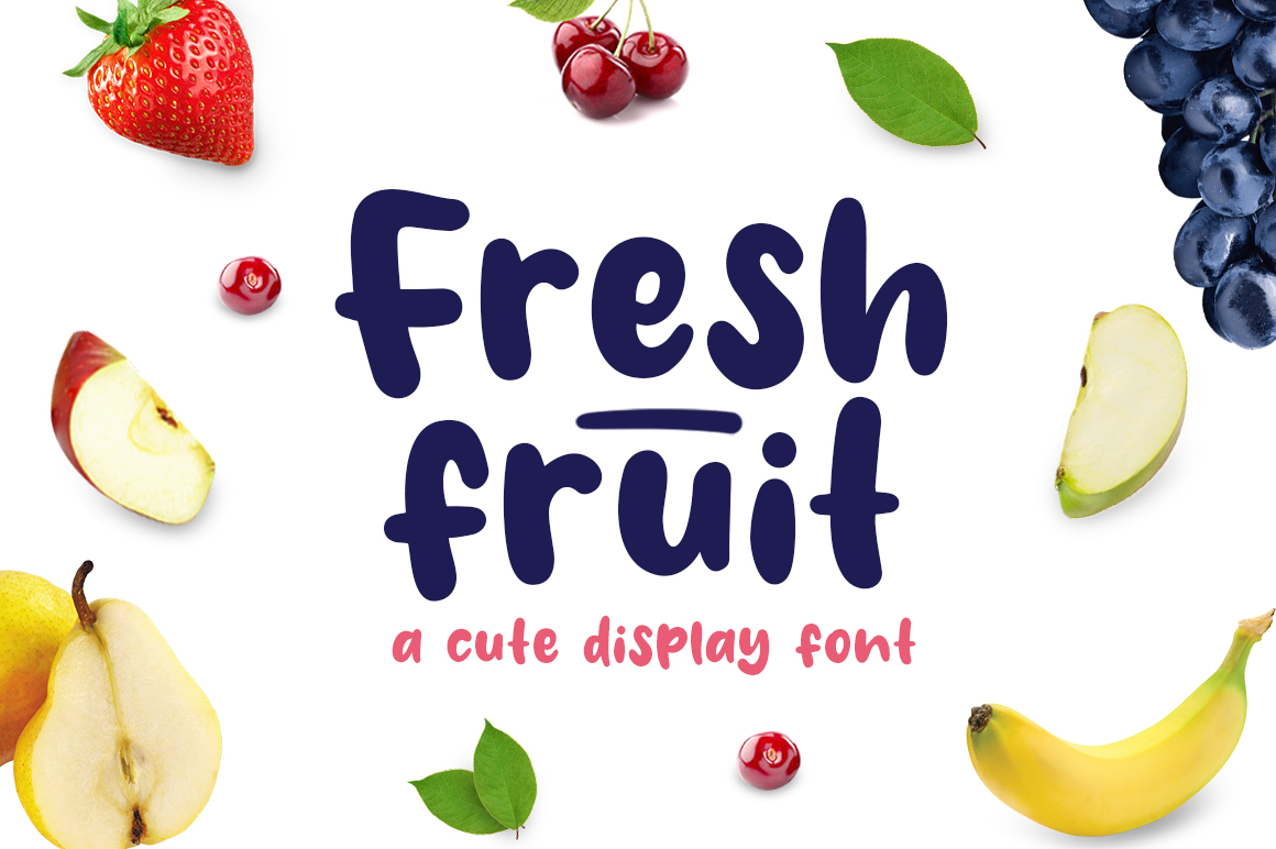
Last but not least, this font may be tricky. But it does not mean you cannot distinguish the capitals and lowercase. Instead, the capital letter’s size is bigger than the lowercase.
It sticks to the line and does not overshoot. Thanks to the cute font of Fresh Fruit, everyone can read the letters effectively.
Also Read: 20 Best Font For Professional Flyer Design
Do You Understand What a Cap Height Typography is?
Understanding the terms in typography will efficiently help you in designing the letters. Furthermore, you should know about cap height which can distinguish between capitals and lowercases. So, let’s practice based on your insights and make a better design now!


