
The visual appeal and functionality of a website or application rely on effective user interface (UI) design. A well-crafted UI should not only look good but also support usability to deliver a satisfying user experience. When done poorly, it results in bad UI design, leading to user frustration, high bounce rates, and reduced conversions.
Let’s explore the key factors that make UI design go wrong and how to fix them.
Key Takeaways:
- Common issues like poor hierarchy, confusing forms, or inconsistent buttons frustrate users and can lead to abandonment.
- Elements like alignment, contrast, and button styles must work together to guide users smoothly through the interface.
- Small details like consistent icons and high-quality images are handy in creating a smooth and trustworthy user experience.
10 Examples of Bad UI Design You Should Avoid
Avoid these common mistakes to improve usability and deliver a better user experience.
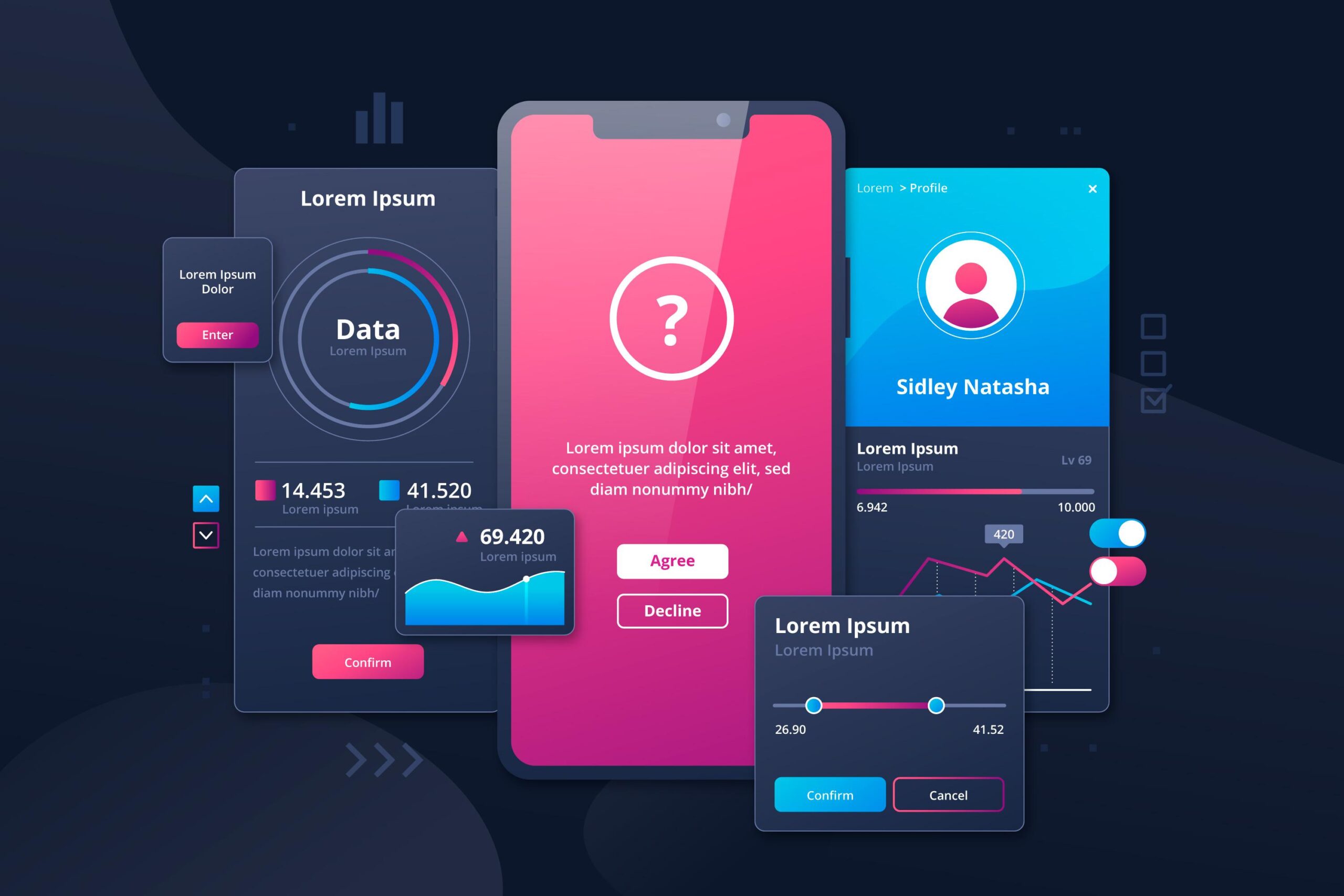
1. Poor Visual Hierarchy
 poor vs. strong visual hierarchy in web layouts | source: santapod.co.uk and ellipsus.com
A weak or unbalanced visual hierarchy is a hallmark of bad UI design. When users can’t tell what’s important or where to look, they struggle to scan or navigate your content. As a result, it would delay users in decision-making, which often leads to high bounce rates.
There are various ways to optimize hierarchy:
- Prioritize key elements with size, weight, and color.
- Maintain consistent spacing and alignment.
- Group related content closely together.
Also Read: From Zero to UX: How to Become a UX Designer Step by Step
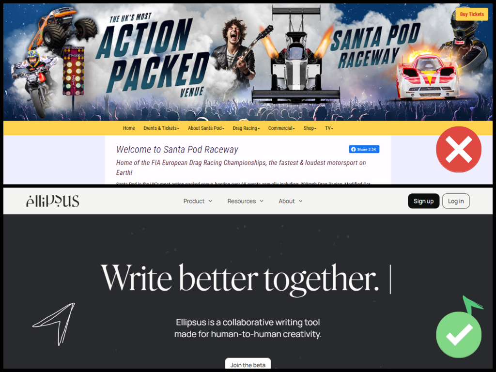
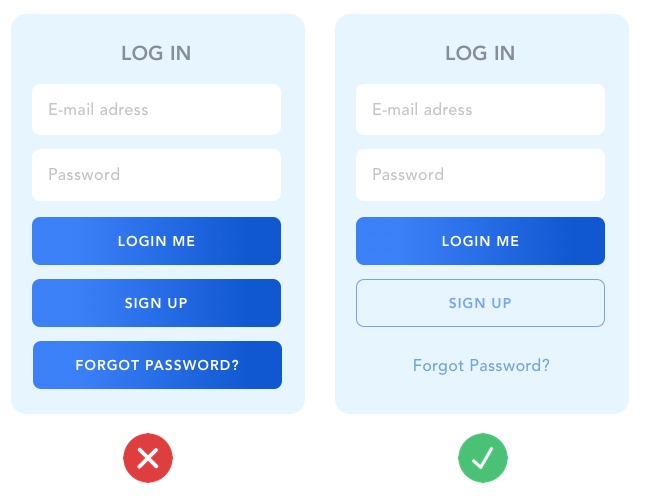
2. Confusing Forms
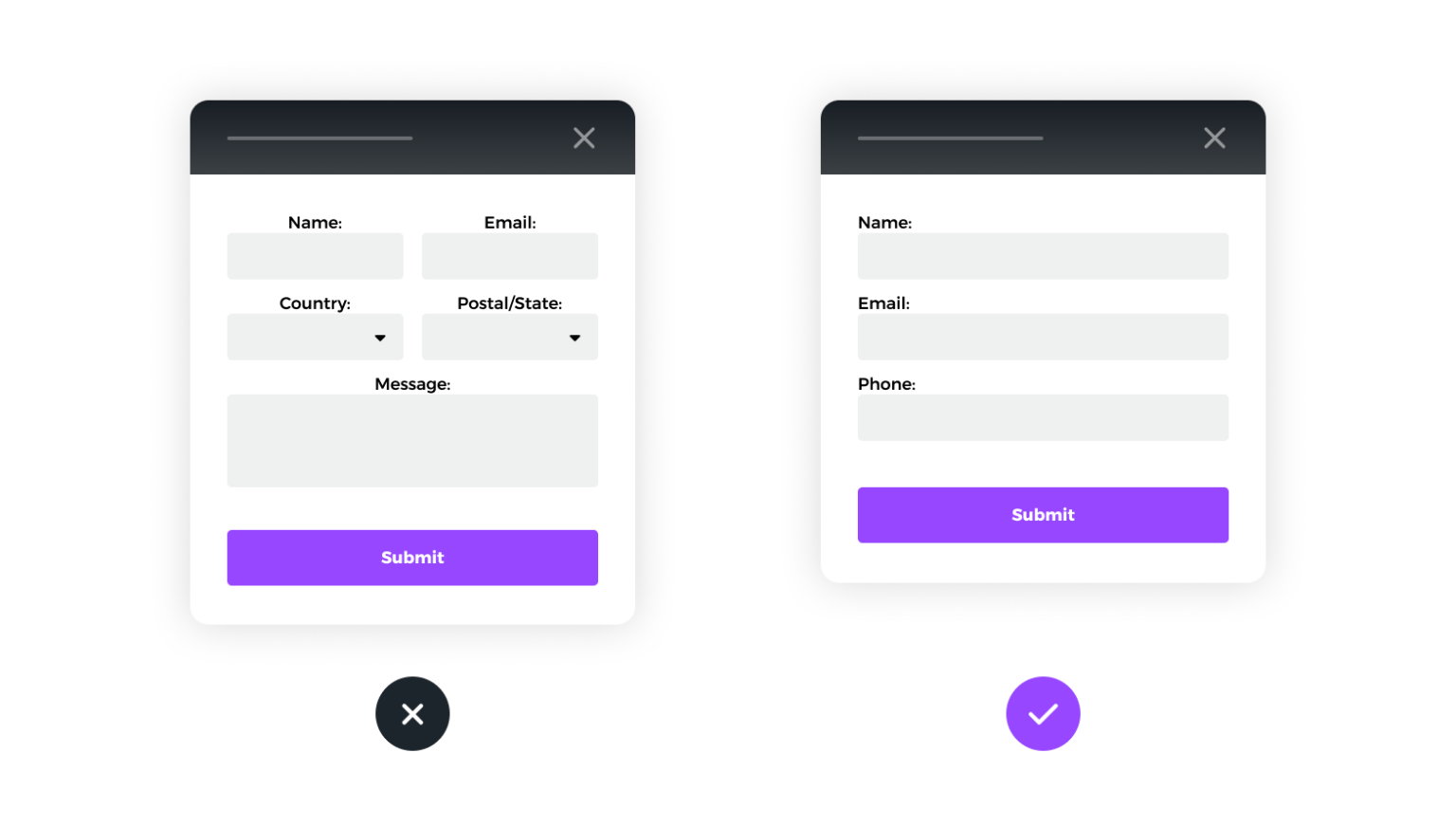 Poor vs. effective form structure | source: parachutedesign.ca
Forms are where users take action, like for signups or checkouts. But if they’re disorganized or unclear, they lead to user hesitation, incomplete submissions, and reduced conversions.
To prevent this, you can do these things:
- Use a single-column layout.
- Label fields clearly and concisely.
- Support autofill and show inline error messages.
3. Tiny Tap Targets on Mobile
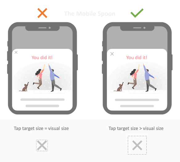 Close button too small for mobile UI | source: godesign.pk
Small buttons on mobile are a subtle but serious form of bad UI design. Inaccessible tap targets reduce task success and increase user drop-off, especially on mobile-first platforms.
Always consider a more responsive approach, for instance:
- Ensure tap targets are 44–72px.
- Provide enough spacing between interactive elements.
4. Bad Button Distinction
 Clear vs. unclear CTA button styles in UI | source: careerfoundry.com
One of the most overlooked bad UI examples is when buttons blend together, especially CTAs and secondary actions. Consequently, users can’t easily identify primary actions, which harms conversions and breaks visual hierarchy.
Improve this situation by doing these:
- Use high contrast for CTA buttons.
- Differentiate button size by priority: e.g., primary (72px), secondary (60px), and tertiary (42px).
Also Read: UX Audit Explained: What It Is and How to Do It
5. Overwhelming Clutter
 Cluttered vs. clean web design | source: liveactionrevival.org and lifehack.org
Overloading a UI with too many menus, widgets, or visual distractions is a classic case of bad UI design. As a consequence, users feel overwhelmed, struggle to focus, and often miss key content or actions.
Optimize your UI design utilizing these tips:
- Embrace whitespace for breathing room.
- Group content logically and reduce unnecessary elements.
6. Poor Contrast and Illegible Text
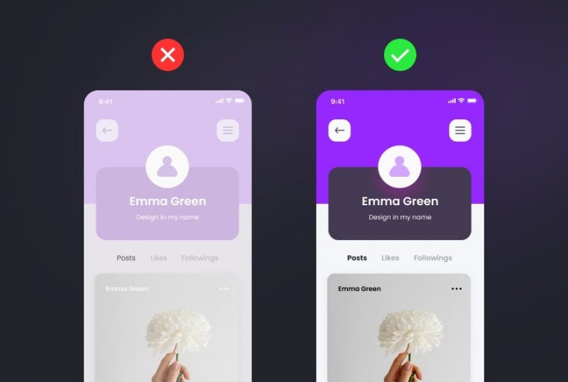 poor contrast UI text | source: altamira.ai
A low contrast between foreground and background colors or using an illegible font is one of the common bad UI design mistakes. Users, especially those with visual impairments, will struggle to read and abandon pages.
Ensure your UI design already does these things:
- Meeting WCAG guidelines.
- Incorporating readable serif or sans‑serif fonts and adequate sizes.
7. Unclear Navigation
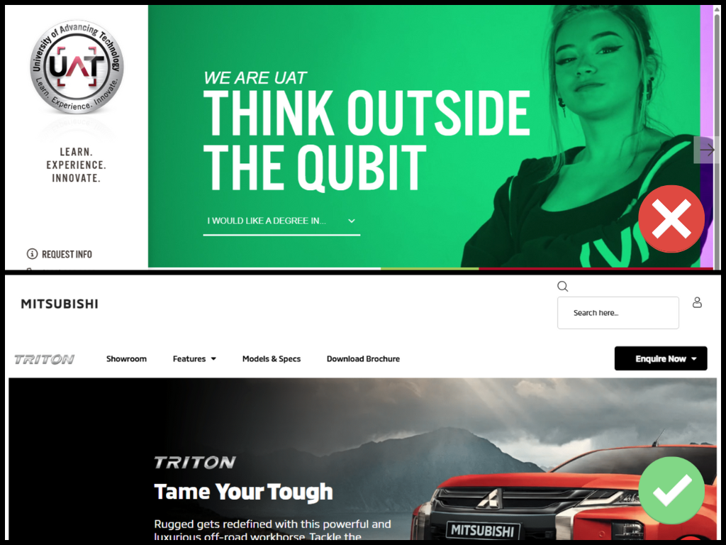 clear vs unclear navigation web design | source: uat.edu and mitsubishi-motors.co.za
The aesthetic-usability effect is when users perceive attractive interfaces as more usable, driving designers to go for the look over usability. For example, the University of Advancing Technology website looks sleek and modern but lacks intuitive navigation.
To avoid this bad UI design, you should:
- Balance design with clear, visible navigation.
- Label menus clearly and avoid hiding key links.
Also Read: 10 Inspiring SaaS UI/UX Projects That Nailed User Experience
8. Inconsistent Iconography
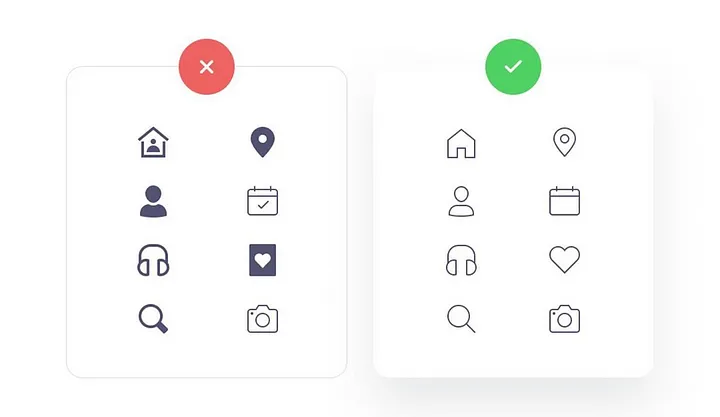 Mismatched icon styles | source: medium.com – Huy Nguyen
Inconsistent iconography is one of the bad UI design examples that designers tend to overlook. An inconsistent icon will confuse users about their function. Moreover, it makes your design look unpolished and unprofessional.
Make sure to:
- Adopt one icon library or style guide.
- Stick to universally recognized symbols.
- Use SVGs for crisp, scalable graphics.
9. Bad Alignment and Layout
 bad UI alignment | source: uxplanet.org
Misaligned elements, uneven spacing, and off-center sections make an interface a bad UI design. They make your design look messy. Even if functionality remains intact, a bad layout reduces perceived quality.
To fix this, try to:
- Align related items to a common edge.
- Test layouts on multiple screen sizes.
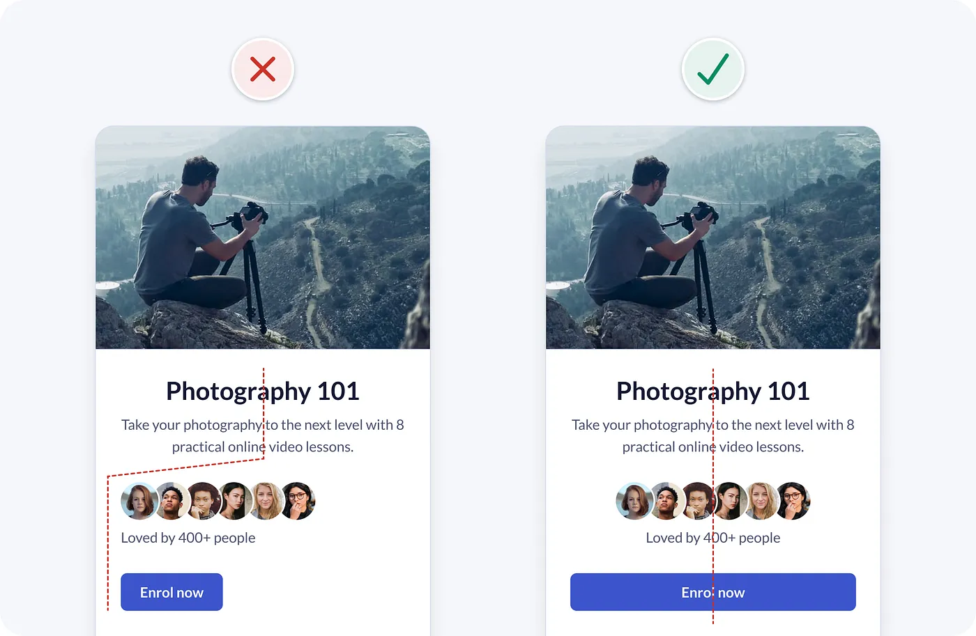
10. Low-Quality Images
 blurry images on a web page | source: gomycode.com
Blurry, stretched, or generic stock photos erode brand credibility and distract users from key messages.
Always adopt these things:
- Serve high‑resolution, optimized images per device.
- Favor original photography over generic stock.
Also Read: 7 Must-Know Best Practices for UI Design That Users Will Love
Fix the Flaws, Improve the Experience
Bad UI design can turn even the most powerful product into a frustrating experience. By identifying common design flaws, you can build interfaces that are not only visually pleasing but also intuitive and user-friendly. Prioritize clarity, usability, and consistency to ensure your design truly supports your users.
Remember, clear, readable typography is essential to any well-designed interface. A thoughtfully chosen typeface can improve navigation and make your UI feel more intuitive. If you want a better outcome, consider using typefaces specifically crafted to enhance UI/UX design.
Creatype Studio presents a diverse variety of fonts created with accessibility in mind. Whether you’re creating a simple mobile app or a complex web dashboard, our fonts feature various license and bundle choices to accommodate every stage of your project.


