Finding the perfect font for any project makes it stand out from the competition and can set a mood for a brand logo, website or other graphic design project. Typefaces come in a variety of looks, but there are a handful of classifications every designer should familiarize themselves with, including serif, sans serif, script and decorative.
5 Typeface Classifications to Study
Within each font type or varied styles. Although looking at a classification gives you a rule of thumb on which selections to use and when, pay attention to the personality of the font and if it matches the brand image. Ideally, you’ll recognize a font’s category simply by looking at its specifications.
There are thousands of different fonts available, and new commercially licensed fonts are being created all the time. Explore these five essential fonts:
1. Serif

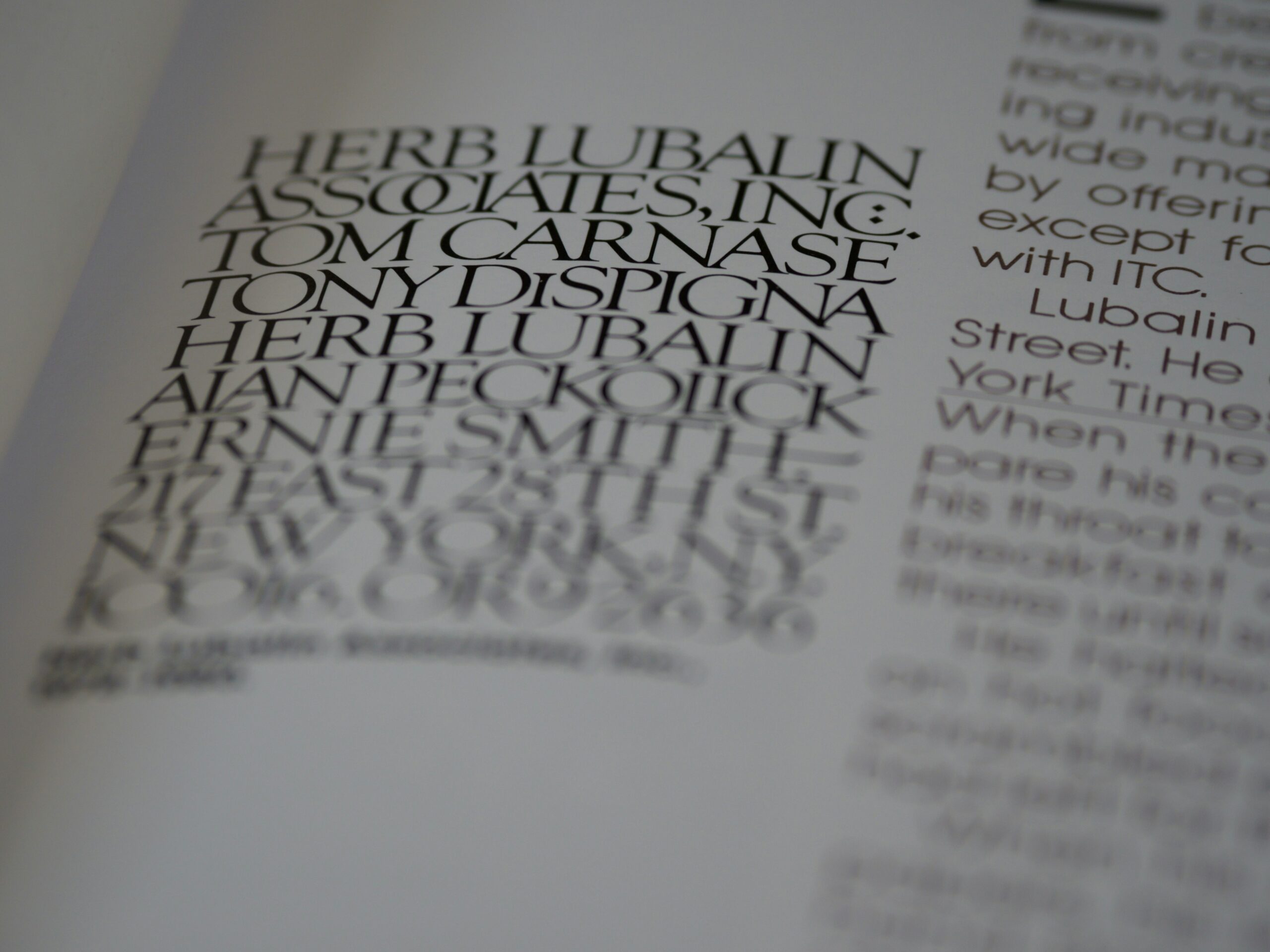
Serif fonts use small lines at the end of letter strokes. Serifs are known for excellent readability, but some may be harder to decipher in smaller sizes. You’ve likely experienced serif fonts in newspapers and many online journals. If you’ve ever written a college paper in Times New Roman or Garamond, you’ve used serif.
If you’re seeking a more traditional look, a serif font is the way to go. You’ll find some contrast between thick and thin strokes to set off certain letters and balance the flow of text. In addition to having serifs, these fonts are further defined by the serif type. For example, you might go with old style with wider embellishments or modern with smaller ones. Vogue Magazine uses the serif font Didot for its iconic logo.
2. Sans Serif

Sans serif fonts are simply strokes for letters without the extra lines. The result is a modern, rounded look that is easy to read.
Sans serif fonts are also best for accessibility. Since 13% of the population is neurodiverse, utilizing a font that’s easier for a dyslexic person or someone with a traumatic brain injury to read can make your site more accessible to all types of readers.
Sans serif fonts have a clean, uncluttered look. Letters appear smooth and uniform. Similar to other typeface categories, you’ll find sub-categories like humanist, grotesque, neo-grotesque and geometric. You’ll find sans serifs in digital documents for easier readability and a modern appeal. Google is a popular example of a brand using a sans serif font.
3. Script

Scripts look like handwriting or calligraphy. The letters flow from one into the next, connecting at some point on the letter line, like in the Coca-Cola logo. Many scripts are also decorative in nature, with swirls and ligatures that make them look fancy. These fonts are perfect for a heading on a wedding invitation or a logo that needs a fancy flair.
Many script typefaces slant slightly to the right. Rhythmic strokes mean that some letter parts are thicker than others, but the overall appearance is similar. Popular script fonts include Windsong, Lobster, Allura, Alex Brush and Dancing Script.
4. Decorative

Also called display fonts, decorative typefaces are meant to serve as something unique rather than readable text. You’d use a decorative font in a title or for added visual appeal in a logo. You’ll find many such fonts with unique shapes, designs and personalities.
Some decorative fonts are more readable than others and better suited to headings or logos. Take the time to step back from any design with an artistic focus to ensure it’s recognizable and matches the tone you want for a project. For example, the logo for the rock band Metallica is instantly recognizable.
5. Monospace

If you’re looking for something with a fixed width, then monospace type is for you. Each character you use takes up the same amount of horizontal space and has the same whitespace between each one, like the classic National Aeronautics and Space Administration (NASA) logo.
Popular monospace fonts include PT Mono, Source Code Pro, Roboto Mono, Courier and Inconsolata. Monospace typefaces work well to align columns of numbers and letters, creating a uniform look and making it easier to skim down quick facts and figures without losing your place.
Which Typeface Classifications Do You Prefer?
Designers have a tendency to pick a few favorite fonts. However, within each typeface category, you’ll find hundreds of options for your next design. Spend a little time trying out different ones and getting a feel for what matches the tone of your project and your client’s needs.
