Some of the worst logo redesigns in history have shown how a simple change can confuse loyal customers. In many cases, these redesigns strip away the brand’s original identity and recognition. As a result, consumers may feel disconnected or even disappointed. Therefore, rebranding without a clear strategy can backfire quickly.
Key Takeaways
- Poor logo redesigns confuse customers and reduce brand loyalty.
- Failed logo redesigns often lack vision and brand connection.
- Terrible logo redesigns teach valuable lessons to brand managers.
Also Read: 6 Logo Variations Every Brand Needs for a Consistent Identity
Before and After: 16 Worst Logo Redesigns That Missed the Mark
Whether it was a confusing concept, poor execution, or a loss of brand identity, these redesigns sparked criticism and backlash. Let’s take a closer look at the logos that serve as cautionary tales for designers and brand managers alike. On the left you’ll see the original, and on the right, the redesign.
1. Mastercard (2006 Trial Logo)
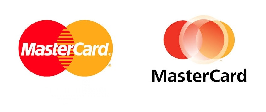
Mastercard Logo Redesign | Image Source: jackbleakley.com
Mastercard briefly tested a grayscale version of its overlapping circles. It looked outdated and lost the vibrant familiarity of the original. Public response was overwhelmingly negative.
2. Animal Planet (2008)

Animal Planet Logo Redesign | Image Source: designity.com
This is one of the worst logo redesigns that removed the elephant and went minimalist, losing its nature-centric identity. Many viewers felt it no longer represented wildlife. It was modern but lacked soul.
3. Capital One Bank (2008)

Capital One Bank Logo Redesign | Image Source: ebaqdesign.com
Capital One Bank added a swoosh over its wordmark in an attempt to appear modern. Instead, the generic arc drew comparisons to clip art. It quickly became an example of the poor logo redesigns lacking originality and purpose.
4. Tropicana (2009)

Tropicana Logo Redesign | Image Source: goproof.com
Tropicana replaced its iconic orange-with-straw visual with a bland, text-heavy design. As one of the most notable failed logo redesigns, it led to a 20% drop in sales and millions in losses. Consumers simply didn’t recognize the product on shelves.
Also Read: 6 Design Tips for Creating Unique Logo Typography
5. Myspace (2010)

Myspace Logo Redesign | Image Source: goproof.com
Myspace attempted a modern look by replacing the “space” with a literal blank underline. The design felt lazy and confusing to users. It failed to represent innovation or personality.
6. GAP (2010)
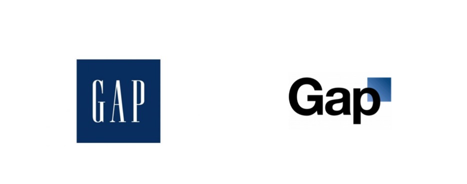
GAP Logo Redesign | Image Source: goproof.com
GAP’s sudden shift from its classic serif logo to a modern, Helvetica-based version sparked instant backlash. The new design felt generic and disconnected from its long-standing image. Within a week, the company reverted to its original logo.
7. Cardiff City Football Club (2012)
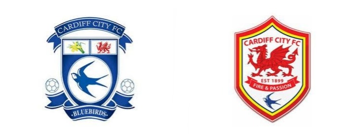
Cardiff City Football Club Logo Redesign | Image Source: clay.com
The Bluebirds changed their blue crest to a red one with a dragon that shocked fans. It ignored team heritage and sparked a backlash. Eventually, blue was reinstated due to pressure.
8. Yahoo! (2013)
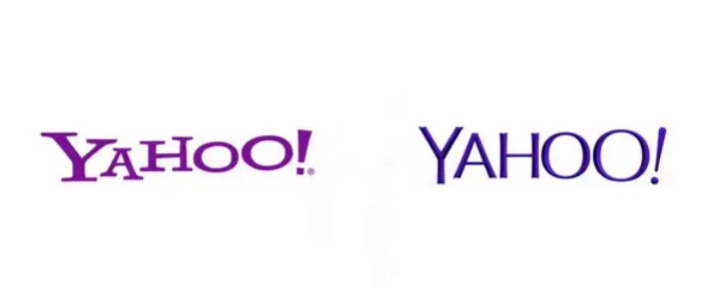
Yahoo Logo Redesign | Image Source: goproof.com
Yahoo’s rebrand aimed to modernize but failed to deliver any real creative impact. The amateur-looking font left users unimpressed. It lacked the personality and energy of the original.
9. Pizza Hut (2014)
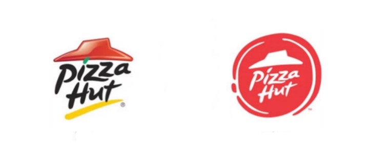
Pizza Hut Logo Redesign | Image Source: qubedagency.com
Pizza Hut’s redesign swapped its iconic roof logo for a brushstroke-style red circle. While intended to feel bold and fresh, many found it messy. It became one of the weakest logo redesigns due to its lack of clarity and brand recognition.
Also Read: 10 Logo Design Mistakes You Should Never Make
10. Google (2015)
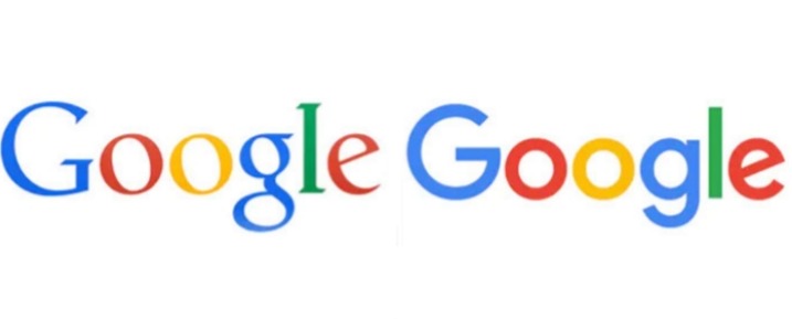
Google Logo Redesign | Image Source: goproof.com
Google’s switch from its classic serif to a geometric sans-serif logo sparked mixed reactions. While clean and scalable, many felt it lost the brand’s distinctive charm. Some even listed it among the worst logo redesigns for feeling too generic.
11. Coors Light (2015)

Coors Light Logo Redesign | Image Source: looka.com
Coors Light ditched its mountain-in-circle badge for a stripped-down design. It lost the rugged outdoor appeal that resonated with its audience. Sales saw little benefit from the shift.
12. Instagram (2016)
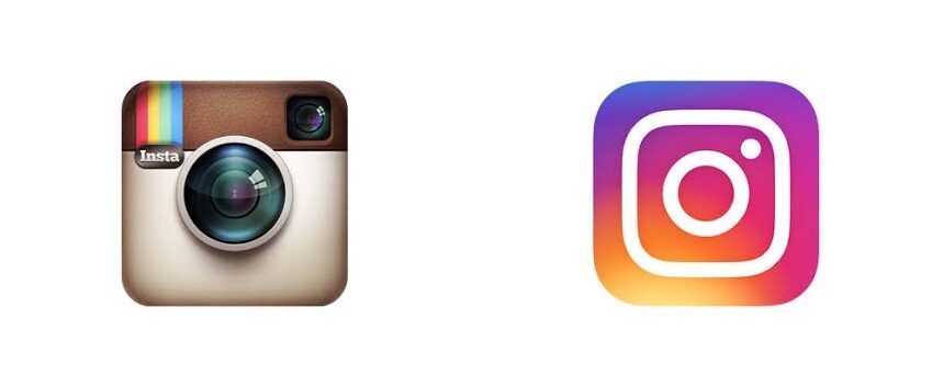
Instagram Logo Redesign | Image Source: goproof.com
Instagram shifted from its detailed camera icon to a simple gradient glyph. Many users disliked the abrupt change, calling it too generic. Over time, it became accepted but not loved instantly.
13. The US Open (2018)

The US Open Logo Redesign | Image Source: digitalsynopsis.com
The tennis tournament’s modern redesign removed detail in favor of sleek simplicity. Many felt it lost the dynamic energy of the old flame ball. As a result, it earned a spot among the poorest logo redesigns for being forgettable and bland.
14. Weight Watchers → WW (2018)

Weight Watchers Logo Redesign | Image Source: goproof.com
Rebranding as “WW” confused long-time users who didn’t understand the change. The name lacked clarity and emotional connection. This became an example of bad logo redesigns because a new identity felt corporate and out of touch.
15. Staples (2019)
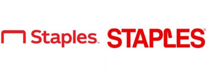
Staples Logo Redesign | Image Source: looks.com
Staples’ new logo featured a bent staple as an icon, which looked more like a paperclip. The visual metaphor didn’t land well with audiences. Critics called it uninspired and awkward.
16. HelloFresh (2022)
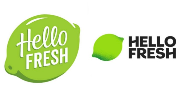
Hello Fresh Logo Redesign | Image Source: goproof.com
HelloFresh updated its friendly logo to a flatter, bolder version with heavy typography. Though modern, critics say it lost the fresh, organic feel it once had. Many users found the change abrupt and less approachable.
Also Read: 10 Logo Redesigns Strategy Without Losing Recognition
Don’t Repeat Worst Logo Redesigns, Plan Smarter!
Avoiding a bad logo redesign starts with thoughtful planning, brand understanding, and the right design tools. Many failed logos lacked typographic harmony or visual clarity. That’s why choosing the right font can make or break your rebranding efforts. A poorly matched typeface often weakens your entire visual identity.
Instead of risking your brand with random font choices, explore the high-quality fonts for logos collection by Creatype Studio. We offer everything from modern sans serifs to elegant scripts. Starting at just $25, our fonts are professionally crafted for clarity and impact.
Moreover, if your brand needs something exclusive, we also offer custom licensing solutions. This is ideal for agencies or businesses aiming for a unique identity that scales. So, before you risk ending up on a list of the worst logo redesigns, invest in fonts that support your brand’s voice and longevity!
