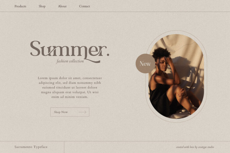
Everything readable that comes in the written form, whether it’s on the books, web searches, or mobile devices, belongs to the world of typography. So, what is typography? How are we able to digest written words from the way typography is arranged?
From event brochures to street signs, types can be found all around us every day. We frequently consider the capability of written words, but we seldom reflect on the behind-the-scenes of it and how the designer’s role in “echoing” the tone of said words or phrases are played there.
The thing is, a type designer worked through a long time and process to produce what they make. One approach they employed was to consider the connection between the appearance of the text and what the text mentions. Realistically speaking, different emotions, atmospheres, and moods can be vocalized merely through the type choice. It makes the whole discussion of typography so deep and dense, which is something we wish to tackle in this reading.
What is Typography?
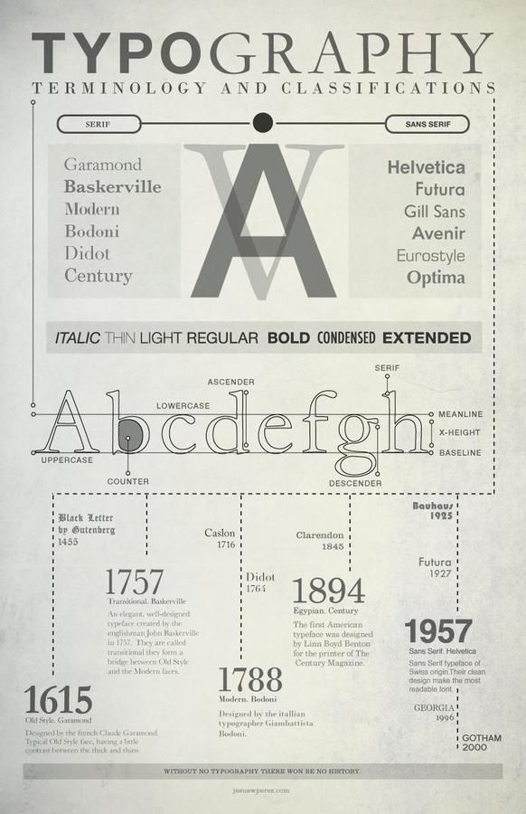
Let’s address the most basic question in this reading: what is typography? Typography generally refers to the technique and art of organizing characters and letters known as “type”—hence the word “typography.”
It can also mean different typography elements ranging from the letters’ size, line or paragraph spacing, and line length. Typography aims to produce readable text, and it’s a bonus point if it’s also interesting to look at.
Another thing about Typography is that it also comprises font structure, appearance, and style, which intends to draw out particular emotions and deliver certain messages. Shortly said, typography is what brings a text to life.
The history of typography goes as far back as the 11th century, especially throughout the reform of movable type. Before the digital age, typography was a singled-out craft linked to magazines, books, and public works. The first specimen of typography can be discovered in the earliest major book printed using mass-produced movable metal type in Europe, the Gutenberg Bible.
After it kick-started the typography revolution in the west, the development of typography has been highly significant to the point where it’s mainly associated with both the print and digital worlds. Thanks to the internet scene, we are all exposed to many creative inventions of the typography arts. Moreover, designers face abundant fonts and types at their disposal, allowing typography to be more visually diverse than ever before.
Brands and companies benefit a lot from paying attention to their typography process since doing so can help increase exposure to their product or service. In addition, various practitioners like writers, art directors, and graphic designers also focus on typography in the creative field.
Though today’s digital age has been enhancing organizing letters, the text’s representation sometimes still presents a huge challenge to conquer. Yes, it’s all about lettering and making things readable, but things can get complicated and overwhelming in practice. Everyone has a different perception of what they find visually readable and appealing, and great typography adheres to as many positive reading experiences as possible.
Why is Typography Important?
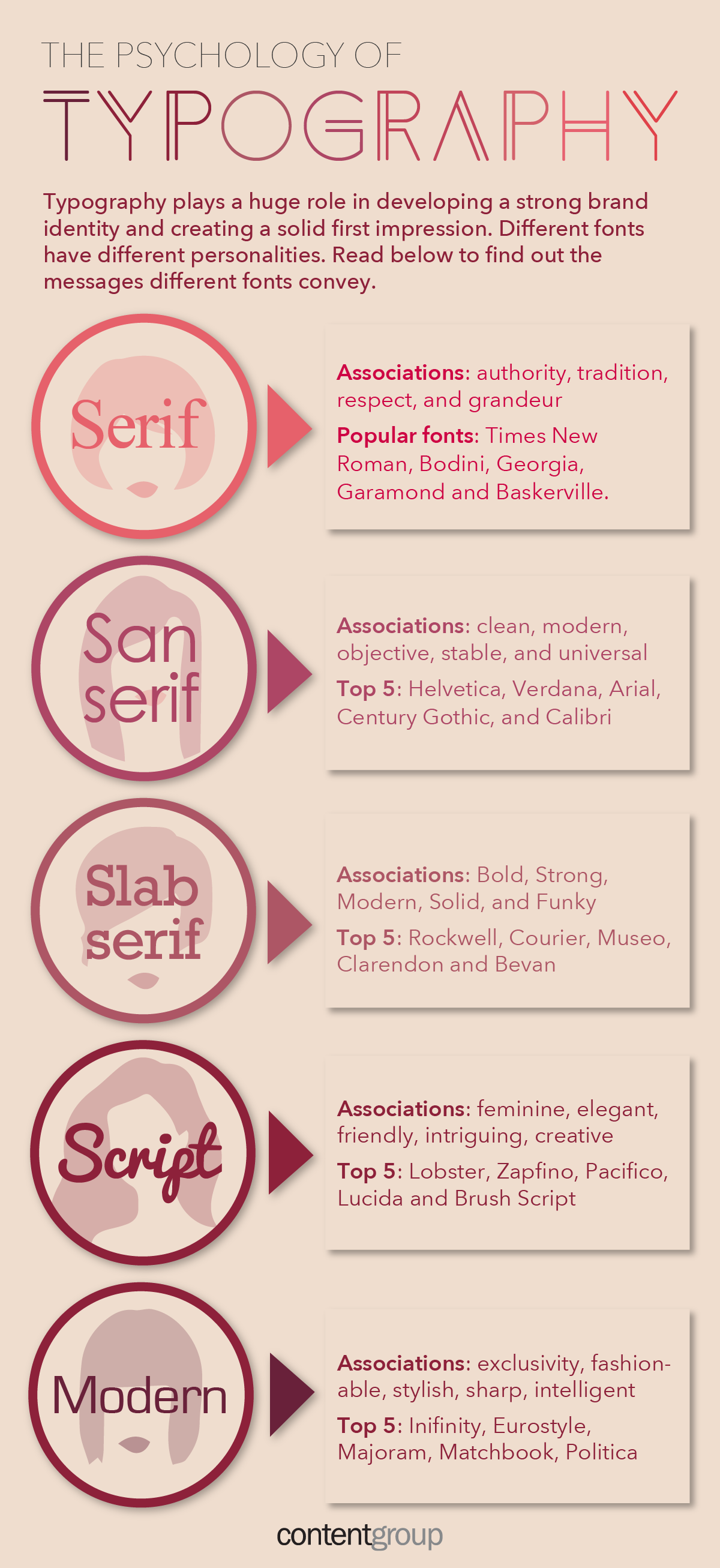
After understanding typography, you probably ask why you should even pay attention to it. Like, what do we even get by arranging fonts on a text? Isn’t it an automatic process where you type it out, print it, and put it up somewhere?
While the intricacies of dealing with typography depend on what you need, typography is so much more than just choosing beautiful fonts. We can not care about how our copies look, but our brand customers or audience will have difficulty understanding the message we wish to convey.
It’s undoubtedly a prominent aspect of user interface design, which, when done correctly, can set up a powerful visual hierarchy, supply a graphic balance to the website, and determine the product’s overall tone. Remember, typography should:
- usher and keep your users posted,
- optimize accessibility and readability, and
- guarantee a wonderful user experience.
Typography constructs brand recognition
Besides boosting your brand’s personality, great typography allows your audience to associate your selected typeface with your brand subconsciously. Therefore, it’s important to go with unique yet consistently arranged typography to help you carry your brand forward, set a solid user following, and grow trust with your customer.
Typography affects decision making
The way your audience takes in and discerns the information your text conveys is highly influenced by how you take care of your typography design. Eye-catching types, for instance, will present more persuasion than everyday fonts that we always find around us.
Typography holds the readers’ attention
When it comes to a printed ad copy or landing page, you recently created, well-put typography can be the determiner of how long your visitors keep reading them until the end. So make sure to have a visually memorable and stimulating typography arrangement so that your readers’ attention doesn’t go somewhere else.
The Different Elements of Typography
After answering the question “what is typography” and understanding its importance, here are eight essential typographic design elements you also need to pay attention to.
Fonts and Typefaces
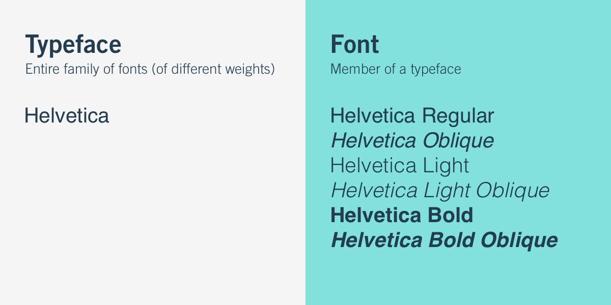
We honestly won’t blame you for not knowing the difference between fonts and typefaces. The two have long been confused for being synonymous anyway by many creative designers out there. However, typography is densely surrounded by these two terms. A font refers to a graphical representation of text characters, while a typeface is a design style containing many characters of varying weight and sizes. A typeface can be understood as “a family of related fonts.”
From millions of options out there, three basic kinds of typeface include serif, sans serif, and decorative. Unfortunately, using all three for typography design does more than harm, which is why designers often opt to do the opposite and keep decorative fonts to a minimum. Doing this will keep the interface streamlined and uncluttered, and your typography design becomes much more effective.
Hierarchy
Hierarchy in typography is also tricky, albeit important. Your text needs to have a visible discrepancy between leading your readers across the text when they’re reading. Especially in such an age of short attention spans, succinct and well-arranged typefaces allow your audience to digest the most important information in a short amount of time.
To establish hierarchy, you can focus on the text’s contrast, alignment, color, and sizing. The most common example of a typographical hierarchy is headers, which are always substantially bigger than the subheadings and body text.
Contrast
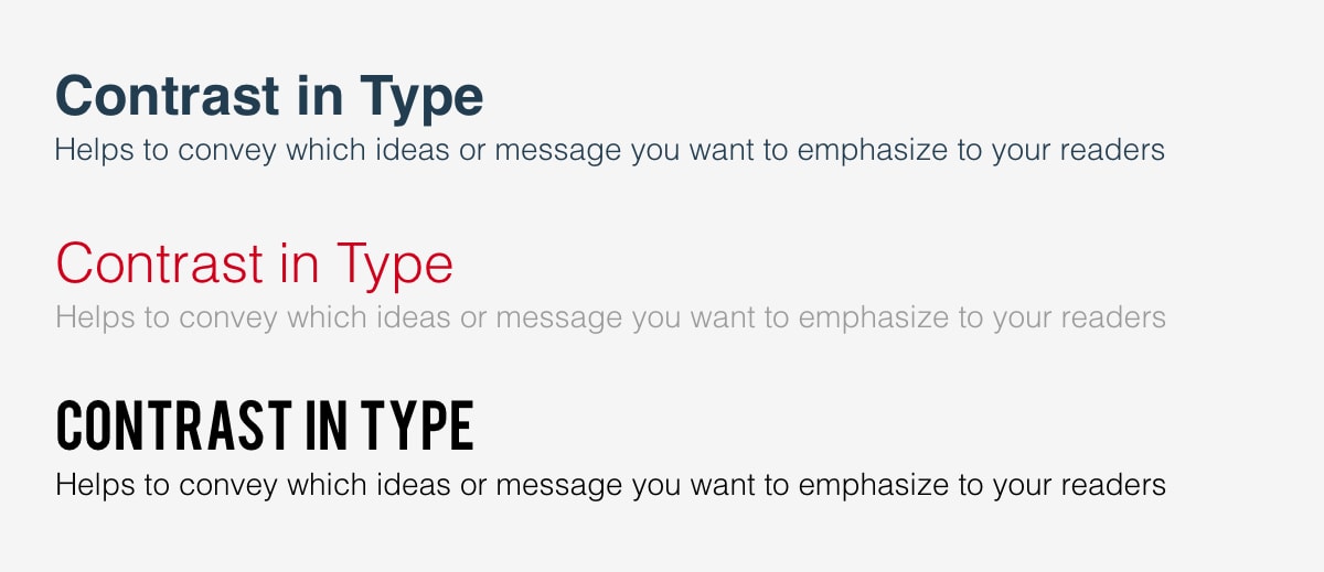
Ask yourself this: will you be interested to see a picture with no contrast whatsoever; everything is practically almost the same in color? Much like hierarchy, a contrast in typography can contribute to delivering specific messages or ideas you wish to accentuate to your audience.
Putting attention to contrast will make your text more attention-grabbing, meaningful, and interesting. And focusing on contrast can be tricky, especially when you’re playing around with varying sizes, styles, colors, and typefaces.
Consistency
There’s also nothing more frustrating other than a messy and confusing interface, which is why it’s important to maintain consistency in your typefaces selection. Sticking to one or similar font styles effectively delivers information to your readers because they’ll notice a pattern. You can experiment with your typography’s hierarchy as much as you want, but make sure it’s consistent.
White space
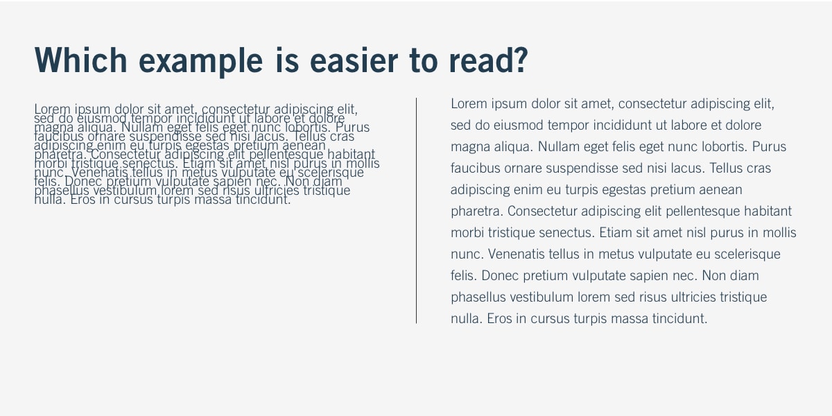
White space in typography is what you commonly see around graphics or text, which is why it’s also frequently referred to as the “negative space.” Well-thought typography makes sure your text is conveniently readable with an uncluttered interface. Proper white space increases the overall reading experience, and you can do this by simply thinking about the padding or margins.
Alignment
Alignment refers to producing and combining images, graphics, and text to guarantee equal distances, sizes, and space between each element. For example, for a brand’s logo, header, and body text to get perfectly aligned, many UI designers make a specific margin that adheres to industry standards.
Color
Lastly, it’s super important to focus on your color options because nailing this one can either make your copy stand out or completely throws it off the bus.
In general, color consists of three main aspects, which are saturation, hue, and value. Playing around with these three components is one thing, but efficiently balancing them is another in producing a legible and eye-catching text to read. One trick designers often do to test their text before publishing it is by viewing it in greyscale (colorless). From here, they’ll create tweaks if the copy is too light or dark against the background color.
How Do We Select the Suitable Typeface for Our Website?
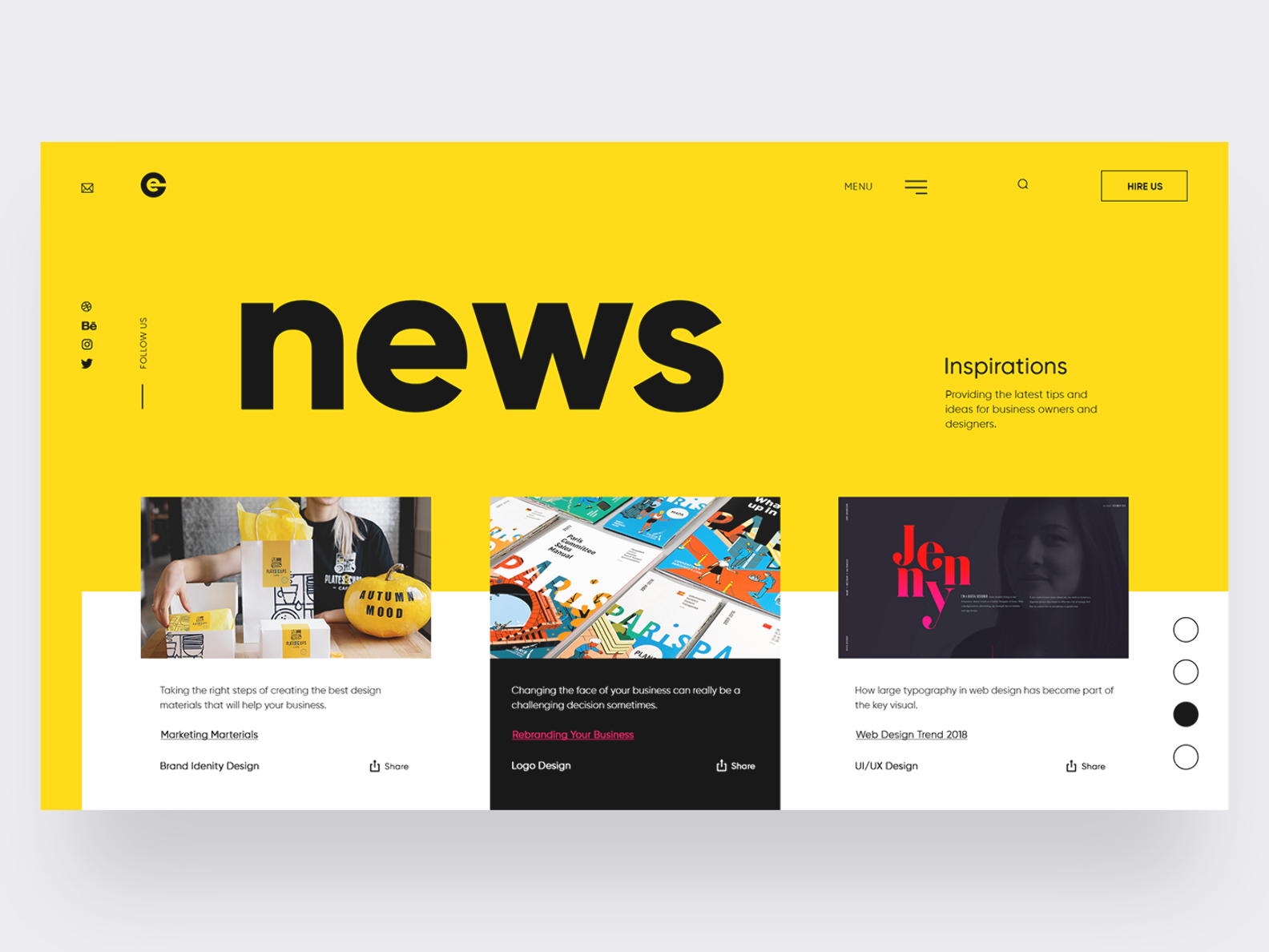
Now that we’ve understood every important typography element to consider, it’s time to get to the action of picking the most suitable typefaces for your interface. Undoubtedly, the problem with this is that there are millions of different fonts and typefaces on the internet to choose from. We’ll save you from this overwhelmed feeling by a few key considerations below:
Think about the personality
First impression matters when your website visitors or copy readers encounter your written material. How do you want them to feel? Do you want to exude a warm atmosphere? Or, perhaps do you want it to be highly serious and professional?
Whatever you want to do for this, it’s crucial to consider how typography itself mirrors your product’s or brand’s personality. If you aren’t sure where to start, it’s always helpful to specify the core traits of your brand first before collecting typefaces that reflect those characteristics. From there, notice a pattern or trend to be incorporated into your text.
Reflect on tone
Another thing to focus on is the tone, which should harmonize with your selected typefaces. For example, if you intend to deliver a serious message, a decorative or stylized font probably won’t be suitable.
Don’t disregard the function
The function is just as important as the form. There’s nothing worse than a copy that appears beautiful but is completely unreadable, which guides users to click the incorrect button or choose a different turn just because the directions were cryptic. Therefore, when determining what typefaces to incorporate in your interface, you should put the voice, aesthetic, and style aside and consider whether the font is accessible, readable, and legible.
Obtain external inspiration
It’s understandable if you’re still stuck even after reading all these tips you find on the internet. Typography design is a tricky business, and you want to be careful in finalizing this process. We hence recommend you take some time to observe what other designers are doing instead!
It doesn’t necessarily mean that you should copy their work or plagiarize their typeface selection. It’s all about opening your eyes and perceptions to the typography you read around you. Are there similar noticeable patterns? Can you determine which typography design is good and bad? What makes you think that way?
Take some time to test
Lastly, never publish your designs without putting them to the test first! You want your interface to be as final as possible so that you don’t have to re-do it just because of tiny minor mistakes. Consider gathering useful feedback from real users. Obtain clear insights into what works and what doesn’t. See what makes a text legible or clunky.
Conclusion
So, what is typography again? In the most basic sense, it’s all about how you deal with arranging fonts in your text to build a readable and interesting piece of information.
While it’s understandable that typography is often overlooked, we still highly advise you to pay attention to this particular design world. It is because we consider typography a crucial component of user interface design. Once you master this field, you’ll be on the right track to becoming a wonderful UI designer! Otherwise, you can improve your designs significantly and learn more about the typography world later.
