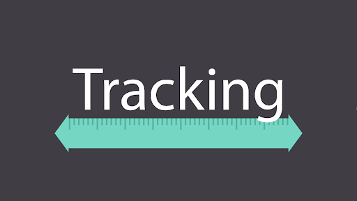
In terms of typography and graphic design, tracking is one of the basic techniques that designers have to master. Font selection can be considered an important thing as well, but the use of appropriate tracking typography can make your content easier to read and understand by the audience.
So, what is tracking in typography and why is this technique so important to master? To help you get the answer to this question, this guide was created. Without further ado, let’s start reading!
What is Tracking in Typography
Tracking is the adjustment of spacing between letters in a word or line. It is also generally defined as a term used to indicate how you reduce or increase the horizontal distance between a range of letters or characters.
![]()
Image Source: Medium
Unlike kerning, which adjusts the spacing between one letter and another. Tracking works to adjust the spacing of letters in a sentence at once.
With the tracking typography technique, you can increase or decrease the spacing in a sentence based on the design needs of your content. Typically, this technique is used by designers to adjust and perfect the letter spacing of logos, or fonts on websites.
Also Read: Difference Between Kerning Tracking And Leading In Typography
Why Does Tracking Important in Typography?
Tracking is a fundamental aspect of typography, and it can have a significant impact on the entire look and readability of the text in your design.
Adjusting tracking can help improve readability and enhance the whole look of your text or content. Additionally, tracking can also be used to change the whole texture or appearance of text blocks, such as creating a tighter or looser texture.
For this reason, tracking is an important typography technique that you should master. With this technique, you can create visual balance, improve readability, and change the texture or feel of your typography.
Tips for Tracking Typography
If you are a beginner graphic designer and are confused about where to start honing your tracking techniques, then you can follow some of the tips below.
1. Experiment with Tracking to Get the Right Balance in Your Design
It is especially important to experiment with tracking if you add text to your design. Different fonts and font sizes require different amounts of tracking, so it is important to personalize as much as possible.
Putting a focus on experimenting with tracking in all your designs will help you hone your skills. Plus, it will help you to create designs that are more visually appealing and balanced.
2. Consider the Differences in Form and Spacing Between Fonts
Just as said before, not all fonts are made equal and some might require either more or less tracking for a balanced design.
Due to this, it is essential for you to consider the specific characteristics of each font you are using before adjusting the tracking.
3. Use Different Tracking for Each Font
Using different tracking for each font in your design is necessary to create visual balance. That means customizing tracking for each font is much better than using the same tracking across all fonts in your design.
4. Combine Tracking with Kerning and Leading for an Attractive Look
Kerning and leading also take on an essential role in typography. For this reason, it is crucial for you to consider all three aspects when creating a design with text.
Adjusting just one element can disrupt the balance of the design, so make sure to make adjustments to tracking, kerning, and leading simultaneously for a well-polished design.
Also Read: What is Leading in Typography?
Tracking Typography Example
One of the most common examples of tracking in typography is using it to adjust the spacing between letters in a word or sentence.
![]()
Image Source: Envato Tuts+
Applying the tracking technique by spacing letters equally can provide a good visual balance. In addition, adjusting the tracking can also give the typography different textures and nuances.
Another example of using tracking typography is applying it to create a certain style in your design. Increased tracking can give a bold and impactful appearance while reduced tracking gives a tight and dense appearance.
Let’s Improve Your Design Quality with Tracking Typography!
Tracking typography is an important technique that graphic designers can use to hone their skills. Tracking creates a substantial impact on the overall look and readability of the content of your design. Adjusting tracking can bring about visual balance, boost readability, and modify the texture or nuances of your design.


