With the e-sport scene and gaming gaining popularity over the last couple of years, the demand for gaming-related content is rising. Gaming fonts, while not being an official term for this group of typefaces, are also enjoying the rise in popularity. Here are some fonts that will give your design project a gamers-approved aesthetic.
-
-
-
- Punchline
- The Rocky
- Evil Empire Regular
- Little Jack
- RACE SPACE Font Family
- Aquawave
- Firestor
- Dash Horizon Fon
- Loomattic
- VP Pixel Font
- Decoode Futuristic Display
- Fruiti Juicy Cut-Out Typeface
- Ekors
- Moonview Display Children Fun
- Acmatic
- Doodleland
- Hattrick
- GalacticaGrid Font
- Kayooh Japanese Display Typeface
- Battle Royale Font
- Modest Stencil Sans
- Halowyne Handdrawn Brush
- Voltec
- Glitcher
- Hiany Lau
-
-
Punchline
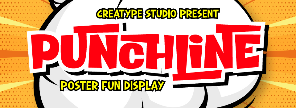
At a glance, Punchline gives a cartoon-y, comic book-esque feels due to its box shape and bold strokes. It also features uneven lines, making each character unique to teach others. When applied to big products like billboards, banners, or event posters, viewers would notice how fun and cute the font is, especially in a vibrant and colorful design.
Learn More
The Rocky
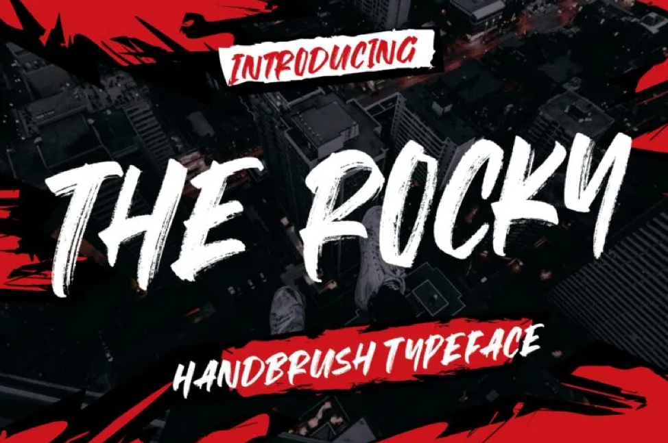
The overall design of the font itself might look quite common. However, the way the designer created this hand-brushed-style font makes it look like it came straight out of a story-driven game like Red Dead Redemption and Life is Strange. The hand-drawn aesthetic of this font is guaranteed to make your design project feel more organic and engaging to the viewers.
Learn More
Evil Empire Regular
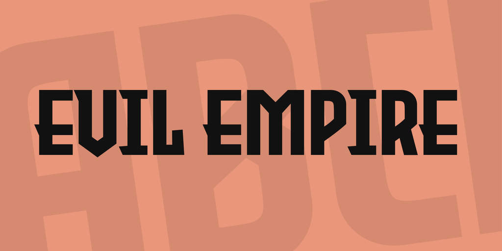
This somewhat retro gaming font is perhaps one of the simplest fonts on this list. However, the simple, boxy, and even shape of the characters with a little to no ornamental aspect gets the job done in a no-compromise style. Moreover, this font looks like something game developers would use for a mafia-themed as well as a horror/thriller game.
Learn More
Little Jack
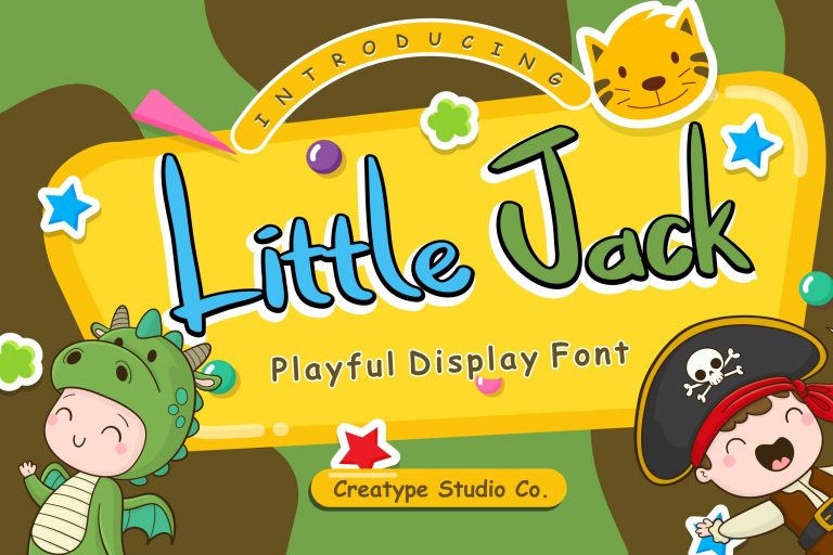
Little Jack is a playful display font suitable for content and media targeted at our little ones—no puns intended. The comically long and mixed case font would give your design project a joyful and active nuance. Combine Little Jack with a bright and colorful palette, and the little ones turn their attention to your finished design.
Learn More
RACE SPACE Font Family
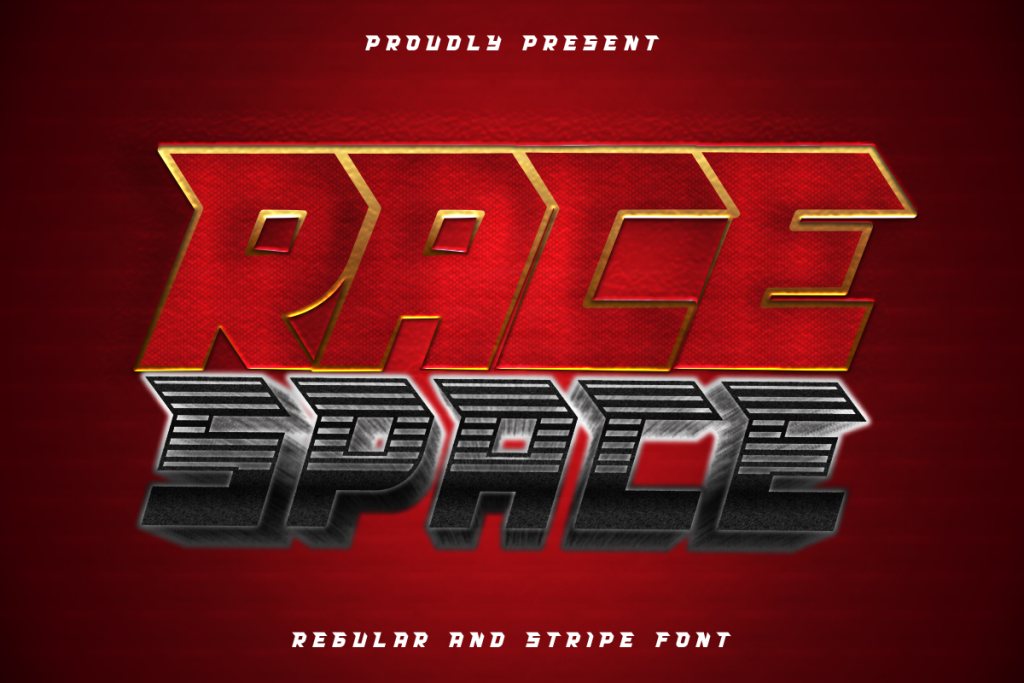
It’s bold, it’s eye-catching, and it looks like it came from the 80’s interpretation of the term ‘futuristic’. The blocky and tilted fonts, complete with its ornamental “helm,” give the design a feeling of dynamic movement. If you oversee a retro-futuristic design project for a ‘Back to the Future’ fan client, this font is perfect for your project.
Learn More
Aquawave
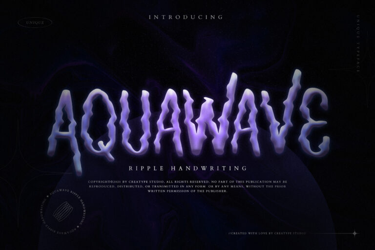
This ripple handwriting gaming font is here to help you create an extraordinary design. Like its name, this typeface looks like a reflection on a ripple. The unique shape of this typeface is guaranteed to give your design a point for quirkiness. This font is perfect for practically anything that wants to look different.
Learn More
Firestor
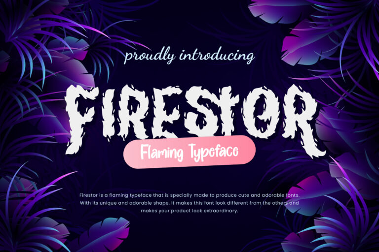
Don’t let the name fools you—this fire won’t burn your design to ashes or toast your computer. Rather, this flaming typeface is specially made to give your design a cute and adorable feel. The unique flaming shape of the font would instantly make your design projects—be it a logo, branding projects, event posters, or invitations—a head-turner.
Learn More
Dash Horizon Font
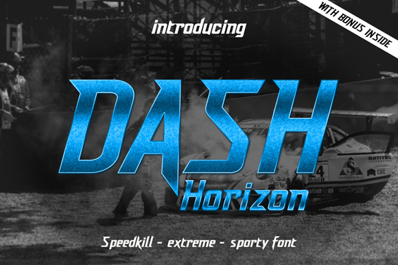
Another retro style font, the leaning characters of this gaming font look dynamic, sporty, and classic at the same time. This font is perfect for design projects that demand a retro yet futuristic feel embedded in it. A perfect use case for this font would be sports events, tech conventions, or even a YouTube banner.
Learn More
Loomattic
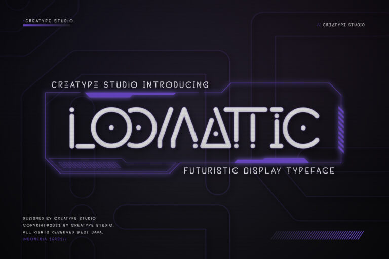
A futuristic display typeface, Loomattic is suitable for design projects or product logos for products that focus on technology, science, or anything that wants an extra futuristic feel. The unique shape of the characters will surely grab viewers’ attention without even trying, especially when combining neon colors for the font with a darker tint for the background.
Learn More
VP Pixel Font
![]()
This pixelated font was inspired by the technologies found in the 80s when computers were basically glorified calculators. It’s straight and simple, and it looks like it hates the term “hi-resolution” with a passion. However, this kind of aesthetic is the one that would attract gamers within a 50-meters radius. Choose between different types of pixelated squares or characters made from dots and design your own retro.
Learn More
Decoode Futuristic Display
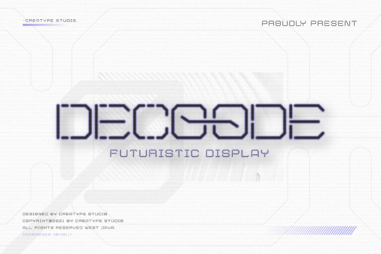
In case the font’s name itself didn’t give enough hints, Decoode is a gaming font that aims to give futuristic as well as high-tech feels to your design. This is the courtesy of its octagonal shape with a slim stroke that breaks apart in certain parts of each line. This font is perfect for design projects around technologies, science, or even sci-fi pop culture.
Learn More
Fruiti Juicy Cut-Out Typeface
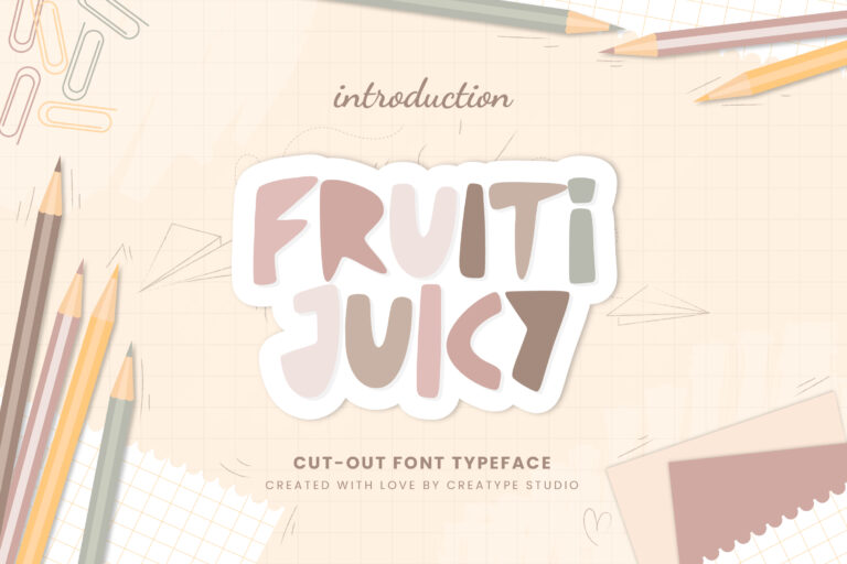
You might be thinking, “Wait, is this a gaming font?” and yes, it is, although this kind of blocky, bold, handwritten font is seldom found its way to the gaming scene. However, when they do, they are typically used in casual games. This font is no exception. This hand-drawn-style font is suitable for design projects that demand the subtle quirkiness of this font.
Learn More
Ekors
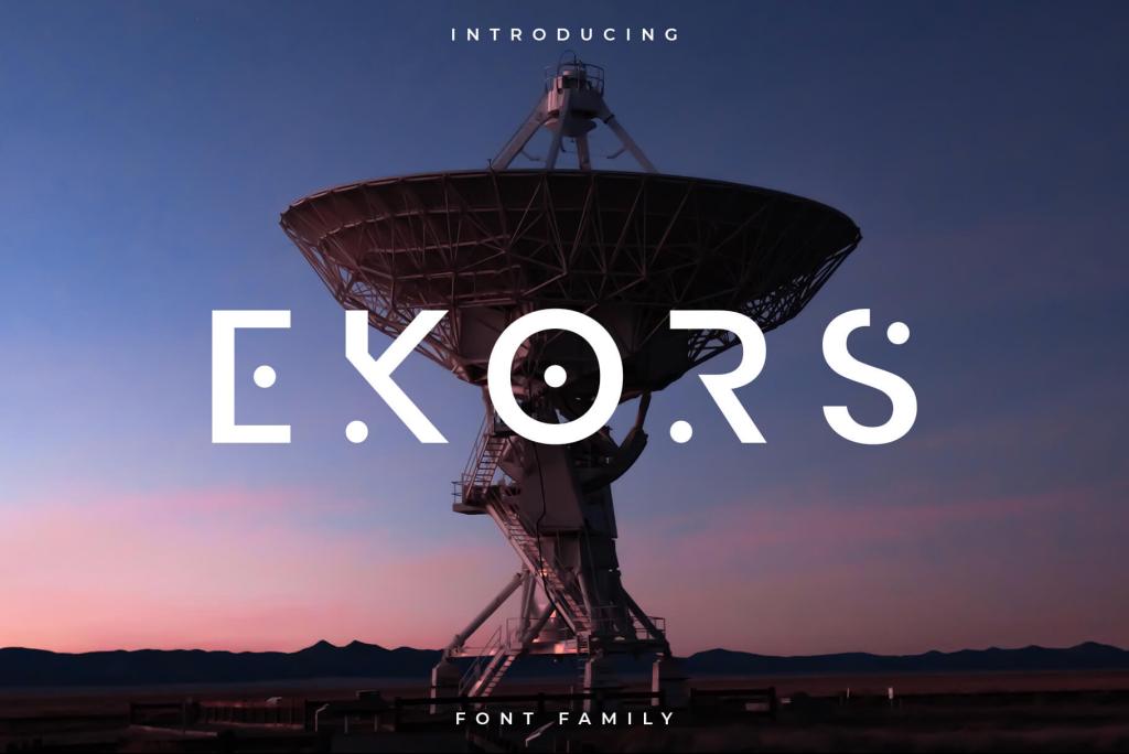
We are moving from retro-futuristic style fonts to a font inspired by 2010’s idea of ‘futuristic’. Ekors looks like a font that would be used in the interface of a spaceship. The font itself looks simple yet gives out so much character to the design. This font is suitable for any design project that wants to present a minimalistic and futuristic feel to the viewers.
Learn More
Moonview Display Children Fun
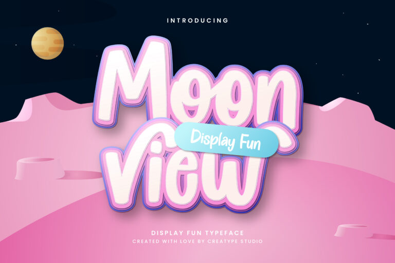
Moonview is a fun and cute font that can fit into various design themes. The uneven heights of each glyph, combined with the soft pastel color, would make the copy written in this typeface looks cute. As far as gaming fonts go, this font would work well in an interactive game for toddlers or any media targeted at children or new mommies.
Learn More
Acmatic
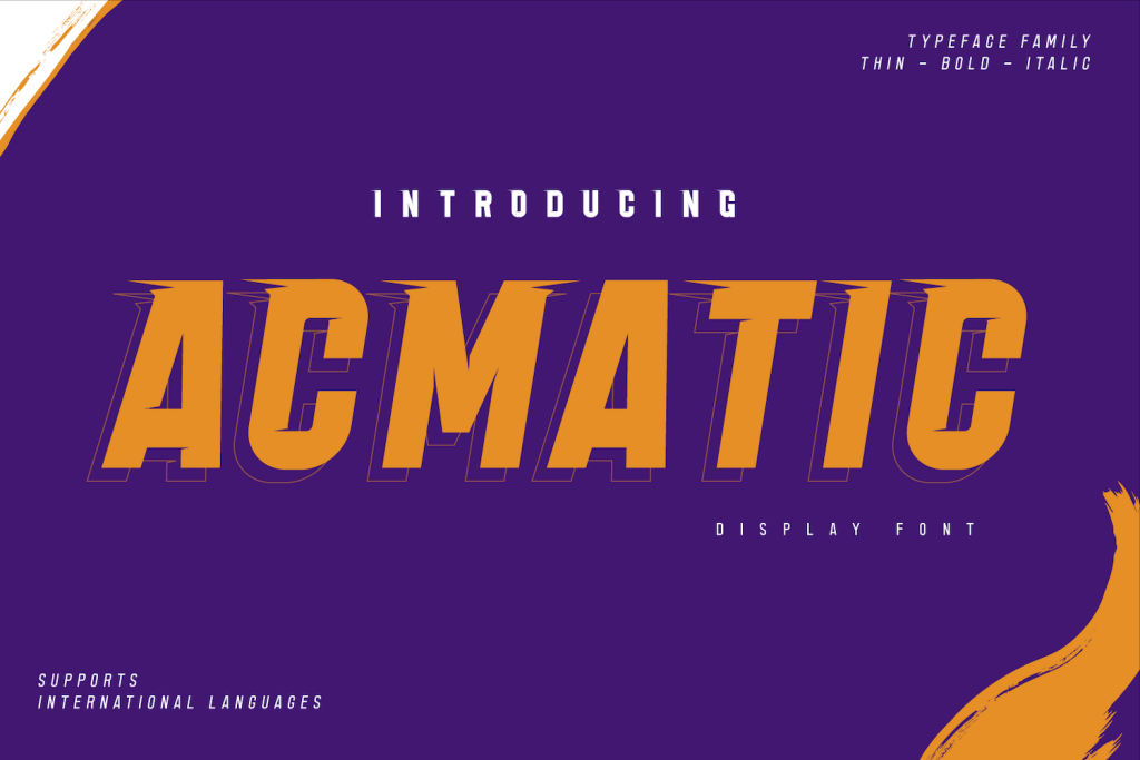
Acmatic is like Agent 47 from the video game series “Hitman”; bold, stoic, and gets the job done. You can choose between Acmatic Personal to send a bolder message with your design or use Acmatic Thin Personal for a more subtle approach.
Learn More
Doodleland
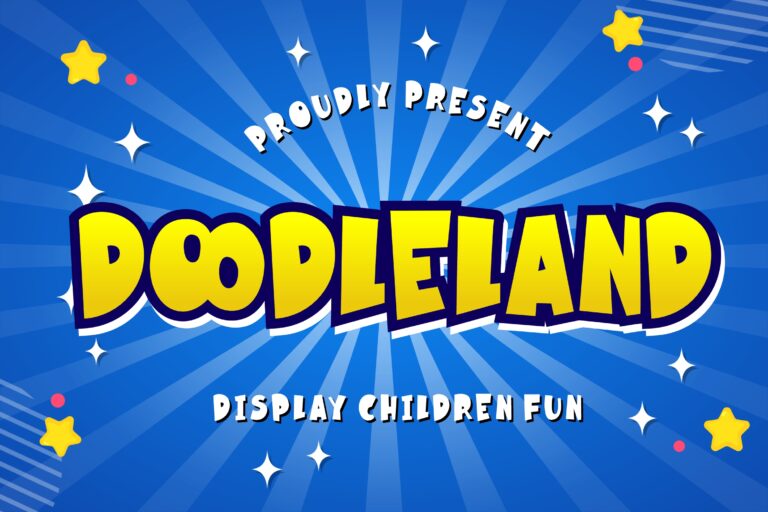
If you are looking for a font for children’s events or daycare decorations, look no more, Doodleland is here. The uneven heights, thickness, and defined outlines give this font a cartoony nuance. This font is suitable for branding projects, logos, or social media banners that want to give a fun and playful feel to the viewers.
Learn More
Hattrick
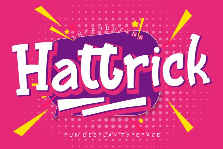
From school sporting events to interactive children’s games and children’s clothing brand logos, this font is suitable for any occasion that involves fun and playful activities. Each character features a thick and slightly curved stroke, making the font look organic and quirky. When combined with vibrant colors, your design would easily catch the attention of its viewers.
Learn More
GalacticaGrid Font
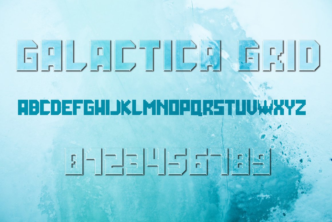
Retro gaming enthusiasts would love this gaming font for sure. Why? Because the bold, blocky, all-capital aesthetics were so common in the golden era of arcade games. Furthermore, this font is still suitable for any media that speaks about futurism, technologies, sci-fi, or even space explorations.
Learn More
Kayooh Japanese Display Typeface
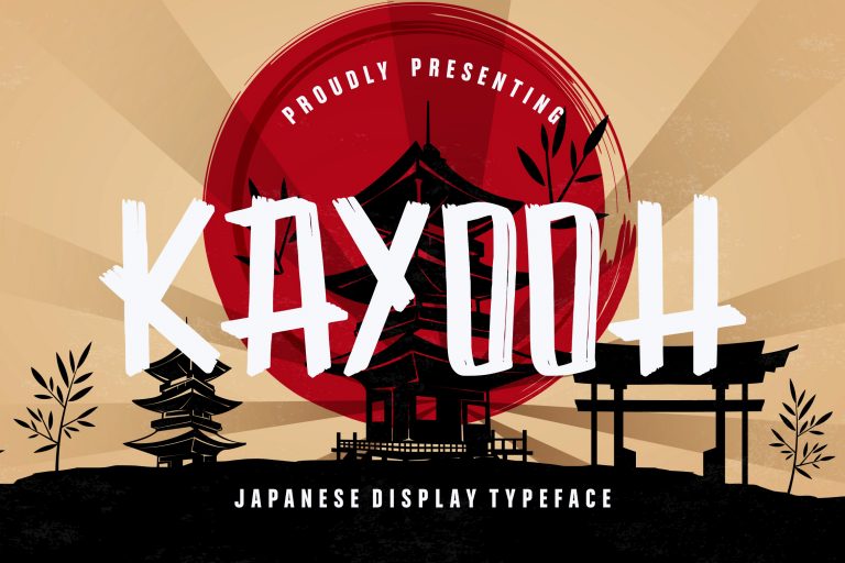
This font looks like it was written using a brush, and honestly, we love it. Consider using this font if your design aims at Japanese pop culture enthusiasts. The brush stroke gives this font traditional Japanese feelings and works exceptionally well with simple colors like black or white over a more colorful background. However, you might want to keep your overall design quite simple to pop out the font more.
Learn More
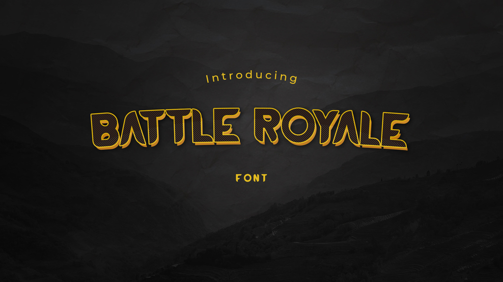
This font looks like it wants its drink to be shaken, not stirred. The all-capital font offers a bold, no-compromise attitude to your design. This typeface would look great on event posters, movie titles, game titles, café logos, etc.
Learn More
Modest Stencil Sans
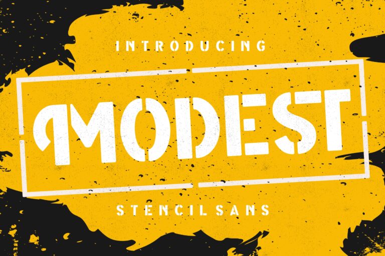
We have to admit that street cultures are among the most iconic in terms of design, and it shows in this font. This font, inspired by stencils often made using spray paint, is perfect for when you want to embrace street or urban cultures in your design, as well as underground music scenes and extreme sports.
Learn More
Halowyne Handdrawn Brush
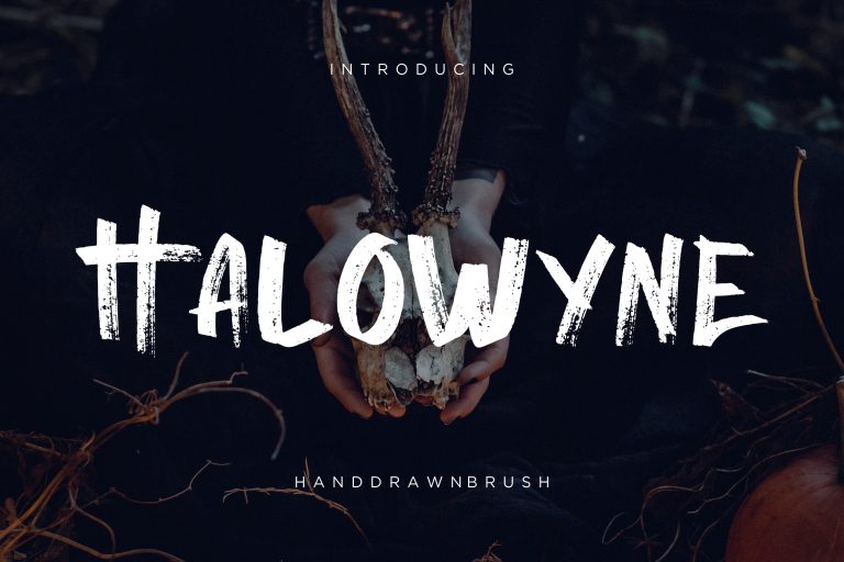
Bold hand-drawn brush fonts are usually difficult to tell apart. Yet, each and every one of them has its own feel and quirkiness, like this one. This font can be used to express different emotions depending on the color scheme of the design. Dark and gritty? A perfect fit for Halloween. Lush and low contrast? Your local conservation NGO will love it.
Learn More
Voltec
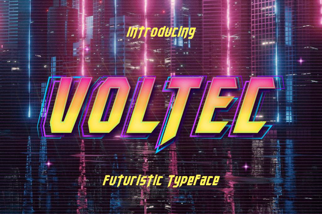
A sharp, angular, retro-futuristic aesthetic never gets old, especially in the era where everything seems like they want to go back to the 80s. You should consider using this gaming font for your next design project.
Learn More
Glitcher
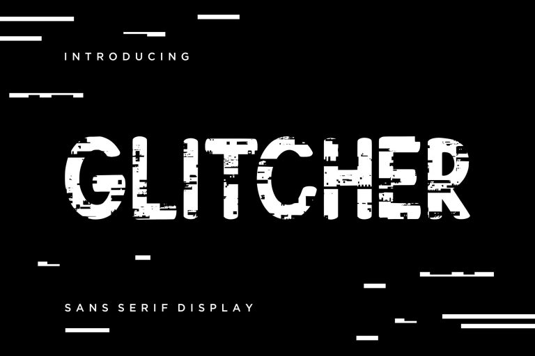
Glitcher, like its name, looks like someone hacked the system and managed to corrupt a bunch of files, making the display looks glitchy. The font would look great in media focusing on technologies, gadgets, or sci-fi cultures.
Learn More
Hiany Lau
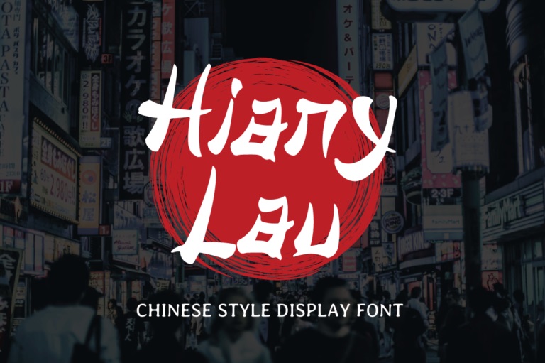
A font inspired by Chinese-style hand-brushed characters, this font would instantly give an oriental nuance to your design. You can practically use this typeface in numerous applications, but this font would look exceptionally good for Asian restaurant logos, menus, or decorations.
That wraps up our list of gaming fonts that would enhance your design project. What’s great about this list is that a lot of them are not necessarily created with the gaming scene in mind, so you can choose and match one of the aforementioned fonts to fit your design. Happy designing!
Learn More
