

Not sure if your website offers the best user experience? The Laws of UX helps you fix that through various relevant sources. A combination of interactive infographic icons and compiled resources for designers, Laws of UX offers a complete starting point for all designers to create the best user experience elements.
Laws of UX for Design Resources
The Laws of UX makes it easier for you to access design resources. Created by Jon Yablonski, this website collects various important elements of creating websites with the best user experiences. They are grouped into a giant interactive infographic, complete with large, colorful icons.
Each icon represents principles, design theories, and cognitive features that hold important roles in web designing. You can tap each icon to access all resources related to that theme. It creates a modern, uncluttered look main page look.
Which one would you choose to access information about web design? The boring, cluttered website or the one with unique, interesting icons like Laws of UX? Thanks to the interesting, modern look, this website is a great resource for your design project!
Main Features of Laws of UX
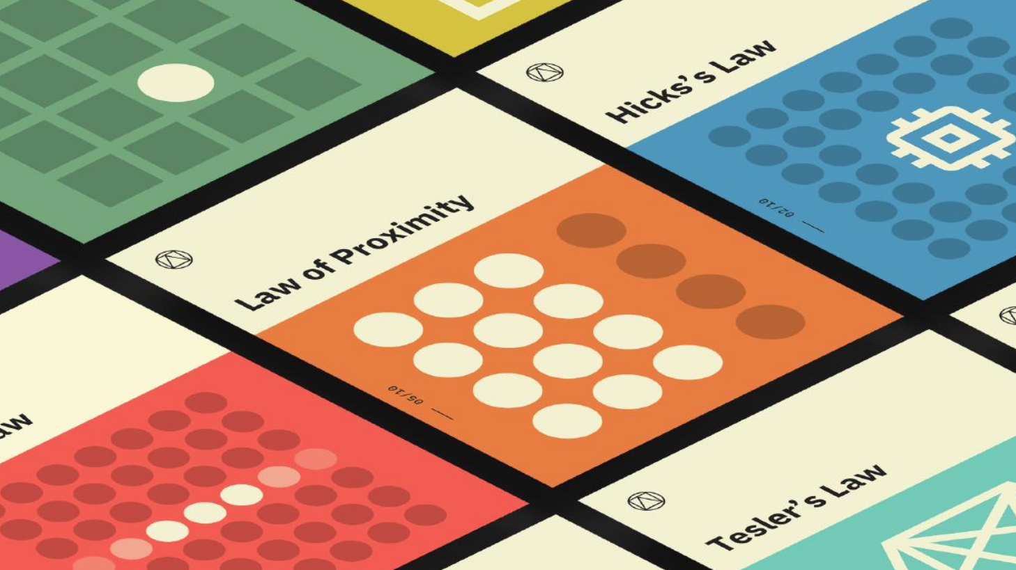
When you open the main page, you will be welcomed by large square icons grouped into four major themes. They consist of:
1. Heuristics
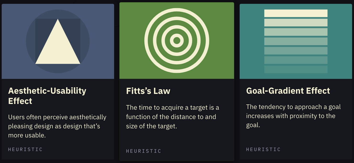
The heuristics icons cover theories about the perceived usability of your web design. They determine the level of usability in a design based on how visitors interact with the website. For example, the Aesthetic-Usability Effect explains why users think that aesthetically pleasing websites have higher quality. Fitts Law describes the comfortable designs of “touch targets”, which must be big and spaced enough to be used comfortably on the webpage.
2. Principles
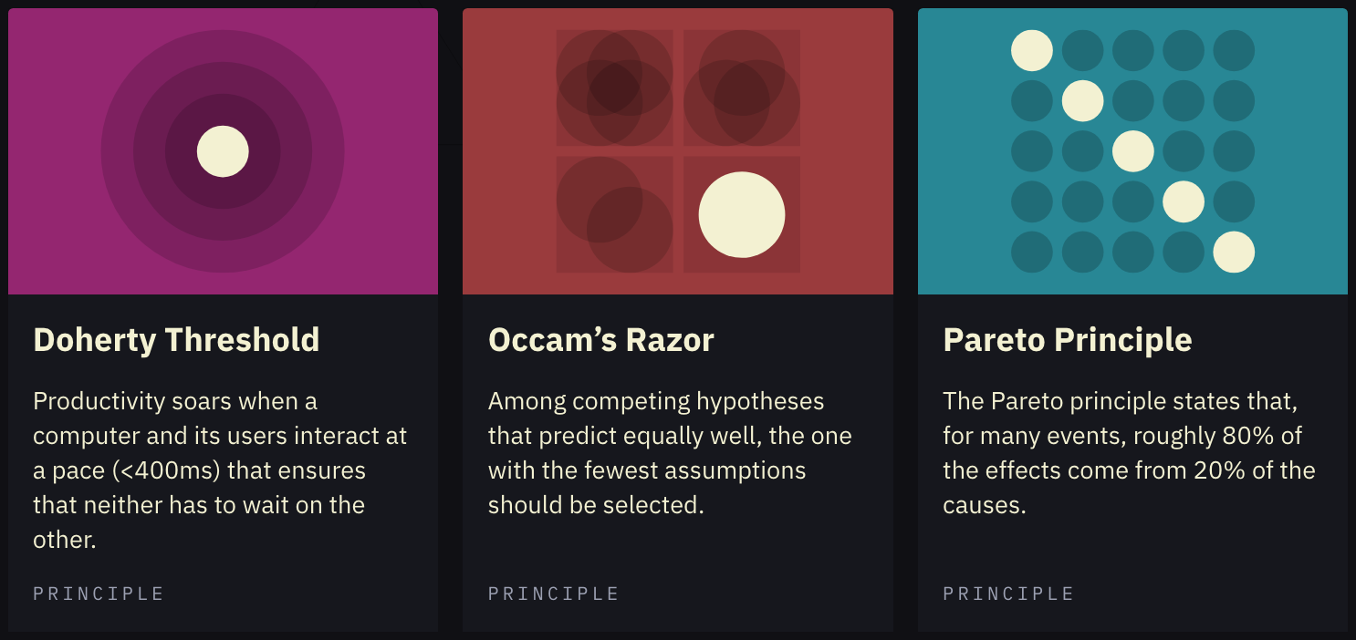
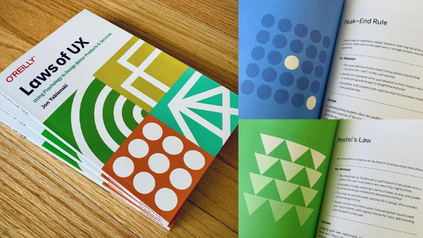
Principles cover everything a designer must know to create an ideal webpage composition. Icons that cover Principles include Tesler’s Law, which depicts a certain level of necessary complication in web design, or Postel’s Law, which considers the alternatives of several possible actions by web visitors.
3. Gestalt
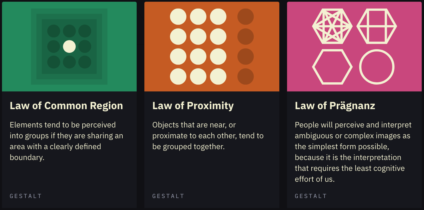
With Gestalt icons, website visitors will learn about things they need to keep the design elements harmonious when viewed as a whole. For example, the Law of Prägnanz depicts how users will always take the simplest interpretation of difficult design elements. Meanwhile, the Law of Proximity states that objects that are situated close to each other will be grouped.
4. Cognitive Bias
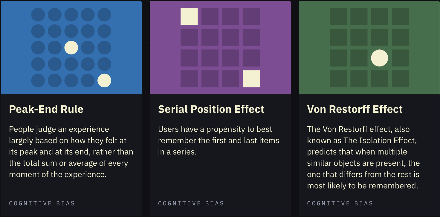
Finally, the Cognitive Bias icons take you on an interesting journey about how users view the website designs using their own cognitive biases. For example, in the Von Restorff Effect icon, an object that looks different compared to the rest will be easily remembered, even in a crowd. Zeigarnik Effect depicts how people will remember something incomplete or damaged when looking at a design.
There are still several icons on the Laws of UX website. Open one, and you will see simple explanations paired with several online resources specific to that topic.
Why Using Laws of UX?
User experience is considered an important thing in design. If you are new to web design, exploring these design principles will be easier because of interactive icons, inserted online resources, and simple design. Each icon also provides a helpful definition that you can use to understand the elements of design.
Laws of UX is web-based, so you can learn stuff without downloading. Create a website with the best user experience by following these written rules on the Laws of UX webpage.


