
As Katy Perry unveiled her single “Never Really Over,” she embraced a personal vibe that spoke to self-discovery and healing through her dream-pop roots. The cover art, featuring the Jelytta Handwritten Script, captured this emotional journey with its handwritten look to forge a bond with listeners.
Also Read: 17 Best Handwriting Fonts for Your Authentic Designs
The Story Behind the Single’s Artwork
 Source: Creatype Studio
When Katy Perry released the Zedd-produced single “Never Really Over” in 2019, it signaled a powerful shift toward personal vulnerability and authenticity. Perry described the song’s thematic foundation as touching upon the “age of Aquarius, new age, esoteric, California, healing”, which is a narrative centered on self-discovery and accepting past relationships as lessons in growth.
The track was teased with “bursts of bright colors and flower-filled aesthetics”, confirming a visual return to her “dream-pop era” with a newly vulnerable lyricism.
This deeply personal emotional message demanded an equally intimate visual identity. The cover art, rich in color and organic imagery, required a design element that could anchor the vulnerable mood.
The solution was found in typographic contrast. Unlike bold, blocky fonts that signify rebellion, the handwritten style is essential for creating a “personally organic feel”, aligning with folk or singer-songwriter genres. This style is psychologically powerful because it mimics the act of human handwriting that signals vulnerability by stepping away from the polished, corporate mold.
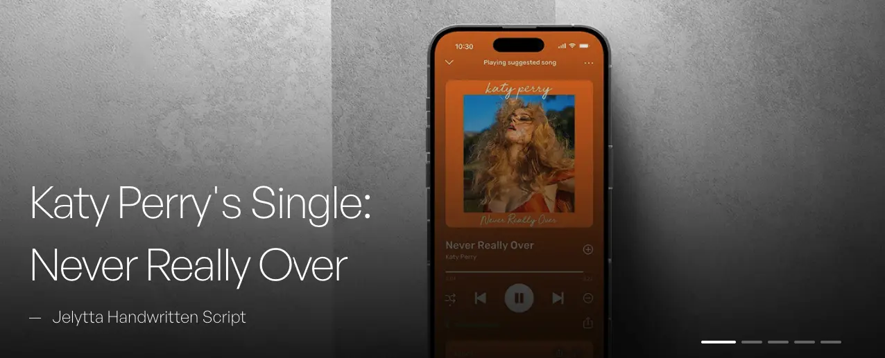
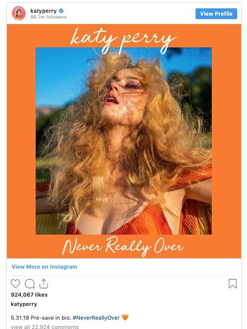
Katy Perry Never Really Over Cover design used handwritten typography, Jelytta Handwritten Script, to visually connect with the audience to feel the artist’s genuine struggle.
Also Read: 17 Modern Serif Fonts for Elegant and Stylish Designs
Why Jelytta Works for Music Branding
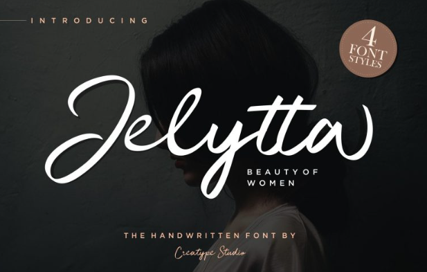
The Jelytta Handwritten Script, developed by Creatype Studio, was the specific typographic choice to achieve this intimate connection. Jelytta’s form is inspired by the “beauty of women with all their softness”, providing the elegant and sophisticated curve that reinforces the emotional concepts of the song.
Handwriting fonts thrive because they mimic real human writing that engages with the brain’s social-emotional processing center. They elicit powerful emotions like nostalgia, warmth, and trust.
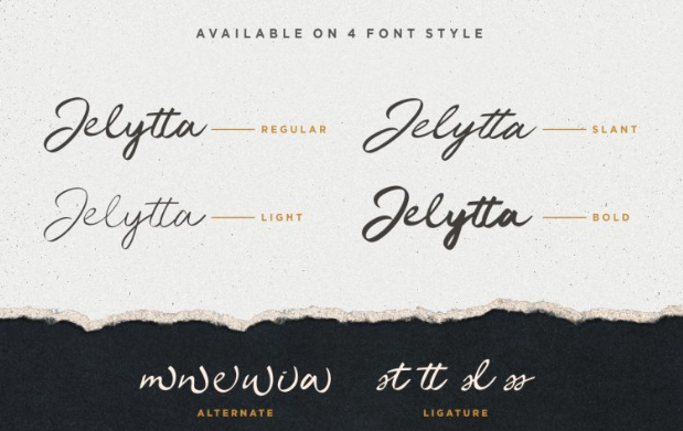
The use of Jelytta, a script that includes ligatures and alternates, is for spontaneous character flow, which gives the cover an unpolished authenticity. This organic nature creates immediate empathy and memory retention, so the audience can “feel” the song’s therapeutic theme before they even read the words.
Also Read: 5 Typeface Classifications That Every Designer Should Know
Design Breakdown
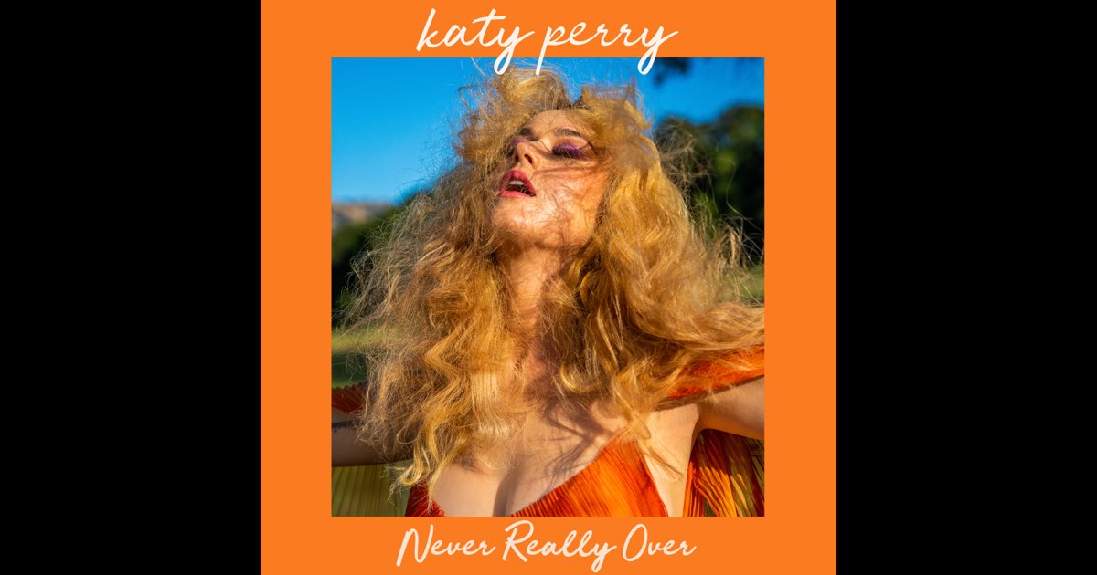 Source: Apple Music
The cover art is a masterclass in using type and imagery to set the emotional tone. The photo itself is saturated with warm, golden-orange tones, recalling the “bright colors and flower-filled aesthetics” noted in the release. The Jelytta handwritten script for the album title is layered over this vibrant image, striking a perfect balance.
The deliberate choice of a flowing script against the rich background reinforces the overall psychological impact, like a message of emotional authenticity.
Also Read: Jelytta Handwritten Font Brings a Playful Look to the POND’S x Maudy Ayunda Collaboration
Final Thoughts
The strategic deployment of the Jelytta handwritten script on the “Never Really Over” cover proves that typography is a fundamental tool for shaping emotional narratives in music.
The single choice of a handwritten script successfully translates the personal, vulnerable theme of the song into an immediate, empathetic connection with the audience. This strategic alignment establishes a unique visual identity for the musician. Use Jelytta Font to give your next creative project a heartfelt touch.


