
Design trends come and go, but Japanese graphic design continues to inspire creators worldwide. Its balanced simplicity and cultural depth offer a refreshing perspective that still feels timeless and relevant today. In this article, we’ll explore this design style in depth and look at how you can apply its principles to your own projects.
Key Takeaways:
- Japanese design emphasizes simplicity, balance, and cultural symbolism.
- Typography choices strongly influence how authentic the aesthetic feels.
- Minimal layouts and traditional motifs help adapt the style across modern media.
Exploring the Essence of Japanese Graphic Design
Blending tradition with modern aesthetics, Japanese visual culture offers a distinctive mix of clarity, symbolism, and restraint. Its influence can be seen across branding, fashion, art, and digital media.
At its core, Japanese graphic design is guided by principles of simplicity, balance, and quiet elegance. Many designers lean on minimalism and intentional negative space, echoing the calming spirit of nature and traditional arts such as ukiyo-e woodblock prints and sumi-e ink painting.
Unique Characteristics of Japanese Design
These defining elements capture the unique characteristics of Japanese graphic design and demonstrate how it differs from global design trends:
- Minimalism: Layouts stay clean and purposeful, with each element chosen for meaning rather than decoration.
- Negative Space: Empty areas aren’t gaps; they’re active components that sharpen focus and create visual impact.
- Asymmetrical Balance: Inspired by classical art, compositions often avoid perfect symmetry, producing a natural sense of movement and energy.
- Precision and Craftsmanship: Designers approach every detail with care. Hierarchy, spacing, strokes, and textures are refined until they feel just right.
- Tradition Meets Modernity: Classic techniques like ukiyo-e and sumi-e blend seamlessly with digital tools, creating work that feels both familiar and innovative.
Also Read: Respectful Design for Sensitive Topics: Graphics and Typography Considerations for Serious Content
4 Essential Visual Elements
Japanese graphic design relies on visual cues that feel both intentional and deeply cultural, shaping how each piece communicates mood and meaning. Below are some of the key elements that define this aesthetic.
1. Color Palette
Many designers highlight bold reds, deep blacks, and soft whites—tones tied to Japan’s national identity and long-standing artistic traditions. These colors often symbolize purity, strength, contrast, and elegance, depending on the context.
2. Traditional Patterns
Traditional motifs continue to enrich contemporary works, especially in branding, textiles, and packaging. Some well-loved patterns include:
- Seigaiha (Blue Waves): Symbolizing resilience and calm.
- Asanoha (Hemp Leaf): A geometric star pattern linked to growth and protection.
- Kikkō (Tortoise shell): Hexagonal shapes representing long life.
- Shippō (Seven Treasures): Interlocking circles for harmony and good fortune.
- Sakura (Cherry Blossom): A poetic symbol of renewal and impermanence.
- Kanoko (Fawn Spots): Delicate dotted patterns associated with grace and status.
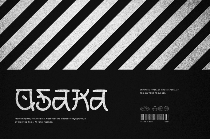
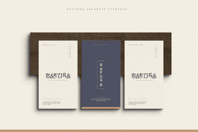
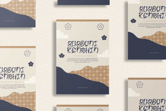
3. Typography
Typography in Japanese graphic design often draws on brush calligraphy. Whether built from kanji characters or Latin type inspired by brushstrokes, the style leans on bold, sweeping forms that naturally command attention.
Also Read: What Is Leading In Typography? With Rules and Examples
4. Ukiyo-e
The influence of ukiyo-e remains unmistakable. Its flat colors, expressive outlines, asymmetrical cropping, and nature-inspired framing continue to shape modern visuals. Many designers reinterpret these hallmarks in contemporary branding and editorial work, proving that its artistic DNA still thrives today.
Examples of Japanese Graphic Design in Modern Applications
Japanese aesthetics appear across many creative fields today, each medium interpreting the style in its own way. Below are practical examples showing how its principles translate into real-world visuals, from branding to fashion.
1. Hangtag
This design uses clean geometry, muted colors, and precise spacing, reflecting the calm refinement typical of iconic examples of Japanese minimalist design while keeping the brand identity clear and memorable.
Also Read: Design Psychology: 7 Visual Elements That Drive Action
2. Book Cover
A book cover may pair bold calligraphic typography with generous negative space, creating a balanced composition that feels poetic, modern, and deeply connected to traditional visual storytelling.
3. T-shirts
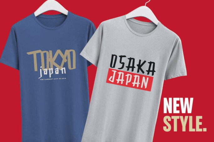
Graphic tees often feature stylized kanji, abstract wave patterns, or brush-inspired motifs, providing a contemporary yet culturally grounded look that feels expressive without overwhelming the viewer.
4. Packaging
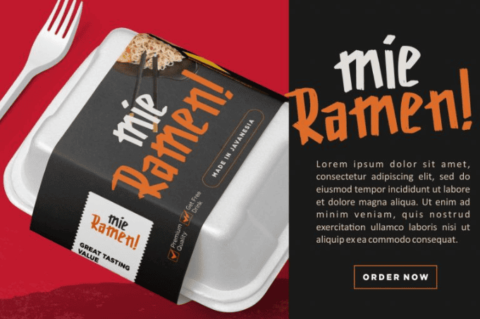
Japanese-inspired packaging frequently blends restrained layouts and tactile textures, resulting in a premium appearance that highlights craftsmanship and the care behind the product.
5. Food Posters
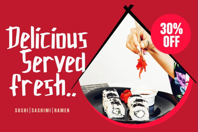
Food posters often pair vibrant imagery with minimalist grids, creating an appealing visual balance. With clear hierarchy and refined typography, they celebrate flavor while maintaining strong visual clarity.
6. Music Album Cover
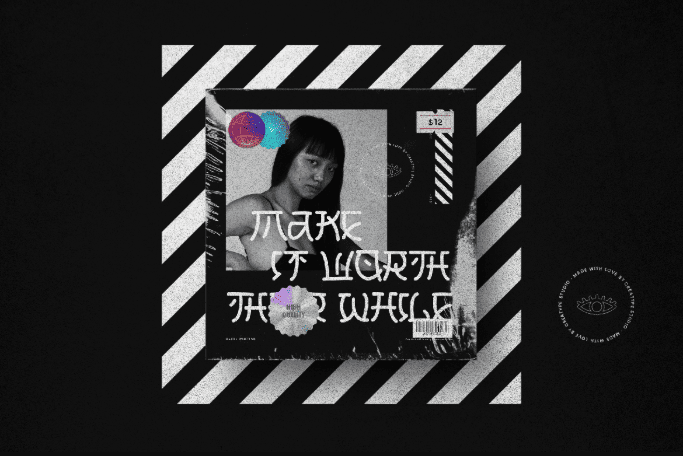
Album artwork may blend hand-drawn strokes, atmospheric textures, and subtle symbolism, echoing techniques found in influential Japanese designers and their work, giving the music a strong visual identity.
7. Fashion Banner
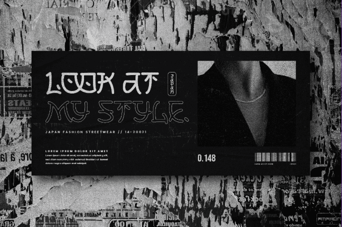
A fashion banner typically uses sleek typography, soft gradients, and asymmetrical composition, creating a dynamic presentation that feels modern, stylish, and unmistakably influenced by Japanese visual sensibilities.
Also Read: The Role of Graphic Design in Building a Strong Brand Identity
Ready to Bring Japanese Graphic Design Into Your Work?
Choosing the right font is one of the easiest ways to create a Japanese feel. Brush-inspired strokes, angular forms, and generous spacing instantly set the tone. Paired with minimal layouts or subtle traditional patterns, these choices help designers adapt the aesthetic naturally across different visual projects.
At Creatype Studio, we craft typefaces that blend cultural nuance with modern versatility, perfect for designers exploring Japanese-inspired visuals. Our stylish fonts help you shape atmosphere, mood, and identity with ease, bringing authentic character to every creative project.


