

Typography is the most important element in web design. It dictates readability, emotion and brand personality. As digital experiences change and grow, so does the demand for font technology that’s flexible, beautiful and high quality. Variable fonts satisfy all of these requirements by providing freedom, performance and creative possibilities together in a single solution.
A variable font allows designers to adjust multiple font properties without loading separate files. This feature is transforming how sites weigh style and speed, so it’s become an integral element of a modern design toolkit.
What Are Variable Fonts?
A variable font is a single file that contains multiple variations such as weight, width, or slant. In traditional typography, each style requires its own file, but variable fonts bundle them together.
This feature, based on OpenType Font Variations technology, gives designers more precision and reduces the number of files a website needs to load. It makes font management easier and improves both performance and aesthetics. Variable fonts have become an important component of modern web typography because they merge efficiency with expressive design.
Why Variable Fonts Matter
The type you use makes a difference in user experience. It influences how people see content, how they move around a site and how they remember a brand.
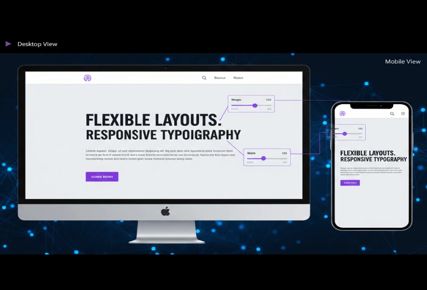
With variable fonts, we can now build responsive designs that change the way we see text from device to device; across different screen sizes and devices. They’re also effective for boosting performance by trading numerous static files for a single dynamic one.
Key Benefits of Variable Fonts
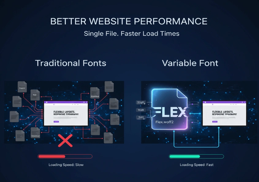
Better Website Performance
A single variable font file can replace multiple weights and styles. This reduces bandwidth usage, improves loading speed, and creates a smoother browsing experience.
Flexible Design Control
Designers can fine-tune font properties such as weight and spacing to match different layouts. This adaptability ensures visual consistency across all screen sizes.
Improved Readability and UX
Typography that adjusts to different devices enhances readability. With variable fonts, you can design for comfort, balance, and accessibility without adding extra code or files.
How to Use Variable Fonts on Your Website
Implementing variable fonts is simple. Modern browsers fully support them, and libraries like Google Fonts and Adobe Fonts provide ready-to-use options.
You can embed a variable font using the @font-face rule or link it directly from a CDN. Once integrated, CSS properties such as font-weight and font-stretch let you control variations dynamically.
Test and Optimize for Performance
Always test how your font behaves across different devices. Check its legibility, rendering quality, and spacing in both light and dark themes.
Use compressed formats like .woff2 to reduce file size. Limiting unnecessary font axes will also help maintain fast performance and quick loading times.
Best Practices for Designers
Focus on Efficiency
While variable fonts are more efficient than traditional ones, using too many variations can increase the file size. Select only the attributes your design needs and avoid unnecessary complexity.
Prioritize Accessibility
Readable typography is essential. Maintain good contrast, appropriate font sizes, and proper spacing. Make sure your text remains accessible to all users, including those using assistive technologies.
Combine with Modern Layouts
Modern layout systems like CSS Grid and Flexbox were built specifically with variable fonts in mind. Such technologies helped to enable responsive designs that age well.
Using flexible grids and adjustable text keep the UI consistent across different screen sizes while optimizing it for various reading distances.
Build Consistent Branding
Typography plays a central role in brand identity. Using one variable font family across platforms helps maintain a unified look.
Adjusting properties such as weight or width allows for subtle variations that align with your brand voice without changing the overall style or visual integrity.
Pair Fonts for Depth
Variable fonts can be paired with static fonts for variety and contrast. For example, use a variable sans-serif font for headings and a readable serif for body text.
This technique improves readability, strengthens hierarchy, and adds character to your overall design layout.
The Future of Web Typography
Variable fonts are shaping the future of digital design. They mix design and performance, giving designers the capabilities to design distinct and flexible user experiences.
As browser support grows, we are seeing more and more brands use variable fonts as a way to build faster, cleaner and scalable typography systems. They’re the way of the future when thinking more iteratively and user-driven.
Conclusion
For the web, variable fonts have completely changed how typography operates. Speed things up, reduce the complexity, and offer designers pixel-perfect control over text rendering. If you want to make websites that feel faster, look sharper and automatically resize for different devices then variable fonts are the best thing to happen to web typography since the dawn of CSS.


