
The future of automotive branding depends on how well design communicates a brand’s values. For Wuling Air ev, typography is a key way to communicate the car’s advanced technology and forward-thinking spirit.
Typography in Automotive Branding
The automotive industry, especially the electric vehicle (EV) segment, now defines itself through purpose-driven design. This movement emphasizes functionality, efficient battery integration, and a sleek aesthetic with futuristic details. The Wuling Air ev, a compact city car, embodies this by prioritizing a small footprint, maximized interior space, and seamless digital functions.
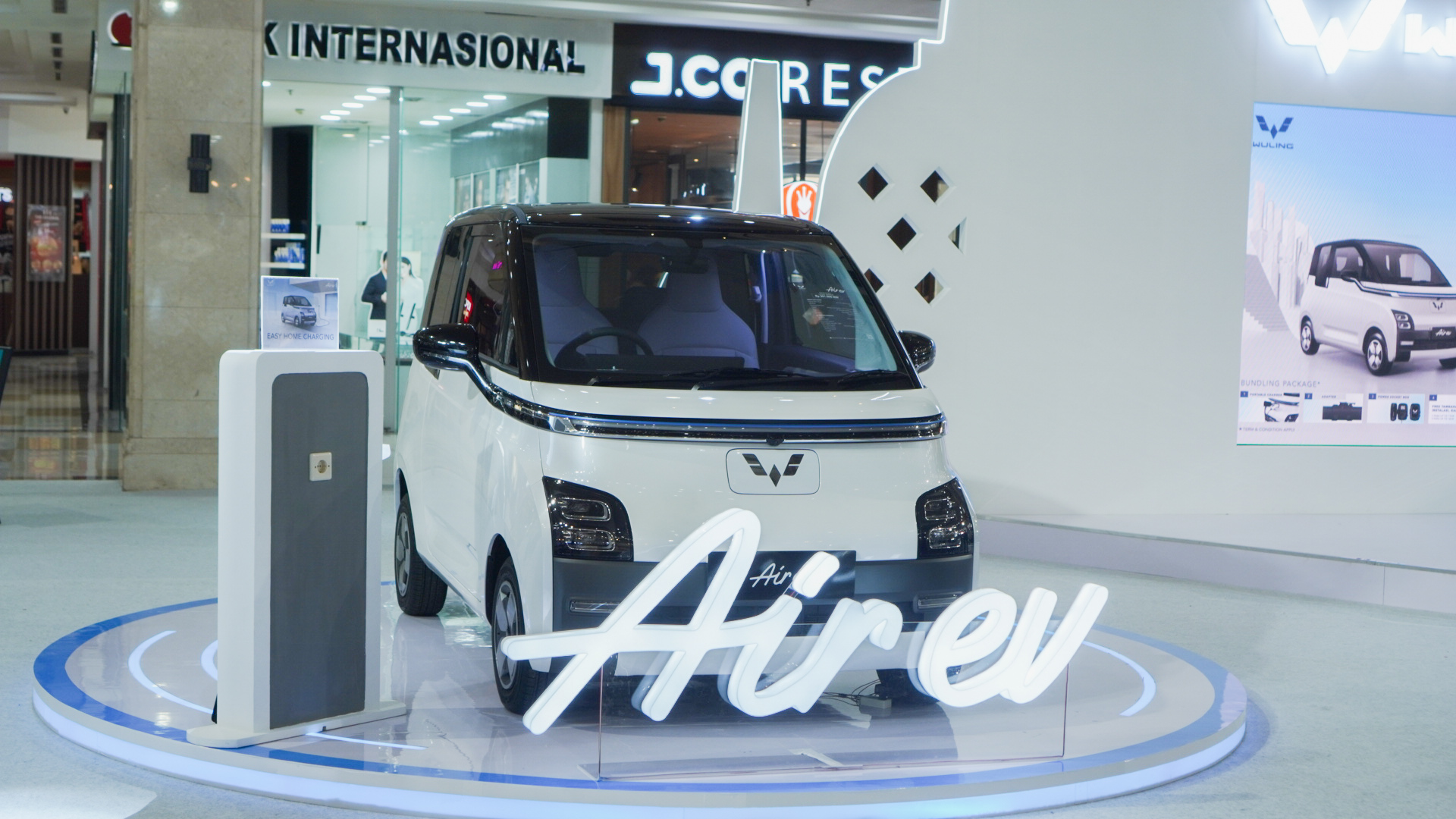
Since its branding, Wuling has put a lot of care into the visual details, with typography stepping up to showcase the car’s tech vision. They leveraged the Gilligan typeface from Creatype Studio to build this futuristic brand identity and ensure the visual language conveys innovation, precision, and tech sophistication to captivate consumers.
Also Read: 17 Elegant Fonts for Luxury Lawyer Branding
About Gilligan Typeface
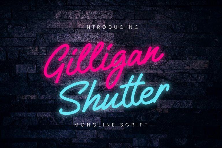
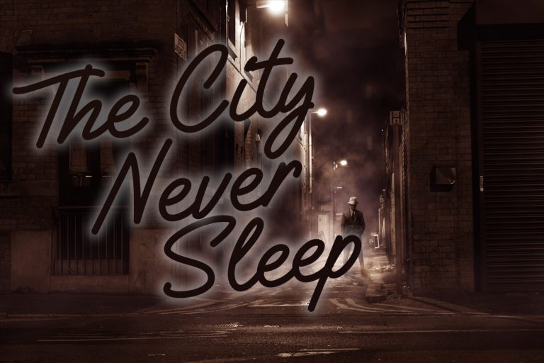
The Gilligan Shutter Monoline is the tool Wuling used to communicate this digital future. While the font is sold as a “signature monoline bold” with a “handwriting taste”, its core strength lies in its geometric precision and monoline structure. This design choice delivers a feeling of engineered simplicity.
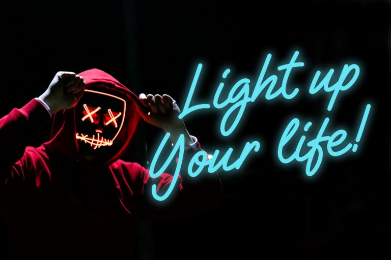
Acknowledged for its minimalism, Gilligan leverages its consistent, even stroke thickness (monoline) to discard the variability of traditional handwriting to easily mimic the look of neon lighting, digital interfaces, or clean-cut engraving.
The subtle transformation makes the font a perfect fit for a brand that needs to look high-tech.
Also Read: 5 Typeface Classifications That Every Designer Should Know
The Rebranding of Wuling Air ev
 Source: Wuling
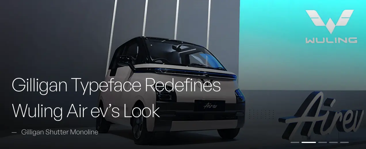
Wuling officially launched the compact Air ev in September 2022 with the ‘Drive For A Green Life’ tagline. The vehicle’s compact dimensions and “future-tech design” were highlighted, particularly its interior, which features an Intelligent Tech-Dashboard and Integrated Floating Widescreen.
The Gilligan typeface was instrumental in creating the new, modern visuals for the Wuling Air ev rebranding. Its geometric handwritten style and cuts are clean, working alongside the car’s logo and color palette to strengthen the “innovation tone”.
This combination ties the vehicle’s physical engineering to its visual marketing and confirms Wuling’s commitment to providing a digitally integrated vehicle for urban mobility.
Also Read: 6 Design Tips for Creating Unique Logo Typography
Visual Consistency and Brand Recognition
Brand consistency is vital in the competitive automotive market. Since 55% of brand impressions are visual, customers must receive a coherent, recognizable message across all digital and physical interfaces.
By adopting the distinctive, monoline structure of Gilligan and applying it consistently, Wuling reinforces the futuristic and simplistic design of the Air ev. This continuous use of geometric typography intensifies customer connection and sharply defines the brand’s unique presence.
Gilligan’s clean visual style ensures the Wuling message stays front and center, weaving the brand’s promise of reliability and tech expertise into a trust-forging visual identity that connects on a personal level.
Also Read: 30 Stunning Signature Fonts to Create a Head-Turner Design
Design Takeaways
The Wuling Air ev shows that in branding designs, structure defeats style. Wuling deliberately chose a typeface with an organic, “handwriting” pedigree but used its geometric structure to achieve a different result.
By applying digital aesthetics, Wuling transformed the font into a symbol of modernity, proving that the technical framework ultimately dictates a typeface’s potential. This transformation of intent aimed to be instantly understood by consumers as the visualization of innovation in the automotive industry.
Typography becomes the fastest visual signal for high-tech competence and turns purposeful design into an instant, unified, and trustworthy brand identity. Explore Gilligan Shutter typeface to power your next tech-forward branding.


