
There are basic things to consider before choosing a font for festival poster or other kinds of signs generally. Firstly, the title’s typeface should appear proportionally more significant than the other text. Then, the fonts should also provide adequate legibility and readability while being ornamental.
The list below is not boring, it enriches your treasury of ideas.
13 Choices of Fancy Fonts for Poster from Assorted Typeface Styles
Then, let’s jump into the following recommendation!
9 Fonts from Serif Category
Below are 9 fonts from serif classification:
1. Vulture Beautiful
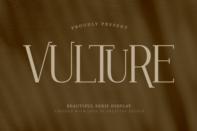
Vulture Beautiful takes after some basic characteristics of serif fonts. Yet, it offers simplicity with lesser ornamental element presence, making it appear more aesthetically modern.
2. Quadrangle
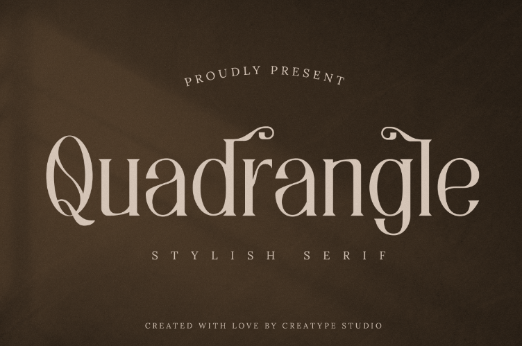
Presenting a new or exclusive festival? Incorporating Quadrangle for the heading or title will give the poster a stylishly unique tone that can grab attention immediately.
3. Brooklyn
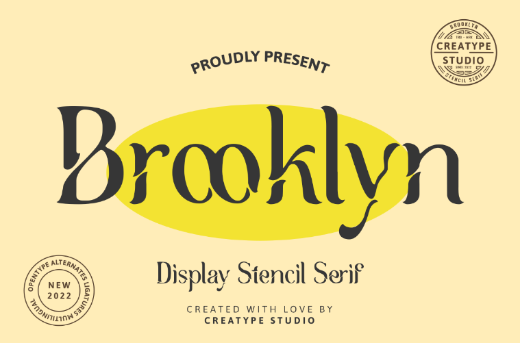
There is a sense of urgency in the stencil typeface. The reason is the crack through the characters’ strokes which signals a brief yet important mood. In addition, the wavy slits of Brooklyn font’s characters make it a great pair for posters with dashing themes.
Also Read: 10 Most Popular Slab Serif Font Chosen by Designer
4. Gentleman
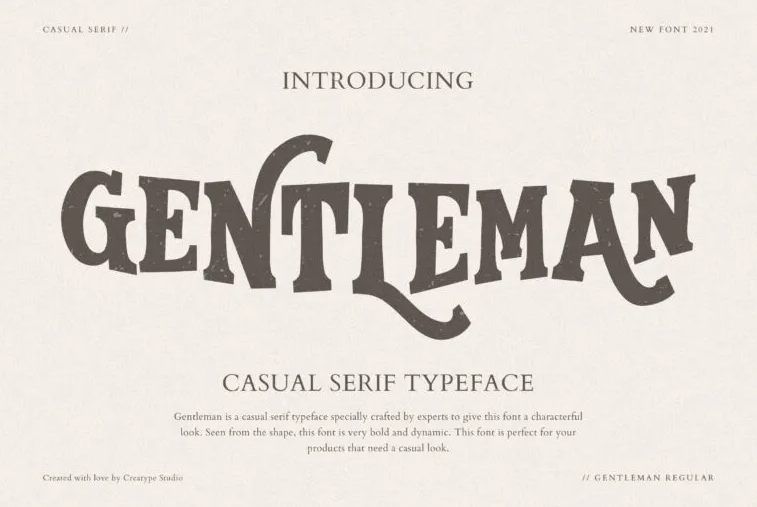
Do you want to deliver a striking message? Choosing a serif font in a bold shape like Gentleman will help you! It’s not only a fancy font for poster, but also works in signage or watermark.
5. Cherly Blossom
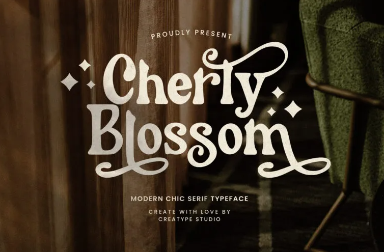
Retro fonts are always captivating for various kinds of posters, especially for posters with contemporary designs. Cherly Blossom offers an eye-pleasing decorative typeface, yet both readability and legibility are proper.
6. Hypebeast
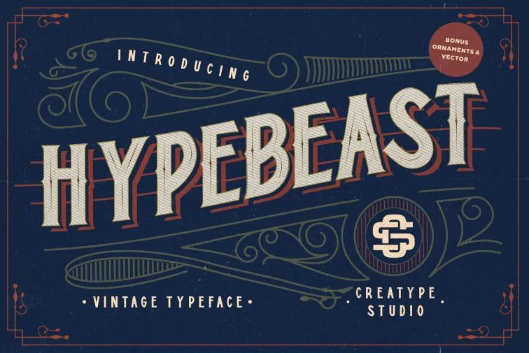
Bring the Hypebeast to life as your ideal font for festival poster with vintage themes. This font features a stunning old Victorian font in a much more humble tone. Not merely providing adequate legibility for posters, this font also seems like a robust head-turner.
Also Read: Top 10 Combination Fonts are Unique and Perfect
7. Wintter
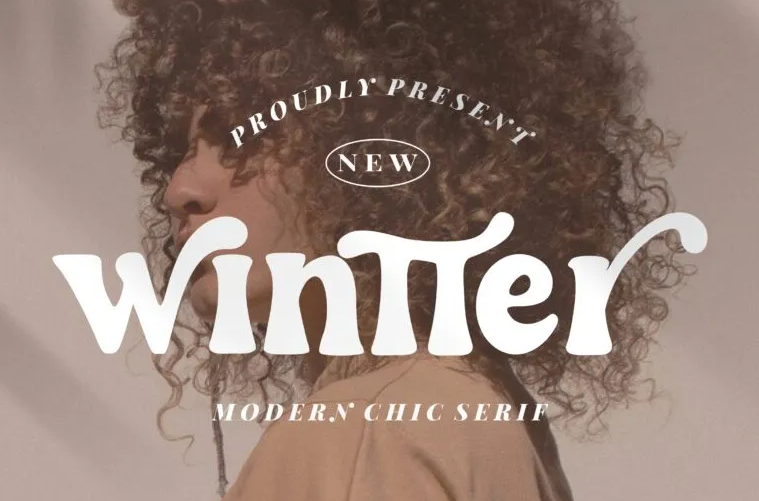
Wintter is one kind that you can pick when you feel like adding a sweeter or romantic touch to your advertisements, posters, photography, or social media post design. The swashes bring a classy retro mood.
8. Quickly Sustain
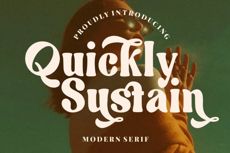
You may find Quickly Sustain similar to Wintter. However, this typeface offers you a cleaner appearance with less contrast in its character set. Quickly Sustain has improved legibility while maintaining bold attributes.
9. Quinllynk
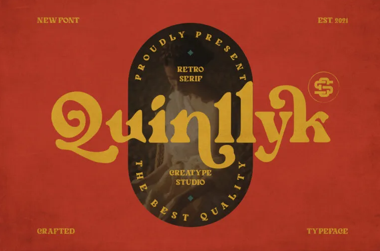
You can go with another bold serif typeface, Quinllynk for a more quirky look. Generally, curls of serif typeface can be too much. But this font grants them in just the right size and amount. A great selection for posters of adventurous events.
Also Read: 10 Free Font Simple Elegant, Here are Recommendations For You
4 Nice Fonts for Posters with Sans Serif Styles
Meanwhile, these collections made of sans serif styles are neat for your project:
10. Glitcher
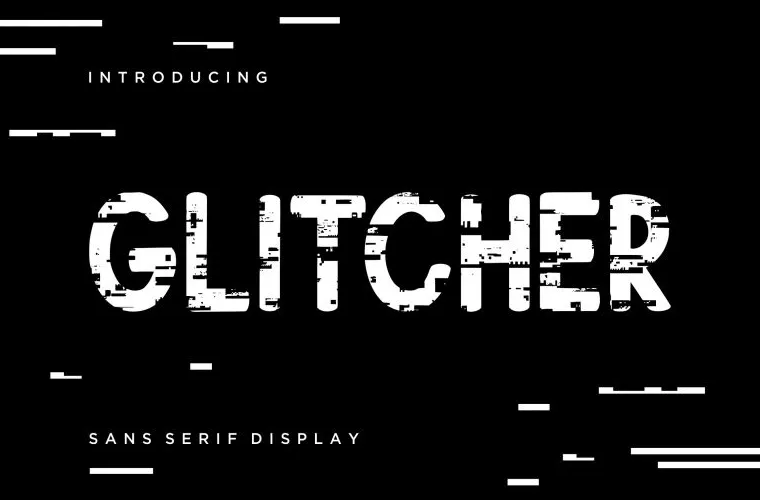
Let your festival information stay in the audience’s mind using glitch font like Glitcher. This sans serif comes in the simplest style. Still, the distorted characters attract the brain to look at them.
11. The Quest Retro

The Quest Retro proves that the sans serif typeface family can come in retro style. Rather, this sans serif typeface makes a great appearance in posters for arts festivals. Furthermore, you may put it for the brand’s summer collection ads design.
12. Greenos
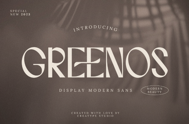
This sans serif was designed with modern attributes. With great readability, no wonder that Greenos suggest a strong impression when you apply it to both title and body text font for a festival poster.
Also Read: 10+ Free Best Typography Cursive Fonts for Modern Design
13. Enternal
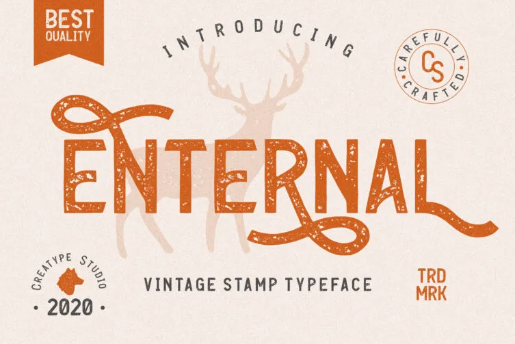
The texture is an element that beautifies pretty much anything, including a typeface. Going vintage or rustic does not merely stop at ornamental curls. Look at Enternal with the stamp texture. It adds clean and aesthetic legibility to your poster designs.
Bonus from Other Styles
Do you need another font from other styles? Worry not because these choices may help.
14. Klassik Style
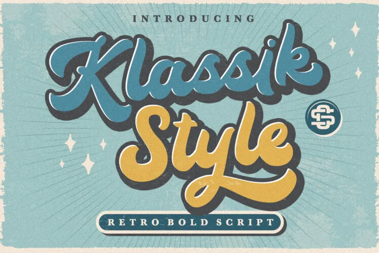
Love antiquity? Klassik Style with script style typeface hears you. This one is a pronounced pair for thematic posters.
15. Hello Sunny
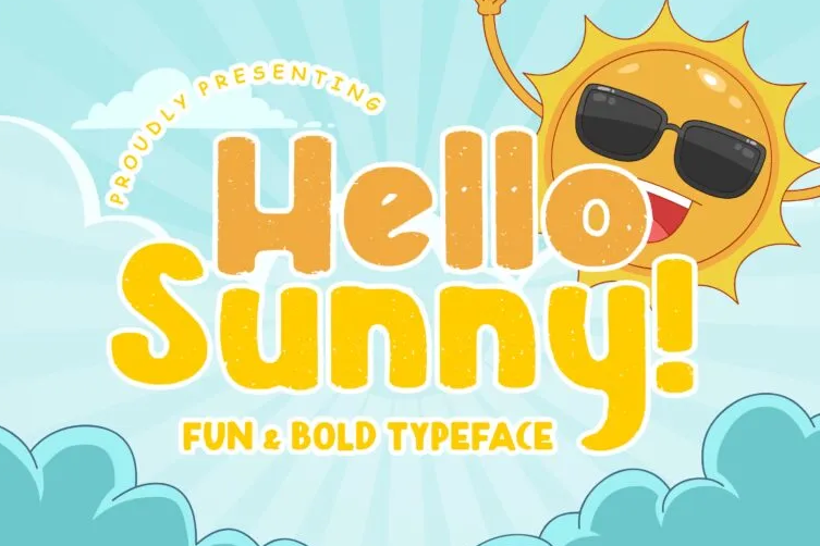
Festival posters are not only available for teenagers or adult human beings. Hence, consider brightening up the poster with a fun, casual, and joyous typeface like Hello Sunny for a chill mood, or a child’s event.
Also Read: 10 Best Calligraphy Font Free Commercial Use
How to Choose a Font for Festival Poster?
In addition to the factors explained earlier, the font you choose needs to technically have harmonious kerning and spacing as well. Moreover, bear in mind if the poster will be published for offline or online boards. In the case of the latter, ensure to pick ones with versatility for various devices.
Eventually, you can mix up the font selection according to your design’s theme up to 3 typefaces. Explore more choices in Creatype Studio collections, you can get a $1 deal for 1st trial for utilization of any of the collections!


