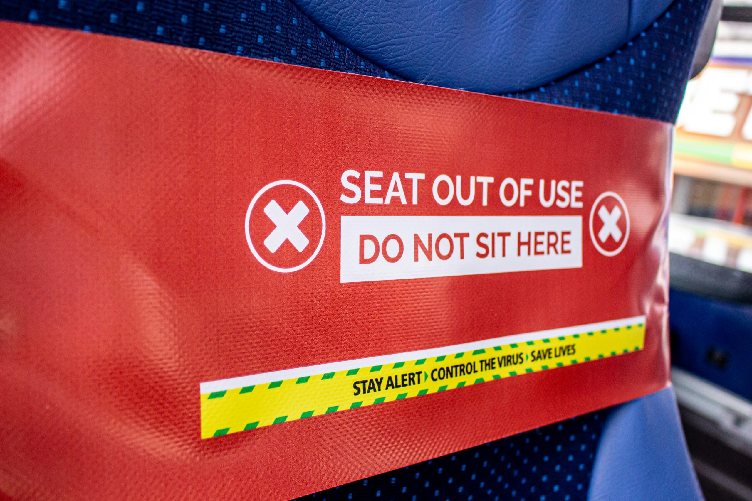
Warning labels and safety graphics help people notice risk and understand consequences. This allows them to take the right action. When a label fails, the result may include injury, equipment damage or a compliance concern that could have been avoided.
Effective design combines human response, ISO standards and visual communication that holds up in real-world conditions. Designers and marketers should treat safety labels as a core part of the user experience, whether they appear on packaging, machinery, interfaces or facility signage.
1. Prioritize Clarity and Legibility
The label has already failed if people cannot read it immediately. The message should land the moment someone looks at it. The font you pick does a lot of the heavy lifting here. Thick, block-style letters usually work best because they remain readable even from a distance or in poor lighting.
Studies show that people read signs 35% faster when the right font is used. That extra speed matters when safety is at stake. Stick to simple words. Aim for a sixth-grade reading level, so anyone can understand the instruction. Sentence case is generally easier on the eyes than “shouting” in all caps.
2. Follow Established Color and Format Standards
You may want your packaging to look unique, but safety labels need to be recognizable. Standard colors and shapes act like a universal language. When you stick to the norms, people know what to expect before they even read the text. Most safety standards rely on three main signal words:
- Danger uses red and white for the most extreme hazards.
- Warning relies on orange and black to show a serious risk of injury.
- Caution features yellow and black for minor or moderate hazards.
The ISO 3864-1:2011 design guidelines for safety signs set the specific requirements for color contrasts and symbols. Following these rules helps users identify hazards immediately. It also keeps your business compliant with global expectations.
3. Leverage the Power of Pictograms
Pictures work faster than words. A good symbol warns a user about a hot surface or high voltage without them needing to read a single sentence. This visual shorthand is critical for nonnative speakers or distracted workers.
Stick to the classics rather than drawing something new. Using recognized ISO 7010 symbols can prevent people from guessing the meaning of a confusing graphic. You want immediate recognition, so the viewer understands the risk and the consequence instantly.
4. Appeal to Human Emotion
Facts are important, but feelings drive behavior. You need to make the risk feel real. A boring text box might get ignored, while a graphic that shows a clear consequence grabs attention. Combining clear text with impactful visuals creates a message that sticks.
Research involving more than 24,000 American college students found that 78.6% considered high-emotion safety labels as effective in changing their behavior. While that study focused on tobacco, the lesson can apply to many other warnings. When the consequences feel personal, people tend to act with more caution.
5. Consider the Label’s Material and Environment
The best design in the world fails if the sticker peels off next week. You have to match the material to the setting where the label will be displayed. A paper label will disintegrate if you put it on a machine that gets hot or oily.
- Vinyl works well for curved surfaces and resists moisture.
- Polyester handles chemicals and abrasion better than most materials.
- Lamination adds a necessary shield against UV rays and heavy wear.
Match the label lifespan to the product lifespan. If a machine runs for 10 years, the warning needs to hold up for that same period. A label that stays intact ensures the safety message remains effective in serving its purpose.
Design for Human Safety
Effective warning labels come from disciplined design decisions, including readable typography, standardized color meaning, proven pictograms, human-focused messaging and materials that survive the environment. When you follow established conventions and apply plain-language writing, people can understand hazards faster and make safer choices more consistently.


