
Brittany Signature font lends the Pond’s Bright Miracle packaging an inviting personality that feels both genuine and refined. It uplifts the design by marrying artistry with readability.
The Art of Elegant Packaging
Modern skincare packaging is now the primary silent salesperson that communicates a brand’s core values before a consumer even reads a word. Typography, ranging from minimalist clarity to clinical authority, shapes how the brand is perceived and distinguishes itself.
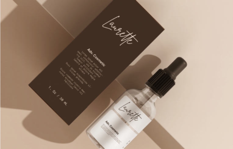
The font choice determines the emotional connection, instantly signaling whether a product is sophisticated, scientific, or youthful. For feminine and high-end categories, selecting an elegant script, such as the Brittany signature font, is vital to achieving a premium look and conveying exclusivity.
Also Read: Jelytta Handwritten Font Brings a Playful Look to the POND’S x Maudy Ayunda Collaboration
About Brittany Signature Font
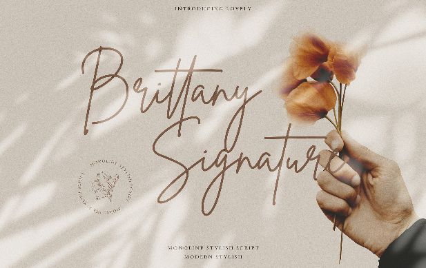
The Brittany signature font is a fashionable and sophisticated signature-style script defined by its unique curves and an elegant, inky flow. It is specifically designed to lend a touch of handwriting flair, which consumers associate with intimacy, craftsmanship, and a higher perceived value.
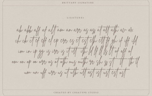
The character and style of the Brittany Signature Script is notable for its balance, being curvy with airy strokes that remain highly legible and elegant. It’s very practical for rapid reading on product labels.
This combination of sophisticated style and clarity makes the Brittany font fitting for feminine and luxury brands, including product packaging, labels, and branding projects that call for an exclusive, handwritten aesthetic.
Also Read: 17 Best Handwriting Fonts for Your Authentic Designs
The Collaboration with POND’S
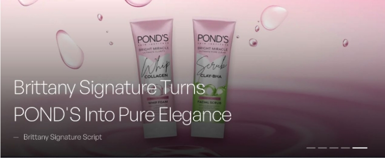
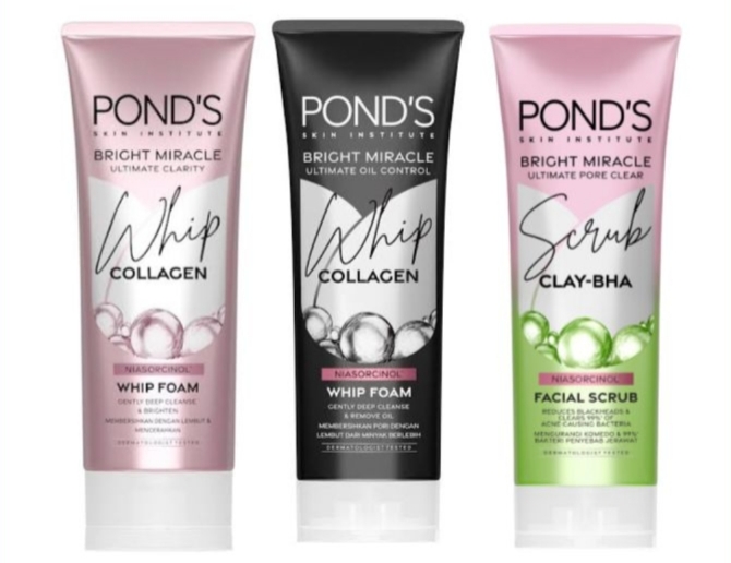 Pond’s Bright Miracle Whip & Scrub | Source: lazada.co.id
POND’S, a global leader in skincare, launched the “Bright Miracle” (Whip & Scrub) line in 2022 with a clear mission: to capture the sophisticated, modern consumer. The brand needed its Pond’s packaging design to signal a powerful shift toward high-performance, brightening ingredients, which required a delicate visual balance.
The identity had to feel soft and approachable, echoing the “miracle” concept as well as maintaining the professional and premium look expected of a trusted global name. The primary design challenge was strategic: how to inject pure elegance and luxury using typography alone, rather than resorting to costly materials like metallic foils or heavy glass.
Also Read: 5 Typeface Classifications That Every Designer Should Know
How Typography Shapes POND’S Visual Identity
The strategic choice of the Brittany signature font successfully elevated POND’S visual identity by blending the emotional warmth of a signature with the professional confidence of the brand. This font influences tone and elegance by evoking specific emotions and, at the same time, creating an aspirational perception.
On the “Bright Miracle” packaging, the combination of pastel colors and script fonts with flowing curves and high contrast signals femininity and indulgence, aligning with luxury packaging trends.
The casual, handwritten style conveys immediate accessibility and personal care, transforming the mass-market product into a more intimate, sophisticated consumer experience. Moreover, it also serves as the focal point, utilizing typography as a substitute for overt metallic ornamentation to convey a premium yet approachable quality.
Also Read: 17 Elegant Fonts for Luxury Lawyer Branding
Design Takeaway
The utilization of this handwritten font for skincare products offers clear design lessons that other brands can apply to elevate their product identity, especially within the feminine and luxury sectors.
- Prioritize emotional resonance: select a typeface that reflects the feeling of the product (e.g., fluid curves for soft, moisturizing products) rather than just the facts.
- Use script as a luxury cue: a sophisticated, legible signature script can convey exclusivity and elegance without requiring expensive packaging finishes.
- Balance style and readability: ensure the chosen script is both decorative and functional, as demonstrated by the Brittany font’s inherent legibility.
The success of this packaging design proves that elegant handwritten typography is the most versatile tool for communicating premium elegance. We encourage brand managers and designers to explore this aesthetic. Find the Brittany Signature Font now on Creatype Studio’s website and begin transforming your next skincare line into a symbol of pure sophistication.

