
Sensitive topics require extra attention to detail to ensure all users have an excellent experience. Whether you’re designing a poster about an illness or laying out a community resource website page, there is more to the process than placing text on a background. The layout, images, typography and words all create a tone that can convey sympathy and help users feel safe. Pay attention to the small details and you’ll create a cohesive message that reaches your target audience.
Select Soothing Colors
Color sets the emotional tone of a piece before the first word is read. For sensitive content, aim for a neutral palette that feels stable, calm and supportive. Avoid harsh or electric tones like harsh neon shades, which can feel jarring.
Muted blues and greens are reliable choices. Studies show that blue can evoke feelings of serenity, while green often signals renewal and balance, making them well-suited for serious topics. For content dealing specifically with aggression or high anxiety, some shades of pink can be a surprisingly powerful tool. In fact, researchers studying color theory have found that a specific shade of pink was more effective than blue at suppressing hostile and anxious behavior in test subjects.
Regardless of your primary color, balance the design with plenty of neutral space using soft grays, sands or creams. These tones give the eye a place to rest and prevent visual overwhelm. Ultimately, legibility is non-negotiable. Always check that your text has sufficient contrast against its background to be easily readable, as this is the most critical accessibility consideration.
Choose Intuitive Layouts
Show respect to the sensitivity of the topic by maintaining a simple design. Clutter can feel overwhelming when people are dealing with other issues. Keep only crucial elements on the page, and add plenty of white space.
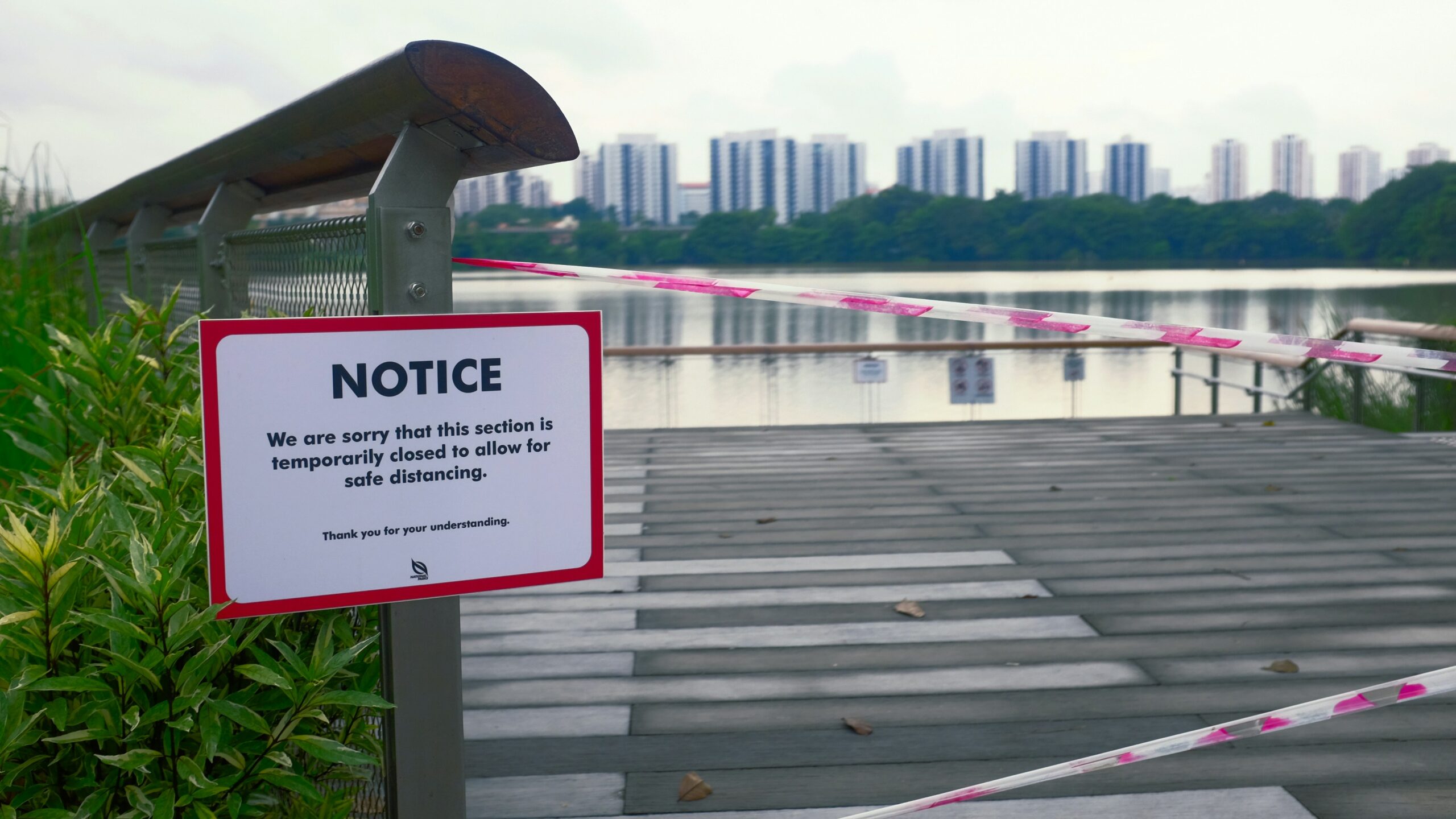
Margins let the content ‘breathe’ and allow people to focus on what matters. Avoid any staged or exploitative imagery. Use photos taken under natural light and avoid anything that might show staged emotions or feel like pandering. For example, if the content is about mental health, avoid showing someone screaming in a rage, as mental health struggles can look different from person to person. Less is more in design and can prevent misunderstandings while leading the user to the information they seek.
Opt for Typography That Matches Tone
Typography is another crucial aspect of designing for sensitive topics. Each typeface has its own personality and sets a mood. It can scream authenticity or can show a misunderstanding of the audience.
A plain sans serif or humanist serif works for serious, sensitive material. Serif fonts inspire feelings of authority and trust. Avoid anything over-stylized or with too much personality. You want the typeface to have a calm authority. Legibility should be your first priority. Using one or two type families throughout a site or guide can create familiarity and lend credibility to the text.
Hierarchy can be created through size and weight, which give the user a clear visual hierarchy. Provide space between lines of text to make dense information easier to read. Effective type is type that does not call attention to itself. It helps the message.
Final Self-Checks Before Publishing
Put yourself in the user’s place. How would they feel over the layout, the images, the language, the contrast? If a person is under stress, they won’t care about a dazzling visual display. They’ll want calm colors and white space to take a breath. A simple layout shows professionalism in the face of turmoil.
It’s okay to dull company colors and simplify logos to show respect for the subject matter being discussed. The best design is one that strives to listen and respond. Before hitting publish, do a few final checks.
- Do the colors contribute to calmness?
- Is the typography legible?
- Does the document have ample white space?
- Are the images authentic and supportive?
- Does the overall design show respect for the audience?
If you can say yes to each of these questions, your design is respectful.
Key to Respectful Design
By designing with empathy instead of playing it safe, the audience will feel safe enough to absorb the content. Using elements like soft color palettes, intuitive layouts and simple typography eases the mood. Sympathetic designs help the reader feel understood and respected. Your visuals should inform and leave room for compassion and lasting connection.
