
Logo sketches are an essential early stage in logo design because they allow designers to explore ideas freely before moving into digital refinement. According to Keeve, 75% of consumers recognize a brand by its logo alone, which highlights how crucial it is for the final design to communicate effectively.
With that in mind, we’ll show you 15 early sketches of famous brand logos, along with insights into how those rough concepts evolved into the polished designs we know today. Thus, keep reading!
Key Takeaways
- Logo sketches reveal raw creativity before digital design refinement.
- Famous brands started from simple sketches evolving into icons.
- Sketching logo ideas ensures clarity, timelessness, and brand recognition.
15 Creative Logo Sketches That Spark Design Inspiration
To fuel your own creativity, we’ve gathered fifteen logo sketching designs that showcase the process and spark inspiration for your next project at once. Follow through!
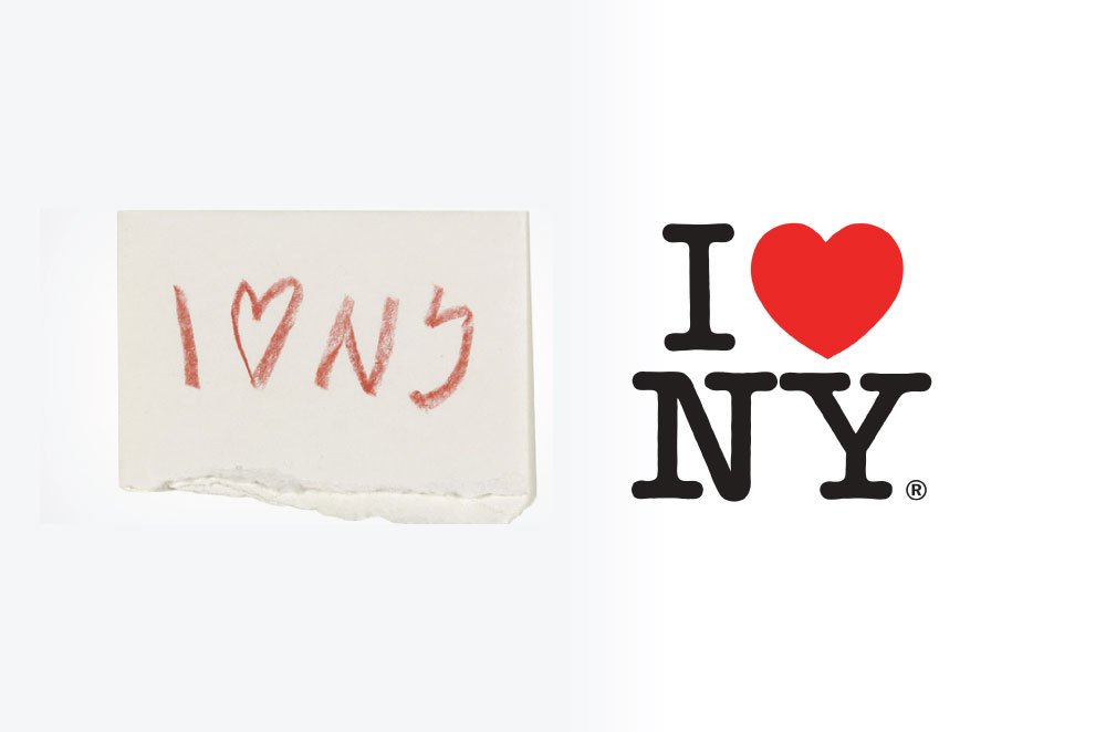
1. I ♥ NY
 I ♥ NY Logo | Image Source: adjustbrand.com
Milton Glaser first sketched the I ♥ NY logo with a red crayon on an envelope during a taxi ride. That rough pairing of letters and a heart needed only minor refinements in typography and spacing. Its enduring power lies in the purity of an idea that was simple yet universal.
Also Read: 10 Types of Logo Design: A Complete Guide to Logo Styles
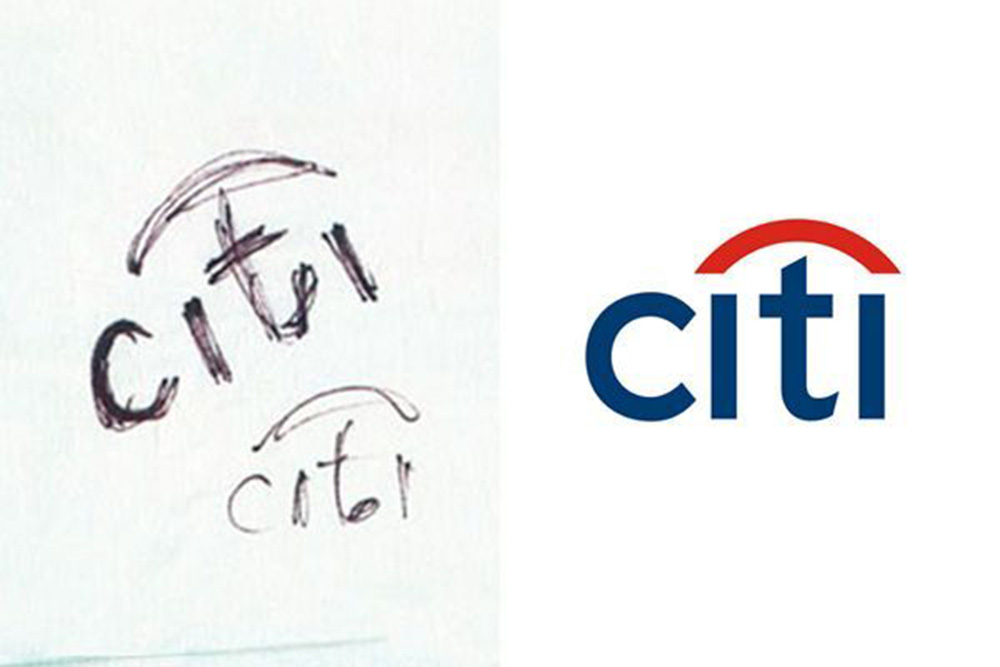
2. Citibank
 Citybank Logo | Image Source: brandripe.com
In 1998, Paula Scher quickly drew Citibank’s name with a red umbrella arc on a napkin during a meeting. Later refinements balanced the typography and integrated the arc into the wordmark. The sketch shows how instinctive gestures can capture a brand’s essence in seconds.
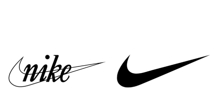
3. Nike
 Nike Logo | Image Source: logos-world.net
The Nike Swoosh was created by student designer Carolyn Davidson, who sketched dozens of wing-inspired shapes. One sketch stood out for its sense of movement and flow, symbolizing speed. With curves smoothed and proportions refined, it became the mark of athletic excellence.
4. Firefox
 Firefox Logo | Image Source: logomak.com
Sketches of the Firefox logo explored foxes wrapped around globes, with swirling tails and flame effects. Designer Jon Hicks simplified those doodles into a sleek, fiery fox circling the world. The result balanced playful character with digital clarity for icon use.
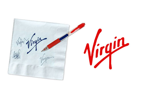
5. Virgin
 Virgin Logo | Image Source: ebaqdesign.com
The Virgin logo was first sketched by Roger Dean, who scrawled the name in a hurried, handwritten style. That raw sketch became the foundation, later refined into the edgy, red wordmark we see today. Its authenticity proved that sometimes energy and personality matter more than perfection.
6. ExxonMobil
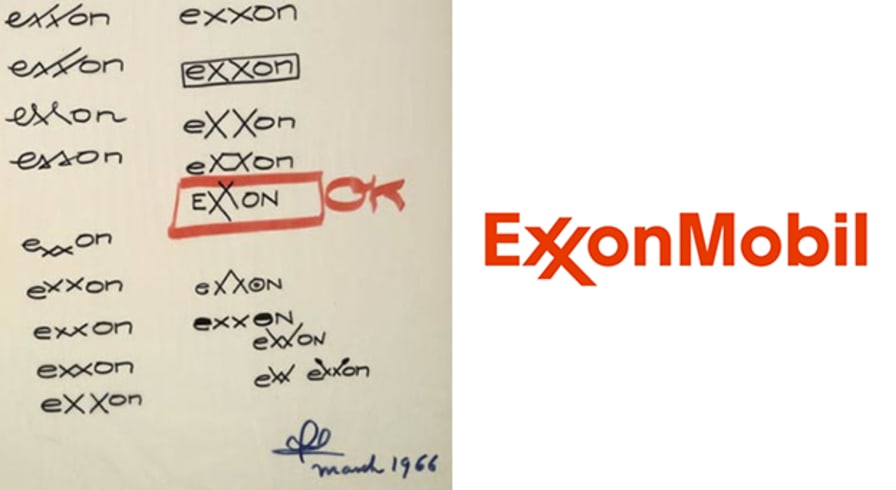 ExxonMobil Logo | Image Source: vistaprint.com
Legendary designer Raymond Loewy drew 18 variations of Exxon’s wordmark, experimenting with the double Xs. He chose one sketch with interlocking strokes that created a visual rhythm. After refinement, the “XX” became the logotype’s most distinctive feature.
7. WWF
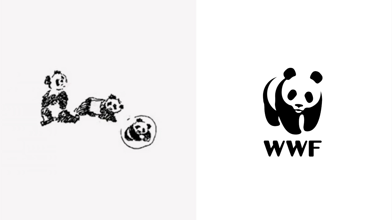 WWF Logo | Image Source: x.com
The WWF panda began as detailed logo sketches, but Gerald Watterson stripped away excess lines for clarity. The final version used bold black shapes and white space to suggest the animal. Its simplicity ensured instant recognition while honoring the original sketch’s charm.
Also Read: 10 Logo Redesigns Strategy Without Losing Recognition
8. Chase Bank
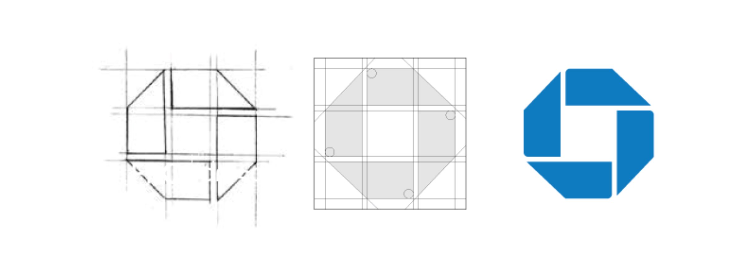 Chase Bank Logo | Image Source: x.com
Chermayeff & Geismar sketched geometric abstractions of vaults and cubes to represent Chase. Their chosen octagon was refined into a bold, balanced mark in blue. This sketch showed how abstract geometry can symbolize security and strength.
9. Apple
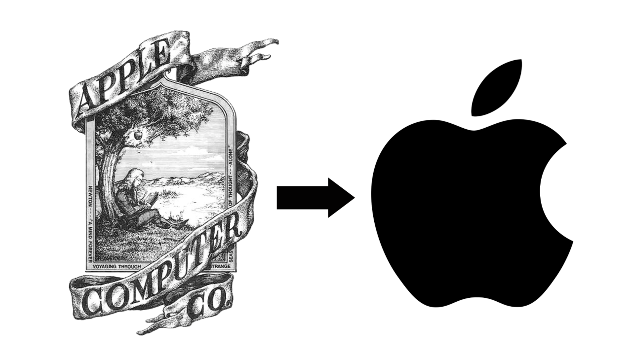 Apple Logo | Image Source: linkedin.com
Apple’s first logo by Ronald Wayne was a complex sketch of Newton under an apple tree. Realizing its impracticality, the team sketched a bitten apple silhouette instead. Refinements smoothed the form, leaving a clear, timeless icon of innovation.
10. Starbucks
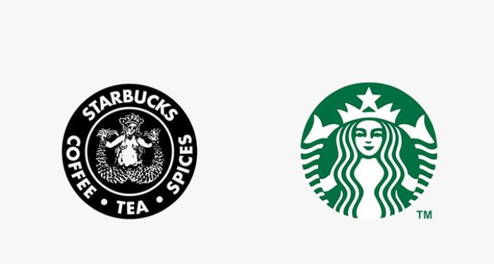 Starbucks Logo | Image Source: logo.wine
The earliest Starbucks sketches by Terry Heckler depicted a two-tailed siren in intricate detail within a circular frame. Over time, designers cropped her face and simplified her features. The mythic siren remained, but the excess ornament faded away.
11. IBM
 IBM Logo | Image Source: logos-world.com
Paul Rand explored solid block lettering before slicing the IBM sketch into stripes. The final design used horizontal bars to suggest speed, technology, and equality. This creative simplification turned a static sketch into a dynamic corporate identity.
12. Coca-Cola
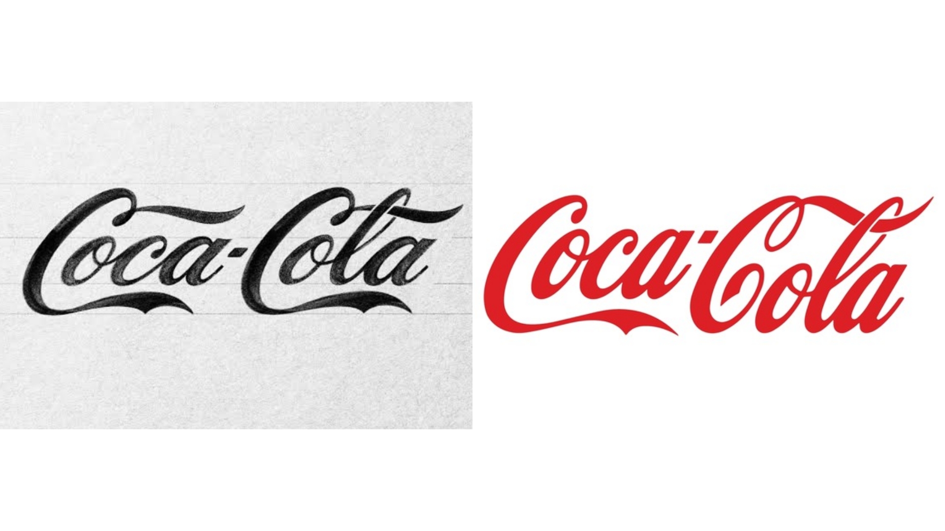 Coca-Cola Logo | Image Source: businessinsider.com
The Coca-Cola logo sketches were first sketched by Frank Mason Robinson in a flowing Spencerian script. Its flourishes and loops were later refined for balance and legibility. Remarkably, the final logo remains nearly identical to that first sketch.
Also Read: 6 Logo Variations Every Brand Needs for a Consistent Identity
13. Google
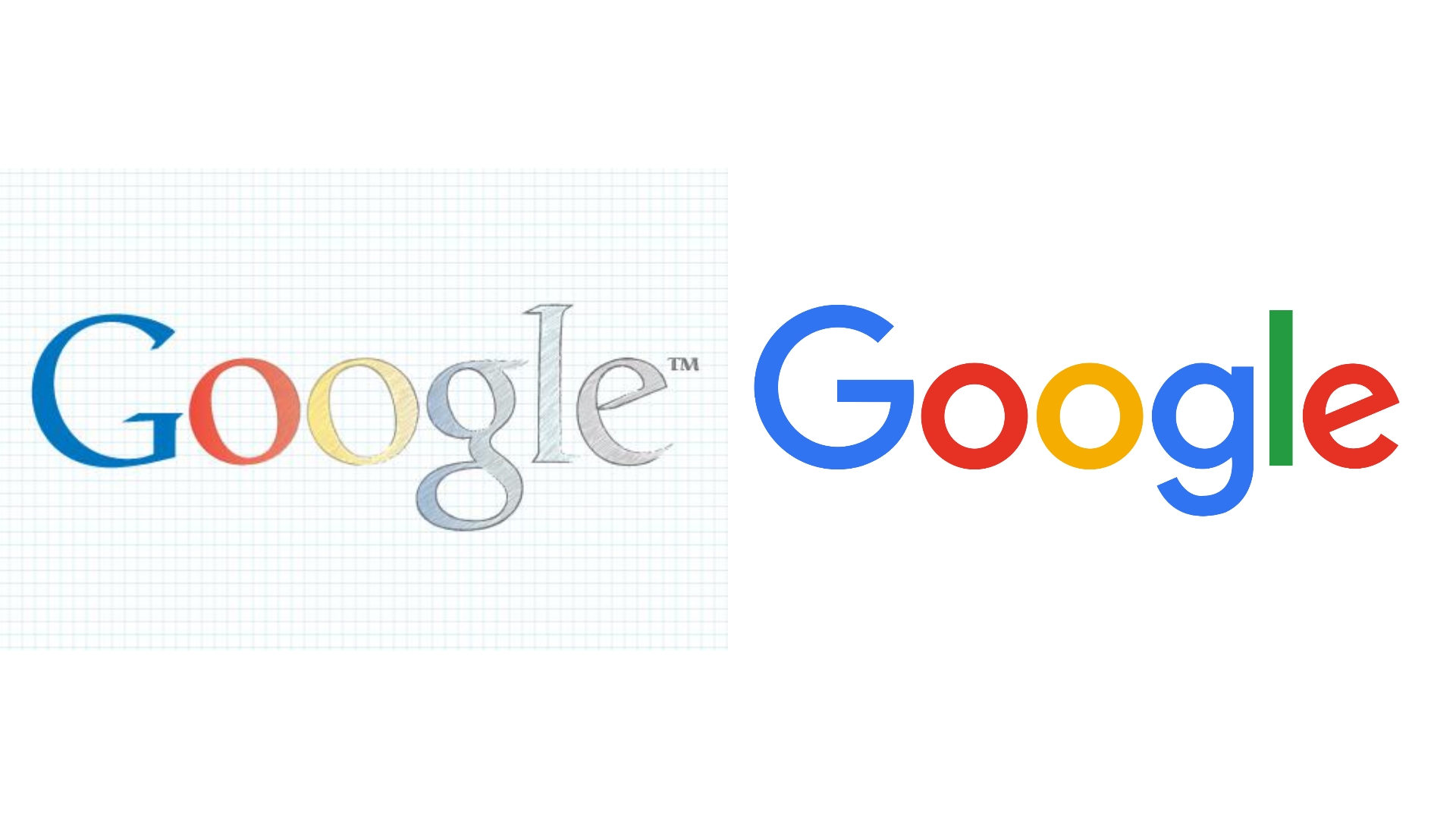 Google Logo | Image Source: pngimg.com
Early Google sketches by Ruth Kedar played with whimsical fonts and shifting colors. What persisted was the rainbow palette, signaling playfulness and openness. Refinements brought a clean sans-serif style that preserved the sketch’s joyful DNA.
14. Adidas
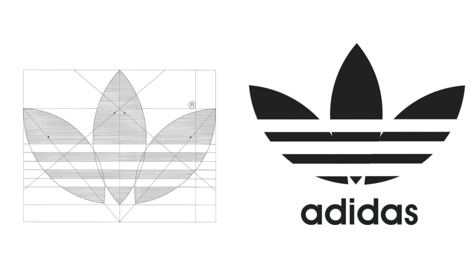 Adidas Logo | Image Source: 1000logos.net
Founder Adi Dassler sketched trefoils, mountains, and stripes, all centered on the “three-stripe” identity. Over time, these sketches evolved into multiple versions for different product lines. The stripes stayed constant, showing the strength of a simple motif.
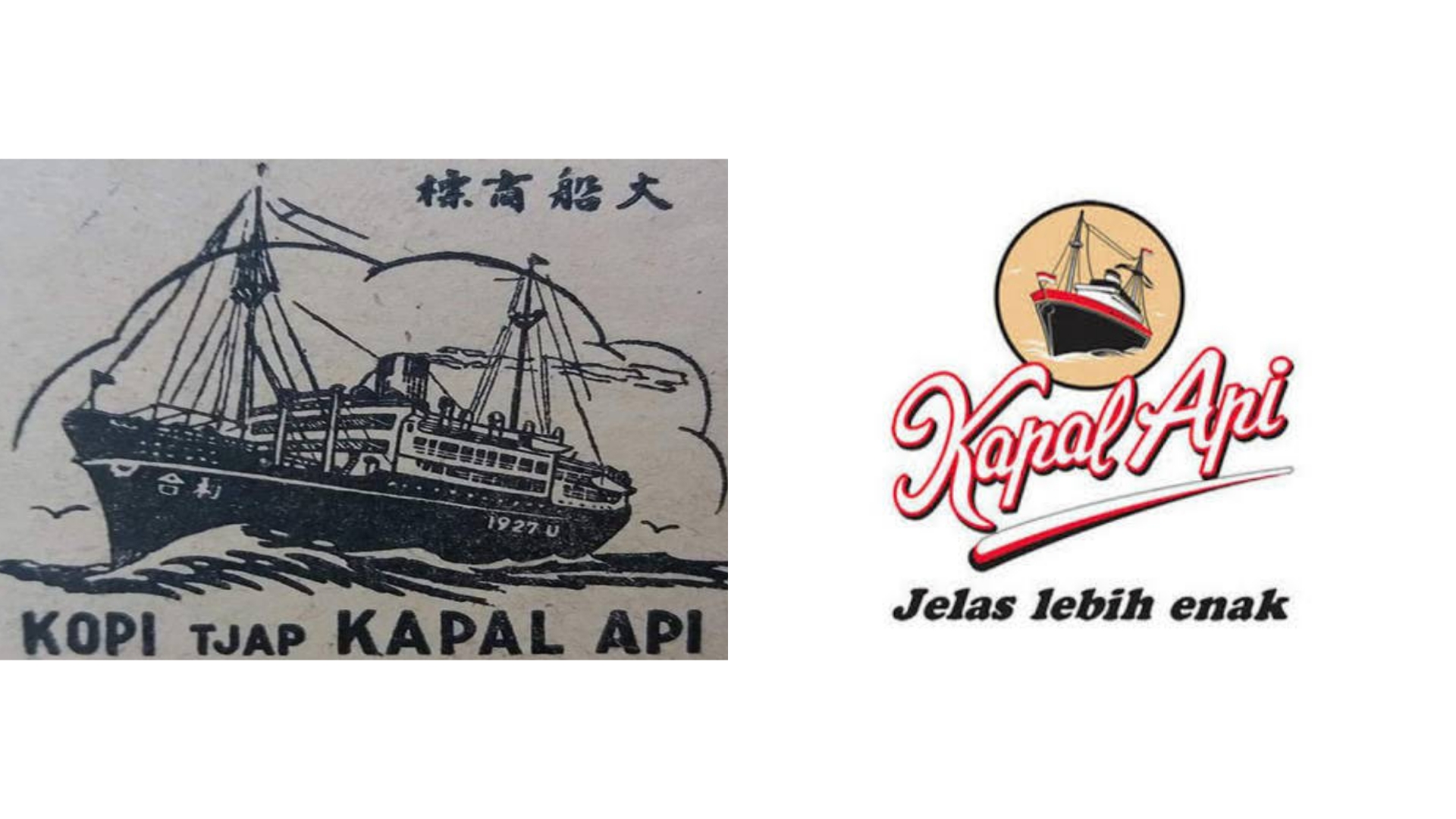
15. Kopi Kapal Api
 Kopi Kapal Api Logo | Image Source: logocorel.com
The Kapal Api logo started as sketches of a traditional ship paired with bold lettering, symbolizing heritage and trust. Designers refined the vessel’s details to make it iconic yet reproducible across packaging. The final logo preserved the ship’s spirit, anchoring the brand in tradition while sailing into modern markets.
Also Read: 6 Design Tips for Creating Unique Logo Typography
Make Your Logo Sketches the Blueprint of Success
The sketching of a logo design is the first spark in shaping a brand, but sketches alone are not enough to carry identity. To boost them, you need reliable fonts for logos that enhance consistency. The right typography helps sketches evolve into professional marks. Moreover, it ensures the final design feels timeless across platforms.
For this reason, many creatives turn to Creatype Studio, known for its technical and versatile font collections. Our trademarked logo license allows lifetime usage, multi-device installs, and broad commercial rights. With OTF, TTF, and WOFF formats included, your sketches easily transform into polished brand assets.


