

Around 84.6% of users prefer a clean interface over an overcrowded one. This is not just a matter of decoration. A clean, minimalistic UI improves usability, speeds up performance, and makes navigation more intuitive. By embracing the principle of minimalist UI design, you can deliver the best visuals and performance for your design.
Key Takeaways:
- The core of minimalist UI design is simplicity with purpose. This can be achieved by using whitespace effectively, removing non-essential elements, and limiting both typography and color palette.
- Ensure UI design has a clear visual hierarchy and predictable navigation that guides users through the interface.
- Bold typography or vibrant visuals can be powerful, as long as they serve a clear purpose and don’t disrupt the overall simplicity.
7 Principles of Minimalist UI Design for Designers
Let’s explore seven fundamentals of minimalist UI design that every designer should understand and apply.
1. Use Whitespace Strategically
Applying whitespace or negative space means making your design look “empty” to create visual breathing room. This intentional “emptiness” reduces cognitive load and helps users focus on key elements.
Furthermore, this principle of minimalist UI design also improves layout structure by clearly separating content and guiding users toward your intended actions.
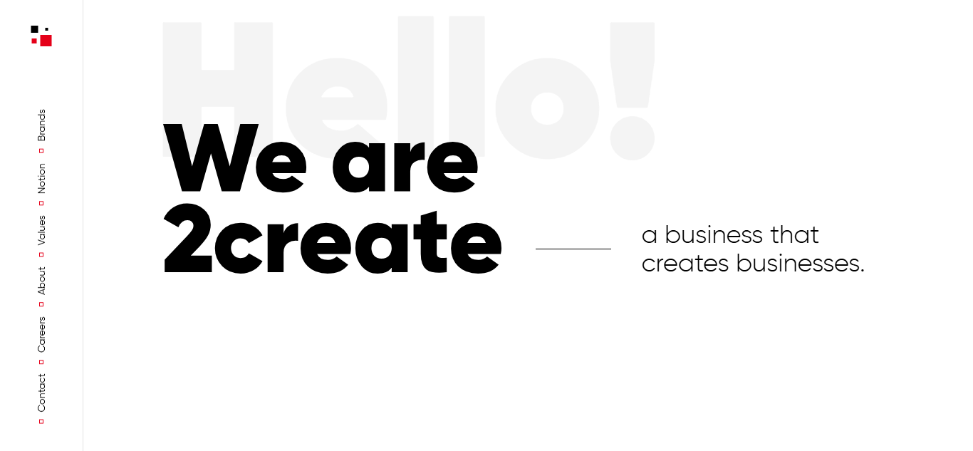 the homepage of 2Create | source: 2create.io
For example, 2Create’s website showcases excellent whitespace usage. It highlights essential content, like mission, portfolio, and services, that makes the site easy to scan and visually trustworthy.
Also Read: 10 Clean User Interface Tips to Enhance Your Website
2. Guide Attention with Visual Hierarchy
A strong visual hierarchy is essential in any minimalist user interface. An effective hierarchy ensures users instantly recognize what’s important and where to look next. These are some key points in optimizing visual hierarchy.
- Scale: Larger elements like headings naturally draw more attention. Use different sizes to signal importance and create a logical reading flow.
- Contrast: Elements with stronger contrast are more visible. These elements serve best as CTAs or alerts. Use bold colors, heavier fonts, or brighter tones to pull the user’s attention where it matters most.
- Spacing: Proximity indicates relationships. By grouping related items or separating prominent elements, you can lead the eye smoothly through the interface.
3. Remove Unnecessary Visual Distractions
One key principle of minimalist UI design is to strip away anything that doesn’t serve a function. That means eliminating visual effects, gradients, flashy animations, or excessive icons that don’t add value. Distractions increase cognitive load and slow users down. Instead, focus on clarity and purpose.
Consider making a flat design. This design style incorporates clean typography, 2D illustrations, and subtle color to support intuitive interaction without overloading the user.
4. Limit Your Color Palette
Too many colors can overwhelm and dilute your message. A limited palette creates visual harmony and strengthens your brand identity. It also improves contrast for better readability and directs attention to CTAs.
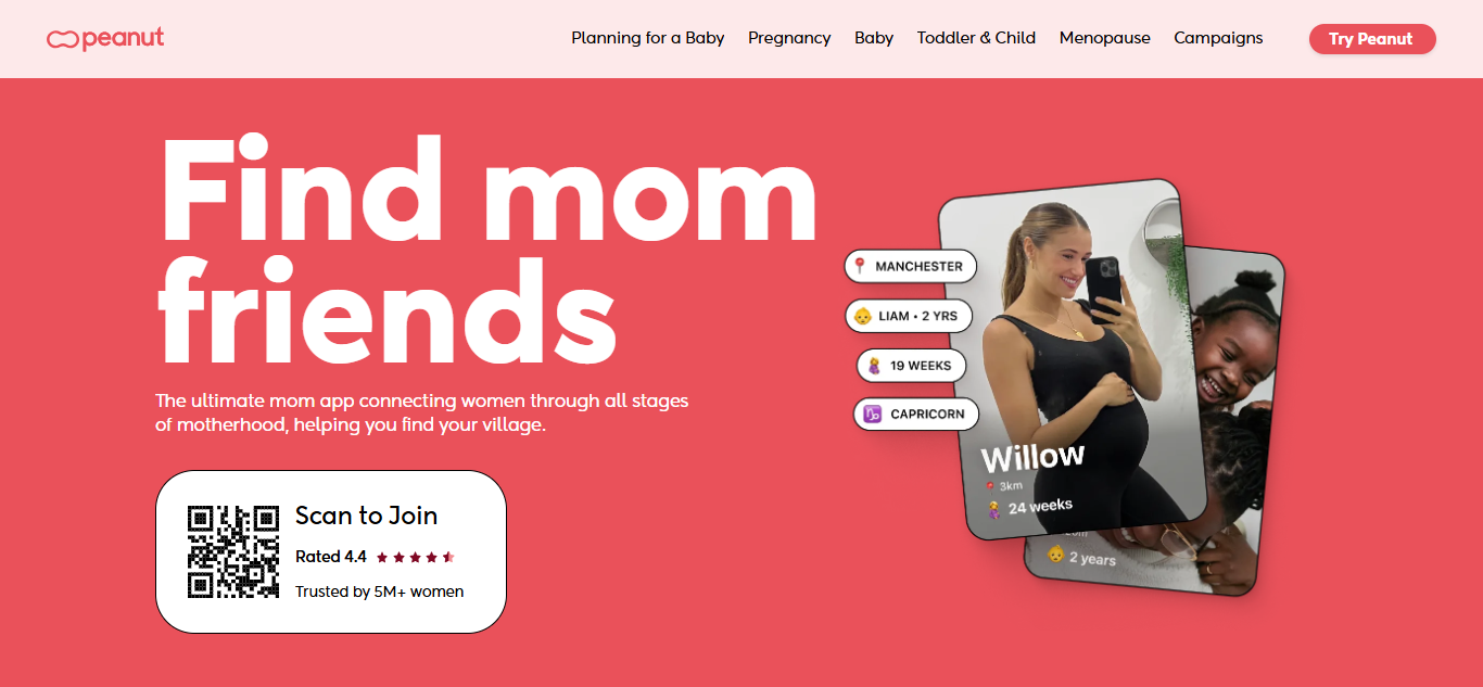 Peanut App’s website | Source: peanut-app.io
Minimalist UI design examples like the Peanut app show how this principle is executed properly. Its site establishes a good monochromatic palette of soft pink and red, conveying femininity and warmth as a safe space for women. Meanwhile, neutral blacks and whites maintain balance and clarity across the interface.
Also Read: UI Testing Tools: The Top 7 Platforms for Flawless UI
5. Prioritize Readable Typography
In the principle of minimalist UI design, typography takes on greater importance, since fewer visuals mean text must work harder to inform and engage. Typography serves two key roles: delivering clear messages and capturing attention.
Body text, labels, and notifications should use legible fonts. It typically uses sans-serif or serif fonts for optimal readability across devices. Meanwhile, headings, hero text, or logos can use expressive typefaces to create visual impact, but they must be used sparingly and intentionally.
For consistency, limit your design to no more than two font families and avoid excessive weights or styles.
6. Simplify Layouts and Navigation Flow
A simple, well-structured layout is the core of any effective minimalism UI. Use a grid system to keep elements aligned and organized.
Additionally, limit the number of choices users must make. Too many options can increase cognitive load and disrupt the experience. Group related content, remove redundancies, and always consider the user’s flow.
Design intuitive navigation with familiar patterns, like the Z-pattern or F-pattern, to guide users smoothly through your interface and keep interactions effortless.
Also Read: How Bad UI Design Breaks User Experience: 10 Critical Examples
7. Design Every Element with Intention
Another principle of minimalist UI design is intentionality. Every element on the screen, like text, imagery, and buttons, should serve a clear purpose. When paired with adequate whitespace, purposeful elements naturally stand out and direct users to your intended message or action.
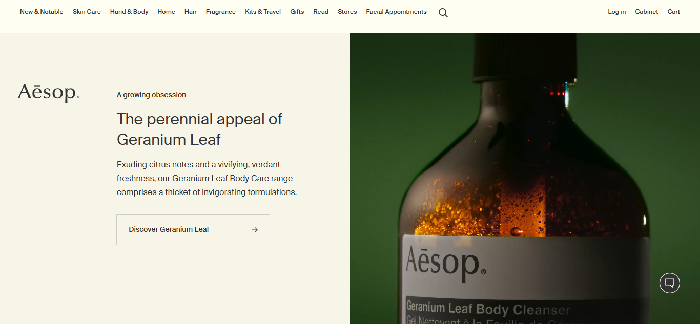 Aesop’s website | source: aesop.com
Aesop’s website embodies this well. Its imagery and video content work seamlessly with concise text, giving users a clear understanding of the brand without overwhelming them. Every component supports the user’s journey and builds trust.
Also Read: 7 Must-Know Best Practices for UI Design That Users Will Love
Design Less, Deliver More!
Minimalism is not just about a simple form, but it is also about comfortable function. By embracing the principle of minimalist UI design, you can create interfaces that are clean, efficient, and user-focused.
Let’s begin optimizing your UI with the easiest one, typography. Is your text legible? Is your headline impactful? If your current typefaces aren’t performing, it might be time for an upgrade, and Creatype Studio is the perfect place to start.
Discover exceptional typefaces for UI design, from clean serifs to expressive scripts, to elevate minimalist interfaces. Explore Creatype Studio and don’t miss out on our bundle sales for even more affordable choices.


