Users favor a smooth browsing experience. They want apps and websites to be easy to navigate and have a clean user interface (UI). A clean UI is important for delivering a comfortable and intuitive user journey on a website or app. To achieve that, it’s essential to understand the principles behind clean and effective UI design. Let’s find out here.
Key Takeaways:
- A clean UI is rooted in minimal design, so focus on essential elements and use ample whitespace to reduce clutter.
- Prioritize a smooth user flow by guiding users with a clear visual hierarchy and well-designed buttons.
- Use a cohesive color palette, typography, and icon style throughout your UI to maintain consistency.
Top 10 Tips for Designing a Clean User Interface
Follow these best practices to improve your UI design and make it smoother, clearer, and more intuitive.
1. Apply Strong Visual Hierarchy
A clean user interface relies on a clear visual hierarchy to guide users through content efficiently. Arrange elements from the most to the least obvious for indicating their importance.
For example, headings should be larger than body text, and key buttons should be more prominent than secondary ones. Done right, hierarchy improves scannability and enhances the overall experience.
Also Read: UI Testing Tools: The Top 7 Platforms for Flawless UI
2. Use Ample Whitespace
 UI comparison with and without whitespace | source: kaarwan.com
Whitespace isn’t wasted space; it gives breathing room and improves legibility. Additionally, in mobile UI, adequate spacing enhances tap targets and comfort. Using a 4- or 8-point spacing system helps maintain clean, organized layouts that are easy to read.
3. Choose a Simple and Clear Color Palette
Color selection is vital for establishing a clean interface. Stick to a minimal palette that reflects your brand without overwhelming users. Try these practices to help you pick the right color palette.
- Apply the 60-30-10 principle by using 60% primary, 30% secondary, and 10% accent colors to achieve visual balance.
- Avoid pure black (#0F0F0F) for backgrounds since it can feel harsh.
- Don’t use overly saturated colors on a dark background.
4. Stick to a Consistent Typography Style
Clear and legible text is essential to make a clean user interface design. Choose scalable, web-safe fonts that remain readable across screen sizes. Limit font choices to 2 or 3, and establish hierarchy through size, weight, and spacing.
Stick to sans-serif fonts for body text, and reserve decorative styles for large headings or visual accents only.
Also Read: How Bad UI Design Breaks User Experience: 10 Critical Examples
5. Maintain Icon Consistency
![]() Icon consistency | source: stephaniewalter.design
Icon consistency | source: stephaniewalter.design
Icons are essential to navigation. To support a clean user interface, use a consistent icon style, like line, filled, or duotone. You may use icon variants based on their state. For example, the filled style is for active, while the line style is for default icons.
However, keep the design language unified. Always label icons clearly since they aren’t always self-explanatory.
6. Minimize Unnecessary Elements
Remove anything that doesn’t serve a clear purpose. Extra buttons, borders, or effects only add noise and cause cognitive overload. Focus on function; every element should support user goals and streamline interaction.
7. Use Clear and Readable Text
No matter how attractive your layout is, poor readability breaks the experience. Here’s how to make a clean user interface through better text clarity.
- Set line height to 1.5× the font size.
- Keep line length between 50–75 characters.
- Keep a clear distinction between your text and background colors.
Also Read: 7 Must-Know Best Practices for UI Design That Users Will Love
8. Design with Alignment and Grid Systems
 UI layout using grid alignment system | source: supercharge.design
Good alignment brings structure and enhances readability, which are essential for UI. Use a grid system to structure layouts vertically and horizontally. Follow these practices to help you.
- Align related elements closely to create connectivity.
- Use center alignment only for short text.
- Align elements to the grid lines and avoid placing them within the gutter space.
9. Use Feedback to Guide the User
Feedback reassures users that their actions have been received. Moreover, it offers more accessibility to streamline the user journey. Here are practical and clean user interface examples of feedback.
- Add form hints or warnings.
- Use autofill to speed up input.
- Trigger subtle notifications (e.g., animation, sound, vibration).
- Display breadcrumbs to show the location.
When using micro-animation, be careful not to overdo it since it can distract users.
10. Make Your Buttons Clear and Clickable
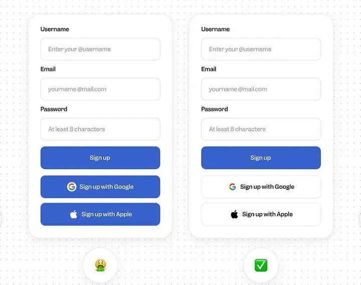
 Button design with clear contrast | source: medium.com – vaishnavimokadam
Buttons are key to navigation and flow. To maintain clear buttons, follow these tips.
- Place buttons where users expect them.
- Clearly distinguish primary and secondary buttons.
- Use strong CTAs. Avoid vague labels like “Next” or “Okay.”
- Add subtle shadows (opacity <40%) for depth with a consistent light source.
- If using gradients, opt for a linear gradient.
Also Read: 10 Inspiring SaaS UI/UX Projects That Nailed User Experience
Clean Up Your UI and Improve the Entire User Experience!
Designing a clean user interface is all about crafting a seamless, intuitive experience that users can navigate with confidence. By applying these 10 practical tips, you’ll create UIs that not only look refined but also feel effortless to use.
Start by improving a simple yet powerful aspect of your UI: typography. With the right typefaces, your interface can get the ideal balance between functionality and visual appeal. At Creatype Studio, we offer reliable typefaces for UI design to elevate your project with clarity and personality.
Explore our creative, diverse font bundles at Creatype Studio as a convenient way to find the perfect typeface that reflects your brand’s style and message.


