
Typography is one of the most powerful tools in design, yet those outside the design profession often overlook it. In reality, there’s more to it than merely choosing a font. Even the tiniest details in letter and line spacing can affect how your brand communicates certain ideas.
To achieve brand success, you should understand the nuances of key spacing processes and the difference between leading, tracking and kerning.
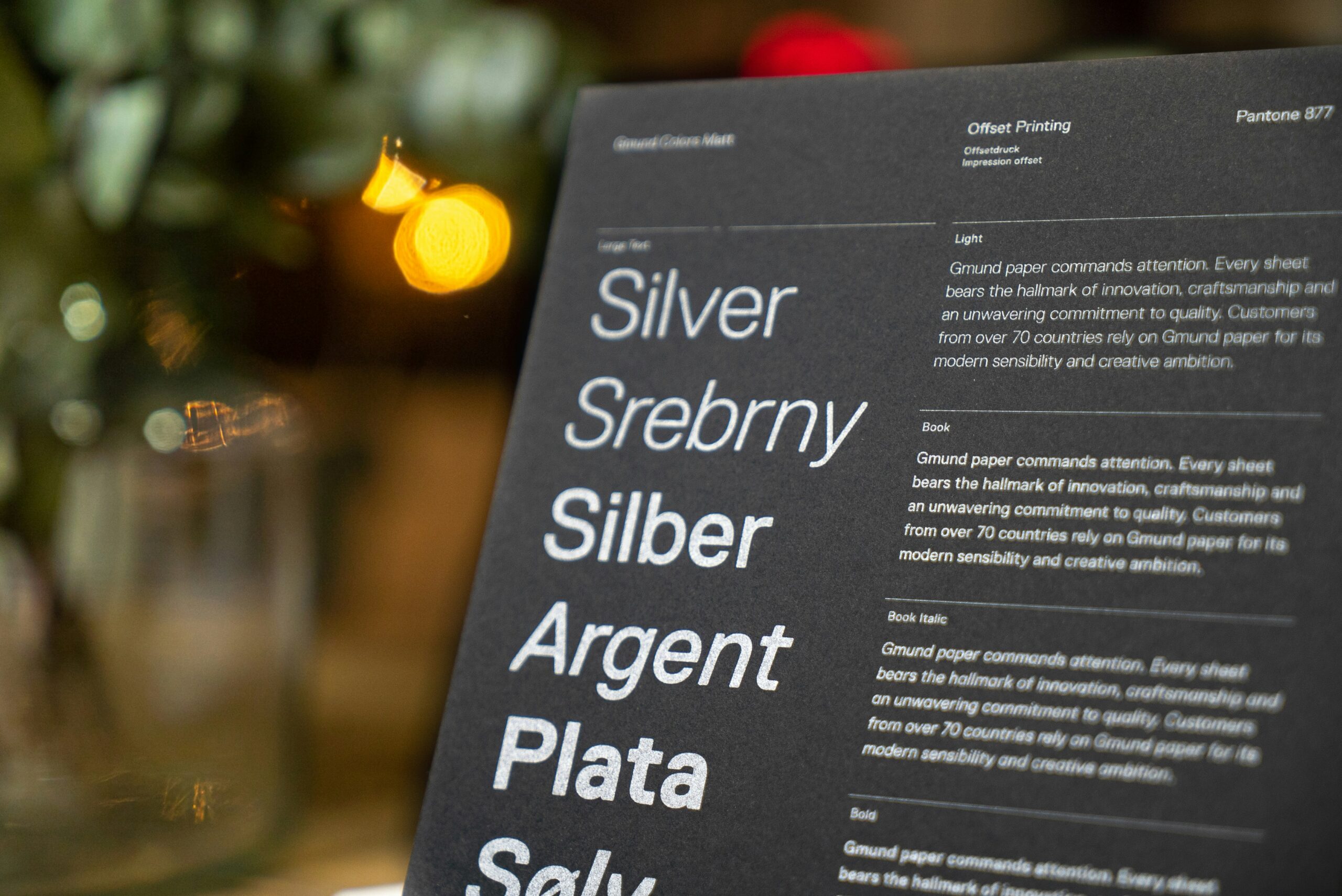
What Is Kerning?
Kerning refers to the adjustment of space between two individual letters. This fine-tuning method ensures characters appear evenly spaced. If the kerning is too tight, letters can blend, creating indistinguishable words and obscured messages. If it’s too loose, the text can look disjointed and unbalanced.
Kerning is especially crucial in logos and headlines, where large font sizes make spacing inconsistencies highly noticeable. Many typefaces come with predefined kerning pairs — such as “WA” and “AV”— where the natural shape of letters requires special spacing adjustments.
Best Practices for Kerning
- Focus on balance. Adjust space so that no letter looks too detached or cramped.
- Pay extra attention to angular letters like A, V and W, which often require more kerning refinement.
- Use manual kerning for logos and large text to maintain a polished appearance.
What Is Leading?
While kerning fine-tunes the horizontal space between individual letters, leading takes a broader approach by controlling the vertical space between lines to improve readability and visual structure.
Leading is the vertical spacing between lines of text. The term originates from the early days of typesetting when lead strips were placed between lines to adjust spacing. Proper leading ensures an optimal reading experience, particularly for body text.
Some software programs have a default leading. However, adjustments may be necessary in digital design depending on content length and font choice. Increasing leading may improve reading speed and comprehension, making it an essential factor in web design and content marketing.
Best Practices for Leading
- Adjust the leading based on content type. Tighten it for headlines and loosen it for paragraphs.
- Avoid overlapping ascenders and descenders — in other words, the tails of “y” or “g” — colliding with the letters above.
- Take screen readers into account. Mobile-friendly text often requires more generous leading.
What Is Tracking?
While leading ensures that lines don’t feel too cramped or too loose, tracking takes it a step further by adjusting the overall spacing of text blocks, affecting readability at scale.
Tracking adjusts the spacing between all letters in a word, phrase or paragraph rather than just between two characters, as with kerning. This uniform spacing is often used for stylistic effects, such as making the text more airy and elegant or denser and compact.
Unlike kerning — which focuses on specific letter pairs — tracking affects an entire block of text. If applied excessively, it can hinder readability. Optimal letter spacing should be 35% of a letter’s average width.
Best Practices for Tracking
- Subtly increase tracking for uppercase headings to improve legibility.
- Reduce tracking in small fonts to maintain readability.
- Avoid excessive spacing, which can make the text feel disconnected.
Why Typography Spacing Matters
Think about the logos of Apple and Coca-Cola. Their typography isn’t just about looking good — the instant recognition conveys professionalism and brand consistency. You know they put significant effort into making their logos what they are today.
Now, imagine those logos with uneven kerning or inconsistent tracking. Customers subconsciously associate bad typography with poor quality.
In fact, research shows that 81% of consumers are more likely to try a product when its packaging catches their attention. A significant 78% of consumers see logos as works of art that can stop them in their tracks, peaking curiosity. This principle extends beyond packaging to website typography, advertising materials and branding elements. Clean, well-spaced typography makes a brand appear more professional and trustworthy.
Master the Invisible Dealbreaker in Design
The principles of leading, tracking and kerning are crucial in the success of a design, whether it’s a website, promotional project or brand identity piece. Before you launch your next website or marketing campaign, audit your typography. Check your kerning in headlines, adjust leading for readability and fine-tune tracking for consistency. A few small tweaks can be the difference between a forgettable brand and one that sticks in customers’ minds.


