
Designers who have many assignments in designing letters must have learned about typography. This state of knowledge allows you to arrange letters to be legible and readable. But what if the letters are too mainstream and look uniform? Here we will learn about ascender in typography. What is this term? Find the answer by reading the explanations below.
What is Ascender in Typography?
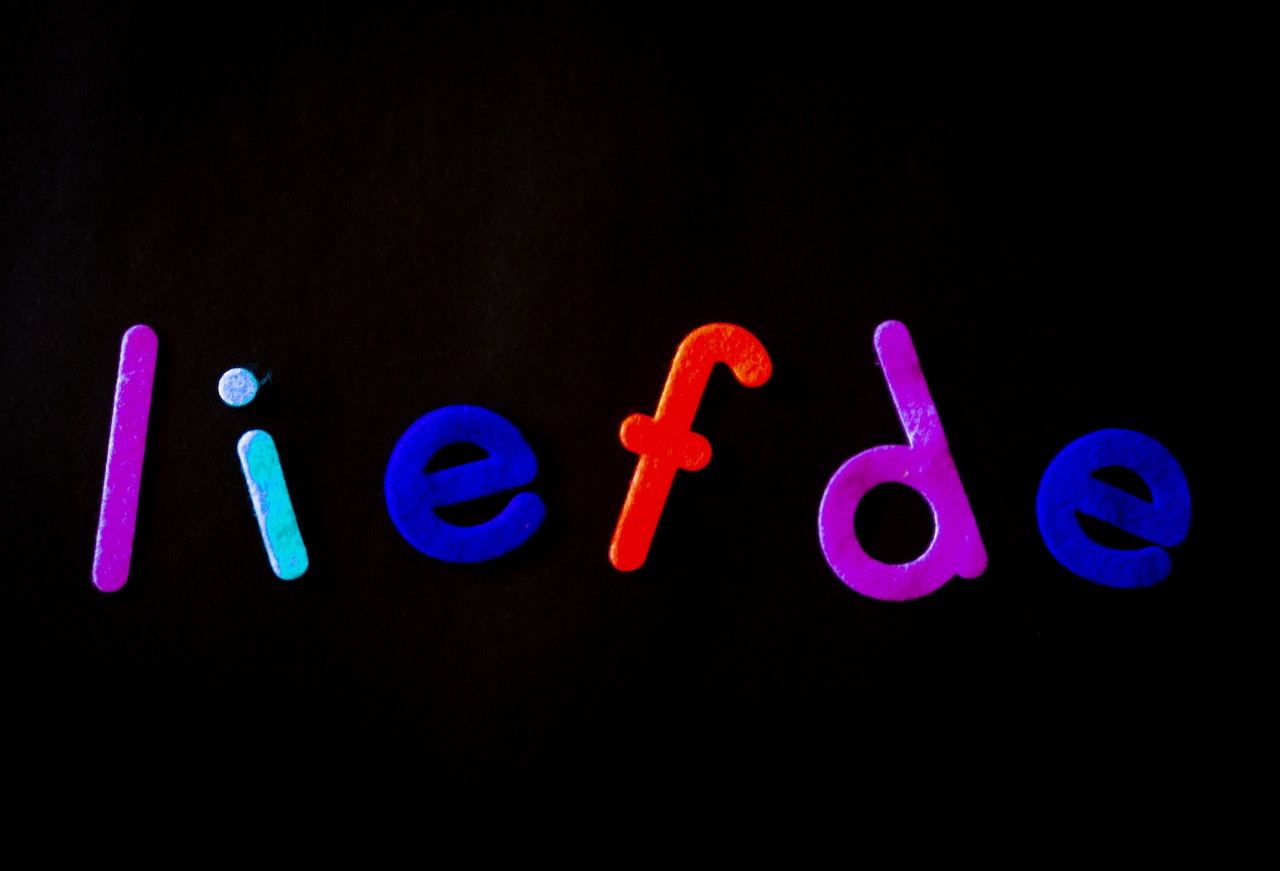
You know that the alphabet has a different shape. Some of them are short, but others are high. For example, the high-shaped alphabet is b, d, and h. These three are perfect explanations of the ascender in typography. This term stands for an upward stem part of lowercase letters extending beyond the meanline and x-height.
Simply put, letters of b, d, and h have the same upward stems that are higher than a or c. This significant distinction with a higher part of the letter is ascender.
Functions of Ascender in Typography
Well, you learn the definition. But what is the function of the ascender?
Lowercase letters tend to have uniform shapes that look alike. This condition may lead to misread by some people. As a result, ascender exists to aid designers in distinguishing one letter from others. The difference must be obviously seen so that people can differentiate the letters and read the message clearly.
What’s more, designers can effectively promote a brand’s name with the ascender without piling up the same letters. The different the letter, the better audiences can read. Therefore, high and low letters are important to give a clear message.
Examples of Ascender in Typography
This article will not be complete without breaking down ascender in typography examples. So, I will tell you three different types of this term on the list below. Without further ado, continue your reading!
1. High Ascender Fonts
The first type of ascender is high. Commonly, the distance between the x-height and the ascent is significant. However, these kind of letters are unique and promotes higher rating for easy reading. These are examples of high-ascender fonts.
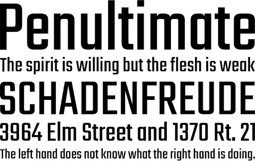
a. A Charming Point
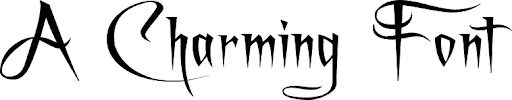
This font has an incredibly lofty ascender which is unique and distinctive. In addition, you can see it often on a book title, especially in fantasy genres. Not only can designers use it for distinguishing letters, but also this A Charming Font will be a great choice for mystery books.
b. Pompiere
Pompiere is the second example of an ascender in typography which has a real lofty ascent line. It does not seem unique as the previous example, but this second list is tidy. Designers mostly use this font for a long paragraph which allows people to distinguish the letters effectively.
Also Read: Get to Know the Difference Between OTF vs TTF, Which Is Better?
2. Low Ascender Fonts
After the high, this second type has a low ascender in typography. It will be a perfect choice if you have limited x-width in your design layer. So, here are the examples.
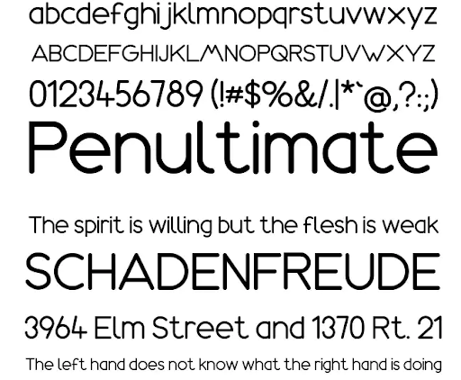
a. Litera
Are you looking for a clean letter? Then, Litera must be your excellent choice. The letter has standard space which people can distinguish well. Furthermore, it is the best choice that gives an anti-mainstream shape but is easy to read.
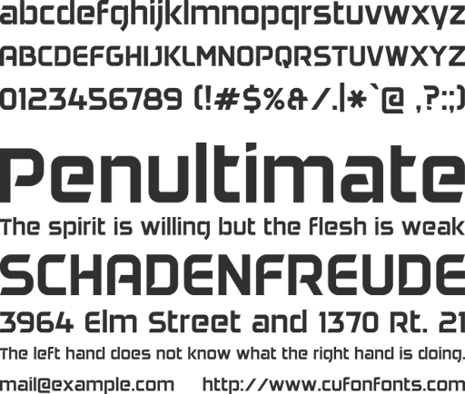
b. Teko
The second example of low ascender in typography is Teko. It is bold and can highlight your title. Either headings or subheadings, no one will ever mistakenly read your writings on your design.
3. Minimum or No Ascender Fonts
You know that ascenders are high upward stems. But this last type only has a minimum or even does not have a high stem at all. How is the look? Here they are.
a. Amazonas
This font seems normal, but it has minimum ascenders. Despite the shape, designers can use the font for titles or long paragraphs. The alphabet is easy to distinguish allowing people to read the sentences correctly.
b. Daggersquare
Last but not least, Daggersquare may be the most unique ascender in typography font you can see in this post. It is wide but short. However, people can recognize the letters correctly since every shape is different from others.
Are You Ready to Make Ascender in Typography?
Designers must learn and work hard to give an easy-to-read word. Thanks to the ascender in typography, their works are no longer difficult. Whatever the writing is, they can provide a clear message. Then, which of the ascender types above do you prefer the most? Let’s use it on your next design project!


